• Skip to main content
  • Skip to primary sidebar
  • Skip to secondary sidebar

Sixth Street Sundries

Emily Midgett

  • Home
  • About Me
  • Contact
  • OLO Marker Color Swatch Chart
  • Shop

Papertrey Ink

Papertrey Ink May Release Fun!

June 8, 2024

Hi friends! The folks at Papertrey Ink were kind enough to share their May release with me, and I’ve been so busy during the month of May that I haven’t been able to share anything until now. My stamping roots start at Papertrey Ink, so it’s such a thrill to be able to use their products as a guest designer! My husband and I will celebrate our 15th anniversary later this month, and while we don’t have any over-the-top plans to celebrate like we had hoped (taking a trip to England and Scotland was contemplated, but we can’t really leave the kids for that long at this point), we have very fond memories of our 10 year anniversary trip to an all-inclusive resort to Mexico. We were particularly enamored of the sunsets; my husband proposed to me during a gorgeous September sunset on a bluff overlooking a river, so sunsets have always held a special place for us, and the sunsets during our trip to Mexico were astonishingly beautiful. I channeled some of those vivid Mexican sunset colors for these summery projects, so let’s get started with the details!

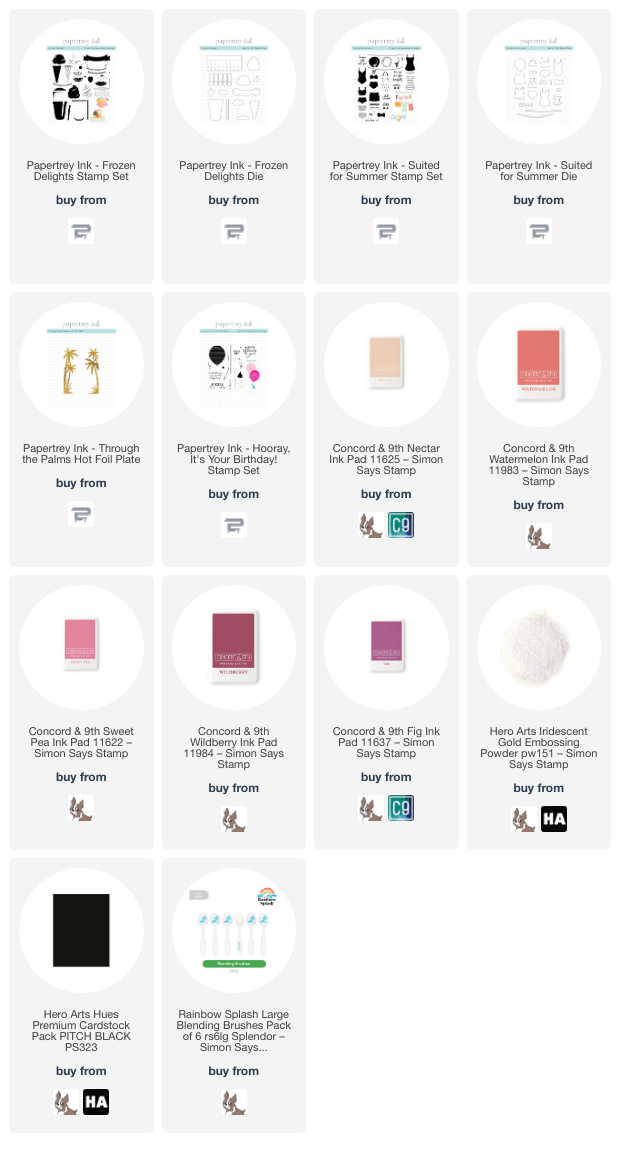
Whenever I am creating a suite of projects, I try to use coordinating ink colors, which can help keep things cohesive even if the subject matter on each card is different. The layering stamps included in the Papertrey Ink May release lent themselves well to summery sunset colors, so I selected Nectar, Watermelon, Sweet Pea, Wildberry, and Fig inks from Concord and 9th to create a unique, warm sunset palette.

For my first card, I hot foiled the beautiful Through the Palms hot foil plate from the May Release onto some white cardstock using the iridescent gold Aura hot foil from Spellbinders. The colors in this foil worked perfectly to create a vibrant tropical card! I used blending brushes to blend the ink colors, working from the darkest at the top to the lightest at the bottom.

I love a good shaker card, and the new-ish flat shakers are so simple while still allowing the entirety of your background to show. I loved the color blend and shining, iridescent palms so much that I didn’t want to cover any of it up, so I used some leftover packaging to create a shaker pocket around the entire blended panel, which I then filled with a variety of coordinating sequins from my stash. For a simple sentiment, I heat embossed a greeting from Hooray, It’s Your Birthday from Papertrey Ink using Iridescent Gold embossing powder from Hero Arts, which looked so gorgeous on the black cardstock. I fussy cut the finished sentiment with my scissors, then popped it up on the shaker front with some foam adhesive, embellishing only with a sparkling gold twine bow.

My second card uses the same vivid color palette, this time to create a sweet patterned background using the Suited For Summer layering stamp set. This set can be used in so many different ways, but I couldn’t resist creating some custom patterned paper using the different swimming suits and accessories included in the set. Using the same ink palette as the first card, I stamped many of the different elements from Suited For Summer onto an A2 panel of white cardstock, starting from the largest image and working my way to the smallest image, filling in bare spots and rotating the stamps so that the pattern was cohesive but still looked somewhat random. I also stamped a few extra swimming suits, the beach hat, and some sassy sunglasses, then used the coordinating dies to cut them out.

The colors were so vibrant on the stamped images, but I still wanted to add some contrast and make those blank spots a bit less open, so I used one of my fine point black markers to add tiny black dots over the white spaces on the background, as well as adding some black accents on the stamped images themselves. I trimmed down a panel of thin vellum to keep the die cuts from getting lost on the busy, colorful background, then added the die cuts and greeting (from Suited For Summer) on the vellum panel before adhering. I flipped the vellum panel over and added some foam adhesive squares behind the solid die cuts to hide the adhesive, then added it to the center of the custom patterned panel. I finished the project off with a few sparkling gems! I think this would be an adorable shower or wedding card!

For my last project, I used the fabulous new Frozen Delights stamp set to create this scrumptious looking gelato cone. I find the colors of gelato to be exquisite; they’re so much more vibrant than traditional ice cream. I used the “rock ‘n’ roll” stamping technique to add some extra shading on the solid layer of the swirled ice cream, stamping the first layer in Sweet Pea, then inking only one side of the stamp up with Wildberry and using my microfiber cloth to muddle the edges so that the shadow faded more smoothly. I stamped the last layer using Fig, the cone with Nectar and Watermelon, and the cherry and banner also with Watermelon. I die cut the finished images with their coordinating dies.

To create a lovely coordinating glow behind the gorgeous cone, I lightly blended Watermelon, Sweet Pea, and Wildberry inks in the center of a panel of white cardstock, then splattered the background with some super sparkly handmade watercolors. After it had dried, I trimmed the panel down and matted it with a black A2 card front, which completed the third black accent (keeping to the “rule of three” whenever I can for accent colors!). I popped up the ice cream cone with some foam adhesive, then added the banner with a double layer of foam adhesive to help it pop a bit. Sometimes simplicity is just as effective as the more involved projects!

Well, that’s all for my projects today. Thank you to Papertrey Ink for the opportunity to play with these super fun goodies! You can check out the entire May release HERE. What a great way to kick off the summer. Thanks so much for stopping by today, and have a marvelous day!
Filed Under: Papertrey Ink Tagged With: birthday, flat shaker, frozen delights, hooray it's your birthday, ice cream, suited for summer, summer, through the palms, wedding card

Papertrey Ink July 2023 Release-Guest Post!

July 26, 2023

Hi friends! I have a post today that is so very exciting for me. When I was first starting out as a stamper, the new releases each month at Papertrey Ink were almost an obsession for me. I waited impatiently each month for the sneak peeks to start, waited impatiently for that moment when the release went live, waited impatiently for my package to arrive so that I could start creating with the elegant goodies so lovingly packaged… After a couple of years, I began working with other companies as well, then began working for those companies, and so as our family grew and as my work increased, my available playtime kept getting diminishing. You can imagine how incredibly thrilled I was when the ladies at Papertrey Ink asked me to do some guest work for them this month! My mom said it was like coming full circle for me. Such an honor to help introduce some of their newest products! I created four different cards for their July 2023 release, two of which I’ll share with you today. Let’s get started with the details!

I cannot get enough of layered flower dies as a general rule, and the stunning new Into the Blooms: Poppies are so beautifully detailed that I couldn’t resist creating a project with them as the star! I used a Smokey Shadow cardstock base for both of my projects, allowing the layered flower dies to really pop from the dark neutral background, adding crisp white embossed sentiments for a super bold look. Let’s get started with the details!

My first project features the beautiful new Into the Blooms: Poppies and the versatile new Love To Layer: Alluring Brackets dies. This is my second Love To Layer die set; you can find another card using these marvelous dies HERE. They work together so beautifully, either die cutting multiple dies at once to create a frame die cut, perfect for encircling with florals, or you can cut them individually as I’ve done here to create a layered look with lots of textures and heights. I die cut the Alluring Brackets dies from some more Smokey Shadow cardstock, then heat embossed one of the large greetings from the new Garden Blessings stamp set with crisp white embossing powder. The contrast between the white embossing and the deep gray background is just marvelous!

To accent these beautiful frames, I die cut the Into the Blooms: Poppies from some Pure Poppy cardstock. I then used a small blending brush to blend some deep cranberry ink on each of the individual petal die cuts to create some extra dimension on these flowers. I cut the foliage from Simply Chartreuse cardstock and blended some coordinating green ink around the edges to add some extra interest to the flat die cuts. For the flower centers, I cut them from more Smokey Shadow cardstock and accented the tips with some white gel pen. I adhered the Love To Layer: Alluring Brackets die cuts to the Smokey Shadow A2 card base using foam adhesive, then tucked the flowers and foliage around the bracket die cuts and adhered them with a single and double layers of foam tape and liquid adhesive for lots of different heights. Finally, I added a few iridescent white pearls for sparkle!

For my second project, I paired the beautiful new Psalm Reflections: July stamp and coordinating die set with the older Into The Blooms: Gardenia layering die set. I first die cut and heat embossed the Psalm Reflections: July stamp and coordinating die set using more Smokey Shadow cardstock and white embossing powder. I love that this die can be used with or without the stamp set; it’s such a beautiful shape, and the little debossed details around the edges are so delicate and lovely! After heat embossing, I popped the sentiment die cut up on my A2 Smokey Shadow card base using foam adhesive.

To accent the lovely greeting, I die cut the components of the Into The Blooms: Gardenia layering die set from some plain white cardstock. I used blending brushes to lightly blend pale peach and jade green inks on the individual die cuts before adhering the pieces together. I kept the blending extremely light on the flower petals, as I wanted the gardenias to be as white as possible. The pale peach blending helps create some contrast between the individual petals while also allowing the flower to glow a little! I adhered the pieces together using liquid adhesive, then added some swipes of my sparkle pen to add some extra interest and shimmer. I had die cut the Elegant Edges: Spring Flowers for a different project and saved some of the die cut sprigs. I tucked those amongst the gardenia arrangement and added some sparkle pen to them, as well, filling in some of the bare spots with a little extra shimmer and texture.

Well, that’s all for these projects! I have two more to share with you using the new Papertrey Ink July 2023 Release, so be sure to check back later this week. Thanks so much for stopping by today, and have a marvelous day!

Filed Under: Papertrey Ink Tagged With: encouragement, floral, garden blessings, into the blooms: gardenia, into the blooms: poppies, layered die cuts, psalm reflections, religious

Spellbinders Large Die of the Month: March!

March 24, 2018

Good morning! I was given the opportunity to play with some beautiful new Spellbinders dies. I love that they have so many different kits available, with many different styles, sizes, and price points so that you can always have something new and fun arriving on your doorstep each month! The March Large Die of the Month kit featured a darling little favor box, as well as some lovely flowers, foliage, decorative swirls, and tags.

I was able to create two projects using this sweet die set, both a card and a decorated favor box.

I’m sure I’m not the only crafter in this community with a copious colored card stock stash, right? I have a giant drawer full of colored card stock that is quite unloved… but I’ve discovered that my reams of colored card stock are perfect for combining with the Spellbinders dies. For my card, I stuck with a magenta, gray, and white color scheme (I’ve really been loving non-traditional foliage colors lately). I die cut the flowers, foliage, and some curlycues included in the March Large Die of the Month kit from colored card stock using my Spellbinders Platinum 6 machine. I also die cut a tag image from white card stock and stamped a simple “thanks” in black ink. For some subtle background texture, I used a lovely background stamp from Papertrey Ink called Cover Up: Quatrefoil, which I heat embossed in white on some pale gray card stock.

I adhered my quatrefoil patterned panel to the white A2 card front, then arranged my little floral bouquet, curling up the edges of the flowers to add a little extra texture and dimension. I added some clear gems to the flower centers, as well. The final touch was to adhere the tag, to which I’d added a black twine bow, with dimensional foam adhesive.

I love the shape of the little favor box included in the March Large Die of the Month kit. It’s the perfect size for a little Lindt truffle or a few Hershey kisses… perfect for bridal shower favors or just a little pick me up for a friend. It also gave me an excuse to break into my (almost more embarrassingly copious) stash of patterned paper, which I seem to collect and subsequently hoard. (I know I’m not the only person who does this.) I die cut the favor box using some beautiful Anna Griffin patterned paper (sadly, the paper pack from which I pulled this paper is no longer in print). The box die is large, but it fits nicely in the Platinum 6 machine! Assembly was an absolute breeze, too. Just a few folds, insert the tabs through the slits, and you’re done.

I wanted to include the cute little extras included in the kit, so I created a tag to add to the favor box. I die cut another flower and some more foliage, then cut a tag from some mint colored card stock. I adhered the flower and leaves to the tag, then added a dainty pearl to the center. I added some coral colored twine and adhered the tag to the box with a teeny tiny clothespin that I found in my stash.

Well, that’s all for me today! I love when I can get extra mileage out of my dies, don’t you? I hope you enjoyed these projects, and I hope you’ll check out the Spellbinders kits…. they’re really marvelous! Have a fantastic weekend!


Filed Under: Papertrey Ink, spellbinders Tagged With: die cutting, favor box

Spellbinders March 2018 Release Blog Hop+giveaway!

March 14, 2018

Good morning! I have an exciting post for you today… Spellbinders is having a fabulous blog hop to celebrate their March Release. There are some truly stunning and versatile dies included in this new release of four new collections: Classics (March), On the Wings of Love by Joanne Fink, Good Vibes Only by Stephanie Low, and the Sew Sweet Collection by Tammy Tutterow. I was able to create three projects for today (including a video!) using some of the pretty new dies in the Sew Sweet Collection. You should have arrived here from Sharyn Johnson Sowell‘s blog, and your next stop is Melissa Phillips‘s blog.

For my first project, I used one of the pretty edgers in the Sew Sweet die collection combined with some loose watercoloring to create this simple-but-pretty project. Here’s a video on my process:

A quick overview of my process in case you can’t watch the video: I started by stamping and heat embossing a floral swag from Altenew’s Just Because stamp set on the upper corner of a panel of Arches Cold Press watercolor paper using pearl embossing powder. I then used the Hero Arts watercolors to do some simple, loose watercoloring.

After watercoloring my image, I used the ribbon scallop die in the Sew Sweet die collection to die cut some pretty blue card stock from Hero Arts. I threaded a white velvet ribbon through and added a white velvet bow. I stamped a greeting from Just Because using Versafine, then embossed it using the pearl embossing powder to create a pretty charcoal pearl embossed greeting. I popped up the ribbon scallop die cut using dimensional adhesive and added a thin strip of yellow card stock above it to further coordinate with the colors in the watercolored image.

For the next project, I focused on the adorable little scene building dies included in the Sweet Tweets die collection. I utilized my (ahem, extensive) colored card stock collection, die cutting several elements from brightly colored card stock. After I had a vague idea of how I wanted to arrange the die cuts, I blended some Salty Ocean Distress Oxide inks around the edge of a panel of polka dotted patterned paper (say that three times fast haha!) to create a halo of blue sky. I thought the polka dotted paper worked well with the homey, shabby chic look of the cute birdie and flowers!

I arranged the little scene using a combination of dimensional foam adhesive and liquid adhesive to create lots of dimension. After I had adhered everything to the card front, I added a few jewels and some Nuvo drops to the centers of the flowers. I love adding those little extra details to plain die cuts. The final step was to add a sweet sentiment from Papertrey Ink.

For this last project, I decided to add some Copic details to the pretty flowers in the Posies and Pennies die set from the Sew Sweet Collection.  I started by die cutting several flowers from the Posies and Pennies die set using aqua, coral, white, and red card stock from Hero Arts. Because these die cuts are quite simple, I decided to add some shading and details with my Copic markers. I was able to quickly add some shading and made these plain flower and leaf die cuts pop with a few quick strokes of a Copic marker!

I die cut a pale gray stitched rectangle (this Posies and Pennies collection has a ton of versatile dies included in it!), then added some white die cut scalloped lines from the Sew Sweet die set. I arranged my flowers in a bouquet across my card front, then added some black to the centers of each flower, followed by some Hero Arts Crystal Lacquer pen. The greeting is a simple “you inspire me” from Altenew’s Penned Rose stamp set stamped in black on a strip of white card stock. I adhered it to the front of the bouquet. The final touch was to add some Oyster Gray Nuvo drops around the edge of the bouquet.

Well, what do you think of these fabulous new products?? Aren’t they just amazing? So many fun things you can do with Spellbinders dies!

How about a giveaway?! Spellbinders has generously offered a $25 gift certificate to the Spellbinders website for one lucky commenter! Simply leave a comment on this blog post by March 20, 2018 at noon. I will select a winner and announce it here on the blog!
(The winner is responsible for shipping cost, and any duties and/or taxes on their Spellbinders order.)

Spellbinders

Kristina Werner

Yana Smakula

Zsoka Marko

Elena Salo

Melania Deasy

Tammy Tutterow

Wanda Guess

Sharyn Johnson Sowell

Emily Midgett

Melissa Phillips

Susie Lessard

Erum Tasneem

Keeway Tsao

Cynde Whitlow

Janette Kausen

Laurie Willison

Rubeena Ianigro

Virginia Lu

Tiffany Solorio

Olga Direktorenko


Filed Under: altenew, Hero Arts, Papertrey Ink, spellbinders, video, watercolor Tagged With: blog hop, die cutting, liquid watercolors, stamping, video

Spellbinders Kit of the Month!

February 21, 2018

Good morning! I’ve recently had the opportunity to play with some super fun dies from Spellbinders… I showed you this project made with Spellbinders’ Poppies Card Creator, and today I have two projects using the Spellbinders Kit of The Month from November of last year.

I created a holiday project and a non-holiday project to share with you today.  (These beautiful filigree dies are really quite versatile, even though the kit is technically a holiday kit!) Let’s get started on the details!

For this first holiday card, I started by die cutting the lovely corner twice from some heavy duty card stock. I used a few scrap pieces of watercolor paper, but you could just use your heavyweight card stock as well. I then created a “molten” die cut by pressing my Versamark pad onto the die cut to make it nice and sticky, then dipping it in my gold embossing powder and heating it up. I repeated this process a total of 3 times to create a lovely, dimensional metallic die cut.

I added a watercolored holiday panel (from Papertrey Ink’s Botanical Blocks series) that I had colored for a Daily Marker 30 Day challenge ages ago, but it worked perfectly with the almost vintage feel provided by the metallic die cuts. Before adhering the die cuts and the watercolored panel, I adhered a strip of red foil card stock down the center of the card front. I then layered the die cuts and the watercolored panel over the red strip. I figured the holly berries on the watercolored panel was self explanatory enough that I didn’t need a greeting!

For my next project, I wanted to showcase the incredible detail on the large die included in the kit. There’s something so perfect, so classy about white on white, and it showcases the gorgeous intricate die cut just beautifully. I die cut the main die three times from plain white card stock and adhered them all together to create a dimensional die cut. I adhered them to the white A2 card base. It’s amazing how much detail you can still see, even without any color!

I heat embossed a simple “happy anniversary” onto a strip of white card stock using gold embossing powder and adhered it using foam tape over the top of the dimensional die cut. For just a smidge of detail to coordinate with the gold embossing, I added some gold jewels to the die cut.

Don’t they look pretty together? I love being able to use one product in several ways.

If you like receiving a monthly subscription of craft supplies (I know mine really spark my creativity when I’m feeling mojo-less!), you should check out the Spellbinders monthly kits! You can choose multiple price points, and they’re all fantastic value. Definitely worth checking out!

Have a marvelous day, friends!


Filed Under: Papertrey Ink, spellbinders, Uncategorized Tagged With: die of the month, dimensional die cut, dimensional dies, heat embossing, spellbinders

  • Page 1
  • Page 2
  • Page 3
  • Page 4
  • Go to Next Page »

Primary Sidebar

  • Facebook
  • Instagram
  • Pinterest
  • YouTube

Favorite Shops

Secondary Sidebar

Subscribe

Enter your email address to subscribe to this blog and receive notifications of new posts by email.

Instagram
Something is wrong.
Instagram token error.
Follow
Load More

Archives

Tags

3D embossing folder alcohol markers better press birthday birthday card blog hop card kit christmas christmas card christmas tag colored pencil copic copic coloring Daniel Smith die cutting embossing folder embroidery felt giveaway holiday holiday card hot foil ink blending karin brushmarker pro layered stencil masculine my monthly hero new release no line coloring no line watercolor OLO marker olo markers original illustration pawsitively saturated rainbow shaker card slimline stamping stamptember stencil thank you thinking of you valentine's day video watercolor

Popular Posts

Simon Says Stamp Sending Cheer Release: Now Available!
Joyful Snowman with New Simon Says Stamp Sending Cheer Release!
Autumn Legs with Colorado Craft Company and Catherine Pooler!
February 2018 My Monthly Hero Blog Hop!
Altenew Paint A Flower: Carnation Blog Hop+Giveaway!
Altenew March 2020 Release Blog Hop+Giveaway!
Special Release: Simon Says Stamp Limited Edition STAMPtember Christmas Card Kit!
Pinkfresh Studios June Washi and Stamp Release Blog Hop!
Pinkfresh Studio 5th Birthday!
2018 Autism Awareness Hop!

Disclosure

Some affiliate links are used in my posts. This means that, should you click on one of my links and purchase something from that company, I will receive a small portion of the sale at no extra cost to you. I use the money earned from these sales to help maintain my blog. I so appreciate you visiting and, if you do choose to use one of my affiliate links, thank you so much for your support!
Copyright © 2026 ·Brunch Pro Theme · Genesis Framework by StudioPress · WordPress · Log in
Loading Comments...