• Skip to main content
  • Skip to primary sidebar
  • Skip to secondary sidebar

Sixth Street Sundries

Emily Midgett

  • Home
  • About Me
  • Contact
  • OLO Marker Color Swatch Chart
  • Shop

A2 thin frames

Rich Red Ink Blending with New Simon Says Stamp Pawsitively Saturated Inks!

October 25, 2024

This post was sponsored by Simon Says Stamp. Thanks, Simon!

Hi friends! The new Sweet Wishes release from Simon Says Stamp contains a gorgeous new ink trio of luscious, vibrant reds that I used as the inspiration point for my projects today. I always love new ink colors, as color is frequently the first element that I decide when mentally designing my project, and these vibrant, cool reds are absolutely perfect for the holiday season. I used two different techniques with the same embossing folder for today’s projects, so let’s get started with the details!

*I have linked all of the products used at the bottom of the post for your convenience using affiliate links. Thank you for shopping with my links! I truly appreciate your support for my work!*

For both of my projects today, I put the new Ink Trio 30 to use with the beautifully intricate new Poinsettia Field Embossing Folder. The 3D embossing folders from Simon Says Stamp are amongst my most favorite products from every release, because there are so many ways to use them, and so many mediums with which to pair them. I’ve used two different techniques for my projects today, creating two completely different looks with almost identical supplies.

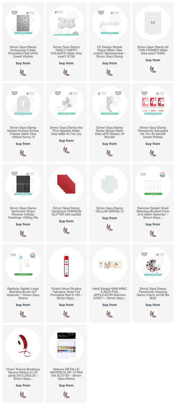
For my first project, I ran a panel of white cardstock through my die cutting machine using the new Poinsettia Field Embossing Folder. To add color to the panel, I flipped the embossed image over to reveal the debossed background, with the images impressed into the cardstock rather than popped up. I then used small blending brushes to blend the two lighter inks in the new Ink Trio 30 in the center of each flower, blending the lightest over most of each flower and enhancing the center of each flower with a small amount of the middle shade from the trio. After I had finished blending on each flower (which sounds time consuming, but actually went quite quickly!), I swiped the darkest shade from the Ink Trio 30 over the raised areas, putting the ink pad directly onto the cardstock, which enhances the pattern and creates such unique texture! I blended that same deeper red around the edges, creating a halo, and splattered the entire panel with metallic red watercolor.

After I had finished creating the background, I die cut a frame from some glittery red cardstock using the Nested Domed Arches Frames and adhered it to the card front using liquid adhesive. I used the same glittery red cardstock to die cut the detail layer of the Fancy Happy Holidays die set and added a vellum shadow behind it. To enhance the sentiment, I die cut some foliage using the Airy Pine Needles die and Rustic Sprigs die, tucking the monochromatic die cuts behind the sparkling dimensional sentiment. Finally, I added a few Cherry Pawsitively Dazzling Gems for added sparkle!

For my second card, I did some simple ink blending using the new Ink Trio 30, using blending brushes to blend a smooth ombré horizontally across a white A2 card front. After ink blending, I made sure that the cardstock was completely dry with my heat tool and ran the panel through my die cutting machine with the Poinsettia Field Embossing Folder. The color saturated panel enhances the incredibly detailed background so beautifully, adding texture and pattern to the panel.

After I had finished the background, I die cut another glittering frame, this time using the A2 Thin Frames and the same Crimson glitter cardstock from Simon Says Stamp. I adhered the frame around the edges of the blended, embossed background. The frames help to draw the eye towards the focal point in the center of the card, as well as add texture to the monochromatic card. I die cut the detail layer of the Simple Peace die from some coordinating red cardstock and the shadow layer from more red glitter cardstock, adhering the two layers together with liquid adhesive. I popped the sentiment die cut up with some foam adhesive squares, then tucked a sentiment strip from the Reverse Holiday Greetings sentiment card set, to which I had added some red toner foil using my Minc machine. To accent the sentiment pieces and add a bit more botanical softness to the card, I die cut a deep red Airy Pine Needles sprig and tucked it beneath the sentiment pieces. Finally, I added a Bordeaux ribbon bow and some shimmering gems.

Well, that’s all for my projects today! Each of these cards is so different while still being exactly the same color palette. It’s amazing what a difference technique makes for the color saturation with these embossing folders! Thanks so much for stopping by today, and have a marvelous day!
Filed Under: simon says stamp Tagged With: A2 thin frames, airy pine needles, christmas card, die cutting, fancy happy holidays, holiday card, ink blending, ink swiping, minc, nested domed arches frames, pawsitively saturated, poinsettia field, reverse holiday greetings, rustic sprigs, simple peace, toner foil

More Colorblock Christmas with Simon Says Stamp!

September 30, 2024

This post was sponsored by Simon Says Stamp. Thanks, Simon!

Hi friends! I have some more holiday inspiration to share with you today using goodies from the Simon Says Stamp STAMPtember release. I am a huge fan of non-traditional color combinations for Christmas, color palettes that are just a few ticks off of a traditional color palette. For today’s card and gift bag set, I selected a unique coral, cranberry, plum, and navy color palette, counting on the cranberry red, sparkles, and the snowflake images to convey the holiday theme. Let’s get started with the details!

*I have linked all of the products used at the bottom of the post for your convenience using affiliate links. Thank you for shopping with my links! I truly appreciate your support for my work!*

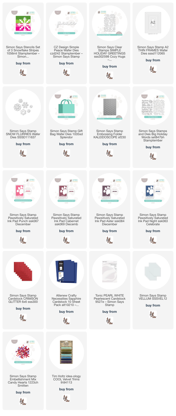
The colorblocked imagery began with the new Snowflake Stripes Stencil from the STAMPtember product release. I have been loving the clean look of color blocking lately; you can see some more inspiration using this technique HERE. For today’s card, I selected several inks from the Pawsitively Saturated Ink line: Punch, Cabernet, Aster, and Night. I used blending brushes to blend them on the new Snowflake Stripes Stencil set on a panel of white cardstock. These ink colors work so nicely together, blending in a gradient from coral to navy beautifully!

After I had finished stenciling the color blocked snowflake, I trimmed the A2 panel down and created a shaker pocket with some leftover stamp packaging, filling it with some Candy Hearts sequins to create a flat shaker card. I nestled the shaker panel in the upper left hand corner of an A2 panel of Altenew’s Sapphire cardstock, allowing the deep blue to peek out from the bottom right hand corner.

For the greeting, I die cut the new Simple Peace die from some more deep blue cardstock, backing the detail layer with a vellum shadow layer. I also white embossed a coordinating sentiment from Simple Holiday Greetings onto some more deep blue cardstock. To embellish my shaker front, I added some pearlescent white snowflakes cut using the Snow Flurries die set as well as a glittery red frame cut using the A2 Thin Frames and Crimson glitter cardstock, all from Simon Says Stamp. I popped up the sentiment pieces with dimensional clear adhesive, then added the snowflakes in a swag down the front of the card.

I created a coordinating gift bag using the ever-versatile Gift Bag Die. This die is quickly becoming a favorite of mine; it’s the perfect size for all sorts of goodies like lip gloss, candy, gift cards, and so much more! I created the bag itself by die cutting the bag twice from more of the Sapphire cardstock and adhering it with super strong double sided tape. I continued the color blocked theme and embellished the front of the bag with strips of coordinating colored cardstock, one of which was embossed using the Kaleidescope Embossing Folder. I cut the strips down and adhered them to the front of the bag with strong double sided tape, embellishing the front of the bag with more snowflakes from the Snow Flurries die set and a greeting from the new Big Holiday Words sentiment set. A velvet bow and some tissue paper finished this gift bag off, ready to be filled with treats and gifted to a friend!

Well, that’s all for my projects today! Tomorrow is October 1, and I am thrilled to be able to share as much Christmas and holiday inspiration as my little heart desires. So many wonderful things are coming, friends! I am excited to share them with you. Thanks so much for stopping by, and have a marvelous day!

Filed Under: simon says stamp Tagged With: A2 thin frames, big holiday words, christmas, christmas card, die cutting, embossing folder, gift bag, holiday, holiday card, ink blending, kaleidescope, shaker card, simple holiday greetings, snow flurries, snowflake stripes

The Sweetest Birthday with Simon Says Stamp!

August 29, 2024

This post was sponsored by Simon Says Stamp. Thanks, Simon!

Hi friends! I have a pair of softly colorful birthday cards to share with you today featuring a newer set with some scrumptious treats and the loveliest birthday sentiments: Sweet Birthday. One of my favorite parts of my birthday is the “excuse” to have some delicious treats that I wouldn’t normally eat, so food is always a big part of what I look forward to on my birthday! I used to say that my favorite food was dessert, which thankfully has expanded a bit as I’ve aged (not by much, though, ha!), so these sweet treats to celebrate a birthday were right up my alley. Let’s get started with the details on my projects!

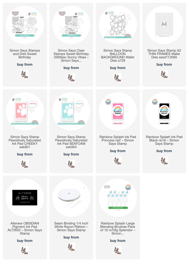
Both of my projects feature a dreamy, cotton candy-inspired color palette, with a soft pink, muted blue, and warm peach created by pairing the beautiful Cheeky and Seafoam Pawsitively Saturated Ink with Rainbow Splash Princess ink and some pastel Copic marker selections. I think this color palette is just delectable and the perfect complement to these sugary sweet treats from the Sweet Birthday set!

For my first card, I started by stamping a trio of macarons from Sweet Birthday using Rainbow Splash Black ink, which is alcohol marker-friendly. I used some pastel Copic markers to add color and shading to the images and die cut them using the coordinating die. I created a coordinating background using some super soft and ethereal blending with Cheeky and Seafoam Pawsitively Saturated Ink and Rainbow Splash Princess ink with blending brushes, keeping the blending around the edges of the card and leaving the center of the A2 card a bright, crisp white with a colorful halo. Once I had completed the blending, I splattered the background with some iridescent glitter watercolors from my stash, which I think enhances the dreamy blending so perfectly!

After I had allowed my background to dry completely, I added an iridescent white Balloon Background die, which adds some extra festiveness and shine to the simple backdrop. I also stamped some of the fabulous sentiments from the Sweet Birthday set using black pigment ink and clear embossed over the top, die cutting them with their coordinating dies. I popped up the greeting pieces with some foam adhesive and stacked up my macarons next to the sentiment. Finally, I tucked a bow created using 1/4″ white ribbon and added a smattering of shimmering gems to finish everything off!

For my second card, I continued the cotton candy color palette, this time stamping some cupcakes and that large lollipop from Sweet Birthday and coloring them using the same Copic color palette. I also added some watercolored sparkles to the lollipop and the cherry on the cupcake, covering the cherry with clear lacquer, as well. I also blended the background with the same soft ink colors from the first card, this time concentrating the color in the center of the A2 card front to create a glow from behind my cluster of sweets, adding some more sparkling splatters over the top of the ink blending as well!

After I had finished my background and treats, I die cut some white frames using the A2 Thin Frames and some iridescent white foil cardstock. I offset one of the frames over the blended area, then arranged my treats in a trio and adhered them using foam adhesive squares. I added some more greetings from Sweet Treats, stamped with black pigment ink and clear embossed, then popped up with a double layer of foam adhesive. Finally, I added a few more sparkling gems to make the card extra special and festive!

Well, that’s all for my projects today! I love celebrating special occasions with sweet treats. How cute would these cards be with a little gift card to your favorite bakery tucked inside? I know I would be super excited to receive that gift! Thanks so much for stopping by today, and have a marvelous day!

Filed Under: simon says stamp Tagged With: A2 thin frames, balloon background, birthday, ink blending, sweet treats

Blue, Pink, and Copper Pumpkins with Simon Says Stamp!

August 27, 2024

This post was sponsored by Simon Says Stamp. Thanks, Simon!

Hi friends! We had a little taste of autumnal temperatures last week, and it made me start yearning for fall! (We’re back to face-melting temps this week, though. Blah!) I pulled out some new-to-me stamps and dies from Simon Says Stamp to indulge my autumnal yearnings, but added some fun blue and pink to the traditional orange pumpkins to create this pair of modern fall cards. Let’s get started with the details!

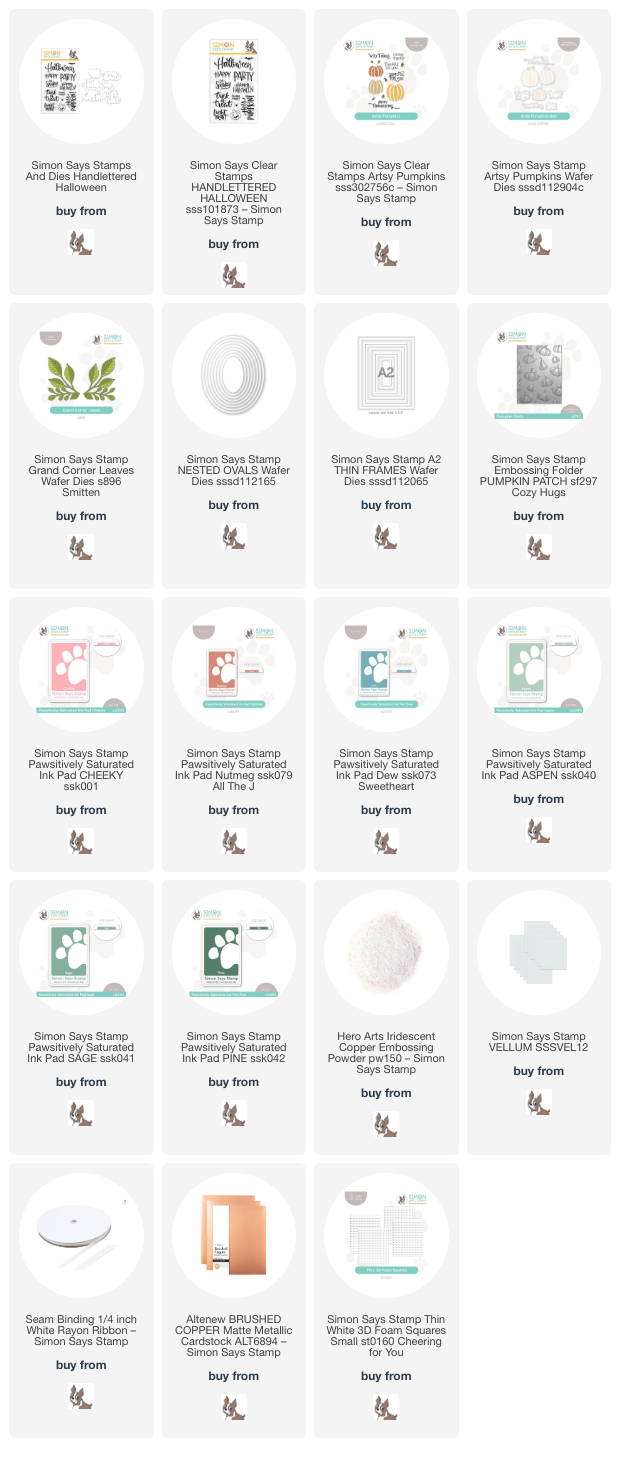
I’ve mentioned before that orange is not my favorite color, but it becomes much more palatable to me when paired with some colors to which I naturally gravitate. I paired the coppery Nutmeg Pawsitively Saturated Ink with Cheeky and Dew ink and crisp white to create a modern autumn color combination!

For my first project, I created a custom patterned paper background by stamping the Artsy Pumpkins stamps onto some bright white cardstock using Cheeky, Nutmeg, and Dew inks, adding foliage and stems with Aspen, Sage, and Pine inks. To create patterned paper, I always start with the largest images first, stamping at least three of them randomly, rotating the stamp and the cardstock to make things look somewhat random and cohesive. I move to the next largest stamp, filling in the large spaces between the stamped images, then fill in any remaining spaces withthe smaller images, always rotating the stamp and the paper to keep things interesting! I also stamped a few extra pumpkins in various sizes and die cut them using their coordinating dies.

After I had created the background, I used a blending brush to blend some more Dew ink around the edge of the card front, creating a soft blue glow.

After I had finished the background, I die cut some foliage using white cardstock and the Grand Corner Leaves dies. I contemplated using some coordinating sage green cardstock, but I thought that the white cardstock kept things light and airy without adding visual weight to the card. I die cut a medium-sized oval using vellum and the Nested Ovals die set, arranging the pumpkin die cuts and foliage on the vellum oval. I hid some foam adhesive on the back of the solid die cuts, adhering the die cuts to the patterned background. I also stamped and heat embossed a greeting from Hand Lettered Halloween using Iridescent Copper embossing powder, die cutting it with the coordinating die. Finally, I tucked a bow made from soem 1/4″ white ribbon amongst the pumpkins and foliage and added a few sparkling gems!

For my second project, I used some of the leftover stamped and die cut pumpkins that I created for the first project using the Artsy Pumpkins stamps and coordinating dies with Cheeky, Nutmeg, Dew, Aspen, Sage, and Pine Pawsitively Saturated Inks. I had one of each size pumpkin left over, so I envisioned a cluster in a pumpkin patch. I created a background using the Pumpkin Patch Embossing Folder and blended some Dew ink in the center to create a blue glow behind my pumpkins! I also splattered the background with some coppery metallic watercolors for added shimmer.

After I had created the embossed background, I trimmed it down slightly and mounted it in the center of a white A2 card front, creating a solid white frame around the embossed background. I added a delicate frame cut using the A2 Thin Frames and brushed copper foil cardstock, then arranged my pumpkin die cuts in a trio over the blended and embossed background, adhering them using single and double layers of thin foam adhesive squares. Finally, I heat embossed a sentiment from Artsy Pumpkins using Iridescent Copper embossing powder, adding it with a triple layer of thin foam adhesive squares. (yes, a triple layer!) For a final touch, I added some tiny sparkling gems in the corners of the metallic foil frame!

Well, that’s all for my projects today! I love taking traditional color palettes and adding a little twist to make them fit my style a bit better. Thanks so much for stopping by today, and have a marvelous day!

Filed Under: simon says stamp Tagged With: A2 thin frames, artsy pumpkins, autumn, fall, grand corner leaves, handlettered halloween, hey pumpkin, nested ovals, pumpkin patch embossing folder

Christmas In July Week: Finale in Lime and Royal Blue + SALE!

July 20, 2024

This post was sponsored by Simon Says Stamp. Thanks, Simon!

Hi friends! I am back for my final Christmas In July week post, this time featuring a somewhat non-traditional color combination with which I have absolutely fallen in love: lime, royal blue, white, and touches of shining silver. I used this color palette on a holiday card for a catalog earlier this year (in April-yes, holiday products are designed all year round!) and knew that I wanted to incorporate it into this series. I have mentioned before that it’s a bit challenging for me to get into the holiday spirit when it is super hot outside, and so sometimes my color palettes for these off-season cards can be a bit less traditional. I think this color palette certainly fits the festive holiday spirit while still being vibrant and somewhat summery. Let’s get started with the details!

I am always up for any excuse to use my own illustrations, and Festive Bouquets is one that I have not had nearly enough opportunity to utilize since it’s release last year. When coming up with floral bouquets, I try to incorporate unique pairings. For Festive Bouquets, I used anemones paired with hellebore (also called Christmas roses!), ranunculus, berries (a holiday floral staple!), and lots of greenery. Anemones come in tons of different colors, so I started with a vibrant blue anemone as my blue focal point around which I could build my lime green and blue bouquet.

I stamped the hellebore bouquet twice on a panel of white cardstock using alcohol marker-friendly black ink, then used OLO markers to color the pretty blooms. For the lime green hellebores (fashioned after the white hellebores with a lime green center), I selected medium and very pale lime green markers along with the colorless blender marker, adding lime green to the more shadowed areas and blending the edges out with the colorless blender marker. I used a similar technique for the “white” ranunculus bloom, adding a very pale yellow green marker to only the shadowed areas and blending the edges with the colorless blender marker, which leaves the majority of the bloom white. After coloring my holiday bouquets, I die cut them with the coordinating dies.

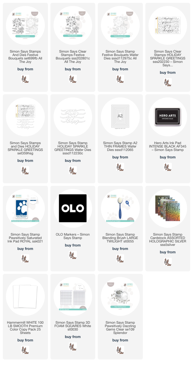
The two bouquets were perfectly proportioned to bookend a slimline card front, so I trimmed down a 3.5″ x 8.5″ panel of white cardstock and lightly blended some Royal Pawsitively Saturated Ink using a blending brush and splattered the blended area with some sparkling silver glitter watercolors for added festiveness. I popped up the floral die cuts with some foam squares in each corner, then added a holographic silver “frame” by die cutting the A2 Thin Frames and trimming off the longer straight pieces, which I strategically tucked behind the floral bouquets to create the illusion of a frame. For the greeting, I stamped the “joy” sentiment from the Holiday Sparkle Greetings stamp set using the Royal Pawsitively Saturated Ink and die cut it with the coordinating die. I popped the sentiment die cut up with a double layer of foam tape to give it some extra emphasis on the colorful background, finally embellishing the slimline card with some Clear Pawsitively Dazzling Gems.

Isn’t this color combo so beautiful for a holiday card? I am absolutely obsessed!

Now for an extra fun weekend surprise: Simon Says Stamp is offering 20% off of all in-stock Simon Says Stamp Branded products through 7/21/24 at 11:59 ET! Click HERE to see all of the in-stock products available for the discount, then use code SMR24 at checkout to receive 20% off of your Simon-branded products!!

Thanks so much for stopping by today, and happy shopping!!

Filed Under: simon says stamp Tagged With: A2 thin frames, alcohol markers, christmas card, festive bouquets, holiday card, holiday sparkle greetings, olo markers, original illustration, slimline card

  • Page 1
  • Page 2
  • Page 3
  • Interim pages omitted …
  • Page 5
  • Go to Next Page »

Primary Sidebar

  • Facebook
  • Instagram
  • Pinterest
  • YouTube

Favorite Shops

Secondary Sidebar

Subscribe

Enter your email address to subscribe to this blog and receive notifications of new posts by email.

Instagram
Something is wrong.
Instagram token error.
Follow
Load More

Archives

Tags

3D embossing folder alcohol markers better press birthday birthday card blog hop card kit christmas christmas card christmas tag colored pencil copic copic coloring Daniel Smith die cutting embossing folder embroidery felt giveaway holiday holiday card hot foil ink blending karin brushmarker pro layered stencil masculine my monthly hero new release no line coloring no line watercolor OLO marker olo markers original illustration pawsitively saturated rainbow shaker card slimline stamping stamptember stencil thank you thinking of you valentine's day video watercolor

Popular Posts

Simon Says Stamp Sending Cheer Blog Hop- Day 2 + Freebie + Giveaway!
Altenew October 2026 Release Blog Hop + Giveaway!
Rustic Monochromatic Stars for Christmas with Rainbow Splash!
Hero Arts Partners Blog Hop: Lawn Fawn!
Waffleflower July Release Blog Hop!
December 2018 My Monthly Hero Blog Hop + Giveaway!
March 2020 Essentials By Ellen Blog Hop+Giveaway!
The Ton Anniversary Release: Day 1!
The Ton Stamps Summer Release: Day 1
Autumn Legs with Colorado Craft Company and Catherine Pooler!

Disclosure

Some affiliate links are used in my posts. This means that, should you click on one of my links and purchase something from that company, I will receive a small portion of the sale at no extra cost to you. I use the money earned from these sales to help maintain my blog. I so appreciate you visiting and, if you do choose to use one of my affiliate links, thank you so much for your support!
Copyright © 2026 ·Brunch Pro Theme · Genesis Framework by StudioPress · WordPress · Log in
Loading Comments...