• Skip to main content
  • Skip to primary sidebar
  • Skip to secondary sidebar

Sixth Street Sundries

Emily Midgett

  • Home
  • About Me
  • Contact
  • OLO Marker Color Swatch Chart
  • Shop

alcohol marker

Vintage Easter Bunnies with Simon Says Stamp!

April 3, 2026

This post was sponsored by Simon Says Stamp. Thanks, Simon! *I have gathered links to all of the products used at the bottom of the post for your convenience, using affiliate links at no extra cost to you. Thank you for shopping with my links! I truly appreciate your support for my work!*

Hi friends! We’ve had a super busy week this week. Not only is it Easter, but my littlest boys turn 6 tomorrow! We’ve been prepping and celebrating amongst our house renovations, so I am a little later in sharing a few Easter proejcts that I’ve prepared using the new Simon Says Stamp In My Heart release! (Click HERE to see the entire new release!) The Vintage Bunnies stamp set was actually part of the limited edition Easter kit, which has now sold out, but luckily, the folks at Simon Says Stamp are always looking to make your shopping experience exciting, and so make it possible for you to purchase the individual products even after the kits have sold out. I have a vintage pastel Easter card to share with you today, a bit outside of my typical color palette with the bold black and white accompanied by some pale pastels. Let’s get started with the details on my project!

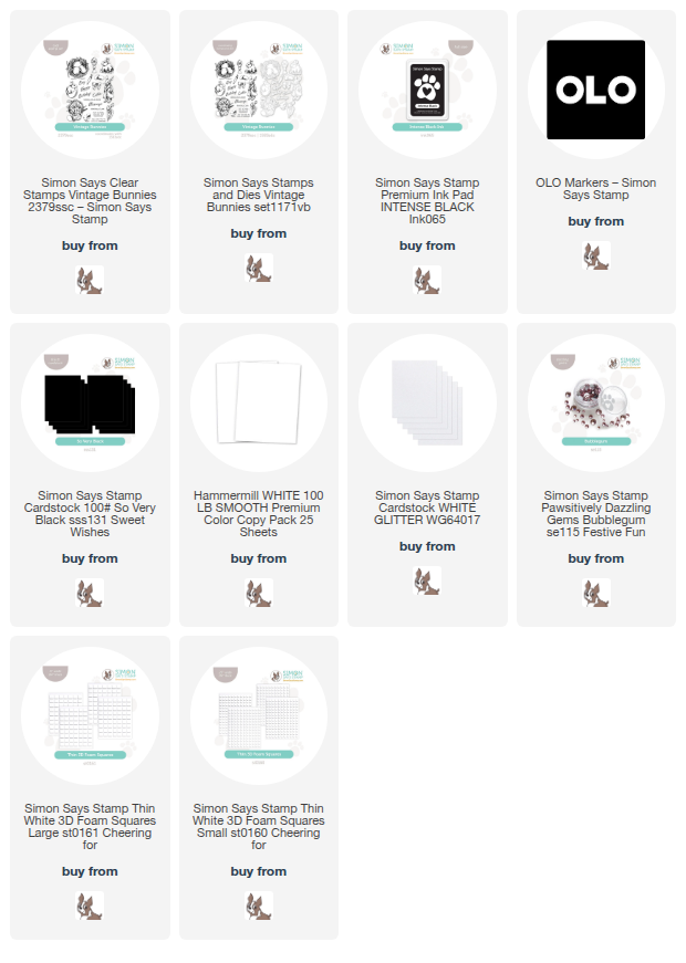
The new Vintage Bunnies stamp set features a plethora of springtime and Easter imagery, containing plenty of details and shading so that coloring is simplified or not even necessary, depending on the technique used! I decided to add some super subtle pastel marker coloring to the images after stamping them using Simon Says Stamp Intense Black ink. I selected a few super pale pastel shades along with a pale gray marker so that I could add some subtle color to the images, almost like when they colorized black and white movies using chalk! I used OLO Markers to add these pale colors, juxtaposing the crisp, intense black lines with those pale springtime colors.

After I had finished coloring the images, I used the coordinating dies to die cut all of the images. I also decided to add a little garden of pink tulips on the card front, providing a springy background for my basket, bunny, and chick die cuts. I stamped the tulips at various heights on my white card front, again with Intense Black ink, then added some simple pale pink and minty green coloring. I arranged the bunny and basket on the card front, nestling them amongst the tulips and adhering them with a single and double layer of thin foam adhesive to add extra dimension.

For the greeting, I stamped three separate sentiment stamps from the Vintage Bunnies stamp set, die cutting the Easter sentiment with its coordinating die and trimming the other two using my guillotine trimmer. I added the sentiments to the cluster of colored images using more foam adhesive, then snuggled my chick die amongst the greetings, creating a visual ping pong down the front of the card. I trimmed off the bottom of the A2 card panel, then tucked a strip of Simon Says Stamp So Very Black cardstock and a thinner strip of white glitter cardstock to add some additional textural variety on the card front. Finally, I added a smattering of Bubblegum Pawsitively Dazzling Gems to add some pastel sparkle to the card!

Well, that’s all for my project today! I can’t believe Easter is almost here… and that my little boys are six! They were born right at the beginning of Covid, and it simultaneously doesn’t feel possible that they are already six but also that it has been some of the longest years ever, ha! I hope that if you’re preparing for Easter celebrations this weekend, your plans are cooperating and you enjoy the family time that Easter can bring! Thanks so much for stopping by today, and have a marvelous day!
Filed Under: simon says stamp Tagged With: alcohol marker, bunnies, die cutting, easter, easter card, olo markers, vintage bunnies

NEW- Orange Blossom Blessing with Simon Says Stamp!

May 29, 2025

This post was sponsored by Simon Says Stamp. Thanks, Simon!

Hi friends! The new Simon Says Stamp Moments in Time Release went live last night, and I am thrilled to say that I illustrated a new stamp set for the release: Orange Blossom Blessing. I have always loved the idea of orange blossoms being part of a wedding bouquet; there’s something so classic and traditional about the combination of orange blossoms and weddings. The flowers are so delicate and the fragrance is divine (if only I could convey the scent within a drawing!), so it was a very enjoyable experience for me to create this set, filled with florals and meaningful sentiments, perfect for the upcoming wedding season. Let’s get started with the details on my project!

*I have gathered links to all of the products used at the bottom of the post for your convenience, using affiliate links. Thank you for shopping with my links! I truly appreciate your support for my work!*

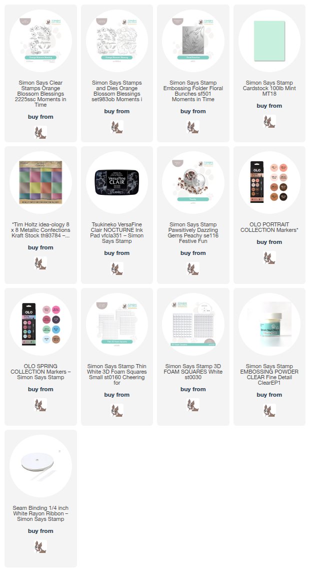
To begin, I stamped a few of the images from my new Orange Blossom Blessing stamp set onto some Hammermill cardstock using Simon Says Stamp’s Nocturne black pigment ink, enhancing the crisp black lines with clear embossing powder to make them extra sharp. I then used OLO Markers to color the images in a springy peach and mint color palette, keeping the colors pale so that those black lines would really pop. I used the coordinating dies to die cut the finished images.

Behind the colored flowers, I added some subtle, relatively neutral texture with the Floral Branches Embossing Folder. I embossed a panel of minty Tim Holtz Metallic Kraft cardstock with the new Floral Branches folder, then trimmed it down 1/2″ on two sides and nestled it in the corner of an A2 panel of Simon Says Stamp Mint cardstock. The shining foil contrasts nicely with the matte colored cardstock, while the coating on the foil helps make that gorgeous floral imagery even more crisp. If you haven’t tried embossing folders with foil or other coated papers, this is your sign to try it out!

After I had finished the background, I arranged the colored flowers in a swag on the textured background, adhering them with both thin and thick foam adhesive squares. I also stamped and embossed a pair of greetings from my Orange Blossom Blessing stamp set and used the coordinating dies to cut them out. Because I was trying to avoid straying from my mint and peach color palette, I used a pale mint OLO Marker to color the white areas around the embossed sentiment to create continuity amongst each piece of the card., then tucked the sentiments amongst the floral swag. Finally, I added a thin white silk bow and some Peachy Pawsitively Dazzling Gems to the card front for more texture and sparkle!

Well, that’s all for my project today. Be sure to stop by later this week for more inspiration during the Moments in Time blog hop. Tons of inspiration and tons of prizes await! Thanks so much for stopping by today, and have a marvelous day!

Filed Under: simon says stamp Tagged With: 3D embossing folder, alcohol marker, die cutting, embossing folder, floral bunches, olo markers, orange blossom blessings

STAMPtember is HERE!

August 31, 2024

This post was sponsored by Simon Says Stamp. Thanks, Simon!

Hi friends! It’s here…. Simon Says Stamp’s 15th STAMPtember month-long celebration is finally heeeeere!!! The incredible work behind the scenes from Heidi and the amazing team at Simon promise to make this year the most amazing STAMPtember ever. I hope you’re ready for an absolutely fabulous party to celebrate this hobby that we all love all. month. long! We are kicking things off tonight with an incredible (and massive) Simon Says Stamp brand release (click HERE to see the entire release!) and there will be limited edition collaboration sets released each day throughout the entire month of September. This release has tons and tons of amazing standalone dies, and I used a few of them on my project for tonight’s release. Let’s get started with the details!

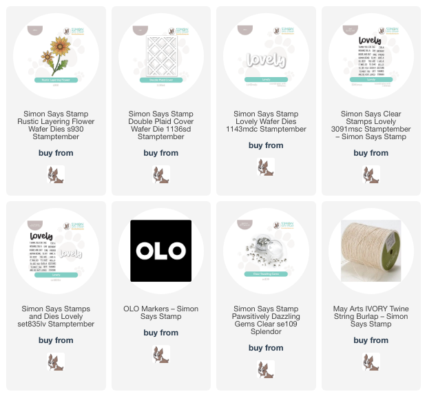
I am a sucker for a pretty flower die, and the new Rustic Layering Flower is so delicate and detailed that I couldn’t resist playing with it. I think that flowers and plaid go together like peanut butter + chocolate, so I also pulled out the new Double Plaid Cover Plate. This cover plate promises to be super versatile for both holiday and non-holiday projects alike!

I started my project by die cutting the Rustic Layering Flower from some white cardstock and used my OLO markers to add color to each layer of the flower before assembling it with liquid adhesive. The bloom reminded me of a gerbera daisy, so I decided to color it with some warm coral-pink OLO markers, concentrating the darker colors in the center to add lots of depth to the flower. I assembled the layers with liquid adhesive, but you could use foam adhesive squares for tons of dimension!

After I had assembled my flower, I stamped and die cut a greeting using the Lovely stamp set and coordinating Lovely die (you can also get the Lovely stamp + die bundle) using a crisp black and white combination to keep things simple and allow that gorgeous coral bloom to be a vibrant pop of color. I die cut the Double Plaid Cover Plate from some white cardstock and layered it on a white A2 background, popping it up with some thin foam adhesive squares to give it just a touch of extra heigh and help it stand out, creating a textured tone-on-tone background. I arranged the flower and sentiment pieces on a vellum die cut circle, then added the entire piece to the background with some more foam adhesive, clustering them together on the bottom right side of the landscape card. Finally, I tucked a twine bow next to the sentiment and added some Clear Pawsitively Dazzling Gems for a bit more texture!

Well, that’s all for my project today! I have been working my tail off creating some fun projects using the new release, so come back again for more inspiration using the new STAMPtember release for the 15th Simon Says Stamp STAMPtember extravaganza! Thanks so much for stopping by today, and have a marvelous day!

Filed Under: simon says stamp Tagged With: alcohol marker, copic coloring, die cutting, double plaid cover, lovely, lovely stamps, olo markers, rustic layering flower

New OLO Marker Colors + Updated OLO Marker Blends!

July 3, 2024

Hi friends! I am back with a fun post featuring the newest markers from my friends at OLO Marker. I was honored to be asked to test out these new markers before they were released to the public a few years ago, and when they emailed to say that they were releasing new colors, I was overjoyed. (You can check out the video that I made when the markers were introduced HERE.) The OLO Markers color palette is beautifully rich and vibrant, but as my favorite color is pink, pink, and more pink, I was a little sad by the comparatively small options for pinks. However, the newest release from OLO Marker certainly fulfills all of my pinkest yearnings! You can check out the 32 new markers HERE.

In the photo above, I have filled out the chart for the entire line of 160 OLO Markers, giving a wonderful visual representation of the huge rainbow of colors available. OLO Marker has provided a great resource page so that you can print out different images on which to practice your coloring, as well as color swatch pages, like the one pictured above.

OLO Markers are a bit different from other marker brands, in that the way in which the ink is released from the barrel is free-flowing. Traditional alcohol markers have a foam core from which the ink flows, which perpetually retains some of the ink, meaning that you will only be able to use 60-70% of the ink in the barrel. The OLO Marker free-flow system utilizes over 90% of the ink in the barrel, saving you money! You can read more about the details on these marvelous markers HERE.

I have previously shared my color blends for the older markers, which I create by mixing and matching on scratch paper until I find a blend that I like. To do this, I select dark, medium, and light markers, sometimes from the same color family, sometimes from an adjacent color family, creating an ombré blend from super dark to very pale color gradients. Once I have a combination with which I am pleased, I color the blend on a piece of 2″ x 2″ white cardstock and place the finished swatches in a coin pocket holder, similar to an ink swatch book for ink pads. I have used the new markers in conjunction with the previously released markers to add some new color blends to my OLO Marker book. In the photo above, I used the 32 New Markers as a starting point to create additional swatches featuring some of my favorite color blends. I mixed and matched from the old and new markers to enhance the rainbow of color blends already in my collection!

These phots are showing the new color blends mixed amongst the older blends. You can see what a wide array of options that are now available to select a perfect color palette!

As I am creating, I sometimes will experiment with new color blends if what I have previously created does not quite match the creative vision in my head, and so I will add to my swatch book if I find a blend that I truly love!

I also have worked with OLO to curate my own collection of favorite colors, which you can check out HERE. OLO has generously provided a coupon code for this collection, as well, which will save you 10% on my collection only. Simply add code emilycolorpicks at checkout!

You can view all of the different options for collections and customizations HERE.

I thought perhaps you might like to see the new OLO Markers in action, so I created a few different projects with these vibrant new colors!

I love using alcohol markers to color my own illustrations in addition to using them for cardmaking, and I thought a really large illustration would demonstrate the gorgeous range of color from dark to light, so I illustrated and printed out this large, 8″ x 10″ ranunculus illustration and went to town coloring!

For this illustration, I used (from dark to light) R 1.8, RV 1.7, R 2.4, RV 0.2, R 2.2 for the bloom and G 1.8, YG 1.6, G 5.3, and G 5.1 for the foliage. To create this wide gradient, I mixed and matched from new and old markers as well as different color families. If you find that your colors aren’t blending super smoothly, (for any marker brand) you can try a couple of different tricks: continue working the color with the tip of your marker in order to make the colors blend together, or you can also try the “tip to tip” method of lightly touching your lighter marker to your darker marker and applying it to the paper. The darker color will eventually be transferred to the paper, allowing your colors the opportunity to blend very subtly and smoothly.

For this project, I pulled out some new-to-me dies from Concord and 9th (linked in the link list at the bottom of the post), cut them from white cardstock, and went to town coloring the images! I used RV 0.6, R 2.4, R 0.3, R 0.2, and R 0.1 for the flowers, as well as G 0.6, YG 1.6, YG 1.4, and YG 1.2 fro the foliage. These citrusy colors were so perfect for a bright summery card!

I arranged the flowers on a stitched plaid background, grounded by a vellum oval die cut, with a coordinating deep hunter green sentiment die cut and stamped greeting strip. A few coordinating gems finished everything off!

My second project is an homage to those spectacular new pink markers. Much the opposite of those pretty citrus-y tones from the previous project, I kept these colors cool and vibrant, using my new favorite OLO Marker combination for the magenta blooms: R 1.8, RV 1.7, RV 1.4, RV 1.5, RV 1.3, RV 1.1. I used BV 4.7, 1.7, 1.4, 1.2, 1.1 for the “blurple” flowers and berries, with G 1.8, 1.7, 1.5, and 1.4 for the large green leaves and G 0.6, 0.4, and 0.1 for the foliage sprig.

I used the coordinating stitched die cut flower arrangement to arrange my colorful floral die cuts, though I did take some creative license with the arrangement as I did not cut exactly the same florals and foliage as the background. I adhered the images with a mix of foam tape and liquid adhesive, tucking a hot foiled sentiment from Pinkfresh Studio amongst the flowers and finishing the card off with some sparkling gems!

Well, that’s all for my projects today. I’m so excited to formally introduce these gorgeous new marker colors to you; I have been using OLO Markers very frequently over the last few years, and I find them to be a staple in my craft room. I can’t say enough about the quality and the vibrancy. If you have any further questions, feel free to send me an email! I also will have the photos with the color swatches that I have listed above on the OLO Marker Swatch Tab on the top of my blog available for your reference. Thanks so much for stopping by today, and have a marvelous day!
Filed Under: Concord and 9th, OLO markers, original illustrations Tagged With: alcohol marker, die cutting, friendly florals, olo markers, primrose garden

Peonies + Lemons = Zesty Combination!

May 27, 2024

This post was sponsored by Simon Says Stamp. Thanks, Simon!

Hi friends! I have an intensely color saturated card to share with you today, pairing some of my favorite dies from Simon Says Stamp with plain white cardstock and OLO markers! I absolutely love customizing plain white die cuts with coloring mediums, and while perusing Pinterest, I saw a graphic that combined peonies and lemons and just had to try the combination out for myself using my OLO markers. This card is a big A7 card, which was the perfect size to give me plenty of room for my larger die cuts. Let’s get started with the details!

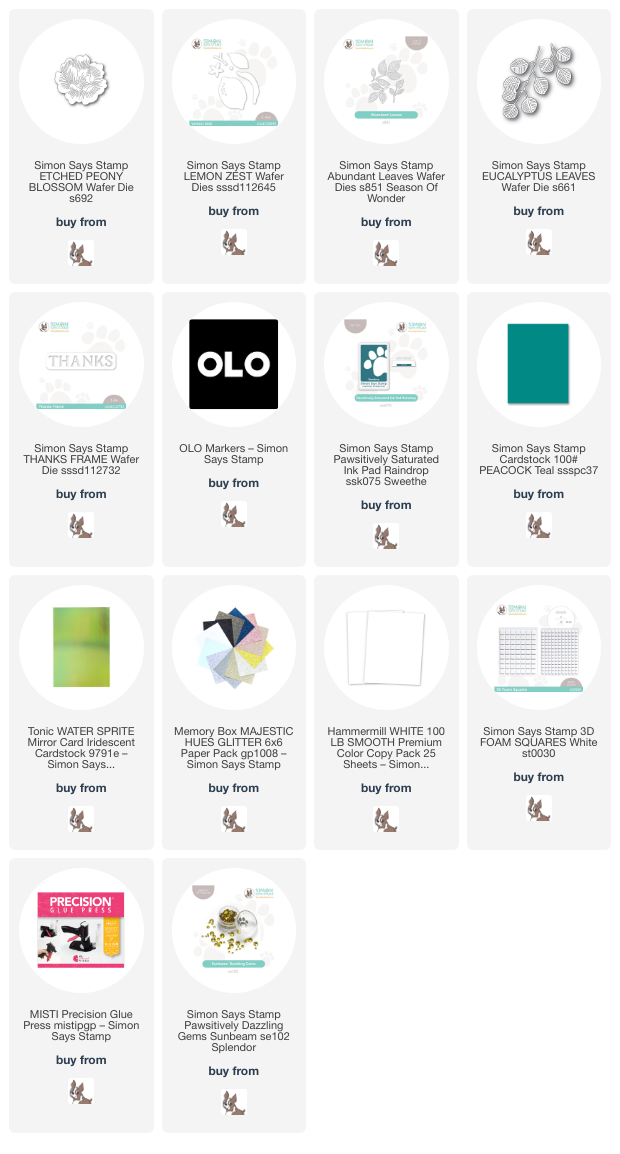
To start my project, I die cut the Abundant Leaves, Lemon Zest, and Etched Peony Blossom dies from some Hammermill white cardstock. I then used OLO markers in zingy, vibrant pinks, yellows, and greens to add lots of saturated color to the individual images. I think this color combination screams “summer!” I also die cut the Eucalyptus Leaves dies from some shiny Water Sprite mirror cardstock to add some fun texture and shine to the bouquet.

After I had completed customizing my die cuts, I trimmed down an A7 panel of Peacock cardstock, which is a lush, saturated teal, then added some extra depth by blending Raindrop Pawsitively Saturated Ink around the edges. This tone-on-tone blending creates a halo effect in the center of the card, which was the perfect canvas to start building my bouquet. To add even more interest to the background, I splattered some shimmery glitter watercolors on the background. Once they were dry, I arranged the colored die cuts on my card front, adhering them with foam squares, then tucked the shiny eucalyptus leaves in some of the bare spots and adhered them with liquid adhesive.

After I had finished arranging my lemon floral bouquet, I die cut the Thanks Frame from some white glitter cardstock. This is my first time using this die, and I love how clean and polished it looks with so little effort. And as a bonus, you can save the letters to use on a different project! I popped it up with a double layer of foam adhesive, then added some Sunbeam Pawsitively Dazzling Gems for extra sparkle.

Well, that’s all for my project today! We have lots of rain in the forecast, along with very cool temperatures, so this vibrant card provided some lovely sunshine in my craft room. Thanks so much for stopping by today, and have a marvelous day!

Filed Under: simon says stamp Tagged With: abundant leaves, alcohol marker, etched peony blossom, eucalyptus leaves, ink blending, lemon zest, OLO marker, thank you, thanks frame

  • Page 1
  • Page 2
  • Page 3
  • Go to Next Page »

Primary Sidebar

  • Facebook
  • Instagram
  • Pinterest
  • YouTube

Favorite Shops

Secondary Sidebar

Subscribe

Enter your email address to subscribe to this blog and receive notifications of new posts by email.

Instagram
Something is wrong.
Instagram token error.
Follow
Load More

Archives

Tags

3D embossing folder alcohol markers better press birthday birthday card blog hop card kit christmas christmas card christmas tag colored pencil copic copic coloring Daniel Smith die cutting embossing folder embroidery felt giveaway holiday holiday card hot foil ink blending karin brushmarker pro layered stencil masculine my monthly hero new release no line coloring no line watercolor OLO marker olo markers original illustration pawsitively saturated rainbow shaker card slimline stamping stamptember stencil thank you thinking of you valentine's day video watercolor

Popular Posts

Watercolor Poinsettia Card and Tag with Tim Holtz and Simon Says Stamp!
Cottagecore Christmas Framed Artwork with New Simon Says Stamp!
Simon Says Stamp Joy For You Blog Hop- Day 1!
Warmth and Love at Christmastime with New Simon Says Stamp!
Honey Bee Stamps 4th Anniversary Celebration!
Altenew Build A Flower Sweet Violet+Giveaway!
Simon Says Stamp Glory to the Newborn King Holiday Kit-Part II!
Altenew July Stamp and Die Blog Hop+Giveaway!
Altenew Watercolor Coloring Book Release Blog Hop + Giveaway!
Cottagecore Canvas with New Simon Says Stamp Shine On Release!

Disclosure

Some affiliate links are used in my posts. This means that, should you click on one of my links and purchase something from that company, I will receive a small portion of the sale at no extra cost to you. I use the money earned from these sales to help maintain my blog. I so appreciate you visiting and, if you do choose to use one of my affiliate links, thank you so much for your support!
Copyright © 2026 ·Brunch Pro Theme · Genesis Framework by StudioPress · WordPress · Log in
Loading Comments...