Hi friends! Today, I am hopping along with Pinkfresh Studio to help introduce their newest collection: Gentle Greetings and Greenery! This collection has some truly beautiful new floral designs as well as some versatile and super useful sentiments, along with some fun basic backgrounds that will make your focal points pop. You should have arrived here from Dawn, and your next stop is Enza. You can also start at the beginning at the Pinkfresh Studio Blog.
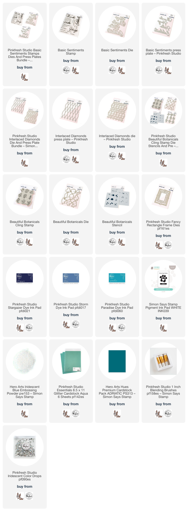
*I have gathered links to all of the products used at the bottom of the post for your convenience, using affiliate links. Thank you for shopping with my links! I truly appreciate your support for my work!*

I am always up for a good ombré color palette, and today’s color palette was inspired by some cards I did for the October Create & Connect Press Plate class. Deep royal purple moving to muted blue to intense teal is such a soothing color palette to my eyes, and I thought it was perfect for the Gentle Greetings theme. I pulled out Paradise, Storm, and Stargazer inks to pair with the new Beautiful Botanicals stamps to create this pair of paradoxical cards: one deeply color saturated and vibrant, and one with lots of crisp white and pops of color!

For my first card, I took advantage of the lovely, symmetrical arrangement on the Beautiful Botanicals stamp set and the coordinating stencils. I wanted to create an ombré effect with the florals, so after stamping the Beautiful Botanicals cling stamp onto white cardstock using Paradise ink, I stamped it again with sticky embossing ink and covered the images with Iridescent Blue embossing powder, adding a ton of shimmer and iridescent shine to these beautifully detailed images! After I had heated the embossing powder, I used the coordinating Beautiful Botanicals Stencils to color the images, inking the flowers from the top down using Paradise, Storm, and Stargazer inks, then using the foliage stencil with only Paradise, adding the details on the last stencil with the same coordinating inks used on each flower. Pairing the gradient ink blending on the flowers with the iridescent shimmer on the embossing creates a magical effect!
After I had finished stenciling, I trimmed down the panel very slightly and matted it on a panel of coordinating deep teal cardstock, leaving a super thin contrasting frame around the edge.

For the greeting, I used the large Thanks sentiment from the new Basic Sentiments Press Plate set. This sentiment set is truly a must-have in my opinion, with its beautiful font and large scale making an excellent impact on your cards! After running the letterpress sentiment through my machine with the Better Press using Paradise ink, I die cut the sentiment with its coordinating die. I centered it over a small, Aqua Glitter Fancy Rectangles Frame, adhering the sentiment to the frame and adding some foam adhesive behind the solid die cut to keep the glittery die cut clean. I finished the card off with a white silk bow and some Iridescent Bubble embellishments!

For my second card, I used the new Basic Sentiments coordinating die as my focal point, allowing the large scale die cuts to be the star of the show with some support from the beautiful new Interlaced Diamonds Press Plate and Coordinating Die and some vibrant ink blending. I began by using Paradise, Storm, and Stargazer inks on the Interlaced Diamonds Press Plate to create a gradient effect, then used blending brushes to blend the same colors over the top lightly before die cutting with the coordinating die. I used the same ink and brushes to blend another panel in an identical pattern, adding some iridescent glitter watercolor splatters after blending for added sparkle and texture! I popped the die cut up with some thin strips of foam adhesive for added texture and dimension, which is key to keeping these monochromatic cards from becoming visually boring.

After I had created my background, I die cut the large scale Hugs from the new Basic Sentiment die set, enhancing it with some sentiment strips from the Basic Sentiment stamp set, which I stamped using white pigment ink and embossed with Iridescent Blue embossing powder on deep teal cardstock. I used the same white pigment ink and iridescent embossing powder combination to stamp and emboss the Beautiful Botanicals stamp set, arranging a few of the die cuts in a swag in the corner of a glittery Fancy Rectangles Frame. I tucked the sentiment pieces within the frame using foam adhesive, finally adding some more iridescent bubble embellishments for added shimmer and shine!
Well, that’s all for my projects today. Now for some fun giveaway information!
To celebrate this release, Pinkfresh Studio is hosting fabulous giveaways! Pinkfresh Studio will be giving away the full release on the Pinkfresh blog & YouTube channel. They will also be giving away a total of TEN $25 gift cards along the hop. The winners will be selected from the comments.
Winners will be announced on December 18, 2024 on our GIVEAWAY PAGE. Winners must claim their prize within 2 weeks.
Here’s the full hop list. Thanks so much for stopping by, and happy hopping!