• Skip to main content
  • Skip to primary sidebar
  • Skip to secondary sidebar

Sixth Street Sundries

Emily Midgett

  • Home
  • About Me
  • Contact
  • OLO Marker Color Swatch Chart
  • Shop

beautiful bouquet

Inspired by Pantone Color of the Year with Simon Says Stamp Beautiful Bouquets + SALE!

March 1, 2024

This post was sponsored by Simon Says Stamp. Thanks, Simon!

Hi friends! Happy March! The days are getting longer, the air is getting warmer and sweeter (sometimes, ha), and the birds are definitely singing. Springtime is so close I can taste it! I thought I would welcome March with some springtime flowers using some of my older illustrations for Simon Says Stamp, including the Beautiful Bouquet stamp set, which was my very first illustration for Simon Says Stamp and one of my all-time favorites! I thought it would be fun to play with some updated color combinations, something a little different from my normal pinks and purples, so I turned to the Pantone Color of the Year: Peach Fuzz.

For me, peach is one of those colors that works beautifully as an accent color, but sometimes gets forgotten as a focal point color. I recently saw a photo of a gorgeous, muted peach anemone and immediately wanted to try my hand at creating my own. The anemone in the Beautiful Bouquet is one of my favorite flowers that I’ve ever drawn; the movement in the flower makes me feel like it’s blowing gracefully in the wind, so I always seem to let it be the focal point on whatever project I use it! I thought it would be lovely to add some crisp blue hydrangea and delicate blue filler flowers to complement the pretty muted peach, so I pulled out a bunch of OLO markers and got to coloring!

I started by stamping my Beautiful Bouquet image onto an A2 card front using Contour Ink from Hero Arts, which is my favorite ink for no-line coloring. Using my color chart for OLO markers, I selected markers for my flowers, creating unique blends by not remaining within one color family, but rather mixing and matching from OR, RG, and R families.

I always blend my colors out on a piece of scrap cardstock so that I can be sure that the color I’ve envisioned in my head comes to life on the paper similarly. It takes a few tries sometimes to get just the right blend, and sometimes I end up going back over the entire image with a different marker to “glaze” the image and make the undertones better fit the picture in my mind’s eye. I did some of this “glazing” with my peach rose; the rose that I had colored with the OLO markers was a bit too dull for what I intended, so I perused my Copic collection and found a peachy marker that worked perfectly in conjunction with the OLO markers that I had selected. This is my first time mixing the OLO and Copic alcohol markers together, and I am excited to see what possibilities lay ahead for creating even more unique color blends!

Because I had used my alcohol markers to color the images and kept the shadows super intense, I wanted to make sure that the center of the anemone was visible but didn’t want to use a black marker, so I pulled out some of my handmade shimmer watercolors. Since they are opaque, so they show up beautifully on the alcohol marker images.

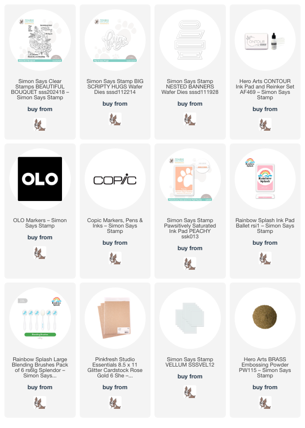
After I had finished coloring the images, I used blending brushes to blend Simon Says Stamp’s Peachy and Ballet inks around the edges to create a beautiful “Peach Fuzz” glow. For the greeting, I die cut the Big Scripty Hugs die from some Pinkfresh Studio Rose Gold Glitter Cardstock. I wanted to help that sparkling sentiment to stand out a bit more from the colorful background, so I die cut a vellum banner using Simon Says Stamp’s Nested Banners die set. I also heat embossed a sentiment from Beautiful Bouquet onto some coordinating peach cardstock using Brass embossing powder and trimmed the strip down. I added some dots of liquid adhesive behind the solid die cut sentiment to hide the adhesive, then adhered it to the edge of my colored panel. I popped up the sentiment strip with some foam squares, overlapping the die cut sentiment, and finally added a few shimmering iridescent gems for one more touch of sparkle!

Well, that’s all for my project today welcoming spring onto my blog! I feel like I haven’t properly colored for a long time with Christmas and Valentine’s Day projects, but I have been getting reacquainted with my coloring mediums for the last four days straight, and I am here. for. it. Now for the SALE that I mentioned at the beginning of the post:

Simon Says Stamp is holding an amazing 22% off sale of *ALL Simon-branded products* to celebrate 22 years of Simon Says Stamp!!
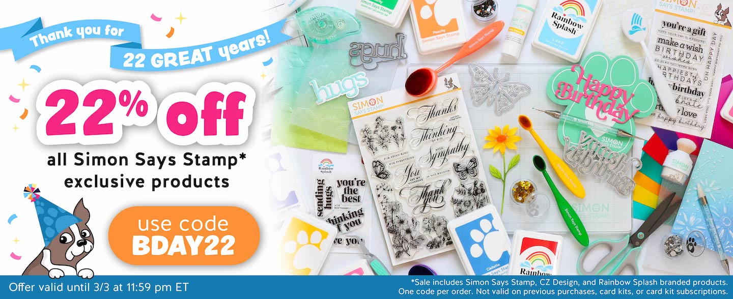
Simply enter code BDAY22 at checkout to receive 22% off of anything Simon Says Stamp, Rainbow Splash, or CZ Design from now through 3/3/24! (Including nearly all of the products that I’ve used on my project today!!) What a fantastic way to welcome the new month, right?

Also- if you missed out on Heidi’s Livestream from earlier today, she (and guests Gina K and Jennifer McGuire) explained alllll things CREATE. (Watch the replay HERE.) Click HERE see all of the details about CREATE! I am so excited to be attending and helping out again this year!

Thanks so much for stopping by today, and happy shopping!
Filed Under: simon says stamp Tagged With: alcohol marker, beautiful bouquet, big scripty hugs, copic marker, nested banners, no line coloring, OLO marker, pantone, vellum

Accenting Focal Points with Thin Frames!

June 12, 2023

This post was sponsored by Simon Says Stamp. Thanks, Simon!

I have really been trying hard to use stamps in my stash to which I haven’t given much love, especially stamps that I have illustrated. This enormous Beautiful Bouquet stamp that I illustrated for Simon Says Stamp early last year has not seen enough love from me, and I am determined to change that! I get so much inspiration for bouquet arrangements and color combinations from the wedding florists that I follow on Instagram, and one of my favorite things about coloring a bouquet like this is that the overall look can change completely depending on the color selections that you make! I created a completely different aesthetic on THIS card by using brighter colors, but today I wanted to focus on some more muted shades of lilac and periwinkle, with a “white” rose. I also pulled out one of my favorite unsung heroes from my die collection: A7 Thin Frames dies. Let’s get started with the details.

I began by stamping the ginormous bouquet from Beautiful Bouquet onto a 5″x7″ panel of Hammermill cardstock using black pigment ink, then clear embossing over the top. Normally, I would use alcohol marker-friendly dye ink, but I wanted those lines to be super stark and black, and the clear embossing powder over the top really defines the crisp black lines and makes them pop.

I colored the images using my OLO markers in shades of periwinkle and lilac for the large anemone and hydrangea blooms, then used some grayish purple markers with my Zero marker to create the “white” rose. I simply concentrated the light purple and almost-transparent gray markers towards the center of the flower to create shadows, then softened the edges with the Zero marker to allow the shadows to fade to the white of the cardstock.

After I had finished coloring the images, I used a blending brush to very lightly blend Heather ink around the edges of my card, creating the softest of halos around my vividly colored image. I recently added the A7 Thin Frames dies to my stash. I find myself reaching for the A2 Thin Frames constantly, so I added the and the Circle Thin Frames to my stash. The thin frames are the perfect clean accent for your focal point, whether it is a large floral like this, critters, or a more graphic background. They are an investment up front, but I find them totally invaluable on so many styles of card!! The addition of a thin frame around the edge of your focal point creates such an incredibly clean and polished look; I use it constantly. I die cut the A7 Thin Frames dies from some Pitch Black cardstock, further accenting the crisp lines of the black embossed lines of the floral image.

For the greeting, I kept things simple with a dimensional black Big Hugs die. I die cut the Big Hugs die three times from more Pitch Black cardstock and adhered them together using liquid adhesive. I adhered the dimensional die cut to the center of the lower third of my card. The black sentiment, black frame, and black lines of the image tick the boxes to complete the “rule of three” for the embellishments! The final touch was to add some sparkling gems for a bit of sparkle!

Well, that’s all for my project today. If you haven’t checked out the Thin Frames dies at Simon Says Stamp, you’re missing out! They’re a staple at my craft desk, for sure. Thanks so much for stopping by today, and have a marvelous day!

Filed Under: OLO markers, original illustrations, simon says stamp Tagged With: alcohol markers, beautiful bouquet, big hugs, olo markers, thin frames

And Back Again Release Blog Hop-Day 2!

January 21, 2022

Hello and welcome to Day 2 of the Simon Says Stamp And Back Again blog hop! I’m so excited to be a part of this month’s hop, particularly because I was lucky enough to illustrate two of the stamp sets in the release that we’re celebrating in today’s hop- To the Moon (released in December 2021) And Back Again (released January 2022)! You should have arrived here from Dilay Nacar, and your next stop is Jennifer Kotas. You can also start back at the beginning at the Simon Says Stamp blog in case you get lost! I have two lovely lavender projects to share with you today using some of the new goodies, so let’s get started with the details!

The new Pantone Color of the Year for 2022 is a lovely shade of purple called Very Peri. I used that color as my inspiration for both projects today.

My first project uses some of the fabulous stencils to create a mini slimline (3.5″x6″) card. I began by placing one of the Heart Stencil Masks offset on a white mini-slimline card base. I blended some Hydrangea ink using a blending brush, concentrating the color around the edges and leaving the center of the heart lighter. While the solid heart stencil was still taped in place on my card base, I centered the detailed Layering Heart Mandala Stencil over the blended heart, then blended some more Hydrangea ink to add a tone-on-tone pattern to the stenciled heart. Lifting the double stencil away was magical!!

For the greeting, I combined the new Birthday die and Sassy Birthday Sentiment Strips. I die cut the detailed layer of the Birthday die three times from some coordinating lavender cardstock, then adhered them together using liquid adhesive to create a dimensional die cut. I die cut the sentiment halo from some vellum, then adhered the dimensional die cut with some more liquid adhesive. I adhered both the sentiment strips and the word die cut using foam adhesive for lots of dimension.

To create a visual cascade down the front of my card, I adhered some leftover glittery heart die cuts and some lavender gems. I love the added texture and sparkle this adds to the card front!

My second project features the Beautiful Bouquet stamp set that I illustrated that was released for the To The Moon release in December, 2021. I previously created some watercolored projects (you can see them both here), so I thought it would be fun to pull out my Copic markers and do some no-line coloring. I began by stamping the bulk of the Beautiful Bouquet image on a full-size white slimline card base using Hero Arts Contour Ink.

I colored the images with my Copic markers, keeping the color palette nice and cool, and allowing that huge anemone and hydrangea to be the focus of my card front. I used Copic shades BV04, B66, BV02, and BV01 with touches of T7 for the anemone, with B28, FB2, and B12 for the hydrangea. Once I had finished coloring, I masked around the edges of the slimline card front using low-tack washi tape, lining up the edge of the card base with the edge of th washi tape to create a nice thick border. I used a blending brush to lightly blend some Blue Jay ink around the edge, tapering off as it got closer to the center of the card and around the colored image. I peeled the masking tape away to reveal a crisp white frame highlighting my Copic colored image!

I didn’t want to cover up my meticulous Copic coloring with a giant sentiment, so I heat embossed the greeting from the new Friend Greetings on some heavyweight vellum cardstock using white embossing powder. I used a vellum adhesive tape runner to add small dots of adhesive to the back of the embossed greeting and adhere it to the card front. Finally, I added a delicate silver thread bow, tucked beneath the sentiment panel and trailing down the card front, just to add a bit of extra texture and some shine to the card front.

Well, that’s all for my projects today! Now, I have some fun promo codes and giveaway information to share with you!

Add the code GNOMIE to your shopping cart receive the cute 3×4 Love Gnome stamp set FREE with purchase! This promotion will expire 1/23 at 11:59 pm EST.

Simon Says Stamp is giving away one $25 gift certificate to each stop on the hop. To enter, simply leave a comment on each hop stop. The more comments you leave, the more chances you have to win!

Your next stop on the hop is Jennifer Kotas. Thanks so much for stopping by, and happy hopping!

Filed Under: simon says stamp Tagged With: beautiful bouquet, birthday card, blog hop, copic, giveaway, ink blending, mask, no line coloring, no line copic coloring, stencil

Introducing Beautiful Bouquet at Simon Says Stamp+Giveaway!

December 31, 2021

Hi there! I am closing out 2021 with some exciting news. Illustrating several stamp sets has been one of the most personally fulfilling parts of my creative journey over the last year, and I’m utterly thrilled to introduce my first stamp set for Simon Says Stamp, called Beautiful Bouquet! When I am brainstorming new floral designs, I look to Pinterest and Instagram for wedding photography, frequently finding beautiful sprays of flowers on cakes, both natural and those made of sugar! The beautiful sugar paste anemone flower that I found on a wedding cake was so stunning that it became the basis for the Beautiful Bouquet. The graceful curvature of the petals made my heart sing, so I built the rest of my bouquet around it, adding some hydrangeas, a rose, anemone leaves, and some eucalyptus. That anemone has been sitting in my creative subconscious for a few months now, begging to be watercolored, and it was so exciting to finally be able to paint it! I have two watercolored projects to share with you today, so let’s get started with the details.

This first project was created using a “tie-dye” technique. I began by heat embossing the main floral image from Beautiful Bouquet in the corner of a large 5×7 panel of Arches Cold Press watercolor paper using white pearl embossing powder. I like to use white embossing powder when I want to give the illusion of no-line coloring. The embossing still creates the little wells, which provide some protection against the petals bleeding into each other. It’s a great way to get that (almost) no-line look but you can finish your project a bit more quickly! Tip: use the “back” side of the Arches Cold Press paper when heat embossing an extremely detailed image. It is still slightly textured, but not so much that the heat embossing is uneven!

After I’d embossed my image onto the watercolor paper, I taped the panel down to my watercolor board using washi tape. I thoroughly wet the bouquet and the surrounding area with clean water, then dropped in some very diluted Daniel Smith paints (specific colors are listed in the photo below), allowing the wet paint and the wet paper to meld the colors with very little help from me. I did mottle the color a bit with my brush to remove any granulation that might have occurred and ensure that there were no harsh lines.

Once my base layer of paint was completely dry, (you can help this along with the aid of a heat gun) I went back in and added some details and shading to the image with more concentrated color. The transparency of the watercolors allows the colors from that base layer of paint to still shine through the darker layers, creating some variation and interest on the flowers, independent of the shading that I added with the concentrated color.

After my image had dried (still taped down to the board to reduce warping from the large amount of water that I used on the paper), I trimmed it down slightly, mounted it on a full size 5×7 Cranberry cardstock base, then added a heat embossed sentiment from the Beautiful Bouquet, mounted to the card front with some foam adhesive. The final step was to add some pretty iridescent pink pearls for some shimmer and shine!

My second project was a labor of love. The massive size of the Beautiful Bouquet stamp set made it perfect for creating some wall art! I am low on wall space, (one of the drawbacks of having a small office with basically every available inch of wall space covered with shelves or bookshelves to accommodate all of my “stuff,” ha) but I wanted to commemorate this particular release with some artwork for my art room!

I stamped the image using Hero Arts’s Contour Ink on a 6.5″ x 8.5″ panel of Arches Cold Press, this time textured side up. I kept the color scheme simple and feminine, sticking to intense pinks and purples. I won’t lie… this piece took me several hours hours over the course of a few days. (Thankful for my mom visiting and hubby being on Christmas vacation to allow me the time to finish this!) I’ve listed the individual colors that I used in the photo below, not accounting for the “palette mud” that I used to add some extra shadows during the final touch-up phase. 😉

No-line coloring can be difficult and time-consuming, mainly because you have to work in sections and layers to prevent the individual elements from bleeding into each other and muddling the edges. Each flower has 3-4 (or more… I kind of lost count haha!) layers of color and shadows, in order to achieve bright highlights and dark shadowed areas. I begin with a light layer of each color on each flower, to help keep the highlighted areas lighter. Each subsequent layer allows me the opportunity to clean up the edges of the petals by adding contrasting shadows to the petal next to it. This requires a steady hand and a nice crisp point on your paintbrush, but it’s worth the effort, I think! I also will use white paint to intensify highlights in certain spots that have become too saturated with color. The contrast of the bright highlights and intense shadows are what give depth and shape to the flower.

I also like to try to pick up the reflections of colors of the flowers around each flower by adding very diluted washes of color on the finished petals, giving the impression of the flowers picking up reflections of the colors around it. Again, trying to add interest to keep things from looking flat.

Once I’d finished my painting, I signed it, mounted the watercolor panel to a slightly larger panel of shiny gold foil cardstock to create a luxurious, shiny border, then mounted that to a full size 8″x10″ panel of Eggplant cardstock from Concord and 9th. I think this is going to be such a pretty addition to my wall! I have framed a few cards from the crafters that I admire most already up on my wall, and I can’t wait to add this piece to the collage.

I could not be more excited about Beautiful Bouquet being added to the lineup at Simon Says Stamp. Seeing my illustrations become stamps has been an absolute dream come true, and it is an honor to have the opportunity to illustrate for these wonderful companies!

Simon Says Stamp generously sent me a few extra stamp sets to give away, and you can find all of the details for the giveaway over on my Instagram post! Please note: the giveaway is only on my Instagram page. I will be pulling the winners from the comments on my Instagram post. Please check out my Instagram page @eamidgett to enter the giveaway!

Thanks so much for reading, and Happy New Year! May your 2022 be peaceful, healthy, and prosperous! Much love to you all.

Filed Under: original illustrations, simon says stamp Tagged With: beautiful bouquet, Daniel Smith, giveaway, no line coloring, no line watercolor, original illustration, watercolor

Primary Sidebar

  • Facebook
  • Instagram
  • Pinterest
  • YouTube

Favorite Shops

Secondary Sidebar

Subscribe

Enter your email address to subscribe to this blog and receive notifications of new posts by email.

Instagram
Something is wrong.
Instagram token error.
Follow
Load More

Archives

Tags

3D embossing folder alcohol markers better press birthday birthday card blog hop card kit christmas christmas card christmas tag colored pencil copic copic coloring Daniel Smith die cutting embossing folder embroidery felt giveaway holiday holiday card hot foil ink blending karin brushmarker pro layered stencil masculine my monthly hero new release no line coloring no line watercolor OLO marker olo markers original illustration pawsitively saturated rainbow shaker card slimline stamping stamptember stencil thank you thinking of you valentine's day video watercolor

Popular Posts

Simon Says Stamp Sending Cheer Blog Hop- Day 2 + Freebie + Giveaway!
Joyful Snowman with New Simon Says Stamp Sending Cheer Release!
Simon Says Stamp Sending Cheer Release: Now Available!
Altenew October 2026 Release Blog Hop + Giveaway!
February 2018 My Monthly Hero Blog Hop!
Altenew March 2020 Release Blog Hop+Giveaway!
Special Release: Simon Says Stamp Limited Edition STAMPtember Christmas Card Kit!
Simon Says Stamp Cozy & Bright Inspiration, Part Two!
Waffleflower December Release Blog Hop!
Altenew Build A Flower Japanese Mum Blog Hop!

Disclosure

Some affiliate links are used in my posts. This means that, should you click on one of my links and purchase something from that company, I will receive a small portion of the sale at no extra cost to you. I use the money earned from these sales to help maintain my blog. I so appreciate you visiting and, if you do choose to use one of my affiliate links, thank you so much for your support!
Copyright © 2026 ·Brunch Pro Theme · Genesis Framework by StudioPress · WordPress · Log in
Loading Comments...