• Skip to main content
  • Skip to primary sidebar
  • Skip to secondary sidebar

Sixth Street Sundries

Emily Midgett

  • Home
  • About Me
  • Contact
  • OLO Marker Color Swatch Chart
  • Shop

best of everything

OLO Marker Colors of the Month + Honey Bee Stamps!

May 25, 2023

Hi there! Each month, OLO Markers comes out with a trio of colors that you can purchase (or use the markers that you already have) to participate in their Color of the Month Challenge! These Color of the Month markers (which you can check out HERE) are always three different colors that, when blended together or used separately, help to expand your blending trios and create a new perspective on your markers!! I found the May 2023 Colors of the Month markers to be extremely inspiring; they were colors that I would not normally have used together, certainly not for coloring, but I thought the blue, turquoise, and lime green were so modern, chic, and fresh that I started creating with them and couldn’t stop! I have been carefully collecting different products from Honey Bee Stamps over the last several months and was inspired to pull a bunch of them out to create a quartet of cards using this fun color combination. Let’s get started with the details!

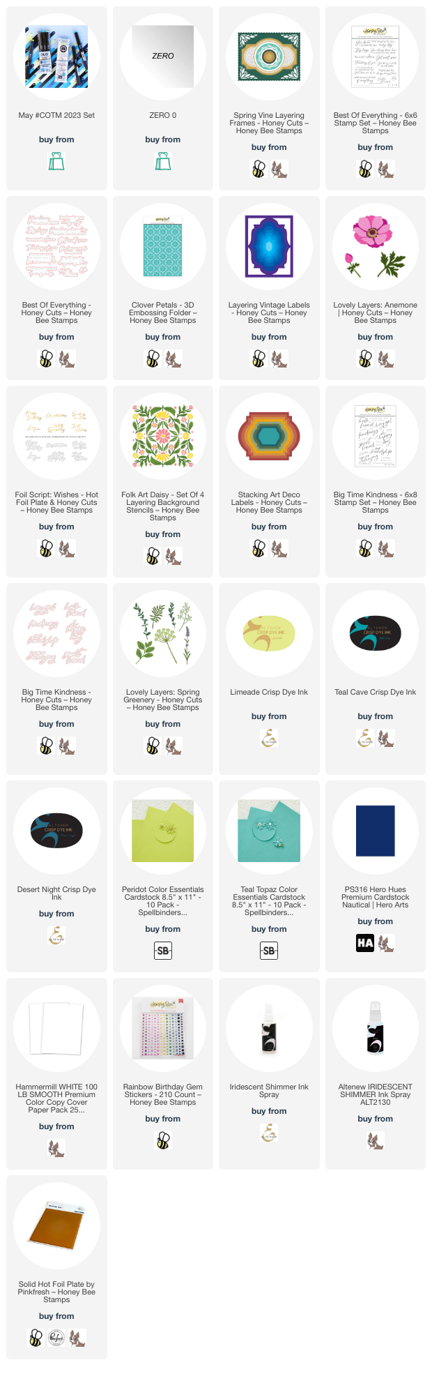
I began by pulling coordinating ink and cardstock colors that would match the May 2023 Colors of the Month. I grabbed Limeade, Teal Cave, and Desert Night inks from Altenew, as well as Teal Topaz and Peridot cardstocks from Spellbinders and Nautical cardstock from Hero Arts.

For my first project, I used the absolutely beautiful Lovely Layers: Spring Greenery standalone dies from Honey Bee Stamps with the May 2023 Colors of the Month. I die cut the images from plain white cardstock, then used only the May 2023 Colors of the Month to add color to the images. Being limited to only the three markers meant that I had to get creative in order to create multiple colors that still worked with the images themselves. I did some “glazing” to create custom colors, laying down one solid layer of color, then adding another color over the top to create a completely unique color. I also was able to increase the intensity of the colors by adding multiple layers of the same color (as I did on the sprigs of lavender). I used all three colors on the larger eucalyptus leaves, laying down the blue in the center of each leaf, blending out with the aqua, then glazing the entire leaf with the lime green marker. The only additional marker that I used was the zero marker from OLO, which I used to add highlights and to lessen the intensity of some of the colors, as well as add tiny dots of white on the Queen Anne’s Lace flowers. I was amazed and really pleased at the variety of colors that I was able to create using just four markers that I would never have normally put together!

After I’d finished coloring the images, I die cut the largest detail frame from the breathtaking Spring Vine Layering using Nautical cardstock, backing it with Teal Topaz cardstock to coordinate with the turquoise tones in the coloring. I die cut a Sentiment Frames frame from some matte silver foil cardstock, which I adhered with foam tape for extra dimension, then arranged my colored floral die cuts around the frame, adhering them with both liquid and foam adhesive for lots of different dimension and height. I added a greeting from the Best of Everything stamp set, heat embossed in silver on navy cardstock and die cut with the coordinating die. Finally, I added a few gems for some sparkle!

For my second card, I blended the three shades of ink (Limeade, Teal Cave, and Desert Night) to create a crazy vivid background. After I blended the three colors together on a panel of plain white A2 cardstock, I ran the entire thing through my die cut machine using the Clover Petals embossing folder from Honey Bee Stamps and spritzed it with some iridescent shimmer spray to enhance the pattern even further.

I die cut the Lovely Layers: Anemone, cutting the flower layers from white cardstock and the foliage from two different shades of green cardstock. I swiped the lime green marker from May 2023 Colors of the Month in the center of each layer of the white flower, smoothing the edges with the zero marker to create just the lightest hint of lime green in the center of the anemone. I die cut some leaves in coordinating shades of bright green.

To create the frame around which I could build my bouquet, I used the Layering Vintage Labels die to create this uniquely-shaped frame, cutting it from Nautical cardstock to coordinate with the navy blending on the background and adhering it with some foam adhesive to give it extra height and help it pop from the background. I arranged the flowers and foliage in a bouquet around the edge of the frame and added a greeting created with the Foil Script: Wishes hot foil plate and die, creating the reverse sentiment using the leftover foil with a solid hot foil plate. The final touch was to add a few bits of bling in a coordinating shade of iridescent lime green!

For my next card, I paired the three ink shades (Limeade, Teal Cave, and Desert Night) that coordinate beautifully with the OLO Colors of the Month with the Folk Art Daisy layering stencil set. I use blending brushes to blend the layers, keeping the flowers that lovely shade of pale lime green, with turquoise leaves and deep navy accents. I trimmed the stenciled panel down and matted with an ever-so-slightly larger panel of navy cardstock, creating a very thin navy blue frame around the edge. I popped these two layers up on a Peridot cardstock card front.

For the greeting, I stamped one of the sentiment strips and a large scale sentiment from Big Time Kindness using the Desert Night ink, then die cut it with the coordinating die. To help the greeting stand out from the busy patterned background, I die cut one of the Stacking Art Deco Label dies from some vellum, slightly offsetting it to the right. I used dimensional foam adhesive to adhere the sentiments to the vellum piece, then hid my liquid adhesive behind these solid die cuts so as not to mar the semi-transparent vellum. Finally, I added a few iridescent gems for some sparkle!

My last card is an homage to the beauty of the Spring Vines Layering Frame die set. I cut the different layers from Teal Topaz, Peridot, and Nautical cardstock, layering them together in a striking combination, using foam adhesive for the largest interior label layer and liquid adhesive for the remaining layers.

I also heat embossed a simple but poignant greeting from the Best of Everything stamp set, heat embossed in silver on some more navy cardstock and die cut with the coordinating die. I used one last layer of foam adhesive to add the sentiment, giving it a little bit of extra height amongst all of the die cut layers. Finally, I added some gems to the four corners for a tiny bit of sparkle!

Well, have you made it this far? That was a lot of cards for one post! I got rolling with that beautiful color ocmbination from OLO and just couldn’t stop! I love when something simple brings on such a flood of inspiration. You can check out more information about the May 2023 Colors of the Month challenge by clicking on the link. Thanks so much for reading today, and have a marvelous day!
Filed Under: Honey Bee Stamps, OLO markers Tagged With: anemone, best of everything, big time kindness, card set, clover petals, colors of the month, coordinating set, folk art daisy, hot foil, layering vintage labels, lovely layers anemone, lovely layers spring greenery, spring vine layering, stacking art deco labels

Video: Watercoloring with Pinkfresh Studio Dye Inks!

August 24, 2022

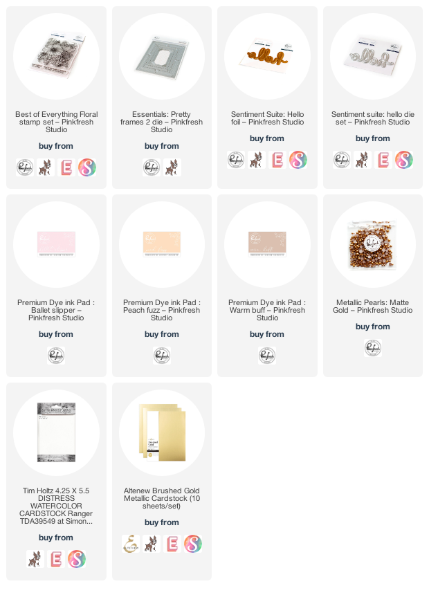
Hi there! I’m over on the Pinkfresh Studio YouTube channel today with this video featuring an unusual-for-me technique: watercoloring with Pinkfresh Studio dye inks! I normally like to stick to my trusty pan watercolors for my watercolor projects, but I wanted to demonstrate how easy it is to get a lovely watercolored look with supplies that you already have on hand. I pulled out one of the first stamp sets that I illustrated for Pinkfresh Studio: Best of Everything. You can watch the video below:

Or you can watch it HERE on YouTube.

I began by heat embossing the Best of Everything stamp set using gold embossing powder onto some Distress Watercolor cardstock. The amount of detail in the Best of Everything stamp set makes it super easy to create a pretty background with minimal effort because the stamp set itself is so super detailed! Once I’d finished heat embossing, I used blending brushes to blend Ballet Slipper, Peach Fuzz, and Warm Buff inks on the background to create a soft background with these muted feminine colors.

Next, I did some watercoloring using several more of the inks from the Pinkfresh Studio line. I simply tapped the different shades out onto my glass mat, picked up the color with my damp paintbrush, and added them to the different flowers, keeping the technique simple and adding very subtle shadows. The end result looks very similar to the results that can be achieved with the layering stencils! The base layer of ink blending helps to add some subtle color variation and interest to the images. I did find that the dye ink color moved more successfully when I first wet the area that I intended to watercolor with clean water, then added in my concentrated ink and maneuvered the color until I was satisfied with the flowers. The damp watercolor paper allowed the ink to “bloom” naturally and not sink into the paper.

After I’d finished watercoloring, the paper was very warped from the volume of liquid that was added to it, so I placed it beneath my watercoloring board and heavy die cut machine overnight to flatten it. The next day, the panel was quite flat, but I added a bit of extra stability with a gold foil frame, cut using the Pretty Frames 2 dies. I added a hot foiled greeting using the Sentiment Suite: Hello Hot Foil and Coordinating Dies, on which I lightly blended some more of the Ballet Slipper, Peach Fuzz, and Warm Buff inks to coordinate with the background. I added a greeting from Best of Everything, then popped everything up with foam adhesive, and added a few matte gold pearls for one last metallic gold element.

Well, that’s all for me today! If you aren’t a watercolorist, I hope this video and technique gives you a little nudge to show you that it’s super easy to do, and you only need a few supplies that I’d bet you already have on hand! Thanks so much for stopping by today, and have a marvelous day!

Filed Under: pinkfresh studio Tagged With: best of everything, ink blending, original illustration, watercolor

Pretty in Pink for the Flower Challenge!

October 4, 2021

Hi there! I am excited to be a guest for The Flower Challenge this month! I was so honored when my friend Aileen (@huh_what_pardon on Instagram) asked if I would be a guest for this challenge. This month’s challenge theme is Use a Shape. I love flowers, we all know that, and so I was excited to have an excuse to play with one of the stamp sets I’ve illustrated for Pinkfresh Studio: Best of Everything. I did some loose watercoloring for today’s challenge project, so let’s get started with the details.

I began by heat embossing my intricate floral image from Best of Everything onto some Arches Hot Press watercolor paper using white pearl embossing powder. I then taped it down to my watercolor board using washi tape and watercolored it using my “tie dye” method of watercoloring with Holbein watercolors. Essentially, I begin by getting my entire watercolor panel wet with clean water, then dropping in very diluted (less pigment, more water) color all over the background, not caring whether the color lands on leaves (which should be green) or flowers, basically just allowing the colors to bleed into each other and create an interesting base layer.

After my tie-dye layer had dried, I went back with the same watercolors that I used for the base layer, this time more concentrated (more pigment, less water) to add depth and shadows to the individual flowers. The base layer helps to add a bit of variation on the individual flower petals and leaves by allowing multiple colors to shine through on the lighter highlighted areas. Once it had dried completely, I trimmed it down and mounted the watercolored panel on a vivid pink card base.

For the “Add A Shape” component of the challenge, I die cut a Blanket Stitched Oval die from Pinkfresh Studio, cut from some heavyweight vellum. I also die cut a Happy Birthday greeting from an older, retired die set (whoops!). I die cut the sentiment twice from the same vivid pink cardstock, then layered them together to create a sturdier, more dimensional die cut. I adhered the sentiment die cuts to the vellum oval, then popped them up with clear dimensional adhesive. Vellum can be tricky to work with, but small pieces of the clear dimensional tape are fairly well hidden behind the sentiment die cut! A few sparkling gems from Pinkfresh Studio helped to finish the project off and add some sparkle.

Well, that’s all for my project today! I hope you’ll check out The Flower Challenge blog to see how you can enter your own project for this month’s challenge: Add A Shape. Thanks so much for stopping by today, and have a marvelous day!

Filed Under: original illustrations, pinkfresh studio, Uncategorized Tagged With: best of everything, flower challenge, happy birthday, holbein, original illustrations, watercolor

Pinkfresh Studio July 2021 Stamp, Die, Stencil, and Hot Foil Release

July 26, 2021

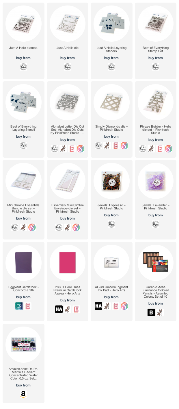
Hi friends! Happy Monday! Today, I’m super excited to be taking part in the Pinkfresh Studio July Stamp, Die, Stencil, and Hot Foil Release Blog Hop. I’m even more thrilled to be taking part in today’s hop, because I get the opportunity to help introduce two new stamp sets that I’ve designed for Pinkfresh Studio:

Just A Hello-features a pretty floral image that can be used stamped in it’s entirety, or die cut with the coordinating dies to create two floral edges that you can use in a variety of ways. The set also has coordinating layering stencils so that you can add color to the images in a variety of ways, even if coloring isn’t your favorite thing to do!

Best of Everything is a detailed floral background stamp featuring a variety of flowers-anemones, daffodil, roses, ranunculus, tulips, and several different types of foliage. This set also has coordinating layering stencils! I love that these sets offer such a variety of ways to add color. So fun!

I have three projects to share with you today using my new sets, so let’s get started with the details!

My first two projects are a pair that are an homage to pink and purple! I love vibrant, saturated color, and I wanted to showcase the Just A Hello and Best of Everything sets on super saturated, vivid colored cardstock.

For this first project, I combined the Best of Everything stamp set with the coordinating layering stencils on some shocking magenta cardstock. I began by heat embossing the main floral background image using some pearlescent white embossing powder, then used a variety of inks from Pinkfresh Studio’s line to add color to the individual images using the coordinating layering stencils. I love the subtle (if one can call a hot pink card “subtle” haha!) addition of color and shading the stencils add over the vivid cardstock base.

For the greeting, I wanted to add a stacked alphabet die cut greeting to the front without covering up the entirety of my super detailed, stenciled background, so I used the outline die cuts from the Adore Alpha Die Set, cut from some royal purple cardstock. I adhered them directly to the card front using liquid adhesive, then added a greeting from the Best of Everything stamp set that I’d white embossed on some strips of the same royal purple cardstock. I trimmed the card base down a bit, then mounted it on a full A2 panel of that deep, plummy purple cardstock using foam adhesive. The final touch was to add some sparkling Lavender jewels.

My second project features a similar color scheme, but with my new Just A Hello stamp set. I absolutely adore the look of colored pencils on colored cardstock, and the pretty flowers in the Just A Hello set were just the right size to use with my Luminance colored pencils-not too small, but big enough that you could add some fun details and shading. I stamped the main floral frame image from Just A Hello using white pigment ink on some more of that gorgeous plummy purple cardstock, then used the incredibly vibrant Caran d’Ache Luminance colored pencils to add lots of color to the floral images, berries, and foliage. I die cut the colored images using the coordinating dies, and I love that the dies cut two separate floral swags, so that you can use them together or separated! (I have a couple of fun ideas that I didn’t get time to finish, so keep your eyes open for another project or two in the coming weeks using this set!)

Once I’d finished coloring and die cutting the floral swags, I die cut the Simply Diamonds die from a full panel of the same purple cardstock, then mounted it on another A2 panel of the same purple cardstock using foam adhesive for a subtle, but dimensional and interesting, background. I heat embossed the greeting from Just A Hello on another snippet of purple cardstock (side note-the sentiments all stamp and die cut in one fell swoop, so you just stamp once, die cut once, and you have a variety of sentiments at your disposal! So freaking handy!), then added the sentiment and floral die cuts to the tone-on-tone background with even more foam tape. So much dimension to this card… I love it! A few more Lavender jewels finished it off.

My final project uses the Best of Everything set to adorn the top and bottom of a mini-slimline card. I began by gold heat embossing the main floral image on some hot press watercolor paper (the smooth surface of the hot press paper allowed the details in this image to stamp perfectly), then used my long-neglected Ph Martin’s liquid watercolors. These colors are so incredibly vibrant and mix so easily. So fun to use! Once I’d finished watercoloring the entire image, I fussy cut it using some sharp scissors.

Next, I trimmed a mini-slimline card base (3.5″x6″) from some creamy linen cardstock and die cut a mat using the Mini Slimline Essentials Dies from some more of the creamy linen cardstock. I mounted it on the card base using some foam adhesive.

I die cut a gold “friend” using the Phrase Builder Hello die set, adding the shadow die cut from some heavyweight vellum. I heat embossed one of the greetings from Best of Everything, then added the greetings to the card front. I cut the watercolored floral bouquet in half, adhering it to the card front with a double layer of foam adhesive. Finally, I added a few Espresso gems for some sparkle!

Well, that’s all for my projects today! I am so thrilled to help introduce these new sets that I’ve designed. Such a joy (and still somewhat surreal) to be designing stamps for Pinkfresh Studio!

We have some fun giveaways for you to celebrate this new release!

-We will be giving away the full release on the Pinkfresh blog & YouTube channel (there will also be a separate giveaway on the Instagram page at a later date, so keep your eyes peeled!)

-We will be giving away a total of TEN $25  gift cards along the hop. The winners will be chosen from the comments along the hop. The more comments you leave, the more chances you have to win!
The winners will be announce don on August 3 , 2021 on the GIVEAWAY PAGE. You must check that page & claim your prize within 2 weeks if your name is selected!

***To leave a comment on this post: click on the title of the blog post itself, then scroll down to the comment form! ***

You are invited to the Inlinkz link party!

Click here to enter

Filed Under: pinkfresh studio Tagged With: alphabet dies, best of everything, colored pencil, just a hello, layered stencils, liquid watercolor, mini slimline, no line coloring, original illustrations, Ph Martins, watercolor

Primary Sidebar

  • Facebook
  • Instagram
  • Pinterest
  • YouTube

Favorite Shops

Secondary Sidebar

Subscribe

Enter your email address to subscribe to this blog and receive notifications of new posts by email.

Instagram
Something is wrong.
Instagram token error.
Follow
Load More

Archives

Tags

3D embossing folder alcohol markers better press birthday birthday card blog hop card kit christmas christmas card christmas tag colored pencil copic copic coloring Daniel Smith die cutting embossing folder embroidery felt giveaway holiday holiday card hot foil ink blending karin brushmarker pro layered stencil masculine my monthly hero new release no line coloring no line watercolor OLO marker olo markers original illustration pawsitively saturated rainbow shaker card slimline stamping stamptember stencil thank you thinking of you valentine's day video watercolor

Popular Posts

Simon Says Stamp Joy For You Blog Hop- Day 1!
Simon Says Stamp Joy For You Release-Now Available!
Frozen Fractals All Around with New Simon Says Stamp Joy For You Release!
Shaped Holiday Shaker Card with New Simon Says Stamp Jolly Season Card Kit of the Month!
Holiday Postage with New Simon Says Stamp!
Simon Says Stamp Glory to the Newborn King Holiday Kit-Part II!
Pinkfresh Studio 5th Birthday!
Altenew Build A Flower: Fuchsia Blog Hop+Giveway!
Holiday Joy in Pink and Green with New Simon Says Stamp DieCember!
Honey Bee Stamps September Release Blog Hop!

Disclosure

Some affiliate links are used in my posts. This means that, should you click on one of my links and purchase something from that company, I will receive a small portion of the sale at no extra cost to you. I use the money earned from these sales to help maintain my blog. I so appreciate you visiting and, if you do choose to use one of my affiliate links, thank you so much for your support!
Copyright © 2026 ·Brunch Pro Theme · Genesis Framework by StudioPress · WordPress · Log in
Loading Comments...