• Skip to main content
  • Skip to primary sidebar
  • Skip to secondary sidebar

Sixth Street Sundries

Emily Midgett

  • Home
  • About Me
  • Contact
  • OLO Marker Color Swatch Chart
  • Shop

copic

One of My Favorite Peeps!

February 23, 2024

This post was sponsored by Simon Says Stamp. Thanks, Simon!

Hi friends! I am back today with an Easter card using the absolutely adorable new Easter Peeps stamp set. This set features some whimsical, playful images that immediately evoke springtime and Easter. I was definitely inspired by the layout on the stamp packaging itself, creating “stripes” with images down the entirety of my card front! Such a fun way to put almost all of the images included in the Easter Peeps stamp set to use. Let’s get started with the details on my CAS card!

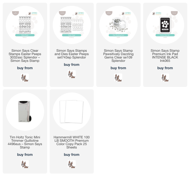
To start, I stamped nearly all of the images from Easter Peeps using Intense Black ink so that I could color them with alcohol markers. I wanted to keep the color scheme crisp and light, with tiny springtime pops of color. After die cutting the images with their coordinating dies, I used OLO markers in a few pastel shades to add some very simple coloring to the flowers, bunny ears, and bunny noses. Sometimes simple coloring is better, especially with cute little whimsical images like these!

I love that the stamp set also includes sentiment “stripes” along with the images. I stamped the adorable “you’re one of my favorite peeps” stamp twice on some very thin strips of cardstock, then used my Tim Holtz Mini Guillotine Trimmer to quickly and neatly trim them down. I also stamped the large Happy Easter greeting and die cut it with the coordinating die. The sentiment dies make everything look so much more polished, in my opinion!

After I had stamped, die cut, and colored all of my different components, I began to arrange them on my white A2 card front. Because I had two of the floral and sentiment “stripes” and only had one of each of the bunnies and the Happy Easter sentiment die cuts, I arranged the doubles on the top and bottom first to get an idea of the spacing. After I had arranged my top and bottom sections, I placed the bunnies and large sentiment die cuts in the center, leaving enough room to add some rows of Clear Pawsitively Dazzling Gems. I love the added sparkle and textural interest that these shimmering gems add to this fairly-simplistic card! I adhered all of the die cut “stripes” with foam adhesive to add extra dimension. Looking back at the card, I wish that I’d added some extra texture behind the die cuts with a stitched cover plate die, but c’est la vie!

Well, that’s all for my project today! This stamp set pushed me outside of my comfort zone a bit, but I’m really happy with how it turned out. Let this be your daily reminder to allow yourself outside of your comfort zone occasionally! It can be a great palate cleanser! Thanks so much for stopping by today, and have a marvelous day!
Filed Under: simon says stamp Tagged With: alcohol marker, clean and simple, copic, easter, easter peeps, pawsitively dazzling

Sweet Snowman Hugs for 2024!

January 2, 2024

This post was sponsored by Simon Says Stamp. Thanks, Simon!

Hi friends! Happy New Year! I am flabbergasted that we are already at the dawn of a new year; I sometimes still feel like I haven’t finished processing 2020! Anyway, I have a project featuring some gorgeous newer products from Simon Says Stamp, perfect for those icy days that we’ve been experiencing after the warmth that we had on Christmas Day. We even woke up to a bit of snow on the ground last week…. as you can imagine, my kiddos were beside themselves with joy even if the snow only lasted until 10 am! For today’s project, I paired the utterly precious Cocoa and Joy stamps and dies with the new Cheery Snowflakes embossing folder. Let’s get started with the details!

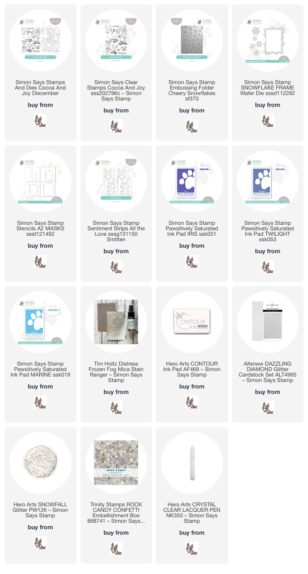
To start my project, I stamped the adorable snowman from Cocoa and Joy (which is back in stock- HOORAY!!! Right?) onto some Hammermill white cardstock using Contour Ink. I used my Copic markers to add some subtle shading on the “white” snowman, giving him a vivid blue hat and scrumptious-looking hot cocoa! I used a fine tip black pen to enhance some of the finer details on the snowman, like the steam from the hot chocolate, his smile, and his little poufs on his hat. I die cut the finished image with the coordinating die, as well as one of the sentiments. For a finishing touch, I also added some black gems for his “coal” buttons and eyes.

For the background, I began by masking off the center of a panel of white cardstock using a stencil from the A2 Stencils and Masks set. I then used blending brushes to blend Iris, Twilight, and Marine Pawsitively Saturated inks in the open area on the white cardstock. While the stencil was still in place, I spritzed the finished background with Frozen Fog Mica Spray to add some extra wintry-looking shimmer behind my snowman. Once my blended and shimmering background was dry, I removed the stencil and ran the entire panel through my die cutting machine using the Cheery Snowflakes embossing folder from the Smitten release!

After I had adhered my snowman to my embossed background using foam tape, I wanted to add some sparkling snowflakes to enhance the icy feeling of the card. I die cut the standalone snowflakes from the Snowflake Frame dies from some Dazzling Diamond glitter cardstock. I tucked the snowflakes behind snowman on the blended area, allowing the white frame to draw the eye to the snowman. I added some extra sparkly glitter “snow” using Clear Lacquer and Snowfall Glitter from Hero Arts. For the greeting, I added the stamped greeting die cut from Cocoa and Joy and a coordinating sentiment strip from the All the Love sentiment cards pack. I added a few shimmering confetti for one last addition of snowy texture and sparkle!

Well, that’s all for my project today! I hope your 2024 is off to an amazing start! Thanks so much for stopping by today, and have a marvelous day!

Filed Under: simon says stamp Tagged With: A2 masks, all the love sentiment strips, cheery snowflakes, cocoa and joy, copic, copic coloring, ink blending, mica stain, no line coloring, snowflake, snowman

Gold Accents and Muted Colors for Fall Flowers!

September 28, 2023

This post was sponsored by Simon Says Stamp. Thanks, Simon!

Hi friends! I always feel a change in the atmosphere as we wind down the month of September. September juxtaposes crisp autumnal mornings with warm summery afternoons, and this combination of temperatures always lets me know that the short and cool days of autumn are just around the corner. I wanted to create another floral project as an homage to those last gasps of summer, but adding in some rich, warm tones to provide a sneak peek at that autumn weather. I really love how this card turned out, and I can’t wait to share all of the details with you! Let’s get started.

I cannot overstate my love for standalone flower dies. It’s so simple to switch up a color combination or cardstock type to completely change the look of your project. I chose to die cut the Etched Layered Daisy die , Etched Meadow Flower & Leaves die. and Alstroemeria Stem die from white Hammermill cardstock and add Copic coloring to the die cut pieces, creating a dusty rose pink daisy and warm orange floral sprigs, paired with gorgeous olive green for the foliage. When working with floral die cuts like this, I always place the die cut pieces where they will end up being adhered so that I can get a better idea of where to place shadows and to which pieces I should add brighter, lighter highlights. This allows me to create more depth and dimension on these layered floral die cuts.

After creating my focal point, I ran a panel of Palm cardstock from Hero Arts through my die cutting machine using the Leaf Tumble embossing folder (which is currently out of stock, but should be restocked soon! Be sure to sign up for email updates so that you don’t miss it when it comes back!). To add some extra interest and dimension to the textured background, I used a blending brush to blend Artichoke Ink from Concord & 9th around the edges and gently swiped the raised areas with the Enchanted Gold pigment ink pad from Altenew. I think the combination of embossing, blending, and gilded leaves makes the perfect backdrop for my colorful flowers!

After arranging my colorful flower die cuts on my richly embossed and colored card front, I adhered them with liquid and foam adhesive. I die cut the Enjoy die from some gold glitter cardstock to complement the gilding on the background, then gold embossed a greeting from the coordinating Enjoy Phrases set, die cutting it with the coordinating die. I adhered both of the sentiment pieces to the card front, tucking them amongst the flowers and foliage, and finally added a few shimmering Topaz Twinkle gems for one last sparkling touch!

Well, that’s all for my project today! I am shifting into autumn- and holiday-mode for the next couple of months (though I can’t guarantee that I won’t throw the odd floral card in here and there!), and I can’t wait! This is definitely my favorite time of year. Thanks so much for stopping by today, and have a marvelous day!

Filed Under: simon says stamp Tagged With: alstroemeria stem, copic, copic coloring, daisy, enjoy phrases, etched layered daisy, etched meadow flower and leaves

Customizing Die Cuts with Alcohol Markers!

August 11, 2023

This post is sponsored by Simon Says Stamp. Thanks, Simon!

Hi there! Do you love standalone dies like I do? There is something so exciting to me about a simple die cut shape, full of possibilities for customization, whether it is from colored cardstock choices to which coloring medium you choose to employ. Color combinations are one of my favorite ways to start a project. I figure out which color combination I want to use, then select which stamps and dies would work well with it. For today’s project, I was still heavily inspired by the soft cotton candy colors from THIS post and THIS post, but wanted to use my Copic markers instead of watercolors. I’ve had a project featuring this sweet bird nestled amongst the foliage ever since I saw this birdhouse die, and created this intricately detailed 5×7 card. Let’s get started with the details!

To begin my card, I die cut the Scalloped Birdhouse, Layered Songbird, Etched Meadow Flower + Leaves, Delicate Leafy Branch, and So Sorry stamps + Dies from plain white Hammermill cardstock. I found a color combination graphic on my Color Combos Pinterest Board and matched some Copics specifically to those colors. Once I had my specific colors, I used my Hex Chart to flesh out each shade so that I would have darker and lighter options for adding shadows and depth to each of the die cut images.

I kept the colors muted, with soft mauve, apricot, and sage green, accented with warm gray to create this serene little birdhouse scene. For the Layered Songbird, I “glazed” the little gray bird with some mauve to create this uniquely colored little wren. After I had colored all of the different die cut components, I set them aside to focus on the card front. Because the Scalloped Birdhouse is so generously sized, I trimmed down a panel of white cardstock to 5×7 to allow plenty of room for all of my different elements. To create the ethereal sunrise background in my head, I lightly blended Winter Sky, Pale Blush Pink, and Merlot inks on my white card front using blending brushes. Doesn’t it look just like a soft summer sunrise?

After all of my blending and coloring was complete, I began to arrange the different die cut and colored components on the card front. I used both liquid and foam adhesive to create tons of dimension on the arrangements. For the greeting, I heat embossed a greeting from So Sorry onto white cardstock using Platinum embossing powder. To keep the color scheme uniform, I lightly blended some more Pale Blush Pink ink over the embossing, then die cut the sentiment with the coordinating dies. I popped the greeting up with a double layer of foam adhesive so that it would really stand out amongst the die cuts.

Well, that’s all for this project! I think this card would look so beautiful as a special holiday card, don’t you? That Scalloped Birdhouse is just begging to be decorated with spruce sprigs, berries, and snow! Thanks so much for stopping by today, and have a marvelous day!
Filed Under: simon says stamp Tagged With: A7, birdhouse, copic, copic coloring, delicate leafy branch, etched meadow flower and leaves, ink blending, layered songbird, scalloped birdhouse, so sorry

Matching Copics to Colored Cardstock-Alcohol Marker “Glazing”!

July 17, 2023

This post was sponsored by Simon Says Stamp. Thanks Simon!

Hi friends! With as much work as I’ve been doing in my craft room lately, I’ve been trying to keep things interesting with different color schemes and techniques. I love cornflower blue, and I love all variations of aqua/pool, but the new Tidepool color from Concord and 9th’s 2023 color release has absolutely won my heart, so for today’s post I wanted to combine the two colors to create a pair of elegant floral cards. I have created a collection of color combinations for my alcohol markers to use as a quick reference when I am searching for a color match or looking at different color combinations, but I couldn’t find just the right match for the gorgeous and unique Tidepool. No matter; I pulled out my Hex Chart and started swatching different combinations of colors that were a close match to the beautiful blueish-green cardstock.

When watercoloring, one can use a technique called “glazing” to add a subtle wash of diluted color over a dry, previously-watercolored area. This addition can completely change the overall feel of the color, brightening or muting the area, depending on the color of the glaze. I frequently use this technique when watercoloring large florals to add reflections of the surrounding colors and to add interest to the image. When searching for an exact match for Tidepool amongst my Copic markers, every combination that I tried was either too blue or too green. After trying a dozen different combinations, I settled on BG78, 75, and 72, which are lovely shades of a muted gray-turquoise, adding a “glaze” of G00 to brighten up the green.

For my first card, I die cut the Flourishing Blooms Plate from some Hammermill cardstock. This beautiful floral cover plate is totally stunning cut from basically any cardstock; I used it HERE with metallic cardstock and pale blush cardstock, adding a bit of interest with some ink blending. Today, I wanted to go more in depth with some coloring, adding dimension and shape to the flat die cuts with some alcohol markers. I used the debossed lines on the floral die cuts to determine which petals were on top vs. tucked beneath. The shape of the flowers reminds me of forget-me-nots, so I used Copics B39, 37, 34, and 32 to create beautiful blue flowers. I used the BG78, 75, 72 with a G00 glaze for all of the foliage, then added some sparkling handmade gold watercolor to the centers of the flowers. I absolutely love the finished product!

To coordinate with the “Tidepool” Copic colored foliage, I trimmed down a panel of Tidepool cardstock to A2 size, then blended some Tidepool ink around the edges to add interest to the background. I also splattered the background with some of the same sparkling golden watercolors that I used on the flower centers. (I hope you’re not sick of watercolor splatters-I just adore the texture and interest that they provide to a colorful background!)

To finish off the card, I die cut the Bold Thanks die from Simon Says Stamp three times from deep navy blue cardstock, adhering them together to create a dimensional die cut greeting. I adhered that to a strip of heavyweight vellum and fussy cutting around it, leaving a border around the die cut. This vellum border helps differentiate the sentiment from the rest of the similar textures on the card. I popped up the colored floral cover plate die cut and sentiment die cut on the blended Tidepool background using foam adhesive.The final touch was a few shimmering iridescent blue pearls!

My second card features the same color combination and Copic colors, this time using the Etched Primrose Blooms and Windswept Leaves dies for the focal point. I die cut the large Etched Primrose Blooms and Windswept Leaves dies again from white cardstock, then used the same Copic combinations to add lots of depth and color to the plain die cuts.

For the background, I ran a panel of Tidepool cardstock through my Platinum 6 machine using the Exotic Vines Embossing Folder. The elegant detail on this folder is spectacular; to enhance it, I first trimmed the panel down to smaller than A2 size, then blended Tidepool ink around the edges. I also lightly swiped the Antique Gold pigment inkpad from Altenew onto the raised areas of the embossed panel, which adds a gilded effect to the background. It almost reminds me of the patina on the Statue of Liberty! I matted the panel with an ever-so-slightly larger panel of matte gold cardstock to add a gold frame and coordinate with the gold accents on the card. To coordinate with my blue flowers, I mounted the embossed panel with the gold frame on a panel of Blueberry cardstock from Concord and 9th.

For the greeting, I heat embossed the newer Elegantly Modern Hot Foil Plate + Dies from Simon Says Stamp, creating both the positive sentiment image and the negative by using the leftover foil panel with the Pinkfresh Studio Solid Hot Foil Plate. I die cut the sentiments with the coordinating die, selecting one and saving the rest for a rainy day. I lightly blended more Tidepool ink over the white areas on the foiled sentiment to coordinate with the rest of my card, then arranged the flowers and foliage on the card front, tucking the sentiment in the corner with a double layer of foam adhesive. The final touch was a few more shimmering iridescent blue pearls.

Well, that’s all for my projects today! I am so excited to try color glazing with my Copics to match even more of my (copious) colored cardstock stash! I hope you will give it a try, too. Thanks so much for stopping by, and have a marvelous day!

Filed Under: simon says stamp Tagged With: bold thanks, colored cardstock, copic, copic coloring, copic glazing, elegantly modern greetings, etched primrose, exotic vines embossing folder, flourishing bloom, solid hot foil plate, tidepool, windswept leaves

  • « Go to Previous Page
  • Page 1
  • Page 2
  • Page 3
  • Page 4
  • Interim pages omitted …
  • Page 9
  • Go to Next Page »

Primary Sidebar

  • Facebook
  • Instagram
  • Pinterest
  • YouTube

Favorite Shops

Secondary Sidebar

Subscribe

Enter your email address to subscribe to this blog and receive notifications of new posts by email.

Instagram
Something is wrong.
Instagram token error.
Follow
Load More

Archives

Tags

3D embossing folder alcohol markers better press birthday birthday card blog hop card kit christmas christmas card christmas tag colored pencil copic copic coloring Daniel Smith die cutting embossing folder embroidery felt giveaway holiday holiday card hot foil ink blending karin brushmarker pro layered stencil masculine my monthly hero new release no line coloring no line watercolor OLO marker olo markers original illustration pawsitively saturated rainbow shaker card slimline stamping stamptember stencil thank you thinking of you valentine's day video watercolor

Popular Posts

Simon Says Stamp Sending Cheer Blog Hop- Day 2 + Freebie + Giveaway!
Altenew October 2026 Release Blog Hop + Giveaway!
Simon Says Stamp Sending Cheer Release: Now Available!
Simon Says Stamp October 2026 Card Kit of the Month: Homespun Gratitude!
A Double Leftovers Card Set with New Simon Says Stamp Stencils and Dies!
Simon Says Stamp November 2025 Card Kit: Give Thanks!
Joyful Snowman with New Simon Says Stamp Sending Cheer Release!
Hero Arts Partners Blog Hop: Lawn Fawn!
Altenew Paint A Flower: Carnation Blog Hop+Giveaway!
Simon Says Stamp October 2025 Card Kit of the Month!

Disclosure

Some affiliate links are used in my posts. This means that, should you click on one of my links and purchase something from that company, I will receive a small portion of the sale at no extra cost to you. I use the money earned from these sales to help maintain my blog. I so appreciate you visiting and, if you do choose to use one of my affiliate links, thank you so much for your support!
Copyright © 2026 ·Brunch Pro Theme · Genesis Framework by StudioPress · WordPress · Log in
Loading Comments...