• Skip to main content
  • Skip to primary sidebar
  • Skip to secondary sidebar

Sixth Street Sundries

Emily Midgett

  • Home
  • About Me
  • Contact
  • OLO Marker Color Swatch Chart
  • Shop

father's day

Man Card Monday: Papa Birdie!

May 20, 2024

This post was sponsored by Simon Says Stamp. Thanks, Simon!

Hi friends! I have a Man Card Monday project to share with you today featuring some new and old products from Simon Says Stamp. With Father’s Day coming up, my thoughts invariably turn to my sweet grandfather, my Papa, whose patient, loving manner, sweet smiles, and constant support were one of the best parts of my childhood. He passed away suddenly right before I turned 17 years old, and I often wonder what he would think of my family and what words of wisdom he might have for me as I navigate parenthood. I frequently see traits of my Papa in my husband, in his tireless efforts to care for our family and his gentle and loving care and support of me, in the way he knows how to fix just about everything, and in the way he will always sacrifice his own comfort to help someone else.

One of the things I remember most clearly about my Papa was the care he took in cultivating the backyard of their house. Grammy and Papa had a huge backyard with enormous shade trees that, while providing lovely cool breezes in the hot Midwestern summers, also gave him no end of grief because their shade prevented grass from growing in the majority of the yard. His solution was to cultivate ivy plants in the sparse spots, creating a lush green visage while also providing haven for huge amounts of mosquitoes. As usual, one solution begat another problem! Their backyard was always a flurry of activity with critters, and he and my Grammy both loved sitting in the screened-in back porch (a necessity thanks to the mosquitoes) to watch the birds visiting the bird feeder (and thankfully eating mosquitoes!). I pulled out some graphic foliage pieces along with the Standing Whirl Bird die to create this little bird in a “garden.” Let’s get started with the details!

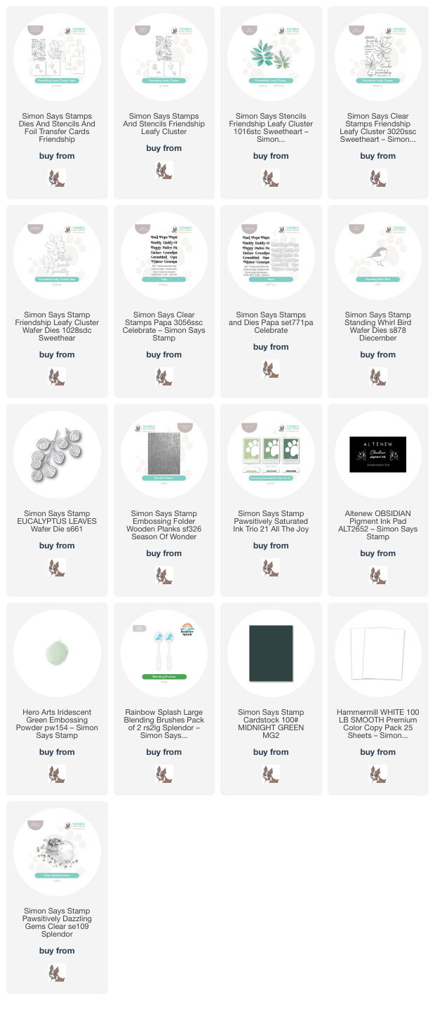
I started my project by stamping the images from the Leafy Cluster product suite using Altenew Obsidian black pigment ink, then sprinkling those sticky black images with Hero Arts Iridescent Green embossing powder. The iridescent green embossing becomes a deep hunter green when paired with the black embossing. I then used blending brushes to blend Artichoke and Cabbage from Pawsitively Saturated Ink Trio 21 using the stencils from the Leafy Cluster product suite. I also die cut a few sprigs of “ivy” with the Eucalyptus Leaves die and Simon Says Stamp’s Midnight Green cardstock.

For the background, I ran a panel of Hammermill white cardstock through my die cutting machine using the Wooden Planks embossing folder. I also die cut the Standing Whirl Bird die from some pearlescent white cardstock. I popped up the wooden plank background with some foam adhesive, then arranged the foliage around the little bird, adhering everything with liquid and foam adhesive to add varied heights to my card front.

For the greeting, I stamped a couple of the sentiments from the Papa stamps and dies (I adore the multitude of possible names in the Papa and Mamacita sets!) using the same Obsidian and Hero Arts Iridescent Green embossing powder combination that I used on the foliage stamps. I die cut the “Papa” with the coordinating die, then trimmed the strip using my trimmer and tucked it next to the bird die cut. Finally, I added a bit of sparkle with a few Clear Pawsitively Dazzling Gems!

Well, that’s all for my Man Card Monday project today! Thanks so much for stopping by today, and have a marvelous week!
Filed Under: simon says stamp Tagged With: eucalyptus leaves, father's day, friendship leafy cluster, ink blending, leafy cluster, man card monday, papa, standing whirl bird, stencil, wooden planks

Gorgeous Denim Blue with New Embossing Folders from Simon Says Stamp!

April 18, 2024

This post was sponsored by Simon Says Stamp. Thanks, Simon!

Hi friends! The new Simon Says Stamp Celebrate Release is now live, and some of my most favorite items are the new Ink Trio 25 and the wide variety of new embossing folders! I have become absolutely obsessed with the embossing folder+ink pad swiping craze, and the dark blue in the Ink Trio 25 is absolutely perfect for use with this technique. It’s dark enough that it can easily cover up most lighter colors (as I showed in THIS post last night). I loved making that navy and coral card so much that I wanted to try it out with all three blue inks from the Ink Trio 25 and the new gender-neutral embossing folders to create some more masculine-friendly projects. I have two blue-tiful cards to share with you today, so let’s get started with the details!

The trick for the ink swiping technique is to make sure that your blending inks are significantly lighter than your swiping ink. You want to make sure that any blending that gets “outside the lines” is covered up by the ink swiping. Luckily, the Night ink from Ink Trio 25 is practically navy blue, so it works beautifully for this purpose! And the super springy foam pad gives great coverage on your debossed panels, almost creating a suction effect to get intense and vibrant inking.

For my first card, I embossed the new Flower Buds Unfolding Embossing Folder onto some Hammermill white cardstock, then flipped the panel over so that the pattern was debossed rather than raised. I then used blending brushes to blend the lighter two inks from Ink Trio 25 randomly all over the pattern, simply adding color to the debossed images. Once I had finished blending, I pressed the Night ink pad directly to the paper and swiped, being careful not to press down too hard to avoid ink smudges inside my patterned debossed areas. I love that this technique picks up the details within the debossed image!! I trimmed down the finished panel slightly and mounted it in the center of an A2 sized dark blue glitter cardstock card front, creating a sparkly mat around the edges of my textured and patterned panel.

For the greeting I chose to heat emboss the “anniversary” from the Happy Combos stamp set, using white embossing on navy blue cardstock, which I paired with the coordinating Happy Die cut from iridescent white mirror cardstock and a vellum shadow. I popped these die cuts up on my debossed and inked panel, then die cut the Ornamental Fine Leaves die from some more dark blue glitter cardstock. These delicate leaves are just simple enough that they can easily be used for a masculine card. You could definitely switch out the “anniversary” die cut for “birthday” and cut the leaves from plain navy cardstock to have a perfect masculine card! Finally, I added a trio of Clear Pawsitively Dazzling Gems for a bit more sparkle.

For my second project, I used the same technique with the new Feather Spiral embossing folder to create a simple Father’s Day card. I first embossed a panel of white A2 cardstock with the embossing folder, flipped the panel over, and blended the lighter two inks from Ink Trio 25 in the debossed areas. I swiped the entire panel with my Night ink pad, again putting the pad directly to the paper and picking up those details beautifully!

For the greeting, I heat embossed a poignant sentiment from Papa and paired it with the new Fancy Father die set, cutting the detail layer from some more navy blue cardstock and layering it with a vellum shadow. To accent the sentiment and ground it a bit so that it wasn’t just floating in the center of the card, I trimmed down a strip of Ocean Breeze glitter cardstock and thinner strip of navy blue cardstock, adhering them to the right hand side of my card front with liquid adhesive. I popped up the sentiment pieces with some foam adhesive, orienting them over my accent strips.

I absolutely love this technique; I think that the possibilities are endless when you change up your ink colors. I think it would be fun to try with watercolored images, too! I can’t wait to experiment more! Thanks so much for stopping by today, and don’t forget to come back tomorrow for Day 1 of the Celebrate Blog Hop. Inspiration abounds with these blog hops, so you won’t want to miss it!

Filed Under: simon says stamp Tagged With: 3D embossing folder, father's day, feather spiral, flower buds unfolding, happy combos, ink swiping, masculine, ornamental fine leaves, papa, pawsitively saturated

New Anita Jeram Stamps from Colorado Craft Company!

April 10, 2021

Good morning! Today, Colorado Craft Company is celebrating their newest Anita Jeram release with a huge blog hop. You should have arrived here from Donna Hitz, and your next stop is Erin Thompson. The Anita Jeram line is so very adorable… it’s great for someone like me whose likes critter stamps but finds it hard to work with the individual critter stamps. These little scenes in the storybook style are so adorable and so easy to work with, all with a touch of elegance that I associate with a style like vintage Winnie the Pooh books. I have two Father’s Day projects for you today using the new For Dad and Dad’s Cooking stamps, so let’s get started with the details!

For masculine cards, I like to keep it fairly simple, with bold colors and simple layouts, a bit of a departure from my normal colorful, feminine, flowery cards, ha! I kept both cards very clean, with lots of white space and crisp black lines, allowing the gorgeously drawn stamps to be the stars of the show. The images in both the For Dad and Dad’s Cooking stamp sets reminded me so much of my husband; he’s such an incredible father to our four kiddos, and he makes so many wonderful memories with them that I think he definitely deserves two cards for Father’s Day.

I absolutely couldn’t resist the little guy bouncing on his dad’s belly in the For Dad stamp set. My kids crawl all over my husband, bouncing on his stomach and generally using him as a trampoline, and I think it’s an unwritten rule that the best dads make the best jungle gyms. I stamped the image from For Dad on some white, Copic-friendly cardstock, then used Copic markers in shades of auburn (like my husband’s hair… not sure if mice are actually that color, but I’m claiming artistic license with this one). I die cut the finished colored image with the coordinating dies.

I trimmed down a white A2 card base to be slightly smaller than A2 size, then matted it on a full size black A2 card base, leaving a fairly chunky black mat around the edges to help make the black outline of the mouse image pop. I stamped the greeting “You are rocking fatherhood.” from For Dad on the white panel using Intens-ified Black ink, then used foam tape to pop up the Copic-colored die cut for a clean, simple, but effective Father’s Day card.

For my second card, I used the darling kitty images from Dad’s Cooking to create a larger scale slimline card. My husband likes to make a big breakfast on the weekends, and my two biggest kiddos love to help him make the pancake batter and flip the pancakes. This image reminded me so much of the adoration on their faces while he makes their pancakes that I couldn’t resist. It’s amazing how much emotion can come from a single image of kitties, isn’t it?

I stamped the main image from Dad’s Cooking, again on white Copic-friendly cardstock and colored it with Copic markers, this time making some gray striped kitties by taking some of the color away for white stripes with my Copic Colorless Blender. I die cut the finished images (including the pancake!) using the coordinating Dad’s Cooking dies.

The greetings included in the Anita Jeram stamp sets are absolutely wonderful, so heartfelt and poignant. This sentiment that I’ve used here from Dad’s Cooking just pulls at the heartstrings, doesn’t it? So true for my kiddos, especially. I stamped it on a rectangular block of white cardstock, then matted it with a slightly larger piece of black cardstock. I popped all of the images and sentiment up on a slimline card base using foam adhesive. The simplicity of the color scheme and the clean white base are made a bit more involved looking with the addition of the dimension from the foam tape, in my opinion.

Each stop on the blog hop will be giving away a $25 gift certificate to the Colorado Craft Company store. All you need to do to enter is leave a comment on each blog in order to be entered to win. The giveaway will end on April 13th at midnight. Winners will be announced on April 14, 2021.

Thanks so much for stopping by today, and have a marvelous day!

Adrienne Kennedy (CCC)
Amber Rain Davis
Angelica Conrad
Bibi Cameron
Caly Person
Cathy Zielske
Chari Moss
Chris Dayton
Daniel West
Donna Hitz
Emily Midgett<— you are here
Erin Thompson
Jennifer Gross
Jennifer Kotas
Jennifer McGuire
Jennifer Shurkus
Joe Sysavath
Kassi Hulet
Kathy Racoosin
Kelly Griglione
Koren Wiskman
Kristina Werner
Laura Volpes
Mansi Bhatia
Marci Snee
Nichol Spohr
Sandy Allnock
Sara Torzullo
Traci Jenkins
Yana Smakula

Filed Under: colorado craft company Tagged With: critters, dad's cooking, father's day, for dad, mouse

Man Card Monday, a day late!

April 30, 2019

Hi there! This month’s Man Card Monday comes on a Tuesday, sorry about that. I didn’t want to distract from the Pinkfresh Studios release yesterday! (You can check out that blog post and enter to win the entire new release here.) Today’s Man Card Monday is an ocean-themed Father’s Day card using some fabulous supplies from Hero Arts, so let’s get started with the details!

This Man Card Monday was inspired by this fabulous seahorse die set from the My Monthly Hero Add-Ons from a few months ago. Male seahorses actually carry and give birth to the baby seahorses, so I thought they would be a perfect focal point for a Father’s Day card! I began by die cutting some of the Paper Layering Seahorses from some Adriatic card stock. My husband and I have twins (though he most certainly didn’t carry and birth them haha!), so I die cut an extra little baby seahorse to give the daddy seahorse his own set of twins!

For the background, I created a swirling alcohol ink panel using teals and gold, then added some gold glitter paste using the Starry Night stencil. While that was drying, I die cut the “happy” 4x from the Happy Stamp and Cut using gold vellum, then adhered them all together to make a dimensional die cut. I also heat embossed the “father’s day” onto a strip of white card stock using gold embossing powder.

Once the glitter paste was dry, I used foam tape to adhere the die cuts and greeting to the card front in a cluster. I know, it’s a little more glitter than you would normally think of for a “man card,” but I couldn’t resist adding that extra bit of texture to the alcohol ink background! Texture paste, to me, is a bit messy, and so of course that works on a guy card. (ha!)

Well, that’s all for April’s Man Card Monday. I hope you’re enjoying the series and finding some inspiration for those forever-difficult “man cards.” Thanks so much for dropping by today, and have a marvelous day!

Filed Under: Hero Arts, Man Card Monday Tagged With: alcohol ink, father's day, stencil, texture paste

Spellbinders Guest Designer, Part 2!

April 12, 2018

Hi there! I’m back again today with another Spellbinders guest post featuring the Lene Lok Folk Art Collection. (For my first post, click here.) Today, I’ve decided to showcase how perfectly these dies work for masculine or gender-neutral cards. Combining a simple stamping trick with some ink blending creates that perfectly simple, no frills card that’s great to give that guy in your life. Let’s get started!


For my first project, I wanted to emphasize how beautifully the details of these intricate dies die cut from masking paper. I started by die cutting the Rosemal Flowers Etched Dies from the Folk Art collection using masking paper. I carefully peeled the backing off and adhered it to approximately the center of my white, A2 card front, burnishing it with my bone folder to ensure that my mask remained in place while I did some ink blending. I then blended Peacock Feathers and Mermaid Lagoon Distress Oxide inks on the card front. I peeled the mask away… and it was like magic. Masking is such a simple, but supremely effective, technique to utilize with these gorgeous intricate dies!

Next, I wanted to add a little extra “something” to the card front, so I decided to press my Versamark pad onto the entire card front and cover it with clear embossing powder. I heated it, then repeated the process again until I had a nice thick, glossy layer of embossing powder. You do run the risk of cracking when trying to maneuver your card front onto a card base, but you can always heat it up again to remove the crack! Such a neat glassy effect, and the lack of sparkles and flowers make this perfectly gender neutral.

For my second project, I wanted to make a decidedly masculine card. I think that the Nordic Tree die looks quite sturdy and masculine, with very few flourishes or hearts, so I wanted to make that the focal point of my masculine project. I essentially repeated the process from the previous card, die cutting the Nordic Tree die from masking paper and adhering it to the card front, then using Hickory Smoke and Black Soot Distress Oxide inks to blend a nice, gray-to-black ombre down the front. Lifting that masking paper off is so much fun. It makes me giddy to see that crisp white pattern revealed!

Next, I added a greeting. I thought this would be perfect for Father’s Day, so I added a crisp white embossed sentiment at the bottom of the blended panel. I trimmed some of the edges off and mounted it on a white card base to add some contrast to the edges of the project.

Well, I hope you’ve enjoyed this foray into the world of masculine cards today! I am all about flowers and pinks and purples, so it was definitely a fun challenge to create something a bit simpler and less frilly (and decidedly less sparkly haha!). Thanks for visiting! I will be back again soon with another guest post featuring the beautiful Lene Lok Folk Art Collection!


Filed Under: spellbinders Tagged With: father's day, ink blending, masculine, masking

Primary Sidebar

  • Facebook
  • Instagram
  • Pinterest
  • YouTube

Favorite Shops

Secondary Sidebar

Subscribe

Enter your email address to subscribe to this blog and receive notifications of new posts by email.

Instagram
Something is wrong.
Instagram token error.
Follow
Load More

Archives

Tags

3D embossing folder alcohol markers better press birthday birthday card blog hop card kit christmas christmas card christmas tag colored pencil copic copic coloring Daniel Smith die cutting embossing folder embroidery felt giveaway holiday holiday card hot foil ink blending karin brushmarker pro layered stencil masculine my monthly hero new release no line coloring no line watercolor OLO marker olo markers original illustration pawsitively saturated rainbow shaker card slimline stamping stamptember stencil thank you thinking of you valentine's day video watercolor

Popular Posts

Simon Says Stamp October 2026 Card Kit of the Month: Homespun Gratitude!
February 2018 My Monthly Hero Blog Hop!
Altenew Craft A Flower: Poppy Blog Hop+Giveaway!
Felted Gourd Wall Hanging with Simon Says Stamp!
Sunflower Home Decor with Simon Says Stamp!
Craft Your Life Project Kit: Feathered Lilies Blog Hop+Giveaway!
Simon Says Stamp October 2025 Card Kit of the Month!
Altenew Standalone Die Blog Hop+Giveaway!
The Ton Anniversary Release- Day 2
Altenew Build A Flower Japanese Mum Blog Hop!

Disclosure

Some affiliate links are used in my posts. This means that, should you click on one of my links and purchase something from that company, I will receive a small portion of the sale at no extra cost to you. I use the money earned from these sales to help maintain my blog. I so appreciate you visiting and, if you do choose to use one of my affiliate links, thank you so much for your support!
Copyright © 2026 ·Brunch Pro Theme &middot; Genesis Framework by StudioPress &middot; WordPress &middot; Log in
Loading Comments...