• Skip to main content
  • Skip to primary sidebar
  • Skip to secondary sidebar

Sixth Street Sundries

Emily Midgett

  • Home
  • About Me
  • Contact
  • OLO Marker Color Swatch Chart
  • Shop

lovely layers anemone

OLO Marker Colors of the Month + Honey Bee Stamps!

May 25, 2023

Hi there! Each month, OLO Markers comes out with a trio of colors that you can purchase (or use the markers that you already have) to participate in their Color of the Month Challenge! These Color of the Month markers (which you can check out HERE) are always three different colors that, when blended together or used separately, help to expand your blending trios and create a new perspective on your markers!! I found the May 2023 Colors of the Month markers to be extremely inspiring; they were colors that I would not normally have used together, certainly not for coloring, but I thought the blue, turquoise, and lime green were so modern, chic, and fresh that I started creating with them and couldn’t stop! I have been carefully collecting different products from Honey Bee Stamps over the last several months and was inspired to pull a bunch of them out to create a quartet of cards using this fun color combination. Let’s get started with the details!

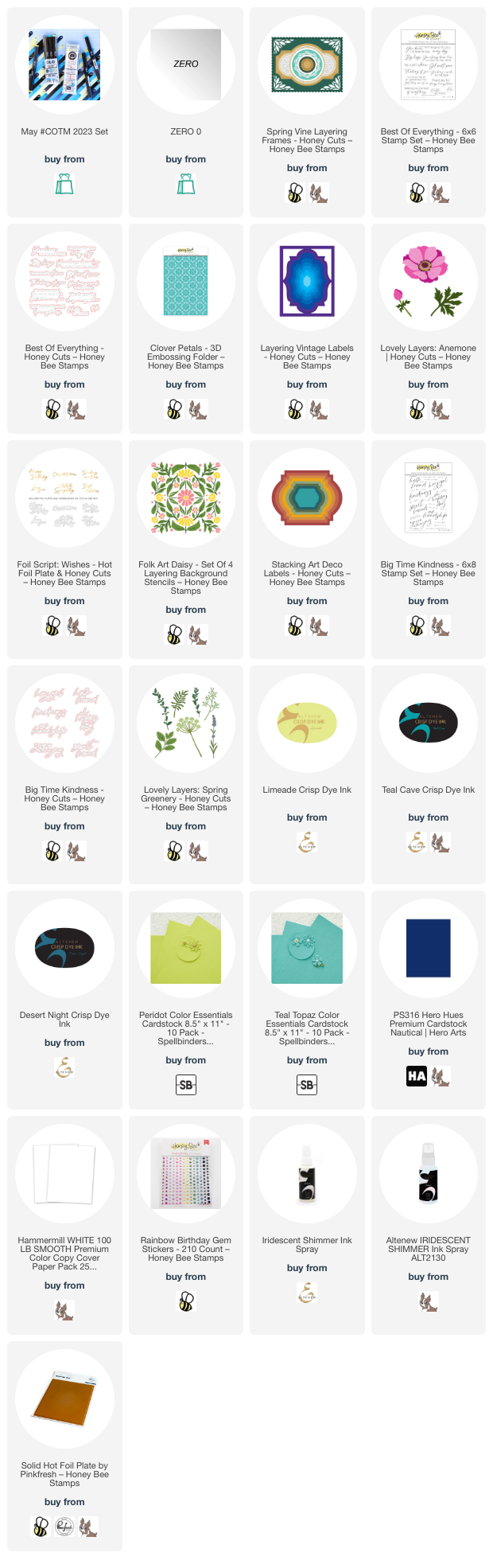
I began by pulling coordinating ink and cardstock colors that would match the May 2023 Colors of the Month. I grabbed Limeade, Teal Cave, and Desert Night inks from Altenew, as well as Teal Topaz and Peridot cardstocks from Spellbinders and Nautical cardstock from Hero Arts.

For my first project, I used the absolutely beautiful Lovely Layers: Spring Greenery standalone dies from Honey Bee Stamps with the May 2023 Colors of the Month. I die cut the images from plain white cardstock, then used only the May 2023 Colors of the Month to add color to the images. Being limited to only the three markers meant that I had to get creative in order to create multiple colors that still worked with the images themselves. I did some “glazing” to create custom colors, laying down one solid layer of color, then adding another color over the top to create a completely unique color. I also was able to increase the intensity of the colors by adding multiple layers of the same color (as I did on the sprigs of lavender). I used all three colors on the larger eucalyptus leaves, laying down the blue in the center of each leaf, blending out with the aqua, then glazing the entire leaf with the lime green marker. The only additional marker that I used was the zero marker from OLO, which I used to add highlights and to lessen the intensity of some of the colors, as well as add tiny dots of white on the Queen Anne’s Lace flowers. I was amazed and really pleased at the variety of colors that I was able to create using just four markers that I would never have normally put together!

After I’d finished coloring the images, I die cut the largest detail frame from the breathtaking Spring Vine Layering using Nautical cardstock, backing it with Teal Topaz cardstock to coordinate with the turquoise tones in the coloring. I die cut a Sentiment Frames frame from some matte silver foil cardstock, which I adhered with foam tape for extra dimension, then arranged my colored floral die cuts around the frame, adhering them with both liquid and foam adhesive for lots of different dimension and height. I added a greeting from the Best of Everything stamp set, heat embossed in silver on navy cardstock and die cut with the coordinating die. Finally, I added a few gems for some sparkle!

For my second card, I blended the three shades of ink (Limeade, Teal Cave, and Desert Night) to create a crazy vivid background. After I blended the three colors together on a panel of plain white A2 cardstock, I ran the entire thing through my die cut machine using the Clover Petals embossing folder from Honey Bee Stamps and spritzed it with some iridescent shimmer spray to enhance the pattern even further.

I die cut the Lovely Layers: Anemone, cutting the flower layers from white cardstock and the foliage from two different shades of green cardstock. I swiped the lime green marker from May 2023 Colors of the Month in the center of each layer of the white flower, smoothing the edges with the zero marker to create just the lightest hint of lime green in the center of the anemone. I die cut some leaves in coordinating shades of bright green.

To create the frame around which I could build my bouquet, I used the Layering Vintage Labels die to create this uniquely-shaped frame, cutting it from Nautical cardstock to coordinate with the navy blending on the background and adhering it with some foam adhesive to give it extra height and help it pop from the background. I arranged the flowers and foliage in a bouquet around the edge of the frame and added a greeting created with the Foil Script: Wishes hot foil plate and die, creating the reverse sentiment using the leftover foil with a solid hot foil plate. The final touch was to add a few bits of bling in a coordinating shade of iridescent lime green!

For my next card, I paired the three ink shades (Limeade, Teal Cave, and Desert Night) that coordinate beautifully with the OLO Colors of the Month with the Folk Art Daisy layering stencil set. I use blending brushes to blend the layers, keeping the flowers that lovely shade of pale lime green, with turquoise leaves and deep navy accents. I trimmed the stenciled panel down and matted with an ever-so-slightly larger panel of navy cardstock, creating a very thin navy blue frame around the edge. I popped these two layers up on a Peridot cardstock card front.

For the greeting, I stamped one of the sentiment strips and a large scale sentiment from Big Time Kindness using the Desert Night ink, then die cut it with the coordinating die. To help the greeting stand out from the busy patterned background, I die cut one of the Stacking Art Deco Label dies from some vellum, slightly offsetting it to the right. I used dimensional foam adhesive to adhere the sentiments to the vellum piece, then hid my liquid adhesive behind these solid die cuts so as not to mar the semi-transparent vellum. Finally, I added a few iridescent gems for some sparkle!

My last card is an homage to the beauty of the Spring Vines Layering Frame die set. I cut the different layers from Teal Topaz, Peridot, and Nautical cardstock, layering them together in a striking combination, using foam adhesive for the largest interior label layer and liquid adhesive for the remaining layers.

I also heat embossed a simple but poignant greeting from the Best of Everything stamp set, heat embossed in silver on some more navy cardstock and die cut with the coordinating die. I used one last layer of foam adhesive to add the sentiment, giving it a little bit of extra height amongst all of the die cut layers. Finally, I added some gems to the four corners for a tiny bit of sparkle!

Well, have you made it this far? That was a lot of cards for one post! I got rolling with that beautiful color ocmbination from OLO and just couldn’t stop! I love when something simple brings on such a flood of inspiration. You can check out more information about the May 2023 Colors of the Month challenge by clicking on the link. Thanks so much for reading today, and have a marvelous day!
Filed Under: Honey Bee Stamps, OLO markers Tagged With: anemone, best of everything, big time kindness, card set, clover petals, colors of the month, coordinating set, folk art daisy, hot foil, layering vintage labels, lovely layers anemone, lovely layers spring greenery, spring vine layering, stacking art deco labels

Non-Traditional Holiday Colors with New Honey Bee Stamps Make It Merry!

October 27, 2022

Hi there! I’m back again today with another pair of projects featuring some of the beautiful new products from the Honey Bee Stamps Make It Merry release! While my projects yesterday felt fairly traditional, today’s projects change up the color schemes a bit, with lots of neutrals, metallics, and a pop of muted pink. I love traditional color schemes for holiday cards, but I love unique holiday color palettes just as much. The beautiful new products lend themselves so well to both!

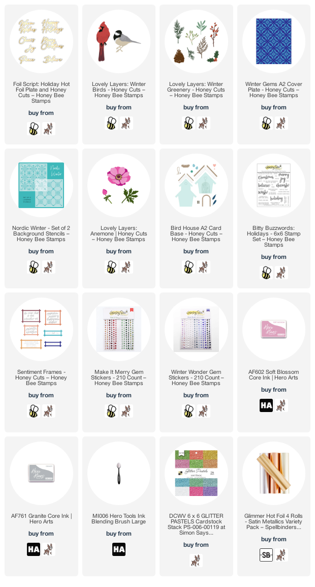
I have two projects today, both of which feature the gorgeous Lovely Layers Winter Greenery to help accent the focal points on the cards. I also used more greetings from the Foil Script: Holiday Hot Foil Plate and Dies. I like to sit down with my foil machine and foil lots of greetings in different shades of foil and on different colors of cardstock so that I have tons of options when I start creating. Let’s get started with the details!

For my first card, I started by creating the finch from the sweet little birds in the Lovely Layers Winter Birds Honey Cuts set. I kept the colors traditional, with creamy and crisp white, grays, and black. It was super simple to put together! I also matched the shades of gray to the warm gray foil that I used for the greeting, foiled using the Foil Script: Holiday Hot Foil Plate and Dies, the Pinkfresh Studio Solid Hot Foil Plate, and some matte pewter foil. I used those two elements as the basis for the rest of my color scheme!

Because I wanted to create a little scene with the fairly large Bird House A2 Card Base Honey Cuts, I cut a 5×7 card front from some plain white cardstock, then masked the edges to create a 1″ white frame around the edge. This 4×6 inch opening created the perfect space for the Nordic Winter Stencil. Using a blending brush, I blended some medium gray ink over the stencil to create the subtle pattern, then removed the stencil and lightly blended around the edge of the opening with the same shade of gray to create a framed area to ground the rest of my images. I find that creating a smaller blended area as a focal point on my card fronts helps to keep the large clean card front from being intimidating when building a scene!

I created a little bird house using similar colors from the Bird House A2 Card Base Honey Cuts, adding a little pop of pale blush pink to the scallops on the roof. I die cut a few elements from the Lovely Layers Winter Greenery, with super dark green pine boughs and some muted melon pink berries. The foliage is the perfect spot to rest my little bird! I adhered the bird house using foam adhesive, then arranged my foliage and berries beneath it, finally nestling my little finch on top and adhering with another layer of foam adhesive to create lots of height and dimension.

I popped up the greeting from the Foil Script: Holiday Hot Foil Plate and Dies and added a heat embossed sentiment strip using a greeting from Bitty Buzzwords: Holiday, both with a double layer of foam tape. Finally, I accented the project with a few sparkling Winter Wonder Gem Stickers! Lots of dimension in this card. Definitely saving this for a super special friend!

My second project uses the same blush pink cardstock that I used in the first project as an accent, but this time it’s the focal point! I had creating some greetings using the Foil Script: Holiday Hot Foil Plate and Dies on this blush pink cardstock using some matte rose gold foil and decided to use that as my starting point for the color scheme for this card.

I die cut the layers from the Lovely Layers: Anemone from the blush cardstock, then used some slightly darker pink ink to lightly blend around the edges and add a bit of extra dimension to the die cuts. I adhered them all together, adding a black and gray center, using liquid adheisve. I also die cut several elements from the Lovely Layers Winter Greenery in a few shades of deep green, as well as some more of the muted melon colored berries, the shade of which coordinated beautifully with the ink on the edge of the anemone.

For the card base, I ran the Winter Gems Cover Plate through my die cut machine with some crisp white cardstock. I love the subtle texture that this cover plate adds to the background; I can’t wait to try this plate with hot foil! I adhered a glittery rose gold frame cut from the Sentiment Frames Honey Cuts die set in the bottom corner of the debossed card front, then arranged my holiday flora in a swag, adhering the components with liquid and dimensional foam adhesive for tons of dimension. I added the foiled blush and gold greeting with a double layer of foam tape, then finished the project with a few iridescent hunter green gems from the Make It Merry Sticker Gem set.

Well, that’s all for these projects. These non-traditional color schemes are some of my favorites, but the images themselves are undeniably holiday! Thanks so much for reading today, and have a marvelous day!

Filed Under: Honey Bee Stamps Tagged With: bird house, bitty buzzwords, christmas card, die cutting, floral, glimmer hot foil, holiday card, hot foil, lovely layers anemone, lovely layers winter birds, lovely layers winter greenery, nordic winter, stencil, winter gems

Red Anemones for Christmas Tags!

October 23, 2021

Hi there! I’m over on the Honey Bee Stamps blog with a pair of pretty holiday tags to share with you today using the stunning new Lovely Layers: Anemone and some of the new tag goodies from the Vintage Holiday release! I don’t use red much outside of holiday projects, but the deep jewel toned red pairs beautifully with slate blue, which is my color palette for today. Let’s get started with the details!

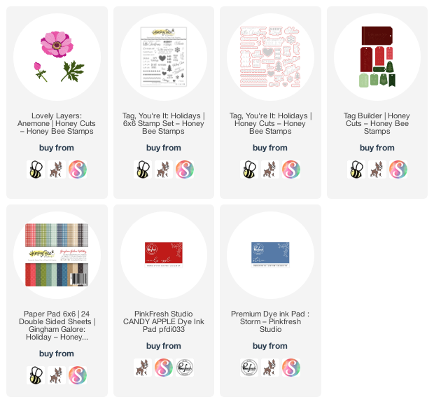
I began by die cutting the layers of the Lovely Layers: Anemone dies from some deep red cardstock, the centers from black cardstock, and the foliage from some deep green cardstock, then blended some slightly deeper red around the edges of the flower petals to add extra dimension. I adhered the layers together using lots of foam tape for tons of dimension.

For the tag layer, I used the new Tag Builder Honey Cuts to cut two layers for each tag, one from plain white cardstock for the back (to help cover up the cut marks from my cutting plate in my die cut machine-sneaky sneaky!) and one from some lovely slate blue plaid gingham from the new Gingham Galore Paper pad. I stamped a greeting from Tag You’re It: Holidays using coordinating slate blue ink and die cut the sentiment using Tag You’re It: Honey Cuts. I layered all of the die cuts on the plaid tag die cut, adhering them with foam and liquid adhesive.

I adhered the two layers together, clean sides facing out. I stamped the “to/from” and some snowflakes on the plain white back using stamps from Tag You’re It: Holidays. To make the red snowflakes a little more subtle, I stamped off once on a piece of scratch paper and stamped the leftovers on the edge of each white tag base. I finished the tag off with some red twine for a topper!

Well, that’s all for my project today. Thanks so much for reading, and have a marvelous day!
Filed Under: Honey Bee Stamps Tagged With: christmas tag, holiday tag, lovely layers, lovely layers anemone, tag builder

Primary Sidebar

  • Facebook
  • Instagram
  • Pinterest
  • YouTube

Favorite Shops

Secondary Sidebar

Subscribe

Enter your email address to subscribe to this blog and receive notifications of new posts by email.

Instagram
Something is wrong.
Instagram token error.
Follow
Load More

Archives

Tags

3D embossing folder alcohol markers better press birthday birthday card blog hop card kit christmas christmas card christmas tag colored pencil copic copic coloring Daniel Smith die cutting embossing folder embroidery felt giveaway holiday holiday card hot foil ink blending karin brushmarker pro layered stencil masculine my monthly hero new release no line coloring no line watercolor OLO marker olo markers original illustration pawsitively saturated rainbow shaker card slimline stamping stamptember stencil thank you thinking of you valentine's day video watercolor

Popular Posts

Simon Says Stamp Joy For You Blog Hop- Day 1!
Simon Says Stamp Joy For You Release-Now Available!
Frozen Fractals All Around with New Simon Says Stamp Joy For You Release!
Shaped Holiday Shaker Card with New Simon Says Stamp Jolly Season Card Kit of the Month!
Holiday Postage with New Simon Says Stamp!
Simon Says Stamp Glory to the Newborn King Holiday Kit-Part II!
Pinkfresh Studio 5th Birthday!
Altenew Build A Flower: Fuchsia Blog Hop+Giveway!
Holiday Joy in Pink and Green with New Simon Says Stamp DieCember!
Honey Bee Stamps September Release Blog Hop!

Disclosure

Some affiliate links are used in my posts. This means that, should you click on one of my links and purchase something from that company, I will receive a small portion of the sale at no extra cost to you. I use the money earned from these sales to help maintain my blog. I so appreciate you visiting and, if you do choose to use one of my affiliate links, thank you so much for your support!
Copyright © 2026 ·Brunch Pro Theme · Genesis Framework by StudioPress · WordPress · Log in
Loading Comments...