• Skip to main content
  • Skip to primary sidebar
  • Skip to secondary sidebar

Sixth Street Sundries

Emily Midgett

  • Home
  • About Me
  • Contact
  • OLO Marker Color Swatch Chart
  • Shop

monochromatic

Pinkfresh Studio “Kindness in Bloom” Release Blog Hop

October 8, 2024

Good morning friends! I am hopping along with Pinkfresh Studio today to share inspiration using some of the gorgeous new goodies from the Kindness In Bloom release! This new release is filled with stunning florals in all forms: stamps, dies, stencils, and press plates, but we also have some marvelous new Essentials dies that are going to be staples in your craft room, as well. I have two projects using some beautiful blue tones, so let’s get started with the details!

*I have linked all of the products used at the bottom of the post for your convenience using affiliate links. Thank you for shopping with my links! I truly appreciate your support for my work!*

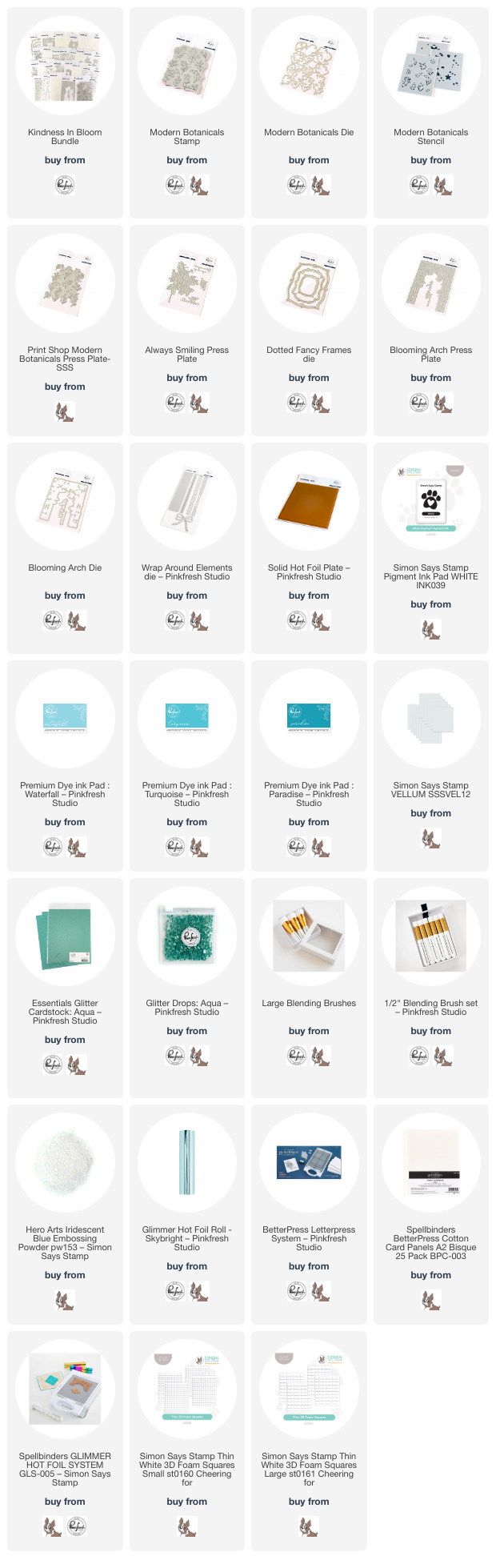
For both of my projects today, I used the new Print Shop Modern Botanicals stamp, die, and stencil product suite (there is also a coordinating Press Plate, but I focused on the stamp set today so that I could do some heat embossing!). To start, I stamped the beautiful Print Shop Modern Botanicals cling stamp twice onto some pale aqua cardstock from my stash using white pigment ink, which I then covered with Iridescent Blue embossing powder to create a shimmery, iridescent, almost tone-on-tone embossed outline. I embossed two of these floral panels in this way: one to use as a background and one to die cut to use as accents for another card!

Before die cutting one of the panels, I used the coordinating stencils with Waterfall, Turquoise, and Paradise inks to add some beautiful monochromatic details to the floral images. After I had finished blending, I used the fabulous one-pass die to die cut all of the flowers in one fell swoop. So convenient!

For my first card, I created a beautifully textured background by pressing the floral bouquet into some more of the lovely pale aqua cardstock. To achieve the textured letterpress look on colored cardstock, I tried a technique that I saw the incredibly talented Carissa Wiley demonstrate. I placed a piece of letterpress paper behind my A2 panel of colored cardstock and used some light washi tape to temporarily adhere the two pieces together. I then used my Better Press system to impress the beautiful bouquet from the new Always Smiling product suite into the corners of my panel. The thick cotton letter press cardstock allows the cushion for the Press Plate to impress the images into the regular colored cardstock! Isn’t that ingenious? Carissa is amazingly clever! After removing the washi tape and letterpress panel, I used a blending brush to blend Turquoise ink around the edges of the panel, enhancing the beautifully detailed letter press images.

To further enhance my card front, I die cut the largest frame from the new Dotted Fancy Frames Essentials die set, placing it in the center of an A2 sized panel of Pinkfresh Studio Aqua Glitter Cardstock. I reserved the die cut frame itself for the next project and instead used foam adhesive to pop up the negative space around the edges of my textured background panel, creating a tone-on-tone glittery shaped frame. I tucked a vellum Dotted Fancy Frame die cut on the bottom right corner of the card and arranged my stenciled Print Shop Modern Botanicals die cuts around a greeting from the Always Smiling Press Plate set, which I foiled onto some more aqua cardstock using Spellbinders’s Skybright foil and die cut with the coordinating die. Finally, I embellished my bouquet with some shiny foil “twine” cut using the older Wrap Around Elements dies and added a few coordinating Aqua Glitter Drops for added sparkle!

My second card is a bit simpler, using some of the leftovers from my first project to create this dainty, monochromatic card. I embellished the full A2 embossed and stenciled Print Shop Modern Botanicals background panel with the leftover Aqua Glitter Dotted Fancy Frames Essentials die cut, adhering it around the edges of the background with some liquid adhesive. I think it is such a pretty addition to the subtle floral background! I also used the smallest die from the Dotted Fancy Frames Essentials die set to cut a piece of vellum, upon which I would build my focal point.

For my focal point, I hot foiled my greeting from the new Blooming Arch Press Plate set, which I created by first hot foiling the sentiment Press Plate, then hot foiling the leftover foil panel using Pinkfresh Studio’s Solid Hot Foil Plate and cutting with the coordinating die. (It looks black in the photo because hot foiled images are so difficult to photograph accurately, but I promise the sentiment is a coordinating pale aqua!) I popped up the sentiment in the center of the vellum piece using foam adhesive, then arranged some leftover Print Shop Modern Botanicals die cuts behind the sentiment. I flipped over the vellum piece and added some thin foam square adhesive behind the solid die cuts in order to keep my vellum piece clean. Finally, I added a few more Aqua Glitter Drops for added sparkle!

Well, that’s all for my projects today! Now for some fun giveaway information:

Pinkfresh Studio will be giving away the full release on the Pinkfresh blog & YouTube channel.  They will be giving away a total of TEN $25  gift cards along the hop. The winners will be selected from the comments, so the more comments you leave along the hop, the more chances you have to win!.
Winners will be selected and announced on October 16, 2024 on our GIVEAWAY PAGE. Winners must check that page & claim their prize within 2 weeks.

Here’s the full hop list in case you get lost:

You are invited to the Inlinkz link party!

Click here to enter

Thanks so much for stopping by today, and happy hopping!
Filed Under: pinkfresh studio Tagged With: always smiling, blooming arch press plate, die cutting, dotted fancy frames, giveaway, ink blending, kindness in bloom, layered stencils, letterpress, modern botanicals, monochromatic, press plate, solid hot foil plate, stencil, wrap around elements

Teal and Lavender with Simon Says Stamp and Interference Ink!

August 19, 2024

This post was sponsored by Simon Says Stamp. Thanks, Simon!

Hi friends! I have another project to share with you using another color of the absolutely spectacular Interference Ink from  Lisa Horton Crafts. I recently purchased many of the colors of these beautiful, shimmery pigment/dye ink combos, and I wasted no time playing with them. They add one of my most favorite embellishments to my cards: shimmer. I love incorporating multiple textures into my monochromatic cards, so having lots of options for colorful shimmer (rather than the typical metallic shimmery inks) helps expand my monochromatic horizons even further. I have paired an unusual color palette for my project today, inspired by the Galaxy Dream Shimmer Interference Ink: teal and lavender. Let’s get started with the details on my project!

I began by running an A2 panel of Simon Says Stamp Audrey Blue cardstock through my die cutting machine using the Winslow Medallions Embossing Folder. After I had embossed the beautifully detailed texture into the vibrant cardstock, I used a blending brush to blend Ocean Pawsitively Saturated Ink around the edges of the embossed panel, which helps to highlight some of the details in the embossed images and add extra depth to the background. I grabbed my Galaxy Dream Shimmer Interference Ink pad and put it directly to the raised areas of the embossed panel; the shimmer helps to highlight those incredible textural details! I also splattered the background with some metallic watercolors for even more shine.

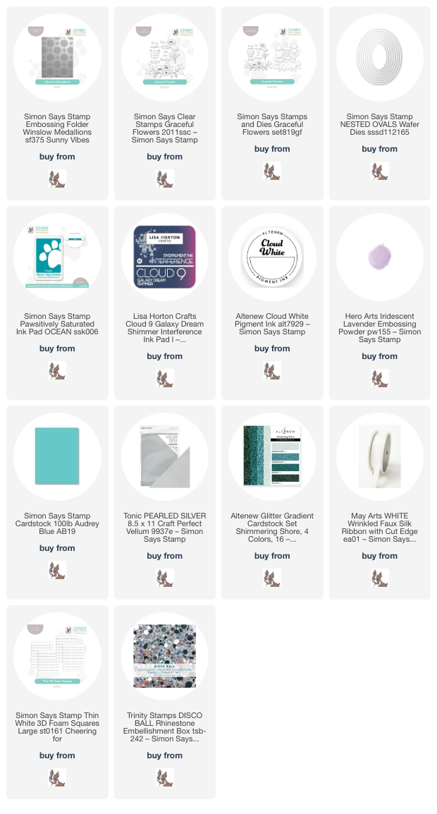
While my background was drying, I stamped some of the individual floral images from the new Graceful Flowers set onto some more Audrey Blue cardstock, first using white pigment ink and then again with sticky embossing ink. I covered the stamped images with Hero Arts Iridescent Lavender embossing powder and heated it. The initial layer of white pigment ink helps the highlight the embossed image on the vibrant cardstock. After embossing, I die cut the images and sentiment with their coordinating dies and added some more sparkling metallic watercolors to the flower and stem.

Before adhering my embossed images to my sparkling, textured background, I trimmed a strip of teal glitter cardstock and adhered it to the background with some foam adhesive strips to ground my focal point a bit on the card front. Next, I die cut a small oval using the Nested Ovals dies and some pearlescent vellum, onto which I adhered the flower and stem die cuts with some thin foam adhesive squares. I flipped the vellum oval over and hid some more foam adhesive behind the solid die cuts, then added it over the glittery cardstock strip. I tucked the embossed, die cut greeting next to the glittering flower and added a bow created by dying some 1/2″ silk ribbon with an alcohol marker in a coordinating color. Finally, I added a few sparkling Trinity Stamps Disco Ball gems, which have a perfectly coordinating teal and lavender iridescent shine!

Well, that’s all for my project today. If you haven’t checked out the  Lisa Horton Crafts Interference Inks, you’re missing out. I am absolutely loving the additional shimmer that they add to my cards, and I can’t wait to play with them even more. Thanks so much for stopping by today, and have a marvelous day!

Filed Under: simon says stamp Tagged With: 3D embossing folder, graceful flowers, interference ink, monochromatic, nested ovals, shimmer, watercolor, winslow medallions

VIDEO: Acetate Window Card Using Pinkfresh Studio Fairytale Frame Press Plate with Hot Foil!

May 1, 2024

Hi friends! I am up on the Pinkfresh Studio YouTube channel today with this fun window card featuring the utterly lovely Fairytale Frame Press Plate and coordinating die. My favorite feature of the Press Plates are their versatility; you can use them both to create letterpress images or with your favorite hot foil machine! I wanted to highlight the details of this gorgeous plate with some shining iridescent foil, shown to amazing advantage when hot foiled on a luxuriously thick pearlescent mint cardstock from Memory Box. You can watch the video below or click HERE to watch on YouTube:

In case you can’t watch the video, here are some details on how I created this project:

I started by hot foiling the luscious Fairytale Frame Press Plate into that glorious pearlescent mint cardstock using Prism Glimmer hot foil roll. This cardstock is so thick that the impression created with the hot foiling is almost akin to letterpress, giving you lots of texture and spectacular shine! I die cut the finished image with the coordinating die; the die is super detailed and showcases the intricacies of the pattern beautifully.

To create my window card, I first trimmed down some Sea Glass cardstock from Simon Says Stamp to 4.25″ x 5.75″. I then used my score board to score a lip .25″ from the edge of the long side of the cardstock in order to create a top-folding notecard and used my bone folder to create a nice crisp crease. I placed some super strong tape on the lip and added an A2 panel of clear acetate, onto the top of which I adhered my hot foiled frame with some more super strong double sided tape.

To add a bit of interest and contrast behind my minty foiled frame, I used a blending brush to blend Meadow ink around the edges of my mint panel, effectively the back of the card. Because these layers are fairly monochromatic, that contrast is important to help differentiate between the different elements. The cardstock is also a bit more blue than my minty pearl cardstock used for the frame, so layering the green ink over the top helps to tie those colors together a bit more closely.

For the greeting, I stamped a sentiment from the Circle Florals stamp set using Meadow ink, then again directly over the top with embossing ink and embossed it with Hero Arts Iridescent Blue embossing powder. This additional step adds lovely shine and iridescence to the sentiment, making it extra special. I die cut the finished sentiment with the coordinating die. To accent the sentiment and add a bit more visual interest to the center of my acetate window (and perhaps provide an area to write a hidden message), I die cut the Curvy Leaves die from leftover pearly mint cardstock and some Jade glitter cardstock. I arranged the leaves and greeting in the center of my window, adhering with both liquid and foam adhesive, then added a few Iridescent Clear Drops for some additional shine and texture.

Well, that’s all for my project today! I think that these window cards are just so much fun, definitely something different for me. I have shied away from them before simply because I didn’t know where I would put my sentiment, but I have found that there is plenty of room on the back side of the card to write a longer message! I hope you’ll try out this fun technique! Thanks so much for stopping by today, and have a marvelous day!

Filed Under: pinkfresh studio Tagged With: better press, circle florals, curvy leaves, fairytale florals, hot foil, ink blending, monochromatic, press plate, window card

Team Alcohol Marker or Team Glitter? Floral Die Cuts Two Ways with Simon Says Stamp!

April 10, 2024

This post was sponsored by Simon Says Stamp. Thanks, Simon!

Hi friends! My oldest son recently asked me what my favorite color is, and do you know… I couldn’t answer. I love too many to have one particular favorite! Case in point, my infatuation with Concord and 9th’s Fig. It’s the most luscious shade of purple- not quite fuchsia, not quite plum…. so unique and gorgeous. I found some glitter paper in my stash that matches it absolutely perfectly, and thought to myself that I needed to make a project with some detailed tone-on-tone die cutting. I couldn’t stop at just one, so I created two of course! I used the new Meadow Swag dies from the Simon Says Stamp Be Bold release, working with them in two completely different “mediums” (if you can truly call glitter cardstock a medium, ha!). Let’s get started with the details!

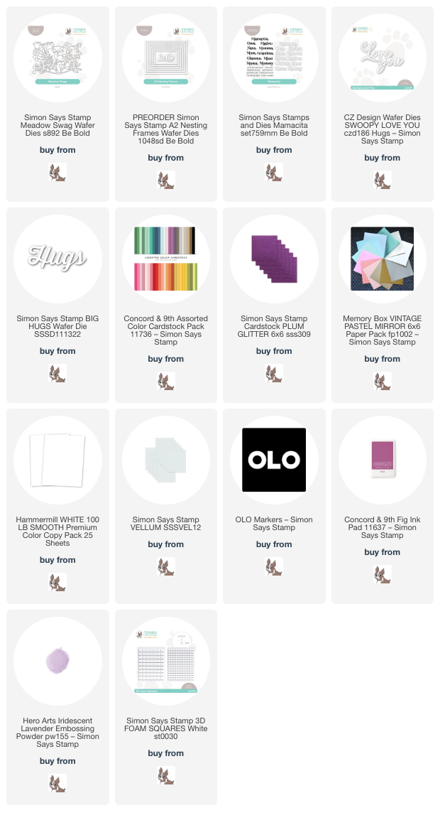
For my projects, I pulled out some Fig cardstock from the Concord and 9th cardstock sampler pack, matching it with Plum Glitter cardstock from Simon Says Stamp. I always say that it pays to have specialty card stock in lots of different shades in your stash, because you never know when something will match perfectly! I also pulled out the coordinating Concord and 9th Fig ink and a plethora of dies, new and old, to create my pair of purplicious cards.

For my first card, I die cut the Meadow Swag dies twice from white cardstock, then used my OLO Markers to add lots of vibrant color. The purple markers from OLO are truly special and are such unique shades amongst the alcohol marker brands. I love that with some simple white cardstock and your alcohol markers, you can create completely customized die cuts even if you don’t care to keep an abundant stash of colorful cardstock like, ahem, some people do! (Not that I would know anything about that…..) Before adhering my colorful floral arrangement to my A2 sized Fig card front, I added an iridescent white frame cut using the new A2 Nesting Frames dies, centering it on my card front. I popped up the vibrant flowers using lots of foam squares. It’s a bit tedious to add these foam squares to such an intricate arrangement, but I think the dimension it adds is totally worth it!

For the greeting, I heat embossed the “madre” sentiment from the new Mamacita stamp and die set. I took four years of Spanish in high school and have called my mom “madre” for (yikes) twenty years, so I was so excited to see this stamp included in the Mamacita set. I heat embossed the sentiment on some Fig cardstock using Hero Arts Iridescent Lavender embossing powder. This translucent and iridescent embossing powder looks incredible on both white and colored cardstock. Definitely a must-have, in my opinion! I also die cut the detail layer of the Swoopy Love You Dies from some Plum Glitter cardstock and backed it with a vellum shadow layer, which helps the tone-on-tone glitter sentiment stand out a bit better from the colorful floral background. I added the greeting die cuts in the center of the floral arrangement with some more foam adhesive, then added a few shimmering gems for one last touch of sparkle. Such an intricate, eye-catching card, I think! That purple just grabs your attention!

My second card is a bit simpler in concept, allowing the intricacy of the Meadow Swag dies and the vibrant plum hues in the Fig cardstock and the Plum Glitter cardstock to do most of the work for me. I die cut the Meadow Swag from the Plum Glitter cardstock a couple of times, then trimmed down some Fig cardstock to both an A2 panel and a piece to 3.75″ x 5″. I blended the coordinating Concord and 9th Fig ink around the edge of the smaller panel and splattered it with some iridescent lavender glitter watercolors from my stash to add extra interest to the background. I arranged the glittering floral die cuts around the edge of the blended panel, creating almost a sunset silhouette effect against the blended cardstock.

After I had adhered all of the intricate floral die cuts on the blended panel using liquid adhesive, I placed the entire patterned panel in the center of a full size A2 Fig card front. For the greeting, I die cut one of my favorite sentiment dies from Simon Says Stamp: the Big Hugs die. To get lots of contrast and allow the sentiment to stand out from the monochromatic patterned background, I cut this bold sentiment from some more iridescent white mirror cardstock, then popped it up in the blank area of the patterned glittery panel using foam adhesive. Finally, I added a few more shiny gems for more contrast and sparkle!

Well, that’s all for my projects today! Which do you like better: the alcohol marker die cuts or the monochromatic glitter die cuts? If I have the time, I will always love coloring my standalone die cuts, but you can’t beat the dramatic effect of the glittery die cuts, especially when you’re short on time! Thanks so much for stopping by today, and have a marvelous day!

Filed Under: simon says stamp Tagged With: A2 Nesting Frames dies, Be Bold release, big hugs die, concord and 9th cardstock, mamacita, meadow swag, monochromatic, OLO marker, swoopy love you

Simon Says Stamp Smitten Release-Now Available!

December 14, 2023

This post was sponsored by Simon Says Stamp. Thanks, Simon!

Hi friends! Remember how much fun we had with STAMPtember, with surprises and releases all month long? Well, DieCember is shaping up to be just as fun! Tonight, Simon Says Stamp is releasing the Smitten collection, perfect for starting on those Valentine’s Day projects! (Mentally, I’m still in Christmas mode, but the seasons are ever changing in this industry!) I pulled out my red cardstock again to create this incredibly vibrant monochromatic crimson card, featuring tons of die cutting and zero stamping. Let’s get started with the details!

I began my project with lots of die cutting. I started with a die cut heart, cut using a fairly large heart die from the Nested Rounded Hearts die set, which I cut from Simon’s Matte Metallic Red cardstock. I ran this unique heart shape through my die cutting machine using the Burst Snowflakes embossing folder to add some gorgeous texture. I know that the pattern on the embossing folder is technically snowflakes, but they remind me of lacy doilies, which I thought was perfect for a Valentine’s Day card!

Next, I die cut several blooms and foliage using the Aurora Blooms dies. I used a shade of deep ruby red for my flowers, adding some red glitter accents and buds cut using red cardstock from the new Be Mine Glitter Paper Pack. I cut some foliage from deep teal and minty green cardstock, which I think stands out beautifully amongst all of the vivid red. I popped up the embossed heart die on an A2 sized card front, using a slightly lighter shade of cherry red cardstock, then arranged the flowers in a swag around the heart, popping some up with foam tape, adhering others with liquid adhesive for lots of dimension.

For the greeting, I used the brand new Fancy Love You die to die cut a sparkling greeting using the red cardstock in the Be Mine Glitter Pack. I popped it up on the heart die cut using another layer of foam adhesive, creating multiple levels of height. The textural contrast between the matte red foil cardstock and the red glitter cardstock helps to make the greeting even more visible. I added a few red pearls to the center of the flowers, then adhered a smattering of red gems for more sparkle!

Well, that’s all for my project today! I have lots more inspiration to share with you, both from the Smitten release as well as more DieCember projects, so be sure to pop back to check them out. Thanks so much for stopping by today, and have a marvelous day!

Filed Under: simon says stamp Tagged With: aurora blooms, burst snowflakes, fancy love you, monochromatic, nested round hears, valentine's day

  • « Go to Previous Page
  • Page 1
  • Page 2
  • Page 3
  • Page 4
  • Page 5
  • Go to Next Page »

Primary Sidebar

  • Facebook
  • Instagram
  • Pinterest
  • YouTube

Favorite Shops

Secondary Sidebar

Subscribe

Enter your email address to subscribe to this blog and receive notifications of new posts by email.

Instagram
Something is wrong.
Instagram token error.
Follow
Load More

Archives

Tags

3D embossing folder alcohol markers better press birthday birthday card blog hop card kit christmas christmas card christmas tag colored pencil copic copic coloring Daniel Smith die cutting embossing folder embroidery felt giveaway holiday holiday card hot foil ink blending karin brushmarker pro layered stencil masculine my monthly hero new release no line coloring no line watercolor OLO marker olo markers original illustration pawsitively saturated rainbow shaker card slimline stamping stamptember stencil thank you thinking of you valentine's day video watercolor

Popular Posts

Simon Says Stamp Joy For You Blog Hop- Day 1!
Simon Says Stamp Joy For You Release-Now Available!
Frozen Fractals All Around with New Simon Says Stamp Joy For You Release!
Vintage Peach Ornament with New Simon Says Stamp Joy For You Release!
Shaped Holiday Shaker Card with New Simon Says Stamp Jolly Season Card Kit of the Month!
Holiday Postage with New Simon Says Stamp!
Simon Says Stamp Glory to the Newborn King Holiday Kit-Part II!
Pinkfresh Studio 5th Birthday!
Studio Katia 2nd Anniversary Blog Hop!
Holiday Joy in Pink and Green with New Simon Says Stamp DieCember!

Disclosure

Some affiliate links are used in my posts. This means that, should you click on one of my links and purchase something from that company, I will receive a small portion of the sale at no extra cost to you. I use the money earned from these sales to help maintain my blog. I so appreciate you visiting and, if you do choose to use one of my affiliate links, thank you so much for your support!
Copyright © 2026 ·Brunch Pro Theme · Genesis Framework by StudioPress · WordPress · Log in
Loading Comments...