• Skip to main content
  • Skip to primary sidebar
  • Skip to secondary sidebar

Sixth Street Sundries

Emily Midgett

  • Home
  • About Me
  • Contact
  • OLO Marker Color Swatch Chart
  • Shop

pawsitively saturated

April Showers Bring May Flowers: Stencil Edition!

May 16, 2024

This post was sponsored by Simon Says Stamp. Thanks, Simon!

Hi friends! I was thrilled to be asked to help teach at a booth at Simon Says Stamp’s amazing in-person creative event last weekend, appropriately called CREATE, and on Saturday, we used a new-to-me product that was so lovely that I just had to go purchase on my break: Floral Whimsy Stencil! We used a beautiful ink combination of Cheeky, Tidepool, and Ocean to create a springy, cool color palette, but my dress for Saturday featured pretty yellow blooms on a white linen background, and all I could think about was trying out this stencil set with a similar color palette when I got home. I went to town blending and create two different projects with very different feel to them, so let’s get started with the details!

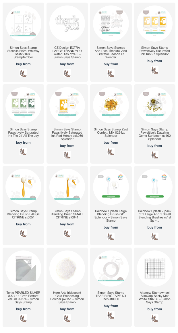
For both of my projects, I paired the Floral Whimsy Stencil with the luscious lemony tones of the Pawsitively Saturated Ink Trio 27 and used Cabbage and Artichoke Pawsitively Saturated Inks from Ink Trio 21 to create the foliage. If you’ve followed my blog for any length of time, you’ll know that I love monochromatic projects, adding in fun textures and accents to keep things interesting. I have been looking at home remodeling ideas on social media, and one of the popular trends right now is called “color drenching,” which perfectly coincides with my monochromatic style! Everything is painted the same color, from the doors to the trim to the walls, and it creates the most elegant and luxurious effect. I wanted to channel that a bit today, creating one project with a traditional crisp white background, but also creating a “color drenched” project with some sunny yellow cardstock.

For my first project, I placed a panel of sunshine yellow cardstock in the center of my sticky mat and blended the pattern with the inks listed above using the the Floral Whimsy Stencil, adding some extra interest with dark and light inks by using both the small and large blending brushes. One of my favorite things about this stencil is that each stencil has registration marks lasered around the edge of the pattern that line up perfectly with your A2 card front so that you can get exact placement of each stencil. Super user-friendly!

Once I had finished blending my color-drenched background, I die cut the detail layer of the Thank You XL die (another purchase last weekend!) twice from some deep green cardstock, adhering the layers together to get some extra height and dimension. I die cut the shadow layer from some silver pearl vellum and adhered all of the layers together, adding them to the card front with some thin strips of foam adhesive. Finally, I finished off this simple, color-drenched card with some coordinating, sparkly Sunbeam Pawsitively Dazzling Gems.

For my second project, I decided to create a flat shaker card, this time with a more lemon meringue color palette, blending the Floral Whimsy Stencil on white, rather than yellow, cardstock. I blended the images in the same fashion, using the two different sizes of blending brush to help add extra shading to the centers of the flowers and leaves, etc. I trimmed the panel down by 1/4″ on all sides, then blended some of the darkest yellow ink from the Pawsitively Saturated Ink Trio 27 around the edges to create a glow on my patterned background. To create the shaker, I adhered some leftover clear stamp packaging from a stamp set around the entirety of the patterned panel with some super sticky double sided tape, then filled it with Zest sequins. I love the effect of these flat shakers; they’re so fun and so sparkly!

For the greeting, I stamped some sentiments from the Thankful & Grateful set onto some white cardstock using Honey ink, then stamped directly over the top with some sticky embossing ink and added some Iridescent Gold embossing powder. This extra step of adding the iridescent sheer embossing powder adds a little extra shimmer and interest to the sentiment. I used the coordinating die for the large “grateful” sentiment, then used my trimmer to trim the sentiment strips. I added the sentiment strips to the center of my shaker with some foam squares and mounted the entire shaker panel with some more super strong double sided tape onto a full size panel of white cardstock. Such a fun way to make a simple stenciled panel a little extra special!

Well, that’s all for my projects today. I hope these sunny yellow cards bring some sunshine to your Thursday! Thanks so much for stopping by today, and have a marvelous day!
Filed Under: simon says stamp Tagged With: extra large thank you, flat shaker, floral whimsy, ink blending, layered stencil, pawsitively saturated, stencil, thankful and grateful

Using Simple Masks to Create Small Scenes!

May 9, 2024

This post was sponsored by Simon Says Stamp. Thanks, Simon!

Hi friends! I have a pair of princess projects using the absolutely darling Once Upon A Time stamp set designed by the incredibly talented Alberto Gava. This stamp set features so many of our favorite fairytale princesses and accessories to visually tell their stories! I have mentioned in previous posts that I have difficulty building scenes with “cute” sets like this; for some reason, my brain finds it difficult to build a design on a completely blank canvas. However, I have found a way to overcome this difficulty with the diffferent masks and stencil sets from Simon Says Stamp. I can use these masks to “shrink” the canvas, which helps me concoct the little scenes a bit more easily. Let’s get started on the details for my projects!

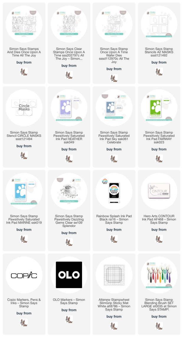
For both of my projects, I stamped several of the images from the Once Upon A Time set, creating elements for a Cinderella scene and a Rapunzel scene. As a super girly mom of three boys and one girl, I am so glad that my daughter loves princesses as much as I do! In fact, she told me that she was stealing this stamp set from me when I was finished with it, the stinker. I stamped the images from Rapunzel using Rainbow Splash Black ink from Simon Says Stamp, and Contour Ink for the Cinderella images so that I could do both outline and no-line coloring. I used both Copic and OLO markers for these images; the OLO color palette fills some of the holes in the Copic color spectrum very nicely, particularly in the purple range!

For my Cinderella card, I placed one of the Circle Masks stencils on my A2 white card front, offsetting the stencil slightly to create a balance the large castle image that I had stamped and colored. I used a sticky mat to keep my stencil in place while blending; these tools make it super simple to create stenciled images without having to worry about your stencils shifting while blending! I used blending brushes to blend Heather and Sky Pawsitively Saturated Inks on my background, also splattering the masked area with some glittery handmade watercolors.

After I had finished blending and splattering my background, I used the same glittery watercolors to add some shimmering details to Cinderella’s dress. (Do you follow @hnicholsillustration on Instagram? If not, you totally should… her illustrations are phenomenal. She adds metallic accents to her dresses all the time and they look marvelous!) I arranged my die cuts on the card front, using the blended circle to ground my little scene, and I popped them all up using foam adhesive for extra dimension and interest, adding a black embossed die cut greeting with a double layer of foam tape to help it pop. Finally, I added some Clear Pawsitively Dazzling Gems for extra sparkle!

For my second card, I used a brighter color palette, in keeping with the bright cheerfulness that exudes from the Rapunzel character in Disney’s Tangled. I centered one of the A2 Masks stencils on my A2 white card front, then used blending brushes to blend Fairway and Marine inks, giving the illusion of both grass and sky behind my die cuts. This is a super simple way to trick your recipient into “seeing” that background without having to go to the trouble of drawing individual pieces of grass!

I arranged the die cuts on my blended background, allowing them to spill over the edges of the blended areas a bit to keep things interesting. I tucked the stamped and die cut sentiment beneath the tree, finally finishing everything off with some Clear Pawsitively Dazzling Gems for extra sparkle!

Well, that’s all for my projects today. You might see some more projects using this set from me, but then again you might not…. my daughter has taken custody of it, and I will have to try to get it back from her, lol! Thanks so much for stopping by today, and have a marvelous day!

Filed Under: simon says stamp Tagged With: A2 masks, circle masks, copic coloring, ink blending, no line coloring, OLO marker, once upon a time, pawsitively dazzling, pawsitively saturated, stencil

Revolutionary New Tools to Up Your Cardmaking Results!

April 24, 2024

This post was sponsored by Simon Says Stamp. Thanks, Simon!

Hi friends! I was recently thinking about how long I’ve been papercrafting, nearly 15 years at this point, and I remarked to my husband how many more fun tools we now have to use to create unique and professional-looking projects. Hot foil, letter press, toner foil, and of course, the MISTI… there are so many interesting new (ish) innovations to take our cardmaking from fantastic to spectacular! When I started stamping, it was just acrylic blocks and some flash-in-the-pan newfangled tools that didn’t really stand the test of time, but I feel like over the last five or so years, the quality of the new tools has increased exponentially, and the quality of our cards has increased with them! Case in point: the Minc machine. This fantastic machine is not exactly new, but companies have recently stated giving us marvelous options to use with it. Simon Says Stamp has been building their collection of Toner Hot Foil prints lately, and the new Diamond Circles Foil Transfer Cards is amongst my favorite. The print is so classy and neutral, perfect for use with tons of different focal points and subjects. Let’s get started with the details on my card!

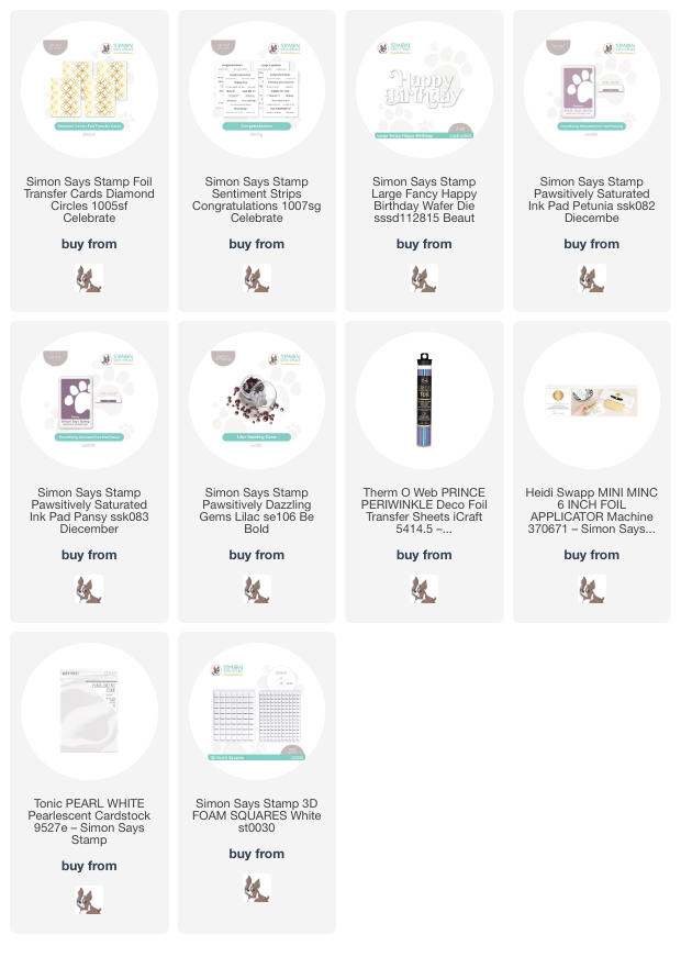
I got hooked on foiling the CZ Design sentiment cards from Simon Says Stamp several months ago, and so scoured the website for toner foil in unique shades beyond the typical metallics. I found that DecoFoil has some utterly divine foil colors, including the Prince Periwinkle DecoFoil. This metallic periwinkle foil is iridescent, so can be paired with a number of different color palettes. I paired Prince Periwinkle DecoFoil with the new Diamond Circles Foil Transfer Cards, running the card through my Minc machine with some Prince Periwinkle foil. When I peeled the foil away, it was like magic, with that gorgeous background print beautifully foiled and a perfect canvas to do some ink blending. I also foiled some sentiments from the new Congratulations toner foil cards set to create some coordinating elements for my card.

After foiling my background, I trimmed down the foiled panel so that I could mat it with an A2-sized panel of deep eggplant cardstock. I then used blending brushes to blend Petunia & Pansy Pawsitively Saturated Inks around the edges of the foiled panel to pick up the pretty purple tones in the iridescent foiled image. I mounted the finished blended background on an A2 eggplant card front, creating a crisp frame around the edges of the panel.

For the greeting, I die cut the Large Fancy Happy Birthday from some pearlescent white cardstock. (Coated and specialty cardstocks in a multitude of colors are another newer innovation that make cardmaking so much more fun and make the results so much more professional looking!) I trimmed down one of my coordinating foiled greeting strips from the Congratulations toner foil card set and popped both greeting components up in the center of my foiled and blended panel using foam squares. Finally, I added a bit more shine with some Lilac Pawsitively Dazzling Gems, which are made of glass and are delightfully sparkly!

Well, that’s all for my project today. You can check out all of the new toner foil cards from the Celebrate release HERE; there are so many marvelous options to see! What cardmaking innovation has taken your cardmaking to the next level? Are there any products that you purchased that you thought you would use more than you do? I want to know!

Thanks so much for stopping by today, and have a marvelous day!

Filed Under: simon says stamp Tagged With: congratulations sentiment strips, foil transfer cards, ink blending, large fancy happy birthday, minc, pawsitively saturated, toner foil

Happy Ever After with New Simon Says Stamp Celebrate!

April 20, 2024

This post was sponsored by Simon Says Stamp. Thanks, Simon!

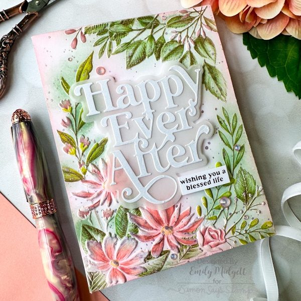
Hi friends! The new Simon Says Stamp Celebrate Release is full of some absolutely stunning new embossing folders, and I fell in love with the grace and elegance of the new Beaufort Floral Frame. It features a beautiful wreath of flowers and lots of lovely foliage, and the images are large enough that you can do tons and tons of techniques to add color and details. I have been super inspired by Suzy Plantamura’s work with colored pencils, (check out her gorgeous work HERE) and thought that I would try out using colored pencils to add details to this delicate embossed image. Let’s get started with the details!

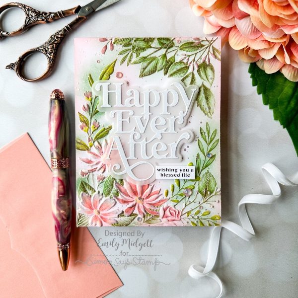
When I first embossed this image from the Beaufort Floral Frame embossing set onto some Hammermill white cardstock, I thought that it reminded me of a magical, ethereal garden, misty and somewhat blurred by the warm, romantic early evening air. I thought the best way to achieve this look was by combining some loose ink blending with colored pencil details. I used small blending brushes to blend Pawsitively Saturated inks Artichoke, Blush, and Cheeky on the floral images, concentrating the deepest colors on the raised areas but also spreading some out over the areas surrounding it, as well. Because coral and green would make a muddy mess if mixed together too intensely, I tried to keep the colors as light as possible where they touched. The result was a lovely garden background, which would have been pretty on it’s own, but I decided to step it up a notch!

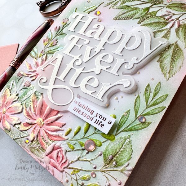
To add some extra details and make the flowers more lifelike, I used colored pencils to add details on each individual petal and leaf, working with very sharp points and keeping a light hand so that the blended color did some of the work for me. (My wrists are not huge fans of pencils, but my artistic soul loves the results!) After I had finished adding the pencil details, I used some super sparkly handmade watercolors from my stash to do some “gilding” on the edges of the petals and foliage, also splattering the entire panel with more of the sparkling watercolors. It reminds me of delicate dewdrops or something equally magical! You can get a bit of an idea of just how sparkly this card is in the photo above; that “gilding” technique adds so much to an embossed card!

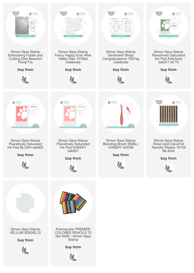
After spending so much time adding the detailed coloring and gilding to the embossed image, I decided to keep the rest of the card simple. I die cut the new Fancy Happy Ever After die from some pearlescent white cardstock and backed it with a vellum shadow to help it stand out a bit from the light background. I also used my Minc machine to add some Simon Says Stamp Rose Gold Deco Foil to the new Congratulations toner foil cards. You can easily leave these sentiment cards black and white, but I think the addition of the foil takes them just one step further towards luxurious elegance. A few gems finished it off with some extra sparkle!

Well, that’s all for my project today. I hope you’ll check out Day 2 of the Celebrate Blog Hop over on the Simon Says Stamp blog. So many prizes and such a wealth of inspiration to be had! You can check out my post from Day 1 of the Celebrate Blog Hop HERE. Thanks so much for stopping by today, and have a marvelous day!

Filed Under: simon says stamp Tagged With: 3D embossing folder, beaufort floral frames, congratulations, happy ever after, pawsitively saturated, toner foil card, wedding card

Gorgeous Denim Blue with New Embossing Folders from Simon Says Stamp!

April 18, 2024

This post was sponsored by Simon Says Stamp. Thanks, Simon!

Hi friends! The new Simon Says Stamp Celebrate Release is now live, and some of my most favorite items are the new Ink Trio 25 and the wide variety of new embossing folders! I have become absolutely obsessed with the embossing folder+ink pad swiping craze, and the dark blue in the Ink Trio 25 is absolutely perfect for use with this technique. It’s dark enough that it can easily cover up most lighter colors (as I showed in THIS post last night). I loved making that navy and coral card so much that I wanted to try it out with all three blue inks from the Ink Trio 25 and the new gender-neutral embossing folders to create some more masculine-friendly projects. I have two blue-tiful cards to share with you today, so let’s get started with the details!

The trick for the ink swiping technique is to make sure that your blending inks are significantly lighter than your swiping ink. You want to make sure that any blending that gets “outside the lines” is covered up by the ink swiping. Luckily, the Night ink from Ink Trio 25 is practically navy blue, so it works beautifully for this purpose! And the super springy foam pad gives great coverage on your debossed panels, almost creating a suction effect to get intense and vibrant inking.

For my first card, I embossed the new Flower Buds Unfolding Embossing Folder onto some Hammermill white cardstock, then flipped the panel over so that the pattern was debossed rather than raised. I then used blending brushes to blend the lighter two inks from Ink Trio 25 randomly all over the pattern, simply adding color to the debossed images. Once I had finished blending, I pressed the Night ink pad directly to the paper and swiped, being careful not to press down too hard to avoid ink smudges inside my patterned debossed areas. I love that this technique picks up the details within the debossed image!! I trimmed down the finished panel slightly and mounted it in the center of an A2 sized dark blue glitter cardstock card front, creating a sparkly mat around the edges of my textured and patterned panel.

For the greeting I chose to heat emboss the “anniversary” from the Happy Combos stamp set, using white embossing on navy blue cardstock, which I paired with the coordinating Happy Die cut from iridescent white mirror cardstock and a vellum shadow. I popped these die cuts up on my debossed and inked panel, then die cut the Ornamental Fine Leaves die from some more dark blue glitter cardstock. These delicate leaves are just simple enough that they can easily be used for a masculine card. You could definitely switch out the “anniversary” die cut for “birthday” and cut the leaves from plain navy cardstock to have a perfect masculine card! Finally, I added a trio of Clear Pawsitively Dazzling Gems for a bit more sparkle.

For my second project, I used the same technique with the new Feather Spiral embossing folder to create a simple Father’s Day card. I first embossed a panel of white A2 cardstock with the embossing folder, flipped the panel over, and blended the lighter two inks from Ink Trio 25 in the debossed areas. I swiped the entire panel with my Night ink pad, again putting the pad directly to the paper and picking up those details beautifully!

For the greeting, I heat embossed a poignant sentiment from Papa and paired it with the new Fancy Father die set, cutting the detail layer from some more navy blue cardstock and layering it with a vellum shadow. To accent the sentiment and ground it a bit so that it wasn’t just floating in the center of the card, I trimmed down a strip of Ocean Breeze glitter cardstock and thinner strip of navy blue cardstock, adhering them to the right hand side of my card front with liquid adhesive. I popped up the sentiment pieces with some foam adhesive, orienting them over my accent strips.

I absolutely love this technique; I think that the possibilities are endless when you change up your ink colors. I think it would be fun to try with watercolored images, too! I can’t wait to experiment more! Thanks so much for stopping by today, and don’t forget to come back tomorrow for Day 1 of the Celebrate Blog Hop. Inspiration abounds with these blog hops, so you won’t want to miss it!

Filed Under: simon says stamp Tagged With: 3D embossing folder, father's day, feather spiral, flower buds unfolding, happy combos, ink swiping, masculine, ornamental fine leaves, papa, pawsitively saturated

  • « Go to Previous Page
  • Page 1
  • Interim pages omitted …
  • Page 3
  • Page 4
  • Page 5
  • Page 6
  • Page 7
  • Interim pages omitted …
  • Page 9
  • Go to Next Page »

Primary Sidebar

  • Facebook
  • Instagram
  • Pinterest
  • YouTube

Favorite Shops

Secondary Sidebar

Subscribe

Enter your email address to subscribe to this blog and receive notifications of new posts by email.

Instagram
Something is wrong.
Instagram token error.
Follow
Load More

Archives

Tags

3D embossing folder alcohol markers better press birthday birthday card blog hop card kit christmas christmas card christmas tag colored pencil copic copic coloring Daniel Smith die cutting embossing folder embroidery felt giveaway holiday holiday card hot foil ink blending karin brushmarker pro layered stencil masculine my monthly hero new release no line coloring no line watercolor OLO marker olo markers original illustration pawsitively saturated rainbow shaker card slimline stamping stamptember stencil thank you thinking of you valentine's day video watercolor

Popular Posts

Simon Says Stamp Joy For You Blog Hop- Day 1!
Simon Says Stamp Joy For You Release-Now Available!
Frozen Fractals All Around with New Simon Says Stamp Joy For You Release!
Vintage Peach Ornament with New Simon Says Stamp Joy For You Release!
Shaped Holiday Shaker Card with New Simon Says Stamp Jolly Season Card Kit of the Month!
Holiday Postage with New Simon Says Stamp!
Simon Says Stamp Glory to the Newborn King Holiday Kit-Part II!
Pinkfresh Studio 5th Birthday!
Studio Katia 2nd Anniversary Blog Hop!
Altenew Build A Flower: Fuchsia Blog Hop+Giveway!

Disclosure

Some affiliate links are used in my posts. This means that, should you click on one of my links and purchase something from that company, I will receive a small portion of the sale at no extra cost to you. I use the money earned from these sales to help maintain my blog. I so appreciate you visiting and, if you do choose to use one of my affiliate links, thank you so much for your support!
Copyright © 2026 ·Brunch Pro Theme · Genesis Framework by StudioPress · WordPress · Log in
Loading Comments...