This post was sponsored by Simon Says Stamp. Thanks, Simon!
Hi friends! I have a project to share with you today using one of my most favorite stamp designs that I’ve ever illustrated: Blissful Bouquet. I absolutely love using bouquet builders to create unique bouquets, and so I made sure to add lots of options for foliage and filler flowers to create interesting arrangements with the larger peony and dahlia images. Dahlias come in such a huge range of colors, and so I wanted to create a late-summer bouquet that would also work for early fall using some vivid orange, a shade that doesn’t see much love in my studio! Let’s get started with the details on my project.

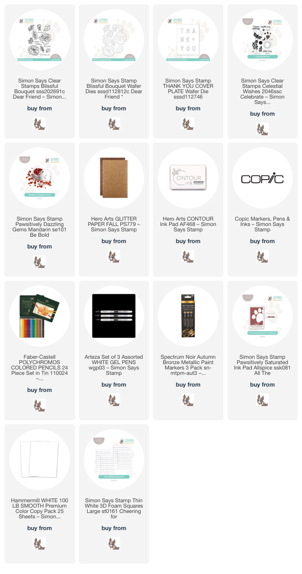
I began by stamping the dahlia flower and foliage and some eucalyptus branches from the Blissful Bouquet stamp set using Contour Ink onto Hammermill white cardstock so that I could do some no-line coloring with Copic markers. I used some fiery and vibrant yellow and orange markers for the dahlia image, then used some warm greens to add color to the foliage, as well. Because the dahlia is generously sized, I was able to add a bit more dimension and depth to the main floral focal point using some colored pencils directly over the top of the alcohol marker coloring. It can be tricky to add shadows and shading to orange, for me at least, so lightly coloring the most deeply-shadowed petals with a mahogany brown colored pencil helps to create more contrast and make the flowers practically jump off of the paper!

After I had finished coloring, I die cut each of the images with the Blissful Bouquet coordinating dies and added some deep orange marker around the white die cut edges to coordinate with the orange background. I also used a white gel pen and Autumn Bronze paint marker to create the center of the dahlia. With no-line coloring, those super delicate flower centers can be a bit of a challenge, so ignoring the flower stamens on the stamped image while coloring the petals makes things a bit less tricky. I like using opaque coloring mediums over the top of the finished alcohol marker coloring to make sure that I don’t lose those details.

After I’d finished adding all of the details to the colored floral die cuts, I die cut the Thank You cover plate from some vibrant deep orange cardstock, then used a blending brush to blendAllspice Pawsitively Saturated Ink around the edges, tying in the deep mahogany pencil details to the background. I backed the die cut with some brown glitter cardstock and popped the entire panel up on another panel of the same deep orange cardstock using foam squares. I arranged the flower and foliage die cuts along the edge of the card front, overlapping the sentiment die cut slightly but leaving enough of the letters visible to make the “thank you” easily legible. I also heat embossed a coordinating greeting from Celestial Wishes using white embossing powder on the same deep orange cardstock, popping it up on the card front with more foam adhesive. Finally, I added some additional sparkle with some Mandarin Pawsitively Dazzling Gems.
This layout is so different from my typical symmetrical layouts… I kinda love it! Going to have to try it again with a different project. I hope you enjoyed this floral bridge between summer and fall. Thanks so much for stopping by today, and have a marvelous day!