• Skip to main content
  • Skip to primary sidebar
  • Skip to secondary sidebar

Sixth Street Sundries

Emily Midgett

  • Home
  • About Me
  • Contact
  • OLO Marker Color Swatch Chart
  • Shop

wedding card

Simon Says Stamp Moments In Time Release Blog Hop- Day 2!

May 31, 2025

This post was sponsored by Simon Says Stamp. Thanks, Simon!

Hi friends! I am hopping along with my friends at Simon Says Stamp to celebrate their newest release: Moments in Time! You should have arrived here from Debby Hughes and your next stop is Yana Smakula. You can also start back at the beginning at the Simon Says Stamp Blog in case you get lost. I am always over the moon excited when one of my illustrations are released, and this one is extra special to me. My husband and I got married 16 years ago this June, and one of the cards that we received with a wedding gift had the sentiment “May your troubles be less, and your blessings be more, and nothing but happiness come through your door.” It made such an impact on me that I still remember it (so many) years later, and so when I was designing Orange Blossom Blessings, I absolutely had to include it with the sentiments for this wedding-themed set. We are past the wedding phase of our mid-20’s now, but we do have a wedding coming up this summer for a friend of my husband’s, so I took the opportunity to use Orange Blossom Blessings to create a wedding gift and card. Let’s get started with the details!

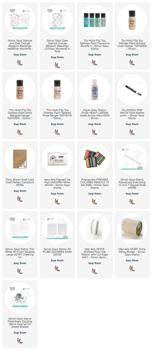
*I have gathered links to all of the products used at the bottom of the post for your convenience, using affiliate links. Thank you for shopping with my links! I truly appreciate your support for my work!*

I’ve been doing some organizing and cleaning in my craft room closet; my mom was living in my craft house for six months while she recuperated from a nasty car accident, so while I was helping to care for her, my office organization was sorely neglected. She went home a couple of weeks ago, so as I have been slowly trying to get my office back under control, and I found these papier machê ornaments that I purchased long ago to embellish. I thought they’d look gorgeous with orange blossoms painted on to create a keepsake ornament for the bride and groom, and of course I had to make a coordinating card!

I stamped one of the floral swags directly onto the papier machê ornament using Simon Says Stamp White Pigment Ink Pad and pulled out my acrylic paints in shades of peach, buttery yellow, and muted teal to add some color to the ornament. I have not really worked with acrylic paints before, though I have a fairly extensive collection (ha) so it was a bit of a learning experience for me, but I am thrilled with the results. I can’t wait to play with them even more! I kept the colors light and bright, creating a lovely contrast between the mid-brown background from the pastel blooms. After I had finished painting the flowers, I used a white paint pen to add a “Mr. & Mrs.” to commemorate the bride and groom’s special day! Once I had completed the ornament, I added a white bow to the top with my glue gun. I hope the happy couple love it!

To create the coordinating card, I stamped some more of the blooms from Orange Blossom Blessings onto an A7 panel of Kraft Cardstock using the Simon Says Stamp White Pigment Ink Pad. I love working with colored pencils on colorful (even brown) cardstock; I think that the seamless pop of color on the background is so unique and lovely! I stamped the orange blossom swag in one corner, then rotated my cardstock in my MISTI to stamp the same swag in the opposite corner. I also stamped a few individual blooms and foliage on a separate panel of Kraft cardstock. I used my colored pencils to add vibrant color to each of the images, die cutting the individual images once colored. I also used the Simon Says Stamp T-square Ruler to create a frame around the edges of the card front, drawing the eye to the center of the card. I love using this trick to create a bit smaller visual canvas for my focal point!

After I had finished coloring and die cutting the floral images, I used white pigment ink with embossing powder to stamp my favorite sentiment from Orange Blossom Blessings on some more Kraft cardstock. I used the coordinating die to cut the greeting out, then adhered it to the card front with foam adhesive. I tucked the individual flowers next to the die cut sentiment with some thin foam adhesive squares. I tied a double twine bow and adhered it beneath the floral accents, finally adding a few Opal Pawsitively Dazzling Gems for some sparkle!

Well, that’s all for my projects today. Now for some fun giveaway and freebie information!

Simon Says Stamp is giving away a $25 coupon to every stop on the hop, selected from each blog comment section. Winners will be selected and posted on the Simon Says Stamp blog on Wednesday the 4th of June. All winners can email Simon Says Stamp to claim his/her prize!

Simon Says Stamp is also offering a sweet freebie for blog hoppers! Simply make any purchase from the Moments in Time collection to receive the to-be-released Best Fishes stamp set totally free!

Your next stop on the hop is Yana Smakula. Thanks so much for stopping by today, and happy hopping!
Filed Under: simon says stamp Tagged With: acrylic paint, colored pencil, distress paint, kraft, orange blossom blessing, ornament, wedding card, wedding gift

Ink Swiped Wedding Card with New Simon Says Stamp!

May 6, 2025

This post was sponsored by Simon Says Stamp. Thanks, Simon!

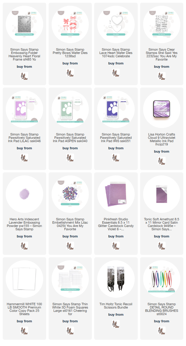
Hi friends! I have a unique project to share wtih you today using some fun old and new goodies from the new Simon Says Stamp  You Are My Favorite Release. The ink-swiping trend is such a fun way to make a big impact on a card with relatively little time commitment! I paired this fun technique with the new Heavenly Heart Floral Frame Embossing Folder to create this dainty wedding card. Let’s get started with the details!

*I have gathered links to all of the products used at the bottom of the post for your convenience, using affiliate links. Thank you for shopping with my links! I truly appreciate your support for my work!*

To begin, I embossed a panel of plain white cardstock with the new Heavenly Heart Floral Frame Embossing Folder, then flipped the panel over so that the panel was debossed, that is, with the pattern pushed down rather than raised up. I then used Simon Says Stamp’s small blending brushes to blend Lilac and Aspen Pawsitively Saturated Inks on the debossed flowers and foliage. The great thing about this technique is that you don’t have to be too fastidious with your ink blending and keep things too neat; any messy edges will be covered up with the dark ink swiping! Once I had “colored” all of the individual images, I pressed the Iris Pawsitively Saturated Ink Pad directly to the paper, sliding it over the flat parts of the debossed panel. The subterranean debossed images maintain their color, creating a colorful patterned background panel.

To enhance the heart shape in the center of the debossed pattern, I die cut a dainty and lacy heart frame using the previously-released Lace Heart Die from some coordinating lilac colored glitter cardstock. I popped the lacy heart frame up on the card front using thin strips of foam adhesive and topped the point of the heart off with a coordinating lilac matte foil bow cut using the Pretty Bows die set.

For the greeting, I stamped a sentiment from the new She Said Yes stamp set onto some coordinating minty pastel cardstock using Lisa Horton Ultraviolet ink, then embossed the pigment ink with Hero Arts Iridescent Lavender Embossing Powder to create a shimmering iridescent sentiment. I used my sharp scissors to cut the sentiment out, then popped it up in the center of the heart with a double layer of foam adhesive squares to give it a little extra height. Finally, I added a few sequins from the new Lilac Embellishment Mix to add a little more sparkle to the card!

Well, that’s all for my project today. Isn’t the ink swiping technique so much fun?? I just love the different looks that you can create simply by your color palette choices! Thanks so much for stopping by today, and have a marvelous day!

Filed Under: simon says stamp Tagged With: die cutting, embossing folder, heavenly heart floral, ink swiping, lace heart die, lisa horton ink, pawsitively saturated ink, pretty bows, she said yes, wedding card

Shimmering Pink Wedding Card with Simon Says Stamp!

April 22, 2025

This post was sponsored by Simon Says Stamp. Thanks, Simon!

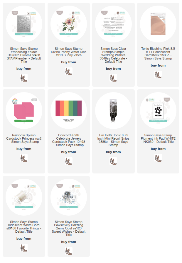
Hi friends! We are coming up on wedding season, and I have a project to share with you today that would work for both a wedding shower or a wedding gift! I love combining standalone die cuts with the gorgeous texture of Simon Says Stamp’s 3D Embossing Folders, and I’ve been loving experimenting with coated specialty papers to enhance the exquisite details on the embossed images. I used some gorgeous pearlescent pink cardstock with several different shades of solid pink cardstock to create this pink-on-pink-on-pink wedding card. Let’s get started with the details!

*I have gathered links to all of the products used at the bottom of the post for your convenience, using affiliate links. Thank you for shopping with my links! I truly appreciate your support for my work!*

To begin, I embossed a panel of gorgeous pearly pink cardstock using the Delicate Blooms Embossing Folder and used my sharp scissors to cut the large floral bouquet out. Using the Tim Holtz Mini Recoil Snips made this fussy cutting go super fast, even with this large and intricate image! I mounted the large bouquet on the front of a bright pink A2 card front using foam adhesive squares, creating vibrant contrasting background for the delicate, pearlescent floral bouquet.

After adding the intricately embossed image to my card front, I knew that the main focal point still needed a bit of extra oomph, so I die cut the Divine Peony die set from some blush cardstock and adhered all of the layers together using liquid adhesive to create a tone-on-tone dimensional die cut. I also stamped the sentiment from Simple Wedding Wishes onto some strips of deep raspberry cardstock, still maintaining the overall theme of pink but allowing the boldly-colored sentiment strips to stand out amongst the softer pinks in the background.

I adhered the sentiment strips to the card front with a double layer of foam adhesive, then arranged the individual Divine Peony bloom and foliage around the sentiment. I added some rose gold paint pen to the flower center, then adhered some Opal Pawsitively Dazzling Gems in the empty areas and tucked a bow created with the Iridescent White Cord next to the sentiment.

Well, that’s all for my project today! I love playing with color and texture, and standalone dies plus embossing folders plus pearlescent cardstock is a total win in my book! Thanks so much for stopping by today, and have a marvelous day!

Filed Under: simon says stamp Tagged With: delicate blooms, die cutting, embossing folder, wedding card, wedding shower, wedding wishes

One Die, Two Cards with Simon Says Stamp!

July 31, 2024

This post was sponsored by Simon Says Stamp. Thanks, Simon!

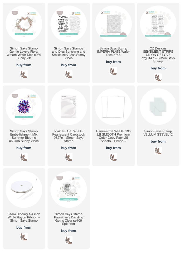
Hi friends! I have a pair of crisp projects to share with you today using the same die in two different ways! When working with monochromatic or tone-on-tone color palettes, I like to use lots of different textures of cardstock in the same color palette to keep the contrast and visual interest high. For today’s projects, I die cut the newer Gentle Layers Floral Wreath dies from both plain Hammermill white cardstock as well as pearlescent white cardstock, then added some coloring and textural details with other die cuts to create these crisp and clean cards. Let’s get started with the details!

For both of my projects, I used the delicate blooms from the Gentle Layers Floral Wreath dies to create some decorative floral focal points, using my alcohol markers to add vibrant pinks to one set of the floral die cuts and keeping the others plain. Using alcohol markers to add vibrant color to specialty cardstocks is a fun way to get extra uses out of your fun coated cardstock!

For my first project, I created a fun shaker card, taking advantage of the open window behind the Gentle Layers Floral Wreath die set for my shaker background. I die cut the floral wreath and coordinating flower dies from both plain white cardstock and white pearl cardstock, then used alcohol markers to add vibrant pinks to only the flower die cuts, layering the finished flowers on their correct spot on the Gentle Layers Floral Wreath die cut. I didn’t go too crazy with the shading on the flowers, simply using one color per flower, then using the different layers to add interest and contrast to the images.

To create my shaker window, I used a circle die that was slightly smaller than the opening for my circular wreath die cut, cut on the bottom right of my A2 card front and backed with some clear acetate. I filled my shaker with some Summer Blooms embellishment mix, then adhered the finished wreath around the circular window using liquid adhesive. I trimmed down a wedding sentiment strip (which I think is from a discontinued set, but THIS set is similar!) and added a delicate bow, dyed a coordinating shade of pink using one of the same alcohol markers and some white ribbon. Finally, I added a few Clear Pawsitively Dazzling Gems for added sparkle!

For my second project, I wanted to take advantage of the leftovers from my first card. Because I had die cut the wreath components from both Hammermill white cardstock and pearlescent white cardstock and used only the pearlescent flowers for the wreath arrangement, I had a pearlescent wreath base and plain white flowers leftover. I changed up the layout a bit, preferring instead to arrange parts of the wreath and flowers around the edge of a vellum die cut circle.

For the background, I die cut a panel of white cardstock using the Imperia cover plate die, which adds beautiful pierced texture to your panel of cardstock without actually cutting any shapes from it. I added the embellished vellum circle die cut to the textured card front, hiding the foam adhesive behind the solid die cuts. I embossed a sentiment from Sunshine and Smiles stamps and dies using silver embossing powder and added it to the center of the vellum circle. Finally, I added a few sparkling Clear Pawsitively Dazzling Gems to fill the arrangement out a bit more and cover more of the card front.

Well, that’s all for my projects today! I cannot believe that we are already approaching back to school time… the summer has flown by so quickly! I can’t wait to get my fill of holiday cardmaking very soon. Thanks so much for stopping by today, and have a marvelous day!

Filed Under: simon says stamp Tagged With: alcohol markers, engagement card, gentle layers floral wreath, imperia plate, sentiment strips, shaker card, sunshine and smiles, wedding card

Papertrey Ink May Release Fun!

June 8, 2024

Hi friends! The folks at Papertrey Ink were kind enough to share their May release with me, and I’ve been so busy during the month of May that I haven’t been able to share anything until now. My stamping roots start at Papertrey Ink, so it’s such a thrill to be able to use their products as a guest designer! My husband and I will celebrate our 15th anniversary later this month, and while we don’t have any over-the-top plans to celebrate like we had hoped (taking a trip to England and Scotland was contemplated, but we can’t really leave the kids for that long at this point), we have very fond memories of our 10 year anniversary trip to an all-inclusive resort to Mexico. We were particularly enamored of the sunsets; my husband proposed to me during a gorgeous September sunset on a bluff overlooking a river, so sunsets have always held a special place for us, and the sunsets during our trip to Mexico were astonishingly beautiful. I channeled some of those vivid Mexican sunset colors for these summery projects, so let’s get started with the details!

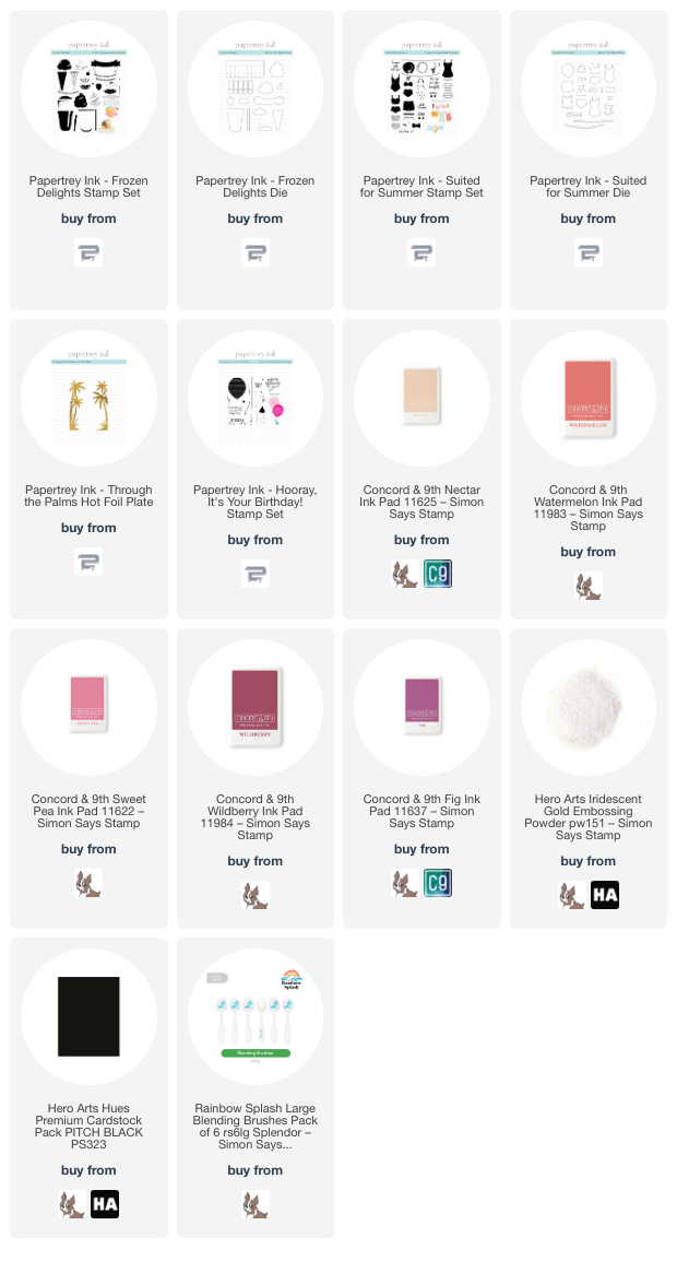
Whenever I am creating a suite of projects, I try to use coordinating ink colors, which can help keep things cohesive even if the subject matter on each card is different. The layering stamps included in the Papertrey Ink May release lent themselves well to summery sunset colors, so I selected Nectar, Watermelon, Sweet Pea, Wildberry, and Fig inks from Concord and 9th to create a unique, warm sunset palette.

For my first card, I hot foiled the beautiful Through the Palms hot foil plate from the May Release onto some white cardstock using the iridescent gold Aura hot foil from Spellbinders. The colors in this foil worked perfectly to create a vibrant tropical card! I used blending brushes to blend the ink colors, working from the darkest at the top to the lightest at the bottom.

I love a good shaker card, and the new-ish flat shakers are so simple while still allowing the entirety of your background to show. I loved the color blend and shining, iridescent palms so much that I didn’t want to cover any of it up, so I used some leftover packaging to create a shaker pocket around the entire blended panel, which I then filled with a variety of coordinating sequins from my stash. For a simple sentiment, I heat embossed a greeting from Hooray, It’s Your Birthday from Papertrey Ink using Iridescent Gold embossing powder from Hero Arts, which looked so gorgeous on the black cardstock. I fussy cut the finished sentiment with my scissors, then popped it up on the shaker front with some foam adhesive, embellishing only with a sparkling gold twine bow.

My second card uses the same vivid color palette, this time to create a sweet patterned background using the Suited For Summer layering stamp set. This set can be used in so many different ways, but I couldn’t resist creating some custom patterned paper using the different swimming suits and accessories included in the set. Using the same ink palette as the first card, I stamped many of the different elements from Suited For Summer onto an A2 panel of white cardstock, starting from the largest image and working my way to the smallest image, filling in bare spots and rotating the stamps so that the pattern was cohesive but still looked somewhat random. I also stamped a few extra swimming suits, the beach hat, and some sassy sunglasses, then used the coordinating dies to cut them out.

The colors were so vibrant on the stamped images, but I still wanted to add some contrast and make those blank spots a bit less open, so I used one of my fine point black markers to add tiny black dots over the white spaces on the background, as well as adding some black accents on the stamped images themselves. I trimmed down a panel of thin vellum to keep the die cuts from getting lost on the busy, colorful background, then added the die cuts and greeting (from Suited For Summer) on the vellum panel before adhering. I flipped the vellum panel over and added some foam adhesive squares behind the solid die cuts to hide the adhesive, then added it to the center of the custom patterned panel. I finished the project off with a few sparkling gems! I think this would be an adorable shower or wedding card!

For my last project, I used the fabulous new Frozen Delights stamp set to create this scrumptious looking gelato cone. I find the colors of gelato to be exquisite; they’re so much more vibrant than traditional ice cream. I used the “rock ‘n’ roll” stamping technique to add some extra shading on the solid layer of the swirled ice cream, stamping the first layer in Sweet Pea, then inking only one side of the stamp up with Wildberry and using my microfiber cloth to muddle the edges so that the shadow faded more smoothly. I stamped the last layer using Fig, the cone with Nectar and Watermelon, and the cherry and banner also with Watermelon. I die cut the finished images with their coordinating dies.

To create a lovely coordinating glow behind the gorgeous cone, I lightly blended Watermelon, Sweet Pea, and Wildberry inks in the center of a panel of white cardstock, then splattered the background with some super sparkly handmade watercolors. After it had dried, I trimmed the panel down and matted it with a black A2 card front, which completed the third black accent (keeping to the “rule of three” whenever I can for accent colors!). I popped up the ice cream cone with some foam adhesive, then added the banner with a double layer of foam adhesive to help it pop a bit. Sometimes simplicity is just as effective as the more involved projects!

Well, that’s all for my projects today. Thank you to Papertrey Ink for the opportunity to play with these super fun goodies! You can check out the entire May release HERE. What a great way to kick off the summer. Thanks so much for stopping by today, and have a marvelous day!

Filed Under: Papertrey Ink Tagged With: birthday, flat shaker, frozen delights, hooray it's your birthday, ice cream, suited for summer, summer, through the palms, wedding card

  • « Go to Previous Page
  • Page 1
  • Page 2
  • Page 3
  • Page 4
  • Page 5
  • Go to Next Page »

Primary Sidebar

  • Facebook
  • Instagram
  • Pinterest
  • YouTube

Favorite Shops

Secondary Sidebar

Subscribe

Enter your email address to subscribe to this blog and receive notifications of new posts by email.

Instagram
Something is wrong.
Instagram token error.
Follow
Load More

Archives

Tags

3D embossing folder alcohol markers better press birthday birthday card blog hop card kit christmas christmas card christmas tag colored pencil copic copic coloring Daniel Smith die cutting embossing folder embroidery felt giveaway holiday holiday card hot foil ink blending karin brushmarker pro layered stencil masculine my monthly hero new release no line coloring no line watercolor OLO marker olo markers original illustration pawsitively saturated rainbow shaker card slimline stamping stamptember stencil thank you thinking of you valentine's day video watercolor

Popular Posts

Simon Says Stamp Joy For You Blog Hop- Day 1!
Vibrant Poinsettia Holiday Wishes with Simon Says Stamp!
March 2020 My Monthly Hero Blog Hop+Giveaway!
Simon Says Stamp Glory to the Newborn King Holiday Kit-Now Available!
Charity Blog Hop!
Vintage Peach Ornament with New Simon Says Stamp Joy For You Release!
2018 Autism Awareness Hop!
April 2018 My Monthly Hero Blog Hop+Giveaway!
Honey Bee Stamps Birthday Blog Hop, Day 2!
Altenew July Stamp and Die Blog Hop+Giveaway!

Disclosure

Some affiliate links are used in my posts. This means that, should you click on one of my links and purchase something from that company, I will receive a small portion of the sale at no extra cost to you. I use the money earned from these sales to help maintain my blog. I so appreciate you visiting and, if you do choose to use one of my affiliate links, thank you so much for your support!
Copyright © 2026 ·Brunch Pro Theme · Genesis Framework by StudioPress · WordPress · Log in
Loading Comments...