This post was sponsored by Simon Says Stamp. Thanks, Simon!
Hi friends! I have been having some fun playing around with different color combinations than I normally utilize, which is usually how I begin my projects. I find a stamp, die, or stencil on which I want to focus, then turn to my color combination Pinterest board to figure out what color palette I would like to use. For today’s project, I found a lovely peach-plum-mauve color palette image, which I thought was a great transitional color palette from summer into autumn! You still have the warm and vivid tones of the coppery peaches, but the richness of that plum just screams “autumn” to my eyes. Once I had my color palette selected, I pulled out some coordinating cardstocks, embossing powders, and gems to pull everything together for a cohesive project. Let’s get started with the details!
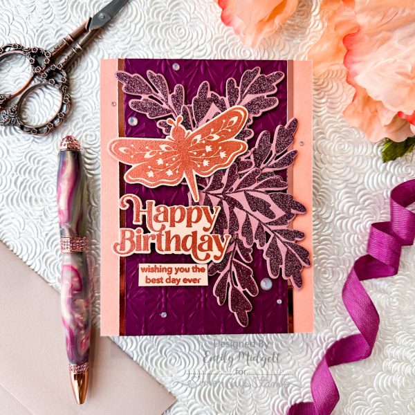
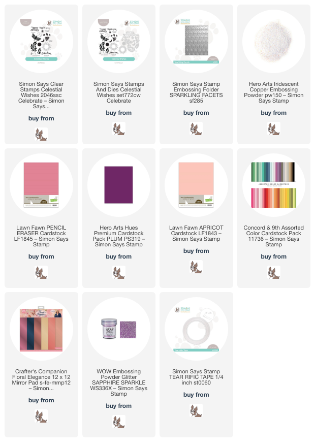
To begin, I heat embossed the leaf clusters from the Celestial Wishes stamp set onto some Lawn Fawn Pencil Eraser cardstock. I used some super sparkly glitter embossing powder from WOW!, which unfortunately seems to be discontinued, but THIS is a good substitute! After heat embossing the leaves, I used the coordinating dies to cut them out. I also heat embossed the lovely stylized dragonfly image and sentiment components from Celestial Wishes onto some Lawn Fawn Apricot cardstock using Iridescent Copper embossing powder, which creates a shimmery, tone-on-tone effect.
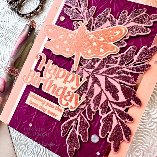
After heat embossing and die cutting the different components for the focal point, I ran a panel of Hero Arts Plum cardstock through my die cutting machine using the Simon Says Stamp Sparkling Facets Embossing Folder. This continuous geometric pattern is a great foil for the flowy foliage and botanical dragonfly images. I trimmed the embossed panel down a bit and mounted it in the center of a Concord and 9th Grapefruit card front using Tear-rific Tape. I added a few thin strips of copper foil cardstock on either side of the embossed panel to add some extra metallic accents to the background before arranging my die cuts.
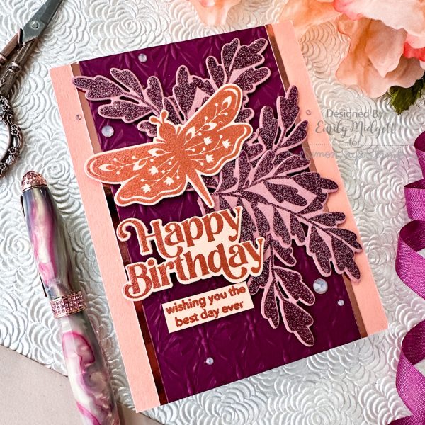
After I had finished my background, I arranged the leaves, dragonfly, and sentiment die cuts, adhering them with a double and single layer of foam adhesive. Using a double layer of foam squares for the dragonfly and sentiment allows them to pop a bit more from the background. Finally, I added a few shimmering gems for added sparkle and shine!
Well, that’s all for my project today! Finding ways to incorporate the color palette into each element of my cards is so much fun. I hope you’ll give it a try! Thanks so much for stopping by today, and have a marvelous day!
Leave a Reply