This post was sponsored by Simon Says Stamp. Thanks, Simon!
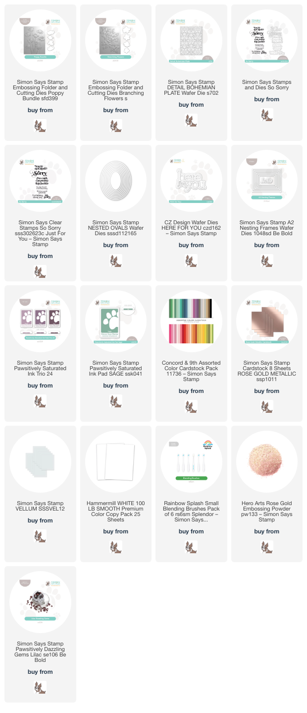
Hi friends! I am back today with a pair of sympathy cards featuring some of the new embossing folders from the Simon Says Stamp Be Bold release. Like stencils, I find embossing folders to be amongst the simplest and most versatile products in my craft room. You can create so many unique looks with them with something as simple as changing up your cardstock from white to colored cardstock. Today, I have used the Poppy Bundle and Branching Flowers embossing folders, both of which create beautifully intricate textures on your card front and also come with matching dies to allow for maximum opportunities to add depth and height to your projects! Let’s get started with the details.
My cards started with some inspiration from Instagram using a technique that I’ve never tried before: ink swiping. I’ve seen lots of reels of crafters embossing their papers using intricate embossing folders, flipping the paper over so that the patterns are debossed rather than embossed, then using small blending brushes to add color to the patterns and images. Most of these videos have then swiped black pigment ink pads over the top of these embossed panels, allowing the ink pads to skim only the raised portion of the panels and leaving the colorful blended areas alone. I tend to use pigment ink pads only in conjunction with clear embossing powder, so I wondered if I could successfully recreate this technique using dark dye ink, allowing me to create colorful cards and still stay true to the technique. And, to my delight, it worked. It worked *beautifully.* I am now officially obsessed.

For my experiment with today’s cards, I selected a muted purple color palette based on the Pawsitively Saturated Ink Trio 24. Simon Says Stamp’s newer additions to the Pawsitively Saturated ink family have featured luscious gradients, with great contrast between the lightest and darkest shades of the trios. This is particularly true for Pawsitively Saturated Ink Trio 24.

For my first project, I die cut a large white oval using the Nested Ovals die set, then flipped it over and ran it through my die cut machine using the Branching Flowers embossing folder. I flipped it over so that the scratched side would be the embossed side, that is, the side on which the pattern is raised up, while the “clean” side would have the pattern debossed down into the cardstock. I then used small blending brushes to blend the two lighter shades of purple from the Ink Trio 24 in the center of the flowers, concentrating the darker shade in the center. I used Sage Pawsitively Saturated Ink for the foliage, not being overly persnickety about making sure that the green ink stayed only on the leaves, because anything that spilled over outside of the leaves would most likely be covered up by the super dark Aster ink.
After I had added simple blending to the debossed images, I carefully swiped my Aster ink pad over the raised areas. I absolutely love that you can enhance the intricate details of the image with the dark ink using this technique!! I splattered some sparkling rose gold glitter watercolors on the oval die cut and added some details to the flower centers for some added luxury, but the pattern looks pretty even without this addition.

After I had finished adding color to my debossed oval die cut, I ran an A2 panel of coordinating lavender cardstock through my die cut machine using the Detail Bohemian Plate. This plate adds pierced texture and is a great background for my detailed floral die cut. To accompany the somber color palette, I heat embossed a sympathy greeting from the lovely So Sorry stamp set, which features some unique greetings that are great for sympathy or thinking of you cards. I heat embossed the sentiments using rose gold embossing powder on vellum, then die cut them with their coordinating dies. I added the greeting die cuts to the floral background, then embellished the finished product with some Lilac Pawsitively Dazzling Gems.

My second card features a simpler technique that I love to use with embossing folders, which allows the details of the embossed images to be a bit subtler for added texture behind a greeting. I ran the Poppy Bundle embossing folder through my die cutting machine with another panel of the same lavender cardstock used on my first card, this time right side up so that the pattern would pop up rather than be debossed down. Then, I used blending brushes to blend Pansy & Aster from the Pawsitively Saturated Ink Trio 24 around the edges of the panel. Ink blending after embossing allows some of those deeply embossed details to be enhanced with the darker ink. I kept the center of the card true to the lavender cardstock, blending only around the edges of the embossed panel.
Once I had finished blending, I used some sparkling handmade glitter watercolors to “gild” the edges of the embossed flower petals. It’s difficult to capture this level of sparkle in a photo, but it’s absolutely magical in real life!

For the greeting, I die cut the detail layer from the Here For You die from some Metallic Rose Gold mirror foil cardstock and backed the intricate die cut with a vellum shadow, using thin strips of clear dimensional adhesive to add the greeting to the middle(ish) of my embossed background. The card needed a little something else to draw the eye towards the greeting and add a touch of contrast, so I die cut the A2 Nesting Frames dies from some deep eggplant cardstock and added a frame around the edge of my embossed panel, popping it up with thin strips of foam adhesive. Finally, I added a trio of Lilac Pawsitively Dazzling Gems for one last touch of sparkle!
Well, that’s all for my projects today! I love experimenting with embossing folders, and I have some more fun projects to show you using more of the ink-swiping technique. Thanks so much for stopping by today, and have a marvelous day!