• Skip to main content
  • Skip to primary sidebar
  • Skip to secondary sidebar

Sixth Street Sundries

Emily Midgett

  • Home
  • About Me
  • Contact
  • OLO Marker Color Swatch Chart
  • Shop

Archives for September 2022

Blue Christmas with Spellbinders!

September 19, 2022

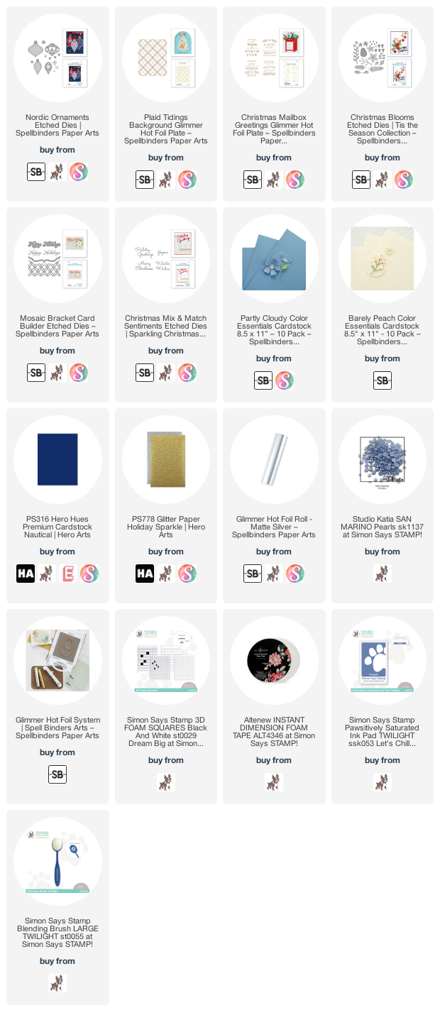
Hi there! I have been playing with some new (and old!) goodies from Spellbinders, including the absolutely stunning new Nordic Ornaments dies, designed by the super talented Zsoka Marko! These ornaments have a classic feel, with lots of details and tons of ways to customize them to your own tastes. I have a project using the Nordic Ornaments traditionally with all of the layers, and then another project using them as a base for other holiday dies, both featuring a unique blue/navy/silver color palette, with pops of pale peach. Let’s get started with the details!

Both of my cards are an homage to one of my favorite shades of cardstock from Spellbinders: Partly Cloudy. It’s a gorgeous shade of medium blue, that can be made brighter or more muted, depending on which colors are paired with it! Before beginning my cards, I sat down with my Glimmer hot foil machine and some Matte Silver foil to create some accents for the Nordic Ornaments. I foiled the stunning new-ish Plaid Tidings hot foil plate on some of the Partly Cloudy cardstock using Matte Silver. I also hot foiled some sentiments using the Christmas Mailbox Greetings. Because I can’t keep my foil machine out on my desk all the time, I occasionally will spend an hour or two of quality time with my foil plates, Glimmer machine, and foils creating tons of pieces to use now and save for later! I have folders for different companies full of foiled accents, so that I can just grab and go when I’m creating.

My first project features the Nordic Ornaments in their intended design, with the layered dies. I die cut the base layer from some navy blue cardstock, then the large detail layer from some more Partly Cloudy cardstock. I die cut the details from sparkly silver glitter cardstock and Spellbinder’s Barely Peach cardstock. (That is one of the most unique colors of cardstock I’ve seen, and my cardstock collection is, ahem, extensive. If you haven’t checked out Spellbinders’s colored cardstock selection, I highly encourage you to do so!)

After I adhered all of the ornament components together using liquid adhesive, I added a coordinating iridescent blue pearl to the center of the flowers as one more accent of sparkle and textural element. I also matted the sentiment with some more of the navy cardstock used for the base of the ornaments.

I trimmed three strips of the accent cardstocks (navy, silver glitter, and peach) and adhered them to the foiled plaid panel using liquid adhesive, to keep the color scheme cohesive. I arranged the ornaments and greeting on the card front using two different heights of foam adhesive for extra dimension. The foiled plaid background is the perfect accent for these beautifully traditional Nordic Ornaments. You can make these ornaments super festive and unique by utilizing lots of different colors for the different elements, but monochrome is my current favorite color story, so I couldn’t resist. I think it looks so elegant!

My second project features only the base layer of the Nordic Ornaments. That’s some awesome versatility, right? I die cut the base layer of the teardrop shaped ornament from Partly Cloudy cardstock, then used a blending tool to lightly blend some coordinating blue ink around the edges of the ornaments to add a bit of dimension and shape. I also die cut some Christmas Blooms from more of the navy, peach, and silver glitter cardstock, setting them aside to accent the ornaments later!

For my card base, I used the Mosaic Bracket Card Builder dies to create a textured monochromatic card base. I die cut the background from some more of the blue cardstock, then layered it on an A2 card base of the same shade. This tone-on-tone is my favorite way to add texture and interest to a background without adding an extra color to my color palette, which I find to be particularly important when doing a monochromatic card like this.

I matted the foiled sentiment with some more navy blue cardstock, then added a silver glitter “greetings” die cut from the Christmas Mix & Match die set. I arranged the ornaments, holiday flora, and sentiment on the textured blue card base using multiple heights of foam adhesive, then added a few iridescent blue pearls for one last pop of shine.

Well, that’s all for these cards! Spellbinders has been knocking their holiday releases out of the park these last few months. September’s release is absolutely fabulous. You should check it out if you haven’t already! I know that the Nordic Ornaments is currently sold out (but it is in stock at Simon Says Stamp-click HERE), but you can always sign up to be notified when it comes back in stock. One good thing about early holiday crafting is that we have a little time to wait for things to go back in stock!

Thanks so much for stopping by today, and have a marvelous day!
Filed Under: spellbinders Tagged With: christmas, holiday, nordic ornaments

New Coloring Panels Release: Peony Passion!

September 17, 2022

I have adored peonies for years. Dare I say… they’re my favorite flowers? (gasp, I can’t believe I just said that!) When my husband and I got married, our colors were blue and white, and I wanted nothing more than to have a big bouquet filled with blue hydrangeas and fluffy white peonies. Alas, peonies were out of our budget (why do they have to be so expensive?), but now I can create my own peony bouquets with my pencils and markers. Thus, the Peony Passion coloring panels were born!

I had no idea, before I started paying closer to attention to the more technical side of peonies, that the world has such a large variety of peony shapes, sizes, and varieties. These new coloring panels feature four different kinds of peonies, each in different sizes and with different flowers helping to create their bouquets.

All of the colored images that you see were colored with my OLO markers in a semi-autumnal color palette. I tried to keep the bubble gum pink peonies (my absolute favorite!) muted with other, richer, more jewel toned shades to make them more appropriate for fall. (Technically they’re “in season” in the springtime and early summer, but these are minor details, and this is an imaginary garden in which I am a successful horticulturalist haha!)

These coloring panels are available in both no-line and outline styles, on either 80 lb watercolor paper or 100 lb Hammermill cardstock for Copic coloring. Shown above is the no-line option printed on the Jack Richeson watercolor paper.

I am also making available a few of the older coloring panel sets:

Enchanting Anemones

Framed Florals, Vol 2

Just Add Fruit

Here are the details:

  • Pricing:
    Copic-friendly white cardstock-$9
    Watercolor paper-$10
    Shipping is included in the continental US for up to 3 sets of panels (twelve total A2 sheets). A surcharge of $3 will be added for four or more sets.
    International friends: add $4 to accommodate international postage (this may be increased slightly if more than two sets of panels are ordered to accommodate for the increased weight of the envelope.) Sorry, no tracking available on these, and international mail seems to be exceptionally unreliable these days, so I can’t guarantee how quickly they will arrive, unfortunately.
  • You will receive 4 panels in each set-one of each for four individual designs.
  • To purchase: please indicate which set(s) you would like, whether you would like outline or no-line printing, paper choice (i.e.-Copic-friendly white cardstock or watercolor paper), and whether you are located within the US or internationally. I will then send you an invoice via PayPal, to please be paid within 24 hours of receipt.
  • I will leave the preorders open for one week, until September 25, 2022. It’s just me printing, trimming, and shipping, so please allow 2 additional weeks for processing and shipping. I have four young kids here; please be patient with me! 
  • ***In purchasing these coloring panels, you agree that you will use the designs for personal use only. The designs belong to me, Emily Midgett, and are not to be copied or used for commercial gain. I appreciate your support in keeping my artwork safe!***

To order: email me at eamidgettsketches (at) gmail.com, and be sure to include all of the information requested above!

Thank you so much for the support and kind words on my little venture! I appreciate each of you who have ordered previously or offered a kind comment so very much. Have a marvelous day!

Filed Under: coloring panels Tagged With: coloring panels, copic coloring, no line coloring, olo markers, original illustration, peony passion, watercolor

Plum for Autumn!

September 16, 2022

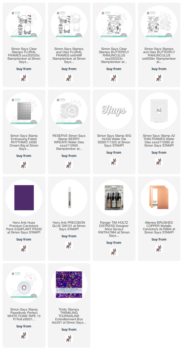
Hi there! I have a couple more cards using some of the new goodies from the initial Simon Says Stamp Stamptember release, including one using one of my two new sets: Floral Frames! I adore white space, but I also love vivid, color saturated card fronts with lots of bold colors and absolutely no white space. I have been having a love affair with Hero Arts’s Eggplant cardstock, and I thought the Floral Frames and Berry Wreath dies would look beautiful on this rich shade of purple. Let’s get started with the details!

I love pairing the Eggplant cardstock with rich metallics and coral. The deep purple cardstock looks even more luscious when contrasted with the lovely light coral.

For my first card, I used the Eggplant cardstock to die cut the wreath base from the Berry Wreath die set. I also die cut the coordinating berries from both coral and deep magenta cardstocks to create a pretty, autumnal wreath. (This wreath would also look marvelous in more traditional holiday colors!) I love that the assembly for this wreath is so simple; you simply die cut the two different sizes of berries and place them on the appropriately-sized spot on the wreath base. Super easy and quick! I also die cut lots of foliage from some sage green cardstock, but left them to the side for later.

For the card base, I ran an A2 panel of Eggplant cardstock through my die cut machine using the Simon Says Stamp Rhythmic folder. The crisp embossed details on this rich cardstock is just beautiful! I adhered the finished berry wreath the cardstock using liquid adhesive.

For the greeting, I die cut a large Hugs die from some sparkling metallic glitter cardstock. This warm rose gold glitter cardstock contrasts beautifully with the rich purple cardstock background. I adhered it using foam tape over the center of the berry wreath, then arranged the sage green foliage in a swag behind the sentiment die cut. The final touch was to add a coral double twine bow! The twine adds a bit of a rustic feel to it, which is juxtaposed nicely with the geometric background. This would be a perfect sympathy card, I think!

My second card features one of my own illustrations: Floral Frames. One of the best parts about illustrating stamps is that I get the opportunity to color the images in tons of different color combinations and mediums. I adore the look of colored pencils on colored cardstock, and this rich Eggplant cardstock was just screaming to be paired with vivid colored pencil coloring. I began by stamping the peony swag from the Floral Frames set onto some Eggplant cardstock using white pigment ink. I used my Caran D’Ache colored pencils to add vivid peachy pink to the flowers, some lilac berries, and jewel green leaves. I used the white pencil judiciously to add lots of highlights so that the color really popped off of the deep purple cardstock. If you’ll notice, the stamped image has a circular frame, but I wanted to show more of the background, so after die cutting the finished colored pencil image with the coordinating die, I trimmed the circular portion off. Nothing wrong with customizing your stamped images to make them work for your card!

For the background, I spritzed some Tim Holtz Mica Spray in Antiqued Bronze on an A2 panel of Eggplant cardstock. This metallic spray looks absolutely gorgeous on this deep purple cardstock. I wish the photos captured the shine better… it’s spectacular! This is the first time that I’ve used the Mica Spray, and it won’t be the last. You can see why I trimmed off the circular frame from the flowers… I didn’t want to let that shine get covered up!

To help accent the flowers, I added some A2 Thin Frames from Simon Says Stamp, cut from some Brushed Copper cardstock from Altenew. I adhered the frames on the metallic background using liquid adhesive, then layered the colored pencil flowers over the top using foam tape for extra dimension. I heat embossed one of the greetings from the Floral Frames set using Copper embossing powder, then trimmed it with my sharp scissors and popped it up as well. Finally, I added a few Twinkling Tourmaline gems from Trinity Stamps to add some pretty purple sparkle to the card front!

Well, that’s all for my projects today! Thanks so much for reading, and have a marvelous day!

Filed Under: simon says stamp Tagged With: berry wreath, colored pencil, framed florals, luminance colored pencils

Spellbinders Seasonal Label Motifs Card Suite!

September 14, 2022

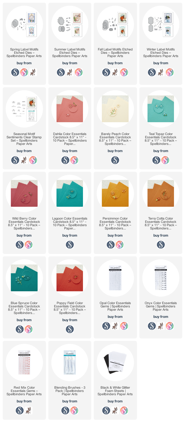
I recently had the opportunity to create a few projects for the Spellbinders Catalog, and I was thrilled to be working with Becca Feeken’s gorgeous Seasonal Label Motifs products! These beautiful dies are grouped by season, featuring a large label shape and several seasonally-appropriate images that are perfect for creating cards for every season!

I kept my cards cohesive to create a “suite” by using my favorite white-on-white-with-pops-of-color palette. I love the look of white-on-white, especially when working with intricate die cut images. The intricacy of the white die cuts popped up on a white background is so elegant and somewhat lacy and feminine to my creative eye. The pops of color help to create the correct seasonal feeling, and the crisp white gives it a modern feel. Let’s get started with the details!

My first card features the beautiful Spring Label Motifs. I kept the color palette light and springy, focusing the main details of the card with lots of crisp white cardstock, with a white glitter foam bunny. I added pops of color with some Barely Peach and Dahlia cardstock flowers, adding Teal Topaz foliage. When working with intricate layered dies like this, I like to start by just die cutting a bunch of the pieces and spend a few minutes assembling everything. Once I have a better idea of the sizes of the assembled images, I can begin to work on a layout.

I adhered the frame background with some foam tape, then worked on arranging the flowers around the leaping, glittery bunny, adhering some with liquid adhesive and some with foam tape for lots of dimension. I added some Opal gems to the center of a couple of the flowers, then added a greeting from the Seasonal Motifs Sentiments, matted with a slightly larger piece of Teal Topaz cardstock to help it pop in the center of the card. The pastel colors paired with the bright white keep things light and springy!

For the Summer Label Motifs card, I made sure to add super saturated pops of color to emulate the beautiful, vivid colors of summer! I again die cut and layered the background label pieces using white cardstock and foam tape. The foam tape helps to make those intricate die cut details more visible . I die cut the moth/butterfly (I think the shape is more like a moth, but I like butterflies better haha!) from the white glitter foam. This foam is thicker than traditional cardstock, so it adds extra dimension without adding extra work of cutting multiple layers or cutting up foam tape!

I die cut the summer extras using Lagoon, Teal Topaz, Wild Berry, and Persimmon cardstocks. I layered the flowers in a swag along the corner of the card front, adhering them using foam and liquid adhesives. I added another greeting from Seasonal Motifs Sentiments, split between two sentiment strips. I added the sentiments with a double layer of foam adhesive for extra height and to help them pop even more. Finally, to accent the black sentiments, I added some shiny Onyx gems.

My next card features the Fall Label Motifs from the Seasonal Label Motifs suite. I struggle with autumnal color combinations, I think because orange is not a color with which I create easily, so I have to find a way to incorporate other colors that I do enjoy working with to compensate. Bright, crisp, cooler colors and lots of white space help to lighten the orange and create a modern fall color palette! I die cut the background label die using more white cardstock, layering it on the card front with more foam tape to really help emphasize those beautiful details.

I die cut a few pumpkins, once from white glitter foam, once from plain white cardstock, and once from Barely Peach, then die cut several details from Terra Cotta, Wild Berry, and Blue Spruce cardstocks. I arranged the die cut accents in a cluster around the pumpkins, then added a greeting strip from Seasonal Motifs Sentiments. Finally, I added a few Opal gems for some sparkle!

My final card features the Winter Label Motifs die set. I adore the little scene building capabilities with this set! I kept things cool and wintry by using all white to build the background scene, adding some very subtle pale blue blending with blending brushes to create a cold winter sky. This subtle blending in the background helps to provide a bit of contrast for the all-white components of the scene.

To help make the snowy scene even more festive, I used Blue Spruce and Poppy Field cardstocks to die cut lots of holiday foliage. I also used the white glitter foam to die cut some sparkling snowflakes. I arranged these accents on the corner of the snowy scene, adhering them with liquid and foam adhesive in single and double layers for lots of changes in height and dimension. I added a few red gems to the center of the berry die cuts for sparkle. I topped it all off with another greeting from Seasonal Motifs Sentiments.

Well, that’s all for this seasonal card suite! I love that these images in the Seasonal Label Motifs are so quintissentially representative of their respective seasons, but you can customize them so easily with unique color palettes. Who would have thought that white cardstock with some pops of color could illustrate the seasons so well?

Thanks so much for reading today, and have a marvelous day!

Filed Under: spellbinders Tagged With: becca feeken, die cutting, fall label motifs, seasonal label motifs, seasonal motifs, spring label motifs, summer label motifs, winter label motifs

More Pinkfresh Studio Holiday Inspiration!

September 13, 2022

Good morning! I know…. four posts in 24 hours? September is a busy month! I have some more inspiration using the new Snowflakes Hot Foil and dies from yesterday’s Pinkfresh Studio holiday release (check out the whole release HERE)! I shared this card over on Instagram for the Pinkfresh Studio Instagram Hop (you should check it out…there are a bunch of prizes up for grabs!), but I wanted to share the details of my card over here! I absolutely love classic, elegant holiday images like the new Snowflakes Hot Foil set. So many ways to customize this design! This card would be so pretty with holographic foil or even rose gold or pale blue, too. Let’s get started with the frosty goodness!

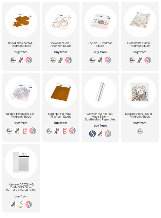
I began by hot foiling the Snowflakes Hot Foil plate several times on white cardstock using Matte Silver Foil from Spellbinders, as well as some vellum. I also used the leftover negative foil pieces with the Solid Hot Foil plate. I die cut the finished foiled pieces with the coordinating die, leaving one of the foiled pieces intact for the card base. (I love that it’s one piece so you can cut all four foiled snowflakes at once. Great for holiday mass production!) I love how elegant this monochromatic look is, but it would look equally beautiful with colorful metallic foil and colored cardstock!

I also die cut the new Joy Die from glittery white cardstock. I also heat embossed a greeting from the new Ornaments stamp set using silver embossing powder on some more white cardstock. I die cut a white Nested Hexagon frame to help ground the die cut images.

Finally, it was time to assemble all of the pieces. I used foam tape to adhere the frame and sentiment die cuts. Then, I arranged the snowflakes over and around the hexagonal frame, overlapping some of the solid hot foil die cuts with the vellum snowflakes, hiding the adhesive behind the solid die cuts. (Vellum can be tricky!) The final touch was a few Metallic Silver Pearls sprinkled throughout the card front.

Well, that’s all for my project today! The new Holiday Release is absolutely fabulous… so many different styles and types of products that are great for holiday card mass production. I hope you’ll check it out! And don’t forget to take a peek over on the Pinkfresh Instagram Hop… lots of great prizes available, including the entire release over on the PFS Instagram page! Thanks so much for stopping by, and have a marvelous day!

Filed Under: pinkfresh studio Tagged With: christmas, holiday, hot foil, snowflakes

  • « Go to Previous Page
  • Page 1
  • Page 2
  • Page 3
  • Page 4
  • Go to Next Page »

Primary Sidebar

  • Facebook
  • Instagram
  • Pinterest
  • YouTube

Favorite Shops

Secondary Sidebar

Subscribe

Enter your email address to subscribe to this blog and receive notifications of new posts by email.

Instagram
Something is wrong.
Instagram token error.
Follow
Load More

Archives

Tags

3D embossing folder alcohol markers better press birthday birthday card blog hop card kit christmas christmas card christmas tag colored pencil copic copic coloring Daniel Smith die cutting embossing folder embroidery felt giveaway holiday holiday card hot foil ink blending karin brushmarker pro layered stencil masculine my monthly hero new release no line coloring no line watercolor OLO marker olo markers original illustration pawsitively saturated rainbow shaker card slimline stamping stamptember stencil thank you thinking of you valentine's day video watercolor

Popular Posts

Simon Says Stamp Joy For You Blog Hop- Day 1!
Simon Says Stamp Joy For You Release-Now Available!
Frozen Fractals All Around with New Simon Says Stamp Joy For You Release!
Shaped Holiday Shaker Card with New Simon Says Stamp Jolly Season Card Kit of the Month!
Holiday Postage with New Simon Says Stamp!
Simon Says Stamp Glory to the Newborn King Holiday Kit-Part II!
Holiday Joy in Pink and Green with New Simon Says Stamp DieCember!
Pinkfresh Studio 5th Birthday!
Altenew Build A Flower: Fuchsia Blog Hop+Giveway!
July My Monthly Hero Blog Hop+Giveaway!

Disclosure

Some affiliate links are used in my posts. This means that, should you click on one of my links and purchase something from that company, I will receive a small portion of the sale at no extra cost to you. I use the money earned from these sales to help maintain my blog. I so appreciate you visiting and, if you do choose to use one of my affiliate links, thank you so much for your support!
Copyright © 2026 ·Brunch Pro Theme · Genesis Framework by StudioPress · WordPress · Log in
Loading Comments...