• Skip to main content
  • Skip to primary sidebar
  • Skip to secondary sidebar

Sixth Street Sundries

Emily Midgett

  • Home
  • About Me
  • Contact
  • OLO Marker Color Swatch Chart
  • Shop

circle florals

VIDEO: Acetate Window Card Using Pinkfresh Studio Fairytale Frame Press Plate with Hot Foil!

May 1, 2024

Hi friends! I am up on the Pinkfresh Studio YouTube channel today with this fun window card featuring the utterly lovely Fairytale Frame Press Plate and coordinating die. My favorite feature of the Press Plates are their versatility; you can use them both to create letterpress images or with your favorite hot foil machine! I wanted to highlight the details of this gorgeous plate with some shining iridescent foil, shown to amazing advantage when hot foiled on a luxuriously thick pearlescent mint cardstock from Memory Box. You can watch the video below or click HERE to watch on YouTube:

In case you can’t watch the video, here are some details on how I created this project:

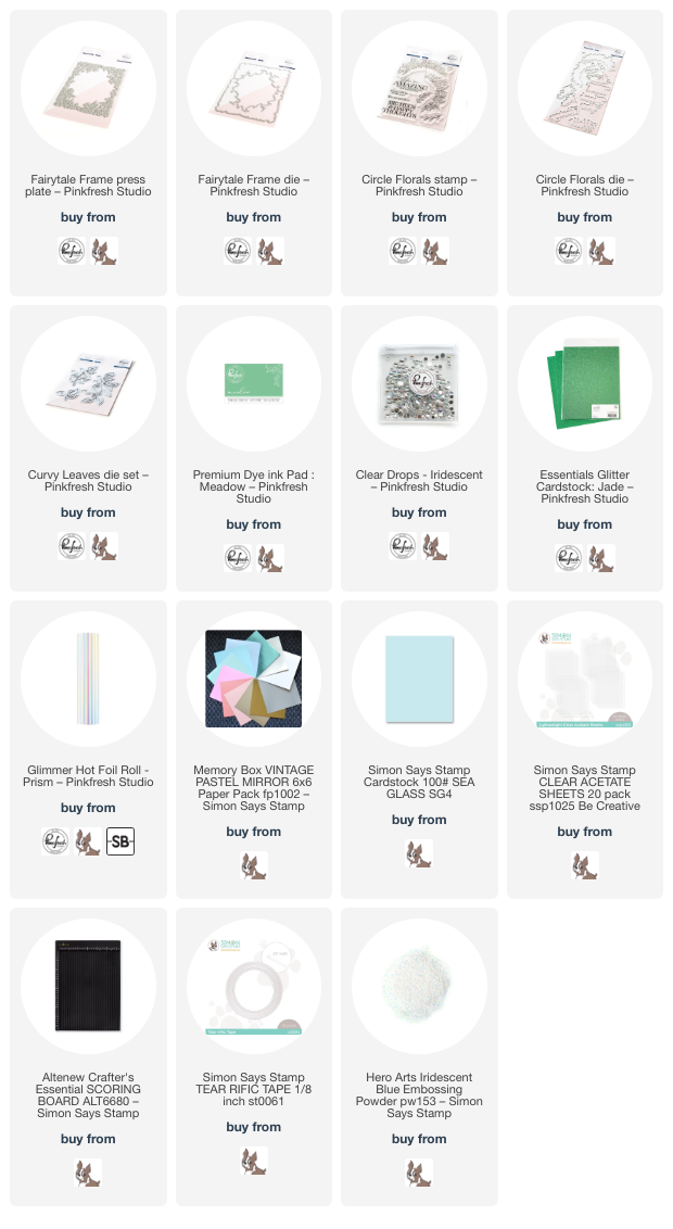
I started by hot foiling the luscious Fairytale Frame Press Plate into that glorious pearlescent mint cardstock using Prism Glimmer hot foil roll. This cardstock is so thick that the impression created with the hot foiling is almost akin to letterpress, giving you lots of texture and spectacular shine! I die cut the finished image with the coordinating die; the die is super detailed and showcases the intricacies of the pattern beautifully.

To create my window card, I first trimmed down some Sea Glass cardstock from Simon Says Stamp to 4.25″ x 5.75″. I then used my score board to score a lip .25″ from the edge of the long side of the cardstock in order to create a top-folding notecard and used my bone folder to create a nice crisp crease. I placed some super strong tape on the lip and added an A2 panel of clear acetate, onto the top of which I adhered my hot foiled frame with some more super strong double sided tape.

To add a bit of interest and contrast behind my minty foiled frame, I used a blending brush to blend Meadow ink around the edges of my mint panel, effectively the back of the card. Because these layers are fairly monochromatic, that contrast is important to help differentiate between the different elements. The cardstock is also a bit more blue than my minty pearl cardstock used for the frame, so layering the green ink over the top helps to tie those colors together a bit more closely.

For the greeting, I stamped a sentiment from the Circle Florals stamp set using Meadow ink, then again directly over the top with embossing ink and embossed it with Hero Arts Iridescent Blue embossing powder. This additional step adds lovely shine and iridescence to the sentiment, making it extra special. I die cut the finished sentiment with the coordinating die. To accent the sentiment and add a bit more visual interest to the center of my acetate window (and perhaps provide an area to write a hidden message), I die cut the Curvy Leaves die from leftover pearly mint cardstock and some Jade glitter cardstock. I arranged the leaves and greeting in the center of my window, adhering with both liquid and foam adhesive, then added a few Iridescent Clear Drops for some additional shine and texture.

Well, that’s all for my project today! I think that these window cards are just so much fun, definitely something different for me. I have shied away from them before simply because I didn’t know where I would put my sentiment, but I have found that there is plenty of room on the back side of the card to write a longer message! I hope you’ll try out this fun technique! Thanks so much for stopping by today, and have a marvelous day!
Filed Under: pinkfresh studio Tagged With: better press, circle florals, curvy leaves, fairytale florals, hot foil, ink blending, monochromatic, press plate, window card

VIDEO: Keeping Monochromatic Cards Interesting Using Clear Embossing + Pinkfresh Studio!

July 12, 2023

Hi there! I am up on the Pinkfresh Studio YouTube Channel today with a project featuring tons of monochromatic layers. In the video, I share tips on how to achieve a really interesting and unique monochromatic card using lots of textures and clear embossing powder with your stenciled images! Here’s the video:

Watch above or click HERE to watch on YouTube.

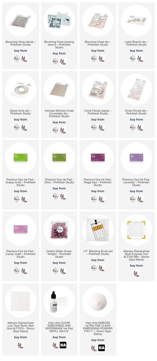
In the video, I start by stamping the Blooming Vines Stamp onto some white cardstock using Candy Violet ink in order to do some “no line stenciling.” I then blended the Blooming Vines Stencils using Candy Violet, Regal Kiss, Lavender, Olive, and Grassy Knoll inks. Once I had completed the solid and detail layer for the flowers, I replaced the solid (that is, the most open and basic stencil covering the entirety of the image, NOT the detail layer that adds shading) stencil over the top of the blended area. I have dedicated a blending brush specifically to embossing ink, and I used that with some embossing ink refill to “blend” the sticky watermark ink over the solid areas of the image. I covered those sticky areas with clear embossing powder and heated it up creating a shiny embossed solid image done entirely with stencils!

I used the same technique for the foliage until I had covered the entirety of the stamped/stenciled images with clear embossing powder. I then blended more Candy Violet ink over the entire panel. The clear embossing powder allowed the stamped/stenciled images to resist the blending, which creates super vibrant stenciled images with a lovely violet blended background. This technique allows you to keep that super saturated and vibrant look throughout your card without having to worry about pesky white die cut edges! I used the Blooming Vines Coordinating Dies to die cut all of the finished images.

Once I had initially decided on the direction for my video, I selected my favorite ink shade from Pinkfresh (Candy Violet) and then searched my cardstock stash for coordinating cardstock in a few different types. I found a beautiful shade of intense lilac-y fuchsia cardstock, as well as some mirrored matte cardstock and glitter cardstock in almost exactly the same shades. I used the Intricate Stitched Ovals, Spiral Circle Die, and Leafy Branch dies to die cut these elements from each of these cardstock styles. When working with monochromatic cards, I liked to use lots of different textures and finishes for the different elements to add visual interest. Multiple textures keep the eye interested, and for me it’s like figuring out a puzzle of which products to use that will give the most monochromatic finished product!

I stamped a greeting from the Circle Florals Stamp Set onto some more of the fuchsia cardstock using Regal Kiss ink, then stamped the same spot again using more watermark ink and covered it with clear embossing powder. I die cut the finished sentiment with the Coordinating Dies. After all of the different elements were completed, I assembled the card using a mixture of liquid and foam adhesive for lots of dimension and different heights. The final touch was to add some Twilight Ombré Glitter Drops for one last bit of sparkle!

Well, that’s all for my project today! Thanks so much for stopping by today, and have a marvelous day!

Filed Under: pinkfresh studio Tagged With: blooming vines, circle florals, ink blending, intricate stitched ovals, leafy branch, monochromatic, spiral circle, stencil

Video: No-Line Watercoloring and Faux Hand-lettered Stenciled Sentiment with Pinkfresh Studio!

March 15, 2023

Hi there! I am up on the Pinkfresh Studio YouTube channel today with this pretty-in-purple card. I received a lot of positive feedback about the stenciled/faux watercolored sentiment from THIS post, so I thought I would show you how I created it in this month’s video! You can check it out below:

Or click HERE to see it in HD on YouTube.

In case you can’t watch the video, I will share a few of the tricks that I used to create this project!

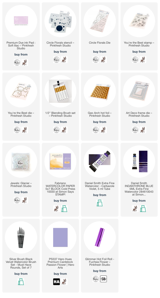
One of my favorite things about the Pinkfresh Studio dye inks is that they are dye based, so they work beautifully for watercoloring! I used Soft Lilac ink for both the blended, stenciled sentiment from Circle Florals Stencils, as well as the outline of the You’re the Best stamped images.

To start, I simply blended the Thank You sentiment from Circle Florals Stencils onto some watercolor paper using Soft Lilac ink and one of the new Blending Brushes. Because the ink is dye based, my Daniel Smith watercolors glided over it super smoothly. I began by using my slightly-more-than-damp, clean paintbrush to add clean water directly over the top of the stenciled sentiment, then while the paper was still wet, dropped in some amethyst purple watercolor. The damp watercolor paper allowed the watercolor to bloom beautifully, creating that gorgeous, artistic watercolor look that we love so much! Tip: a paintbrush with a nice, sharp point is crucial for this technique as well as no-line watercoloring. The crisp point allows you to get a smooth, sharp edge on your images, thus allowing the definition of the original image to remain.

I die cut the finished sentiment with the Circle Florals Dies. I love that there are dies for nearly all of the sentiments included in the stamp and stencil sets! The entire suite of products works so beautifully together.

I had also stamped the delicate, simple flowers from You’re the Best, again using Soft Lilac ink on some Fabriano Artistico watercolor paper. (The Fabriano Artistico is a nice, bright white, not too creamy or yellowed, but still with great texture and movement on the watercolor.) I used the same vibrant Carbazole Violet watercolor from Daniel Smith to add beautiful purple color to the flower. The key with no-line coloring is to make sure that the wet sections remain separate so that they don’t bloom into each other and muddy your crisp edges, which will cause your image to lose its definition. I worked in three different layers, adding a base layer of purple, going in for a second layer to deepen shadows and clean up the edges of the petals (tip: long brush strokes are your friend for crisp, smooth edges), then a final layer of the same Carbazole Violet mixed with my favorite Indanthrone Blue on a few of the petals that were tucked behind each other. I made sure to allow the topmost petal to have the lightest, brightest white highlights to show that it was the top petal and closest to my light source. I die cut the finished floral swag with the coordinating dies.

I had previously hot foiled the Geo Arch hot foil plate onto some beautiful lavender cardstock using purple foil (tone-on-tone hot foil is basically my most favorite thing ever besides coloring), but it was an A2 panel and I wanted to create a mini-slimline card front (3.5″x6″). I trimmed it down to 3″x4.25″ so that it would fit nicely in the center of a mini-slimline card front, then matted with an ever-so-slightly larger piece of dark purple cardstock, which I mounted on my mini-slimline card front. I also die cut a small white Art Deco Frame. I wanted to have at least 3 elements of white on my card front: the card base, the white outline on the floral and sentiment die cuts, and now the white frame. I adhered all of the die cuts using foam adhesive for lots of dimension, then added a few Glacier gems for one last touch of shine!

Well, that’s all for my project today. We are working on the March release from Pinkfresh Studio, and it’s so beautiful! I am especially excited to have another design coming out this month… it’s one of my favorites! Thanks so much for stopping by today, and have a marvelous day!

Filed Under: pinkfresh studio Tagged With: circle florals, Daniel Smith, hot foil, ink blending, mini slimline, no line coloring, no line watercolor, stencil, video, watercolor, watercolored sentiment, you're the best

Pinkfresh Studio February 2023 Stamp, Die, Stencil, and Hot Foil Release Blog Hop+Giveaway!

February 27, 2023

Hi there! Happy Monday! Today, we are celebrating the new February 2023 release over at Pinkfresh Studio with a blog hop full of tons of inspiration and prizes. The new release has so many beautiful new stamps and dies, some of which coordinate with previously-released sets, such as the new Circle Florals Stamps and Dies, which coordinate perfectly with the previously-released Nested Circles Hot Foil Plate and Dies. Let’s get started with the details on my project!

I began by stamping the main floral images from the new Circle Florals Stamps set onto some Arches Cold Press watercolor paper using some no-line coloring ink. I then used my Daniel Smith watercolors to do some no-line watercoloring, keeping the flowers a lovely shade of magenta and adding a beautiful jade green to the foliage. Because these images were a bit small, I used a Silver Black Velvet number 4 round brush with a nice sharp point, keeping kept the wet sections away from each other to make sure that I was able to keep the definition of each image nice and crisp. After I had finished watercoloring, I used the coordinating dies to cut out the finished floral swags.

I love the look of hand-lettered watercoloring, and I wanted to try to recreate that look using the sentiment stencils that are included in the Circle Florals coordinating stencil set. In addition to the layering stencils for the stamped floral images, you also receive some super useful little “extras,” like a circle that is sized to coordinate perfectly with the interior of the floral swags, as well as three different sentiments! I used one of the new small blending brushes to blend more no-line coloring ink on watercolor paper. I then used the same shade of magenta watercolor and that same small paintbrush with a nice crisp point to add watercolor to the script sentiment. I added a few little shadows around some of the curves with a darker maroon watercolor, adding the tiniest bit of dimension and interest to the sentiment, but I am absolutely in love with how this turned out and can’t wait to try it again with another sentiment! I die cut the finished greeting with the coordinating dies, as well.

I had foiled a circle frame using the Nested Circles Hot Foil Plate and Dies and some Satin Metallic Pewter hot foil from Spellbinders. I backed the open circle frame with some vellum to give me a base upon which to adhere my greeting. I ran an A2 panel of white cardstock through my die cut machine with the Dotted Scallops cover plate, creating some super subtle and elegant texture for the background of my card. I popped up the foiled-and-vellum circle frame with some foam adhesive, orienting it to the side and trimming off the overhang. I then arranged my die cut watercolored florals around the foiled frame, cutting one of the swags in half and allowing it to peek over the side, then tucking the leftovers behind the full swag, using a double and single layer of foam tape for the flowers for lots of height. I also die cut a few standalone leaves using some iridescent white mirror cardstock and the Curvy Leaves dies, tucking them here and there amongst my floral swag. The final touch was to add a few Leaf Glitter Drops for some more sparkle.

Well, that’s all for my project today. I love the look of these beautiful new Circle Florals… they remind me of a floral crown! Now for some fun giveaway information:

Pinkfresh Studio will be giving away the full release on the Pinkfresh blog & YouTube channel. They will be also giving away a total of TEN $25  gift cards along the hop. The winners will be selected from the comments, so be sure to leave a comment on each blog hop stop for maximum entries!
Winners will be announced on March 8, 2023 on our GIVEAWAY PAGE. Winners must check that page & claim your prize within 2 weeks.

Here’s the full hop list:

You are invited to the Inlinkz link party!

Click here to enter
Loading Comments...