• Skip to main content
  • Skip to primary sidebar
  • Skip to secondary sidebar

Sixth Street Sundries

Emily Midgett

  • Home
  • About Me
  • Contact
  • OLO Marker Color Swatch Chart
  • Shop

terrace floral

Simon Says Stamp Pawsitively Saturated Blog Hop + SALE!

May 16, 2025

This post was sponsored by Simon Says Stamp. Thanks, Simon!

Hi friends! I am hopping along with my friends at Simon Says Stamp to share a most wonderful rainbow of happiness! You should have arrived here from Amy Rysavy, and your next stop is Bibi Cameron. You can also start back at the beginning at the Simon Says Stamp Blog in case you get lost! Today, we are celebrating all things ink! The exclusive Simon Says Stamp ink line, which includes the fabulous Pawsitively Saturated and Rainbow Splash ink lines are absolutely exquisite with such a gorgeous array of colors available… and they’re so dang juicy… simply luscious! Using colorful ink to make white cardstock into any color that I can dream up is one of my favorite things. To inspire you today, I have created a pair of projects with two different techniques, both featuring a gorgeous, vibrant sapphire and emerald color palette. Let’s get started with the details!

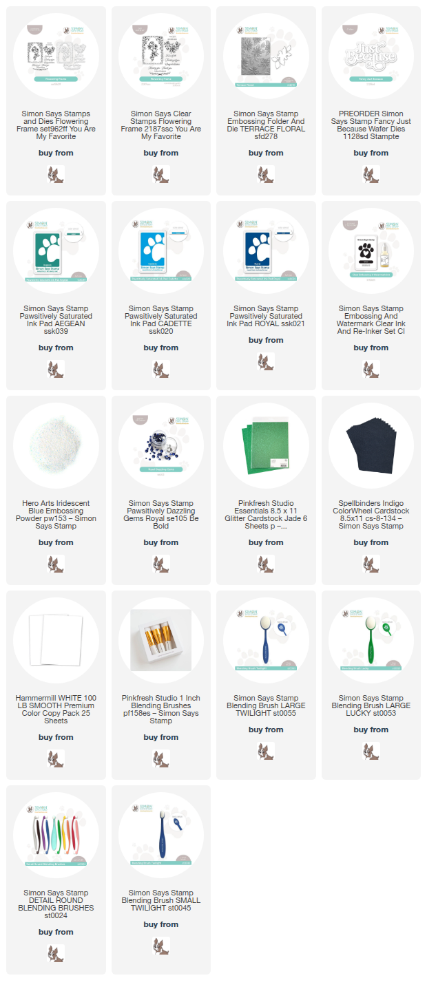
*I have gathered links to all of the products used at the bottom of the post for your convenience, using affiliate links. Thank you for shopping with my links! I truly appreciate your support for my work!*

Because this is a blog hop celebrating all things inky, I first pulled out my ink colors. I decided to pair Aegean ink with Cadette and Royal inks. These analogous colors work very nicely together if applied carefully. I love my monochromatic projects, but in the name of creativity, I decided to push myself to add another vibrant jewel tone into the mix.

For my first project, I decided to do some ink resist, highlighting the beautiful contrast between the blue and green inks. I stamped images from the Flowering Frame stamp set onto white cardstock using Aegean ink, then stamped again directly over the top with embossing ink and added Iridescent Blue embossing powder. This translucent embossing powder not only makes it possible to ink blend over the top of the images without compromising the beautiful teal green, but also adds an irresistible iridescent shimmer to these detailed images. I then used blending brushes to blend Cadette and Royal inks directly over the top of the images, concentrating the deep Royal blue on the outer edges of the panel to create almost an ombré effect.

After I had ink blended and die cut the images, I used the same Cadette and Royal inks on a plain A2 card front to create a color saturated tone-on-tone card front. I popped up the die cut images with foam adhesive, then used the same techniques to create a “thinking of you” sentiment from the Flowering Frame stamp set. I popped the sentiment up on some Jade glitter cardstock from Pinkfresh Studio, then used my sharp scissors to create a shadow layer. This added texture and sparkle from the Jade glitter cardstock allows the sentiment to stand out a bit more from the vibrant background. Finally, I added a few Royal Pawsitively Dazzling Gems to the corners and top of the frame for even more sparkle.

For my second card, I decided to use the same shades of ink in different gradations of intensity on an embossing folder. To achieve multiple shades of the same ink color, I paired ink blending with some ink swiping to create this pretty patterned card front. To start, I embossed a panel of white cardstock with the Terrace Floral embossing folder, then flipped the embossed piece over so that the embossed pattern was actually debossed; that is, the pattern is impressed down into the cardstock. I then used blending brushes to blend Cadette ink on the flowers and Aegean on the foliage, not worrying about the edges of the images, because I knew that the raised areas (that is, the negative space on the pattern) would be covered with the deep blue Royal ink. After I had finished lightly blending the images, I placed my ink pad directly on the cardstock and swiped the deep blue ink onto the raised areas. This swiping technique is so much fun and creates such a huge impact with not a ton of effort!

After I had finished creating the background, I die cut the shadow layer of the Fancy Just Because from some coordinating navy blue cardstock and the detail layer from Pinkfresh Studio Jade Glitter Cardstock. I adhered both layers together with liquid adhesive, then popped it up in the center of my patterned panel with foam adhesive squares. Finally, I added some large Royal Pawsitively Dazzling Gems to the centers of the flowers for a bit of added sparkle and texture!

Well, that’s all for my projects today. Isn’t it amazing what a little ink and white cardstock can create? These techniques are such fun and create those intensely colorful projects that I just love.

**To make this inky hop even more exciting, Simon Says Stamp is offering 20% off of their entire exclusive Simon Says Stamp -branded ink line until 5/18/25! Simply use code HUE4U at checkout to receive 20% off your Simon-branded inks and re-inkers!**

Your next stop is Bibi Cameron. Thanks so much for stopping by today, and happy hopping!
Filed Under: simon says stamp Tagged With: 3D embossing folder, analogous, emboss resist, embossing folder, fancy just because, flowering frame, ink blending, ink swiping, pawsitively saturated ink, terrace floral

Using Karin Decobrush Pigment Markers with Black Watercolor Paper!

August 28, 2023

This post was sponsored by Simon Says Stamp. Thanks, Simon!

Hi there, friends! So you know how I’ve been obsessed with coloring 3D embossed images lately? I cannot seem to get enough of it. I have, ahem, an abundance of coloring mediums, some generously sent to me by companies, others purchased throughout the 13 years that I’ve been doing this. Having such a variety of mediums is at times a blessing and a curse; I find myself longing to use certain mediums but not having the time (like colored pencils) or forgetting to use them in favor of more tried and tested mediums (like the Karin Decobrush Pigment markers that I was obsessed with purchasing and have used maybe three times). The Karin Pigment Markers are not my usual medium. Their opacity stymies me a little, because my normal method of shading and painting doesn’t really work as well with these markers. But, as I was cleaning for my upcoming craft room move, I found some pads of black watercolor paper and had a brainwave! For today’s project, I tried to figure out how to make the Karin Decobrush Pigment markers work for me, rather than me working for them.

For today’s project, I selected the Terrace Floral 3D Embossing Folder and Die from Simon Says Stamp. This folder features just one flower and one style of leaf, so I could work with the same marker colors throughout the project. I selected a light peach and a darker coral, as well as a minty green and a deeper jade green so that I could have dark to light contrast. I also planned to put the black watercolor paper to use in aid of my shading, but we’ll get to that in a minute.

I began by running a panel of black watercolor paper through my die cut machine using the Terrace Floral 3D Embossing Folder. You don’t have to have watercolor paper in order to use the Decobrush Pigment markers, (I’ve used them successfully with plain black cardstock) but since I wanted to move the color with my damp paintbrush, the black watercolor paper was a good choice.

I like to sometimes do a little reverse psychology on myself when working with contrasting colors, especially if I am trying to keep things a little lighter. When working with this black watercolor paper, I had to do a little reverse psychology to make sure that the shadows were in the proper spot. I started with the petals in the back on each flower, that is, the petals tucked beneath the petals on top. I laid down some of the darker coral color on the tips of each petal in the back, then used my damp paintbrush to pull the color out towards the center, allowing the water to fade the opaque color into the black watercolor paper and create a shadow. Once I had painted all of the petals in the back and allowed them to dry sufficiently (you have to let each section dry before working on the spot directly next to it, otherwise the colors will bleed together, and you’ll lose your definition), I ran the lighter peach marker around the edge of the petals on the top and pulled that color out towards the center of the petals. Those top petals are closer to the light source, and therefore are less shadowed and lighter than the petals behind. I used the same approach with the foliage, allowing the black of the watercolor paper to do some of the shading work for me!

After I had finished painting, I trimmed down the panel a bit on the sides and mounted it to a panel of black cardstock, popping it up using foam adhesive and allowing strips of plain black cardstock to peek out from either side. For the sentiment, I wanted to keep things simple, so I trimmed out some strips from the Reverse Well Wishes Sentiment Card set and popped them up with a little foam adhesive. Finally, I added a few shimmering gems for the tiniest hint of sparkle on this matte and textured card front!

Well, that’s all for my project today! It’s a little different from my normal painting style, but I think the mental shift to use these markers and create a project of which I can be proud was definitely worth the experiment. I can’t wait to try it again!! Thanks so much for stopping by today, and have a marvelous day!

Filed Under: simon says stamp Tagged With: 3D embossing folder, black watercolor paper, karin decobrush pigment, terrace floral, watercolor

Classic Pink and Green with Simon Says Stamp!

July 1, 2023

This post was sponsored by Simon Says Stamp. Thanks, Simon!

Hi friends! Today, I have some inspiration that embodies summertime for me. One of my favorite boutiques posted a photo of a beautiful bubblegum pink and bottle green floral dress, saying that “watermelon was having a moment” at their store. I decided to translate that inspiration into a card using some supplies from Simon Says Stamp with the Terrace Floral Embossing Folder and Die as the centerpiece! I am utterly obsessed with the dimension that can be achieved when combining alcohol markers with embossed images, and after die cutting those images…. it’s colorful, dimensional perfection!

The key to getting good results with the die cut embossed flowers is to die cut your images first, then center them over the coordinating spot on the embossing folder. If you try to emboss first and then die cut, your die cut machine will flatten any dimension that you have achieved with the folder. Thumbs down!! I started my project by die cutting three floral sprigs from the Terrace Floral Embossing Folder and Die from Hammermill cardstock. I used Copic markers in some vibrant shades of pink and green to create these unbelievably dimensional little sprays. I think they almost glow! Like I said… utterly obsessed.

After I had finished die cutting and coloring these dimensional blooms, I searched through my stash to find a frame die that had a little bit more pizzazz than just a simple rectangular frame. I came up with a die that I had purchased at Simon Says Stamp’s CREATE event earlier this spring: Love to Layer Beautiful Bracket die from Papertrey Ink. (It’s out of stock at the moment, but you can always sign up to be notified whenever it comes back in stock! The Decorative Bracket set is very similar shape and has lots of fun options to customize!) I die cut the decorative frame from some coordinating bottle green cardstock to complement the bright pink blooms and jewel bright Copic-colored foliage.

For the card base, I wanted to continue the color saturation found on the other elements of the card, so I trimmed down a panel of pale pink cardstock and blended Pawsitively Saturated Watermelon ink lightly around the edges. I love how it mimics the gradation of pinks in the flowers!! I offset the green frame slightly, trimming off the excess and adhering it with foam tape. I arranged the three floral sprays around the frame, meandering gracefully up the card. I did trim off one of the leaf sprays and tuck it amongst the flowers to fill in a blank spot and make the flowers fit better around the frame. For the greeting, I heat embossed a sentiment from Garden Boots onto some heavyweight vellum, die cut with the coordinating die. I popped it up with some clear dimensional adhesive. The final touch was to add a few Buttercup Vase gems for some sparkle!

Well, that’s all for my project today! Watermelon is definitely having a “moment” here on my blog, and I am totally in love. I can’t wait to try out this technique with some more embossing folders and dies from Simon Says Stamp. Thanks so much for stopping by, and have a marvelous day!

Filed Under: simon says stamp Tagged With: beautiful brackets, copic coloring, embossing folder, garden boots, terrace floral, thank you

Primary Sidebar

  • Facebook
  • Instagram
  • Pinterest
  • YouTube

Favorite Shops

Secondary Sidebar

Subscribe

Enter your email address to subscribe to this blog and receive notifications of new posts by email.

Instagram
Something is wrong.
Instagram token error.
Follow
Load More

Archives

Tags

3D embossing folder alcohol markers better press birthday birthday card blog hop card kit christmas christmas card christmas tag colored pencil copic copic coloring Daniel Smith die cutting embossing folder embroidery felt giveaway holiday holiday card hot foil ink blending karin brushmarker pro layered stencil masculine my monthly hero new release no line coloring no line watercolor OLO marker olo markers original illustration pawsitively saturated rainbow shaker card slimline stamping stamptember stencil thank you thinking of you valentine's day video watercolor

Popular Posts

Simon Says Stamp Joy For You Blog Hop- Day 1!
Simon Says Stamp Joy For You Release-Now Available!
Frozen Fractals All Around with New Simon Says Stamp Joy For You Release!
Shaped Holiday Shaker Card with New Simon Says Stamp Jolly Season Card Kit of the Month!
Holiday Postage with New Simon Says Stamp!
Simon Says Stamp Glory to the Newborn King Holiday Kit-Part II!
Altenew Build A Flower: Fuchsia Blog Hop+Giveway!
Holiday Joy in Pink and Green with New Simon Says Stamp DieCember!
Pinkfresh Studio 5th Birthday!
Honey Bee Stamps September Release Blog Hop!

Disclosure

Some affiliate links are used in my posts. This means that, should you click on one of my links and purchase something from that company, I will receive a small portion of the sale at no extra cost to you. I use the money earned from these sales to help maintain my blog. I so appreciate you visiting and, if you do choose to use one of my affiliate links, thank you so much for your support!
Copyright © 2026 ·Brunch Pro Theme · Genesis Framework by StudioPress · WordPress · Log in
Loading Comments...