• Skip to main content
  • Skip to primary sidebar
  • Skip to secondary sidebar

Sixth Street Sundries

Emily Midgett

  • Home
  • About Me
  • Contact
  • OLO Marker Color Swatch Chart
  • Shop

Archives for July 2022

Three Holiday Cards with One Foiled Image+Spellbinders Sale!

July 27, 2022

Hi there! Spellbinders has released some absolutely spectacular holiday products during their July Release, and I was thrilled to have the opportunity to play with some of them. All three of my projects today are based on one product set: Blooming Tree Glimmer Plate and Die. (Waste not, want not!) Let’s get started with the details on my projects!

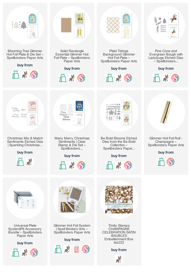
I began by doing some hot foiling the Blooming Tree Glimmer Plate and Die with my Glimmer machine (which is on sale right now, by the way! If you’re on the fence this would be a great opportunity to pick up a hot foil machine at a discount!) using Champagne foil from Spellbinders. I love the Champagne foil. It’s such a lovely, subtle alternative to gold. A bit cooler, and very elegant and chic. I used the Solid Rectangle Foil Plate to use the negative space created by the Blooming Tree Glimmer Plate and Die on the leftover foil panel. After I’d finished foiling, I die cut the original tree image, the negative space image, and reserved the leftover negative space on the original white cardstock panel. One foiled image, three focal pieces!

My first card uses the original foiled image. After foiling and die cutting, I used Copic markers to color the flowers and foliage on the image with a slightly non-traditional color scheme of hot pink and olive green. Still red and green, ish, but but a more modern twist!

For the card base, I ran the Plaid Tidings hot foil plate through my Glimmer machine without any heat or foil. The result was this lovely, subtly textured background! As a ground for my foiled tree die cut, I added a strip of champagne glitter paper along one side of the card base.

I added a few die cut Evergreen Boughs behind the tree in a coordinating shade of olive green. I die cut a greeting from the Christmas Mix and Match sentiment dies, cut from some more champagne glitter paper. I added the “from all of us” from the Many Merry Christmas stamp and die set, heat embossed using platinum embossing powder. Finally, I added a few matte champagne pearls for one last textural element. I love the pops of color and flashes of shine on this card!

My second card features the negative foiled image from the Blooming Tree Glimmer Plate and Die. I used the Solid Rectangle Foil Plate to use the negative of the original foiled piece, which I die cut using the coordinating die. The champagne foil looks so lovely with the white details!

For the background, I used the Plaid Tidings hot foil plate with some more Champagne foil. Pulling that foil off of the heated panel was magical. (So magical that I repeated the process in 4 other colors haha! You can never have too many plaid backgrounds at your disposal!) The busy background needed something to soften it a bit, so I trimmed down a piece of heavyweight vellum and adhered my foiled tree to it, offset to one side.

For the greeting, I die cut another sentiment from the Christmas Mix and Match sentiment die set, again cut from champagne glitter cardstock, then again from plain white cardstock and adhered together to add a little extra height. I added them to the vellum strip using liquid adhesive, then added a coordinating sentiment strip from the Many Merry Christmas stamp and die set, heat embossed using platinum embossing powder on a strip of white cardstock and adhered using foam tape. I popped up the tree and vellum pieces using foam tape, hiding the adhesive behind the solid die cut to keep the vellum looking nice and clean. Some more matte champagne pearls were the final touch!

My final card features the negative cardstock left by the original foiled die cut Blooming Tree Glimmer Plate and Die. When foiling, I placed the tree hot foil plate as close to the center of the cardstock as possible; then when I die cut the tree, I had a tree-shaped window in the center of my cardstock. I backed it with another textured plaid panel, created by running the Plaid Tidings hot foil plate through my Platinum 6 using the embossing mat sandwich from the Universal Plate System. It creates a much more intense texture than just running the plate through with the foiling sandwich.

For the greeting, I heat embossed the pieces from the Many Merry Christmas stamp and die set using platinum embossing powder. I love how well this shade of embossing powder coordinates with the champagne foiling on the previous cards. I also die cut a few pine sprigs from the Pinecone and Evergreen Bough set in some more olive green cardstock. I die cut a few deep pink “berries” and glittery sprigs using some of the elements from the Be Bold Blooms die set. It’s not traditionally a holiday die set, but it worked quite well for this card!

I arranged all of the die cuts around the plaid tree window, adhering them with liquid and foam adhesive for lots of dimension. A few more matte champagne pearls finished it off!

Well, that’s all for my projects today. I had such fun hot foiling, die cutting, and mixing and matching to create three unique cards that still coordinate with each other. If you needed a little extra inspiration to get started on your holiday cards, I hope you’ll check out the beautiful July release from Spellbinders! So many gorgeous products covering such a wide variety of styles. Thanks so much for stopping by, and have a marvelous day!
Filed Under: spellbinders Tagged With: blooming tree, christmas card, copic coloring, die cutting, holiday card, hot foil

Pinkfresh Studio July Release Blog Hop+Giveaway!

July 27, 2022

Hi there! Today, Pinkfresh Studio is releasing their newest collection of stamps, dies, washi tapes, and stencils, and we are hopping along to inspire you with all of the new goodies! This month’s new release has a wide variety of styles and multiple seasons, and I’m super excited to share a new autumnal color variation for the previously-released Sunflowers washi tape set, which I designed and painted for Pinkfresh Studio earlier this year. This new Autumnal Sunflowers features deeper, richer colors that are perfect for autumn and Thanksgiving cards. I have a mini slimline project to share with you today, so let’s get started with the details!

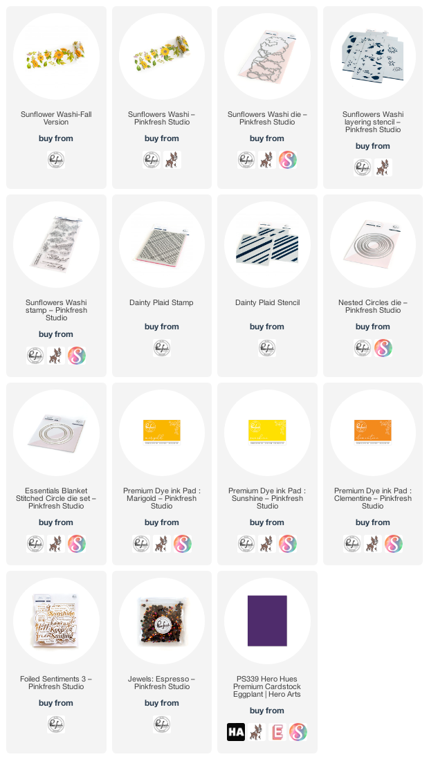
I began by adhering the Autumnal Sunflowers Washi to plain white cardstock. I used a scraper from my old Cricut days to make sure that the washi was adhered tightly to the paper and that there were no air bubbles. I used the coordinating die to die cut the images. (I love that it is all one piece, so you can run your die through your machine one time and get a ton of pieces to use on your project! There is also a coordinating stamp set, also in one piece, so that you can use the washi tape or the stamp set and color with your favorite medium in whatever color combo you choose!)

When I first saw the images for this month’s release, I immediately knew that I was going to be pairing this new Autumnal Sunflowers washi tape with the new Dainty Plaid Stamp and coordinating Dainty Plaid Stencil. I think plaid epitomizes autumn fashion and style, like a big chunky plaid scarf! I heat embossed the Dainty Plaid Stamp on some white cardstock using gold embossing powder, then used blending brushes to blend Marigold, Clementine, and Sunshine inks to create a sunny yellow plaid background. I die cut a large circle from the plaid panel using the Nested Circles dies. I also die cut a gold foil Blanket Stitched Circle frame and adhered it around the edge of the plaid circle.

Once I had the die cut components complete, I trimmed down a coordinating deep purple mini slimline card base (3.5″x6″) to help make those purple berries in the washi tape pop. I arranged the floral washi die cuts around the edge of my plaid circle in a bouquet, adhering them with liquid adhesive and single and double layers of foam tape for tons of dimension. I adhered the entire piece to my mini slimline card base with foam adhesive, allowing some of the pieces to spill over on each side. (You can easily mail this in an A7 envelope, even with the overhanging bits!) For the greeting, I wanted to highlight some of the beautiful foiled accents on the Autumnal Sunflowers washi tape, so I used one of the Foiled Sentiments 3 from last month’s release, the edges of which I lightly blended some Marigold and Clementine inks to help it coordinate further. I popped the greeting up on the plaid circle using foam adhesive, then added a few Espresso jewels for one last element of shine!

Well, that’s all for my project today. To celebrate this new release, Pinkfresht Studio has lots of giveaways! They will be giving away the full release on the Pinkfresh blog & YouTube channel. They will be giving away a total of TEN $25 gift cards along the hop. As per usual with blog hops – the winners will be picked from the comments. The winners will be selected and posted on August 5, 2022 on the GIVEAWAY PAGE. Winners must check that page & claim your prize within 2 weeks.

Here’s the full hop list:

You are invited to the Inlinkz link party!

Click here to enter

Thanks so much for stopping by, and happy hopping!

Filed Under: pinkfresh studio Tagged With: original illustration, stencil, sunflowers, washi tape

Simon Says Stamp Dream Big Blog Hop-Day 2!

July 23, 2022

Hi there! Today, we are hopping along to celebrate the Simon Says Stamp Dream Big release! (You can check out the Day 1 blog hop HERE.) You should have arrived here from Barbara Tarayao, and your next stop is Miriam Prantner. I am extra excited about today’s hop, because I have a fun video to share using my newest stamp illustration: Magnolia Apple Blossom! You can check out the video below or click HERE to watch it on YouTube.

For this project, I wanted to create a bright, vibrant bouquet featuring my new favorite medium: gouache! I was able to experiment with pairing white gouache with liquid watercolors earlier this summer, and it was such a blast that I had to try it out with this giant Magnolia Apple Blossom bouquet.

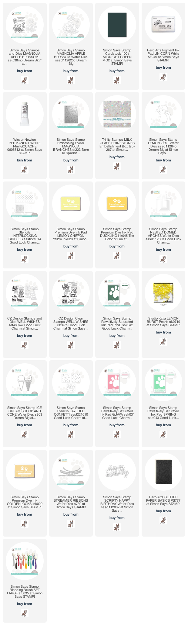
I began by stamping the large bouquet from Magnolia Apple Blossom onto some Simon Says Stamp Midnight Green cardstock using Hero Arts Unicorn ink. The white pigment ink fades beautifully into the opaque paint and shows up perfectly against the dark cardstock background. I die cut the image with the coordinating dies. I mixed the liquid watercolors with the white gouache to create a variety of shades of opaque paint. The brighter the watercolors, the better, because the opaque white gouache will seriously dilute the color from its original vibrancy. The super thick Midnight Green cardstock worked beautifully with this thick paint; it did not warp or pill at all!

I like to mentally replace the water that I would normally use to dilute the watercolor with the white gouache. The white gouache acts to dilute the intensity and vibrancy of the watercolor, so adding more gouache will make your color lighter, more watercolor/pigment will make it brighter and more intense. I laid down the medium shade in the areas that were more shadowed, then added some more white gouache to that medium shade and painted the petals that were on the top, or curled over on themselves. As with all no-line coloring, keeping the contrast and sharp lines between the edges of each image was key in maintaining the shape.

Once my painting was complete, I used the Magnolia Branches Embossing Folder from Simon Says Stamp to emboss a mini-slimline (3.5″x6″) panel of more of the Midnight Green cardstock, which I lightly splattered with more white gouache to add a touch of artsy texture to the background. I popped up the painted die cut with foam tape, then added a sentiment strip from Magnolia Apple Blossom using a double layer of foam tape for extra height. Finally, I added a few Milk Glass jewels for some iridescent sparkle!

My second card features one of the new standalone dies from the Dream Big release: Lemon Zest. I love that these new dies feature just enough detail that you can use colored cardstock for a chunkier, more graphic effect, or you can use your favorite coloring medium to add lots of detail and shading, as I’ve done here. I began by die cutting all of the components from Lemon Zest from plain white cardstock. I used my Copic markers to add a ton of vibrant color to the images. This would be fun to do with ink pads and ink blending, too!

For the background, I wanted to add a subtle pattern, so I pulled out the Interlocking Circles Stencils. These stencils have a definite Tuscan feel to them, which I thought worked perfectly with the bright lemon die cuts! I blended Lemon Chiffon and Duckling inks to create a subtle, sunny pattern for the background.

I die cut a vellum Nested Domed Arches die to create a smooth area to ground my greeting and lemon cluster. I stamped a greeting using the Well Wishes stamps and Pine Paws-itively Saturated ink, then arranged my die cuts and sentiment over the top of my vellum arch. I added the die cuts with lots of foam adhesive, hiding the foam tape behind the solid die cuts to keep it from peeking through my transparent vellum die cut. Finally, I added a few bright yellow iridescent pearls to add a bit of shine!

My final card today might be tied with the magnolia gouache card for my favorite card from this release. As soon as I saw the new Ice Cream Scoop dies, I wanted to create a festive pastel birthday card with them featuring the Layered Confetti stencils. I began my project by die cutting all of the components for the Ice Cream Scoop die cuts three times from white cardstock. I again used my Copic markers to add lots of color to the die cuts, creating vanilla bean, strawberry, and mint chocolate chip ice creams. (Yum, right?) I adhered all of the components together using both liquid and foam adhesive to create as three dimensional a look as possible.

Next, I created a party background with coordinating ice cream shoppe colors! I combined the Layered Confetti stencils with Guava, Spring, and Goldenlocks inks, blending the stencils on a white background, then randomly blending all three colors around the edge of the card front to create a soft, almost bokeh-effect. I also layered a few Streamer Ribbons cut from white cardstock towards the top of my blended background to add an even more festive feel to the card front.

After the card base had been completed, I adhered the ice cream cones to the card front using foam adhesive. I cut the detailed “happy birthday” from the Scripty Happy Birthday die set from some white glitter cardstock and adhered it to the ice cream cones. So many different elements on this card, but I love how festive and sweet this one ended up! The different looks that you can achieve from just some plain white die cuts is absolutely amazing to me.

Well, that’s all for my projects today! Now, to celebrate the release and the blog hop, Simon Says Stamp is generously giving away a $25 shopping spree from one commenter on each stop on the hop!

To enter, simply leave a comment on each blog hop stop. The more comments you leave along the way, the more chances you have to win! The winners will be announced on the Simon Says Stamp blog on Wednesday the 27th of July. The winners can email the folks at Simon Says Stamp to claim your prize!

Simon Says Stamp is also offering a free gift with purchase! Enter code BIGHUGS at checkout to receive the sweet Scripty Big Hugs die FREE with any purchase! This promotion will expire 7/24 at 11:59 pm EDT.

Your next stop is Miriam Prantner. Thanks so much for stopping by today, and happy hopping!

Filed Under: simon says stamp Tagged With: gouache, ice cream scoop, lemon zest, magnolia apple blossom, stencil, video, watercolor

Simon Says Stamp Dream Big Release + New Illustration!

July 20, 2022

Hi there! Simon Says Stamp is releasing their latest collection this evening, called Dream Big, and boy is it a fabulous release! I am loving on so many different things- the new ice cream cone dies, the lemons, the embossing folders…. but I am especially excited to have a new illustration released with it: Magnolia Apple Blossom! I love the grace and beauty of magnolias, and so drawing this new stamp set was such a joy. I have made a couple of projects with it for the release, but tonight I’m sharing a simple Copic-colored project featuring the smaller individual flowers, foliage, and apple blossom buds, so let’s get started with the details!

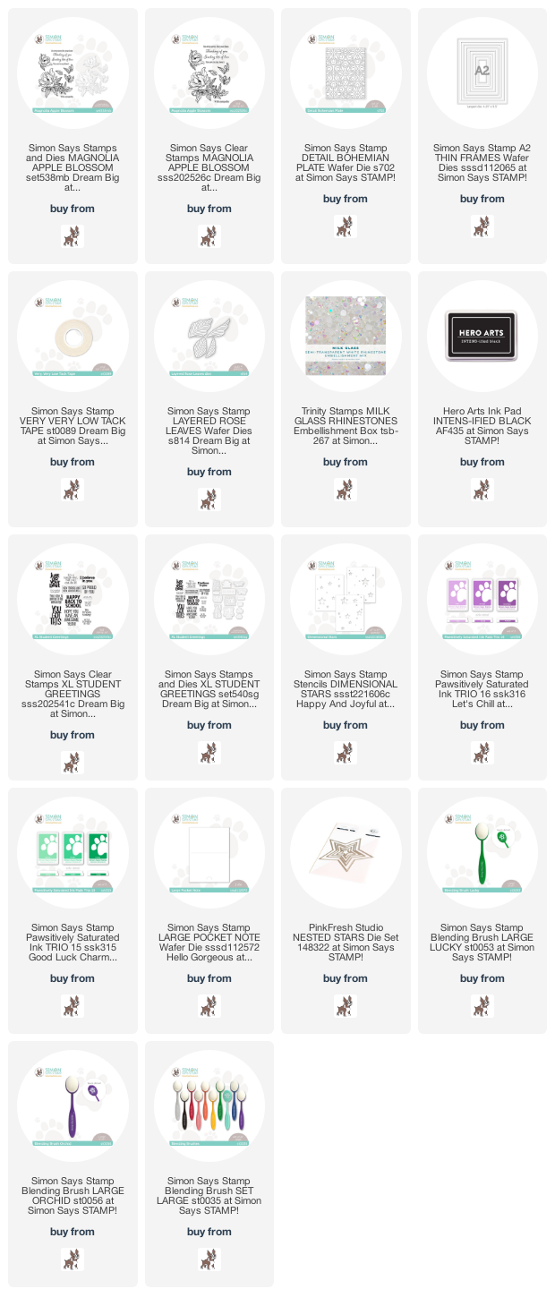
I began by stamping several of the smaller, individual elements from Magnolia Apple Blossom onto some white cardstock using Intens-ified Black ink. I colored them with Copic markers, using the lightest shades from several different color families to create some highlights and shadows, as well as adding some reflections of color along the edges of the petals. It’s very difficult to color “white” flowers, because if you just leave them with the absence of any color, there is no depth or curvature to the flowers, but if you put too much color, it can look dingy. The BV shades that I used to create shadows made the initial images look a touch dingy, but when I added some (very pale) Y and R Copic markers, it helped to brighten the petals up a bit! I always make sure to keep my colorless blender close at hand so that I can blend out any harsh lines and allow the white of the cardstock to show through to add highlights and keep the overall feeling of the flower white. The intense jewel green of the leaves helps to add to the contrast of the white flowers and add to the illusion of their “lack” of color!

For the card base, I die cut the beautiful Detail Bohemian Plate from some white cardstock to match the white borders on the floral die cuts. I also die cut some rectangular white frames using the A2 Thin Frames dies and layered those on the cover plate die cut. I arranged the colored flowers in a swag, then used the new Low-Tack Tape to adhere the arrangement together before flipping it over and adding foam tape. I removed the release paper, then flipped the arrangement over and added it to the die cut background.

I die cut a few of the new Layered Rose Leaves dies from some vellum to add some ethereal and weightless foliage to help fill in a few of the gaps of the floral spray. I created a sentiment strip using a sentiment from Magnolia Apple Blossom and added it with a double layer of foam adhesive. Finally, I added some Milk Glass gems to add some extra shine and a new textural element.

My next projects are a total 180* switch from the elegant project above, featuring the new XL Student Greetings. I created a duo of little lunchbox notes that are the perfect size to tuck into my kiddos’ backpacks or lunchboxes when school starts next month! I began by stenciling the Dimensional Stars stencils onto an A2 panel of cardstock, one using the Green Ink Trio 15 Paws-itively Saturated Inks and one with Purple Ink Trio 16 Paws-itively Saturated Inks.

Once I had finished ink blending using the layered star stencils, I used the Large Pocket Note die to cut these sweet little notes that are the perfect size to tuck in so many different places! Lunch box, backpack, jacket pocket… I stamped the greetings from XL Student Greetings in coordinating ink shades and die cut them using the coordinating wafer dies.

Next, to add a little bit of extra texture and some sparkle, I die cut a few glittery stars using the Nested Star dies from Pinkfresh Studio and some coordinating glitter paper. I popped up the greeting using foam adhesive, then added the stars with some liquid adhesive.

Well, that’s all for my projects today! I have several more projects to share with you later this week. Some of my favorite projects that I’ve made recently! I hope you’ll check out the new Dream Big release; it’s such a fun release with such a huge variety of styles available. Thanks so much for stopping by today, and have a marvelous day!

Filed Under: simon says stamp Tagged With: copic coloring, dream big, lunchbox notes, magnolia apple blossom, original illustration, stencil, XL student greetings

Creating a Vintage Color Palette with Neutrals!

July 20, 2022

Hi there! Today, I’m up on the Pinkfresh Studio YouTube channel with a video using my oldie-but-still-a-goodie Miss Your Smile stamp set, which was one of the very first sets that I illustrated for Pinkfresh Studio! Miss Your Smile may be a bit older, but coloring it gets even more fun with each use, and today I share some tips on how to get more from your watercolors by mixing neutrals with your super bright colors to create a more vintage-y color palette. You can watch the video below or click HERE to watch on YouTube.

In case you can’t watch the video, I’ll do a quick rundown of how I made this project with some still photos. Let’s get started with the details!

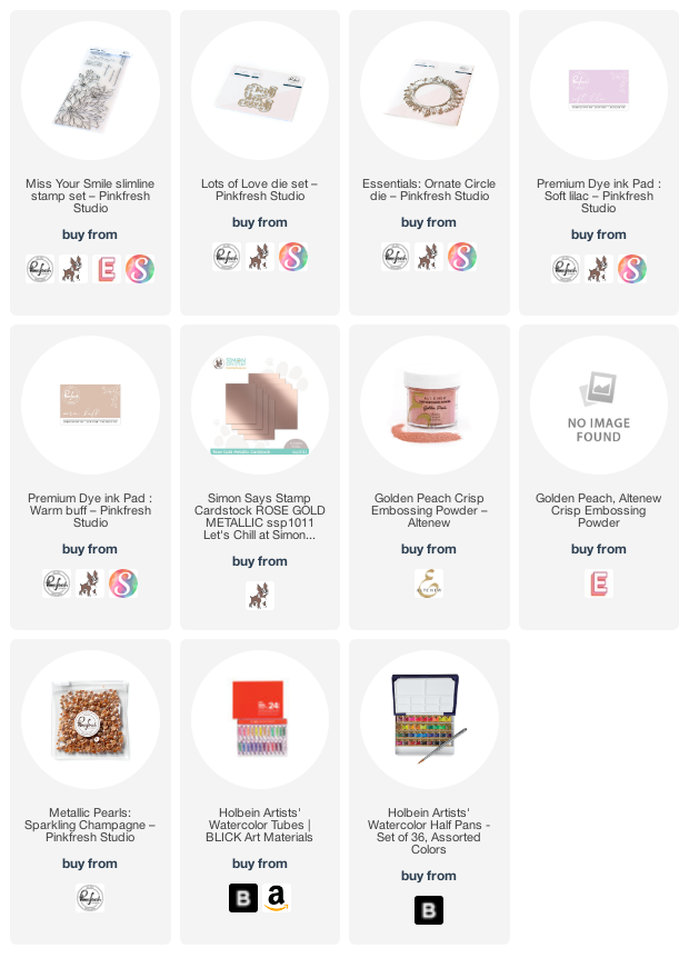
I began by heat embossing the large floral image from Miss Your Smile using some metallic peach embossing powder onto a full size slimline card base created from Arches Cold Press watercolor paper. The metallic peach embossing powder is a lovely, soft alternative to the traditional gold or black stamping! Next, I used my Holbein watercolors to do some watercoloring on this huge image. I wanted to create a more muted, vintage color scheme, so I chose some of the brightest shades of fuchsia and hot pink in my watercolor palette and mixed them with a deep, plummy chocolate brown. Mixing the bright colors with the very dark neutral brown helped to tone down the colors without making them lose their vibrancy.

Once I had finished watercoloring, I felt like the top corner was a bit too open and starkly white to match the soft, muted color palette of the flowers, so I very lightly blended some Soft Lilac ink in the corner opposite the flowers, muting the cool lilac by lightly blending some Warm Buff ink over the top of it. Pairing the two unlikely ink shades is such a fun way to create a wider color palette using the inks and watercolors that you already have!

Once I had finished my card base, I die cut a beautiful Ornate Circle die cut from some coordinating metallic peach foil cardstock. I created a greeting by simultaneously die cutting both pieces of the Lots of Love die set from some coordinating deep plum cardstock. I made sure to keep the interiors of the letters safe (such as on the “o” and “e”), then adhered them in the center of the die cut. I love how the negative space in the greeting still allows you to see the watercoloring without feeling clunky or overbearing on the watercolored panel! The final touch was to add a few Sparkling Champagne pearls to finish it off.

Well, that’s all for my project today! I hope that you enjoyed that project. I encourage you to try mixing in some neutrals to your bright watercolors or ink blending… it’s such fun to see how the colors can be manipulated to create totally new color palettes from the colors that you already have! Thanks so much for stopping by today, and have a marvelous day!

Filed Under: pinkfresh studio Tagged With: holbein, ink blending, miss your smile, slimline, video, vintage, watercolor

  • Page 1
  • Page 2
  • Go to Next Page »

Primary Sidebar

  • Facebook
  • Instagram
  • Pinterest
  • YouTube

Favorite Shops

Secondary Sidebar

Subscribe

Enter your email address to subscribe to this blog and receive notifications of new posts by email.

Instagram
Something is wrong.
Instagram token error.
Follow
Load More

Archives

Tags

3D embossing folder alcohol markers better press birthday birthday card blog hop card kit christmas christmas card christmas tag colored pencil copic copic coloring Daniel Smith die cutting embossing folder embroidery felt giveaway holiday holiday card hot foil ink blending karin brushmarker pro layered stencil masculine my monthly hero new release no line coloring no line watercolor OLO marker olo markers original illustration pawsitively saturated rainbow shaker card slimline stamping stamptember stencil thank you thinking of you valentine's day video watercolor

Popular Posts

Simon Says Stamp Joy For You Blog Hop- Day 1!
Simon Says Stamp Joy For You Release-Now Available!
Frozen Fractals All Around with New Simon Says Stamp Joy For You Release!
Shaped Holiday Shaker Card with New Simon Says Stamp Jolly Season Card Kit of the Month!
Holiday Postage with New Simon Says Stamp!
Simon Says Stamp Glory to the Newborn King Holiday Kit-Part II!
Holiday Joy in Pink and Green with New Simon Says Stamp DieCember!
Pinkfresh Studio 5th Birthday!
Altenew Build A Flower: Fuchsia Blog Hop+Giveway!
July My Monthly Hero Blog Hop+Giveaway!

Disclosure

Some affiliate links are used in my posts. This means that, should you click on one of my links and purchase something from that company, I will receive a small portion of the sale at no extra cost to you. I use the money earned from these sales to help maintain my blog. I so appreciate you visiting and, if you do choose to use one of my affiliate links, thank you so much for your support!
Copyright © 2026 ·Brunch Pro Theme · Genesis Framework by StudioPress · WordPress · Log in
Loading Comments...