• Skip to main content
  • Skip to primary sidebar
  • Skip to secondary sidebar

Sixth Street Sundries

Emily Midgett

  • Home
  • About Me
  • Contact
  • OLO Marker Color Swatch Chart
  • Shop

peony background

Shades of Blue with Simon Says Stamp!

March 14, 2024

This post was sponsored by Simon Says Stamp. Thanks, Simon!

Hi friends! I am back today with a pair of cards with some unconventional blue peonies. I have been in a blue mood lately; this transition time between winter and spring always seems to bring out my love for different shades of blue, as it can be both icy and cold for winter or fresh and crisp for springtime. I never tire of monochromatic projects, so I pulled out lots of different blue cardstock, my Peony Background, the gorgeous Half Spring Floral Mandala, and some other goodies and got to work creating this coordinating card set!

Navy blue is one of those colors that works well as a neutral nearly all the time. It pairs beautifully with so many different colors, and while I normally would pair this deep blue with magenta or coral, I thought it would unique to have some pale, icy blue peonies!

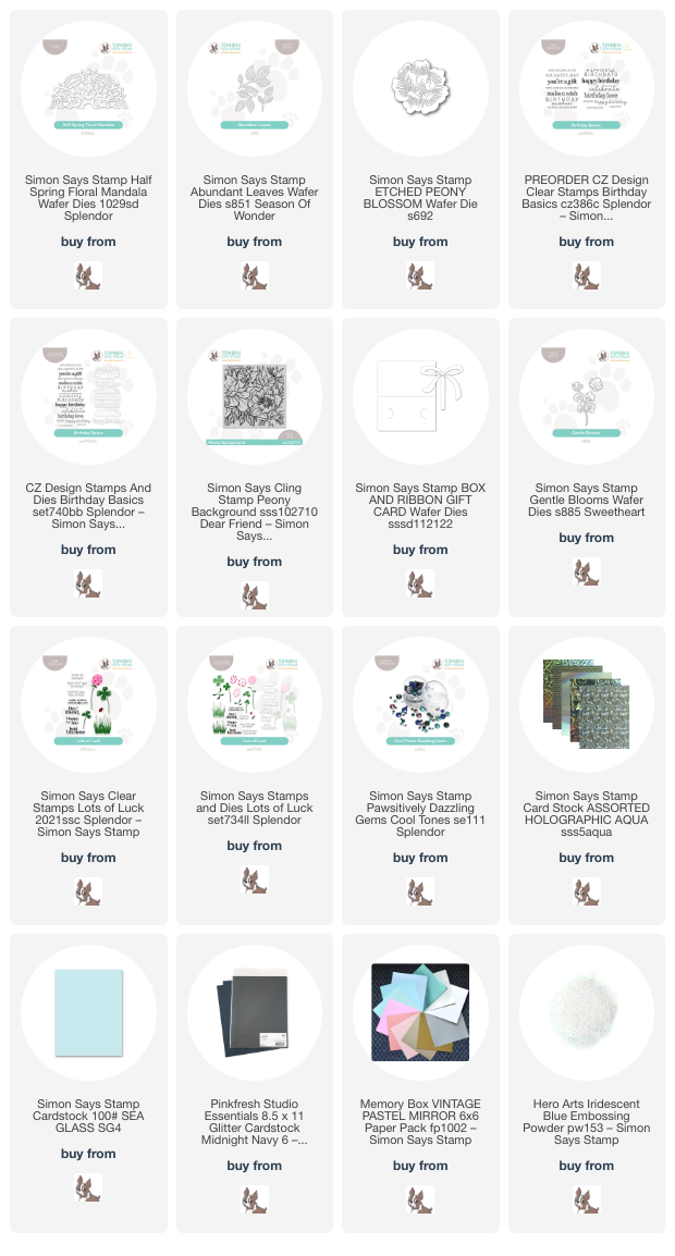
For my first project, I die cut the totally gorgeous new Half Spring Floral Mandala from Simon Says Stamp’s Holographic Aqua cardstock. This super thick iridescent mirror cardstock die cut this intricate die beautifully. The die cuts a delicately-patterned half circle, so I mounted it on my navy blue A2 card base using liquid glue, then added a thin strip of Midnight Navy Glitter Cardstock, nestling it right along the edge of the intricate die cut. This tone-on-tone glitter cardstock helps to create a visual buffer between the edge of the die cut and the solid blue background so that it’s not just floating in midair.

To embellish my lacy background and frame the greeting, I die cut the Etched Peony Blossom from Sea Glass cardstock and some foliage using the Abundant Leaves dies and some iridescent white foil cardstock. I arranged the flowers and foliage over the seam of the glitter paper strip and the die cut, popping them up with foam adhesive. For the greeting, I white embossed a sentiment from the new Birthday Basics on some cornflower blue cardstock, then die cut the larger sentiment with the coordinating die and popped them up with a double layer of foam adhesive to make them extra visible. Finally, I added a few Pawsitively Dazzling Gems Cool Tones for a bit extra sparkle and shine!

For my second project, I wanted to put the Box & Ribbon Gift Card die to use. I have always loved creating extra special gift packaging, but rarely find the time to dedicate to a specific gift, so I thought it might be a good idea to have some on hand the next time I need something! I wanted to create fancy “wrapping paper,” so I heat embossed my Peony Background illustration on some navy blue cardstock using Hero Arts Iridescent Blue embossing powder, masking off the back part of the gift card holder with some Post-It Notes to keep it nice and clean. This Iridescent Blue embossing powder creates the most beautiful tone-on-tone shimmer on colorful cardstock. Depending on the angle, it can take on a more aqua hue or, when angled the opposite way, can look almost purple. So unique and beautiful! I love that the details from the Peony Background are not lost in the slightest, even with this tone-on-tone project.

To embellish my “gift” gift card holder, I die cut the layered bow included in the Box & Ribbon Gift Card die set from some Midnight Navy Glitter Cardstock. I assembled the bow off to the side of the box, popping the top part up with some foam adhesive squares. (If you assemble the bow in the center of the card, it will fit into an A2 envelope when complete. This one won’t quite fit into an A2 envelope, but fits nicely into an A7!) I die cut some Gentle Blooms dies from Sea Glass cardstock and tucked them beneath the bow and greeting from Lots of Luck. Finally, I added a few coordinating aqua Pawsitively Dazzling Gems Cool Tones for extra sparkle!

Well, that’s all for my projects today! I am so in love with this pair of navy blue projects. Monochromatic blue cards are always a winner in my book! Thanks so much for stopping by today, and have a marvelous day!
Filed Under: simon says stamp Tagged With: abundant leaves, birthday basics, box and ribbon gift card, etched peony blossom, gentle blooms, gift card holder, lots of luck, original illustration, peony background, spring floral mandala

Monochromatic Toile Watercolor!

March 5, 2024

This post was sponsored by Simon Says Stamp. Thanks, Simon!

Hi friends! It’s getting warmer out, and so my brain has switched into flower mode. Be prepared for lots of flowers over the next few weeks! I have always loved monochromatic patterns. My wedding colors were selected because of my love of blue and white Delft china and toile, and so I wanted to channel that with my project today! I used my huge Peony Background, which is one of my older illustrations but still definitely a favorite! I love the idea of monochromatic neutral paintings, but I wanted to try my hand at creating my own version of toile using my super detailed Peony Background stamp and just a few painting supplies. Let’s get started with the details!

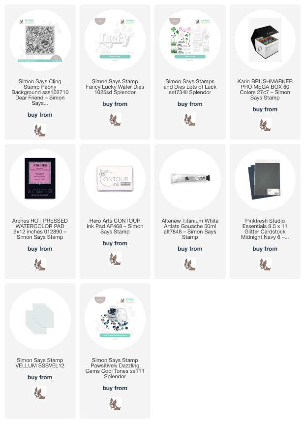
I started my project by stamping the Peony Background onto some Arches Hot Press watercolor paper using Contour Ink. I selected two different shades of blue Karin Brushmarker Pro markers, one dark and one medium. I like to use hot press watercolor paper when working with Karin markers; I find that the smooth surface of the hot press allows the color to move nicely. I taped my stamped panel down to my watercolor board and began the watercoloring process!

One of my favorite things about watercolor is the ability to stretch the colors by changing the water to pigment ratio. The more water you add, the more diluted your color will be, allowing you to create a wide color gradient with each shade. I have found that, for at least the first layer of color with your Karin Brushmarker Pro markers, you will achieve better results if you scribble the color out onto your glass mat or watercolor palette and pick up the color using your damp paintbrush. This allows you to control the vividness of the color being laid down on the watercolor paper. I have found that if you put the marker directly to the paper for the first layer, it sometimes is reluctant to move with your damp paintbrush. I have no idea if there is any scientific reason behind this or if it is just my painting style, but it seems that once you have that initial layer of diluted color laid down, the paper is almost “primed” and the color will move even more easily for you!

Because the first layer of color is diluted with water when I pick up the color from my palette, the color is less intense. For the second layer of color, I want to increase the intensity and the shading, so I put the marker directly to the paper in just the areas that I want to be really shadowed. Using both of these methods allows me to expand that color gradient, keeping some of the white highlights with the diluted color and creating deep shadows with the undiluted color.

After I had finished using my blue watercolors, I used some Artistry by Altenew White Artists’ Gouache to clean up the edges of some of the petals. I squeezed a small amount of the white gouache out onto my glass mat, then wet my brush fairly well and picked up some of the gouache. Using a careful hand, I ran the crisp tip of my paintbrush along the edge of each petal, cleaned my brush, and then pulled the edges of that gouache out so that it faded seamlessly into the blue. The opaque gouache covers up any messy spots or untidy edges, while the medium’s ability to move with water makes it super simple to use.

Once I had finished my painting (I fussed with this for far longer than I should have… no-line watercoloring stirs up my need for perfection!!), I wanted to keep the rest of the card simple, so I die cut the new Fancy Lucky die from Simon Says Stamp’s Splendor Release using Midnight Navy glitter paper for the detail layer and Simon Says Stamp vellum for the shadow layer. I also white embossed and die cut a greeting from Lots of Luck onto some navy blue cardstock. Before adding my sentiments, I trimmed 1/4″ off of the long sides of my watercolor panel and added some strips of Midnight Navy glitter paper peeking out from each side. I popped up the greeting pieces using some foam adhesive, then added a few coordinating Pawsitively Dazzling blue gems for even more sparkle!

Well, that’s all for my project today. I adore how this monochromatic “toile” card came out. I think it was totally worth the time spent fussing on the details! Thanks so much for stopping by today, and have a marvelous day!

Filed Under: simon says stamp Tagged With: fancy lucky, karin brushmarker pro, lots of luck, no line watercolor, original illustration, peony background, watercolor

Simon Says Stamp Dear Friend Release + 2 NEW Illustrations!

May 18, 2023

Hi friends! Simon Says Stamp is releasing their new Dear Friend collection tonight, and I have illustrated two new stamp sets for this release: Peony Background and Blissful Bouquet! I have a minor (okay, major) love affair with peonies, and my friend Caly Person (you can check out her blog HERE) sent me the most stunning photos of peonies from her garden last year… I couldn’t resist drawing them, and then Simon Says Stamp turned my illustration into a big, bold, red rubber background stamp!

I immediately stamped the Peony Background stamp on both Fabriano Artistico watercolor paper and Hammermill paper with black ink so that I could do some watercoloring and some alcohol marker coloring. These huge peony images are perfect to sit down and relax with your favorite coloring medium…. they’re so huge that you can really dig down into the nooks and crannies and practice adding dimension and depth. I colored the watercolor panel with Karin Brushmarker Pro markers (I find that the Fabriano Hot Press watercolor paper works beautifully with the Karin Brushmarkers; the markers’ dye is transparent and I find that that transparency works wonderfully with the super smooth surface of the hot press paper.), and I colored the Hammermill panel with OLO markers. I decided to focus on the OLO panel for today’s cards and save the watercolored panel for a rainy day!

The large Peony Background creates a slightly larger than 5.5″ square panel, which makes it perfect for use on an A2 card, creating a square card, mini slimline… or, as I’ve done here, cutting it in half and creating two different cards! I stamped the Peony Background onto my Hammermill cardstock using Hero Arts’s Intens-ified Black ink, my go-to for alcohol marker coloring or watercoloring, stamping a few times to be sure of a crisp black line. I then used my OLO markers to color the peonies in bright shades of bubble gum pink, deep magenta, and a dark lilac purple (a peony color which I don’t believe truly exists in real gardens, but it’s fun to dream!), adding beautiful emerald to the leaves. Once I had finished coloring the images themselves, I added black marker to the background to make sure that those brightly colored peonies were the stars of the show!

To create the A2 card and mini-slimline card, I cut the 5.75″ square panel in two sections, one 3″x5.5″ for the mini-slimline, leaving the remaining 2.75″x5.5″ for the A2 card. I was sure to keep as much of the two large peonies intact as I could, which worked out well to keep the majority of the cool pinks to one side and the deep magenta on the other panel!

For the first card, I used the A2-sized panel as the jumping off point for the rest of my project. I trimmed a very thin piece of Amethyst cardstock from Hero Arts, as it worked perfectly with the beautiful purple peony “marshmallow” buds in the corners and picked up the cool purple tones in the larger bubble gum pink peony nicely. I also clear embossed the entire Peony Background on a panel of Pitch Black cardstock using clear embossing powder to add a bit more interest to the black panel. I placed the colorful panel along the right edge of my black embossed panel, then nestled the purple strip right up against the other edge of the colorful piece to create a touch of contrast between the two patterned pieces.

After I had created my background, I set to work on my sentiment. I die cut the Big Hugs die from some glittery black foam from Spellbinders, adding extra dimension, height, and texture, but keeping those crisp, dramatic black accents true! I also trimmed down one of the greeting strips from the new Reverse Bold Hello Sentiment Strips and popped it up beneath the glittery black foam greeting with some black foam adhesive.

Once I had adhered the sentiment components, I added a few Perfume Bottle gems from Trinity Stamps to accent the purple tones in my card.

I kept things very simple for my mini-slimline card, simply trimming down the large floral panel to 3×5.5″, which I matted on a 3 1/8″x5 5/8″ panel of pink cardstock to create the slimmest of hot pink outlines around my colorful background, accenting the vivid colors on my black mini slimline (3.5″x6″) card front.

For the greeting, I die cut the Here For You die from some of Simon Says Stamp’s Glossy Black cardstock and adhered it towards the bottom of my card front so that I wasn’t covering up too much of my meticulously-colored magenta peony bloom. The final touch was to add a few iridescent black Melanite Magic gems to add a touch of sparkle. This card is simple in layout, but those enormous flowers make such a huge statement on their own; you don’t really need much more to create a dramatic card!

Well, that’s all for my projects today. I have a few more projects to share with you during the blog hop, so be sure to stop back by on Saturday to see some more inspiration using the new Simon Say Stamp Dear Friend release! Thanks so much for stopping by today, and have a marvelous day!

Filed Under: OLO markers, original illustrations, simon says stamp Tagged With: mini slimline, olo markers, original illustration, peony, peony background, watercolor

Primary Sidebar

  • Facebook
  • Instagram
  • Pinterest
  • YouTube

Favorite Shops

Secondary Sidebar

Subscribe

Enter your email address to subscribe to this blog and receive notifications of new posts by email.

Instagram
Something is wrong.
Instagram token error.
Follow
Load More

Archives

Tags

3D embossing folder alcohol markers better press birthday birthday card blog hop card kit christmas christmas card christmas tag colored pencil copic copic coloring Daniel Smith die cutting embossing folder embroidery felt giveaway holiday holiday card hot foil ink blending karin brushmarker pro layered stencil masculine my monthly hero new release no line coloring no line watercolor OLO marker olo markers original illustration pawsitively saturated rainbow shaker card slimline stamping stamptember stencil thank you thinking of you valentine's day video watercolor

Popular Posts

Simon Says Stamp Joy For You Blog Hop- Day 1!
Simon Says Stamp Joy For You Release-Now Available!
Frozen Fractals All Around with New Simon Says Stamp Joy For You Release!
Shaped Holiday Shaker Card with New Simon Says Stamp Jolly Season Card Kit of the Month!
Holiday Postage with New Simon Says Stamp!
Simon Says Stamp Glory to the Newborn King Holiday Kit-Part II!
Pinkfresh Studio 5th Birthday!
Altenew Build A Flower: Fuchsia Blog Hop+Giveway!
Holiday Joy in Pink and Green with New Simon Says Stamp DieCember!
Honey Bee Stamps September Release Blog Hop!

Disclosure

Some affiliate links are used in my posts. This means that, should you click on one of my links and purchase something from that company, I will receive a small portion of the sale at no extra cost to you. I use the money earned from these sales to help maintain my blog. I so appreciate you visiting and, if you do choose to use one of my affiliate links, thank you so much for your support!
Copyright © 2026 ·Brunch Pro Theme · Genesis Framework by StudioPress · WordPress · Log in
Loading Comments...