• Skip to main content
  • Skip to primary sidebar
  • Skip to secondary sidebar

Sixth Street Sundries

Emily Midgett

  • Home
  • About Me
  • Contact
  • OLO Marker Color Swatch Chart
  • Shop

appreciate you

Enhancing Embossing Folder Details with Lisa Horton Crafts Interference Inkpads!

August 15, 2024

This post was sponsored by Simon Says Stamp. Thanks, Simon!

Hi friends! I recently purchased some new-to-me inks that I’ve seen for a long time: Lisa Horton Crafts Interference Inks. These inks are a mixture of dye and pigment ink, creating an ink that has an incredibly unique metallic pearlescent shimmer and shifts colors in different lights and angles! An Instagram friend of mine (@ritzyhag) shared one of her projects with these inks that she’d purchased from the UK last year, and so I was super excited to see them available at Simon Says Stamp. (Click HERE to see them all!) I purchased… several… of these inks, and I am absolutely delighted with the initial experiementation results.

If you’ve been paying any attention to my blog over the last several months, you know that embossing folders are some of my most favorite products, simply because of the versatility of techniques with which you can use on them. When I purchased these inks, my first instinct was to pair them with some gorgeous detailed embossing folders, and boy they did not disappoint. I have created several cards to share with you over the next couple of weeks, but I thought we’d start off with some citrus-y cards to juxtapost the cool color palettes from my cards this week. Let’s get started with the details!

I realized that I hadn’t used the new Lemon Tree Embossing Folder, so I pulled that out and started ruminating on some citrusy colors and themes. The Interference Inks come in such an enormous array of colors; it was easy to find some colors that would beautifully accent this citrus color palette! They are a mixture of pigment and dye inks, so they stamp one color on white and another on black. I am having tons of fun experimenting with them on different colors of cardstock, too!!

I started by embossing a panel of sunny yellow cardstock with the new Lemon Tree Embossing Folder, then blended Honey Pawsitively Saturated Ink around the edges with a blending brush. Blending after embossing enhances the textured pattern on the cardstock and adds extra dimension to the panel. After I had finished blending, I swiped the raised areas of the panel with the gorgeous Lisa Horton Crafts Lemon Candy Shimmer ink, which adds some incredible shimmer to the pattern and adds some luxury to the entire panel. I also splattered the background with some shimmering gold glitter watercolors from my stash.

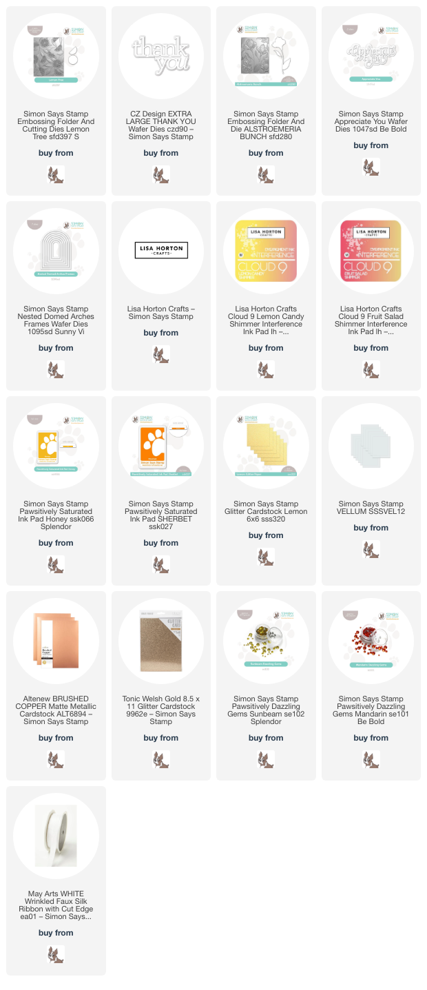
For the greeting, I kept things simple, cutting the Thank You XL die from some yellow glitter cardstock and vellum, then popped it up on the blended backdrop with some thin strips of foam adhesive. I used an alcohol marker to add some deep yellow to a length of white silk ribbon and tied it in a fluffy bow, tucking it beneath the sentiment die cut. Finally, I added a few sparkling Sunbeam Pawsitively Dazzling Gems. The shimmer and sparkle on this card is incredible in real life!!

For my second card, I continued with the citrusy color palette, this time using an under-utilized color in my craft room: tangerine. I paired it with the Alstroemeria Bunch Embossing Folder, creating a fiery tiger lily-inspired background. I embossed the orange A2 cardstock with the Alstroemeria Bunch Embossing Folder, then blended around the edges with Sherbet Pawsitively Saturated Ink. To enhance the details on the embossed area, I swiped Lisa Horton Craft Fruit Salad Shimmer ink over the raised areas. This reddish orange metallic ink worked beautifully with the blended background to add the prettiest shimmer to my project! I took it one step further and splattered some sparkling rose gold glitter watercolor on the background, as well.

For the greeting, I die cut the detail layer of the Appreciate You die from some copper brushed metallic foil cardstock and the shadow from some vellum, adhering the two layers together with liquid adhesive. I also die cut the Nested Domed Arches Frames from some Welsh gold glitter paper, popping one of the frames up on the embellished card front with some thin strips of foam adhesive. Before adhering the greeting over the arched frame, I die cut one of the standalone alstroemeria flowers, which is included in the Alstroemeria Bunch Embossing Folder, from some more of the same vivid orange cardstock, then placed the die cut in the coordinating spot of the embossing folder and ran it through my die cutting machine to emboss the details into the image. I used some residual ink on the blending brush from blending on the card front to add some dimension to the standalone die cut, then added some more rose gold glitter watercolor details. I popped up the alstroemeria flower die cut and greeting with foam adhesive over the glittery arched frame, finishing the card off with some sparkling Mandarin Pawsitively Dazzling Gems.

Soooo much sparkle and shimmer on these cards… the pictures simply do not do them justice!! These new Lisa Horton Crafts Interference Inks have so much potential for fun techniques. I can’t wait to continue playing with them! Thanks so much for stopping by today, and have a marvelous day!
Filed Under: simon says stamp Tagged With: 3D embossing folder, alstroemeria bunch, appreciate you, extra large thank you, ink blending, interference ink, lemon tree, lisa horton interference inks, nested domed arches frames

Orange Ombré with NEW Simon Says Stamp Pawsitively Saturated Inks!

March 29, 2024

This post was sponsored by Simon Says Stamp. Thanks, Simon!

Hi friends! I have a pair of cards to share with you today using the newest installment in the Pawsitively Saturated Ink family from Simon Says Stamp. The Pawsitively Saturated Ink Trio 28 is a unique group of sunset shades, ranging from a lovely peach to a deep crimson, colors that are under-appreciated on my blog! I thought I would really lean into this beautiful sunset ombré with a pair of color-saturated cards using some more new goodies from the Be Bold release. Let’s get started with the details!

Whenever I have new inks to use, I frequently will start by just saturating a few panels of white cardstock with the new ink colors in an ombré. I love color saturated projects as much as I love crisp white space, so these vibrant panels never fail to inspire me. I blended three different panels of Hammermill white cardstock using blending brushes with the new Pawsitively Saturated Ink Trio 28. Having three panels gave me plenty of space to play with some different techniques!

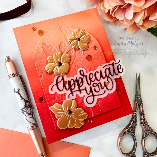
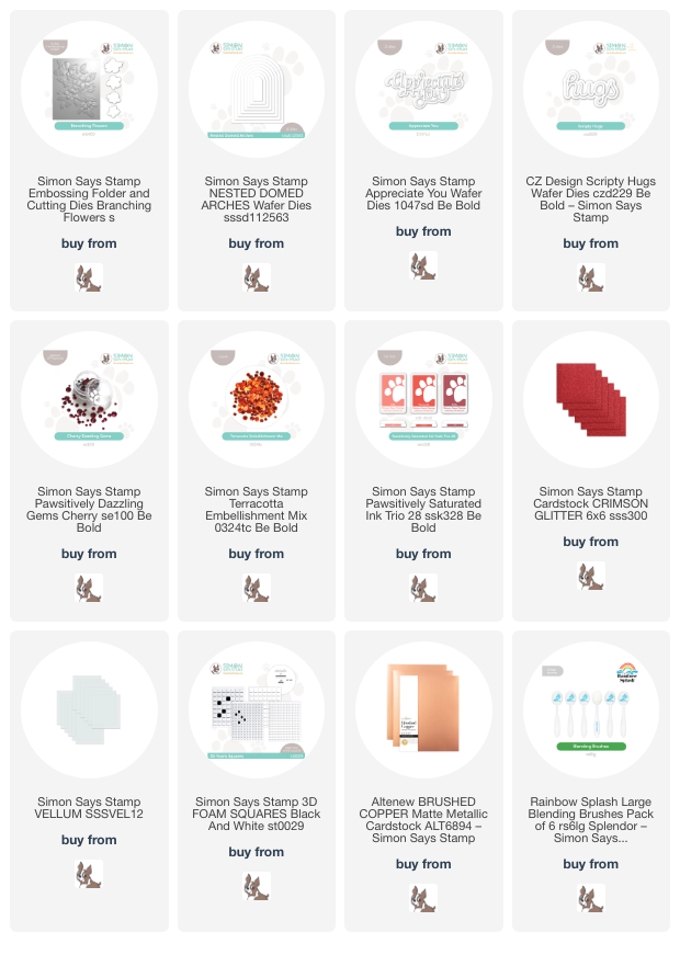
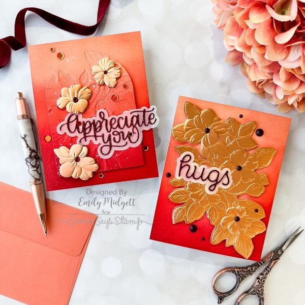
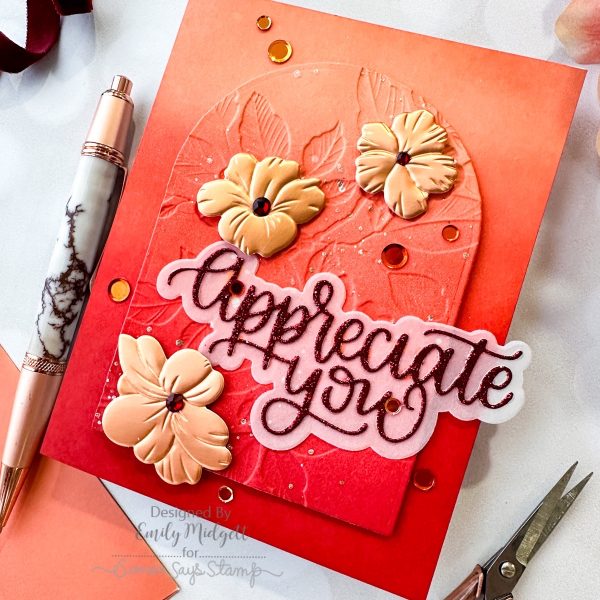
For my first project, I die cut a Nested Domed Arches from one of the blended panels, then ran it through my die cutting machine using the new Branching Flowers Embossing Folder and Coordinating Dies set. Now, I did this backwards on accident, so that the pattern was impressed down into the cardstock rather than being popped up, but I think that the beautiful details and textures were just as lovely this way! I splattered some handmade glitter watercolors in a complementary shade of copper on the embossed panel to add some extra shine. Once the watercolors were dried, I used foam squares to pop up the embossed panel on a coordinating A2 blended panel, creating lots of beautiful tone-on-tone texture.

Once I had my background completed, I die cut the new Appreciate You die from some Crimson Glitter Cardstock and backed it with a shadow layer cut from vellum. It’s difficult to see the sparkle in the photo, but between the glitter watercolors and the glittering sentiment, this card has so much sparkle and shine! I die cut a few of the florals from the Branching Flowers Embossing Folder and Coordinating Dies set using Brushed Copper cardstock, then arranged them in their coordinating spots in the embossing folder and ran them through my die cutting machine. The metallic cardstock picks up the embossed details *so* beautifully. I popped them up on their coordinating spot on the embossed panel, and they fit quite well despite being mirror images of the embossed panel. I added some Cherry Pawsitively Dazzling Gems and Terracotta Sequins for the flower centers and to add a bit more sparkle!

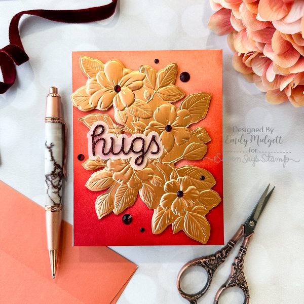
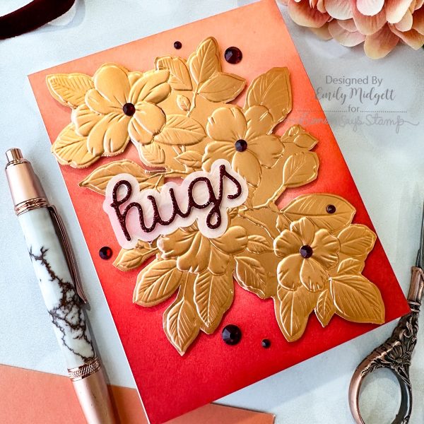
For my second card, I was so entranced by the beautiful details Branching Flowers Embossing Folder and Coordinating Dies with the Brushed Copper cardstock that I wanted to use it as a focal point for a card. I ran a full A2 panel of Brushed Copper cardstock through my die cutting machine using the Branching Flowers Embossing Folder, trimmed out the image using my sharp scissors, then popped it up on one of the remaining A2 panels of cardstock blended using the Pawsitively Saturated Ink Trio 28. The peachy copper cardstock coordinated beautifully with the sunset ombré background!

For the greeting, I kept things simple, die cutting the new Scripty Hugs die from some more Crimson Glitter Cardstock and backing it with a shadow layer cut from more vellum. I added the greeting to the embossed floral piece with some tiny dots of liquid adhesive, then added some sparkling Cherry Pawsitively Dazzling Gems to finish the project off!

Well, that’s all for my projects today! I love playing with floral embossing folders, and I think pairing them with metallic cardstock and beautiful inks makes such a huge impact. Thanks so much for stopping by today, and have a marvelous day!
Filed Under: simon says stamp, Uncategorized Tagged With: appreciate you, branching flowers embossing folder, ink blending, nested domed arches, pawsitively saturated, scripty hugs

Primary Sidebar

  • Facebook
  • Instagram
  • Pinterest
  • YouTube

Favorite Shops

Secondary Sidebar

Subscribe

Enter your email address to subscribe to this blog and receive notifications of new posts by email.

Instagram
Something is wrong.
Instagram token error.
Follow
Load More

Archives

Tags

3D embossing folder alcohol markers better press birthday birthday card blog hop card kit christmas christmas card christmas tag colored pencil copic copic coloring Daniel Smith die cutting embossing folder embroidery felt giveaway holiday holiday card hot foil ink blending karin brushmarker pro layered stencil masculine my monthly hero new release no line coloring no line watercolor OLO marker olo markers original illustration pawsitively saturated rainbow shaker card slimline stamping stamptember stencil thank you thinking of you valentine's day video watercolor

Popular Posts

Simon Says Stamp Joy For You Blog Hop- Day 1!
Simon Says Stamp Joy For You Release-Now Available!
Frozen Fractals All Around with New Simon Says Stamp Joy For You Release!
Shaped Holiday Shaker Card with New Simon Says Stamp Jolly Season Card Kit of the Month!
Holiday Postage with New Simon Says Stamp!
Simon Says Stamp Glory to the Newborn King Holiday Kit-Part II!
Altenew Build A Flower: Fuchsia Blog Hop+Giveway!
Holiday Joy in Pink and Green with New Simon Says Stamp DieCember!
Pinkfresh Studio 5th Birthday!
Honey Bee Stamps September Release Blog Hop!

Disclosure

Some affiliate links are used in my posts. This means that, should you click on one of my links and purchase something from that company, I will receive a small portion of the sale at no extra cost to you. I use the money earned from these sales to help maintain my blog. I so appreciate you visiting and, if you do choose to use one of my affiliate links, thank you so much for your support!
Copyright © 2026 ·Brunch Pro Theme · Genesis Framework by StudioPress · WordPress · Log in
Loading Comments...