• Skip to main content
  • Skip to primary sidebar
  • Skip to secondary sidebar

Sixth Street Sundries

Emily Midgett

  • Home
  • About Me
  • Contact
  • OLO Marker Color Swatch Chart
  • Shop

extra large thank you

Blended Dahlia Thank You and Iridescent Embossing with Simon Says Stamp + SALE!

May 8, 2026

This post was sponsored by Simon Says Stamp. Thanks, Simon! *I have gathered links to all of the products used at the bottom of the post for your convenience, using affiliate links at no extra cost to you. Thank you for shopping with my links! I truly appreciate your support for my work!*

Hi friends! When I find a color palette that speaks to me, I tend to get a bit of tunnel vision and create lots of different projects using similar shades, pulling out similar colors of cardstock, inks, embellishments, and specialty cardstock. The color palette for the striped background from THIS post inspired me so much that I couldn’t resist creating an ink blended background using a similar color palette. My Dahlia Background stamp is super detailed, making it great for an intense coloring session or to use as a background. I chose to do some fun ombré stamping, embossing, and blending to create this pretty sunset-inspired background. Let’s get started with the details on my project!

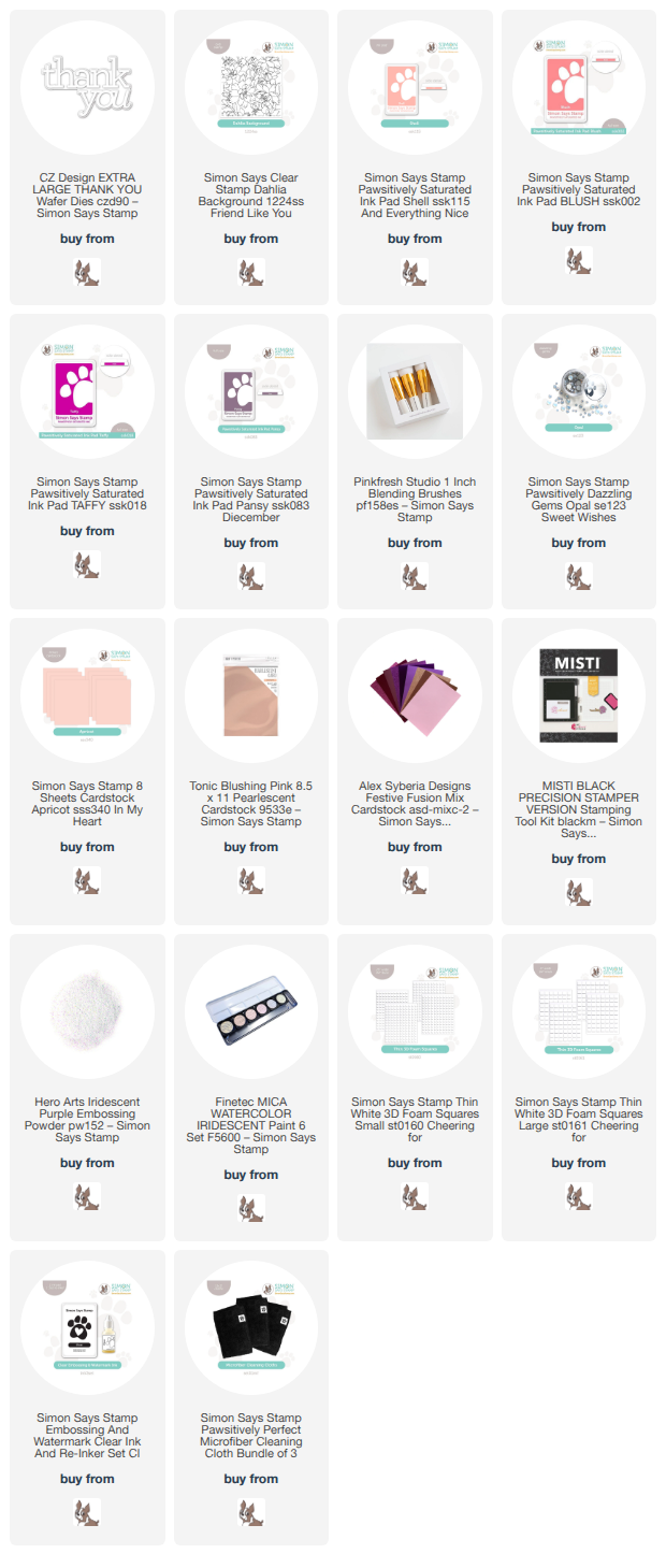
To begin, I placed my Dahlia Background in my MISTI to do my stamping. This project is unique, because it layers the ombré stamped and embossed background with ink blending directly over the embossed images. The MISTI is very important for this technique; not only is it indispensable for creating the stamped ombré image, but it also allows you to stamp the image again with embossing ink so as to create the perfect background for emboss/resist! To create the ombré stamped image, I used Pawsitively Saturated Inks in shades of Shell, Blush, Taffy, and Pansy, first applying the Shell ink to the top of the stamp, softening the inked edge with a microfiber cloth, then closing the lid of my MISTI, repeating the process to ensure good coverage. I repeated the process with the second color on the section of stamp below the first, softening the edges of the top and bottom of the inked area with the cloth. Softening the edges of the inked area helps to create a smooth transition between colors!

Once I had finished stamping the background with the colorful inks, I stamped it once more with sticky embossing ink and added some sheer iridescent embossing powder over the top to protect the colorful stamped background for some emboss/resist blending. Once my embossing powder had been heated, I blended the same ink shades over the top in a smooth ombré, creating a tone-on-tone effect. I also splattered some iridescent glittering watercolors for more sparkle and texture.

After I had created the background, I trimmed the edges off and placed it in the center of an Apricot A2 card front, adding some thin rose gold foil strips at the edges of the blended panel to add some additional contrast between the different pieces of cardstock. I also die cut the generously-sized Thank You XL detail layer from some pearlescent blush cardstock and popped it up at the bottom of the card front with thin strips of foam adhesive. Finally, I added some Opal Pawsitively Dazzling Gems for additional sparkle!

Well, that’s all for my project today. I think the multiple layers of tone-on-tone color is so pretty with the addition of the sparkling accents!
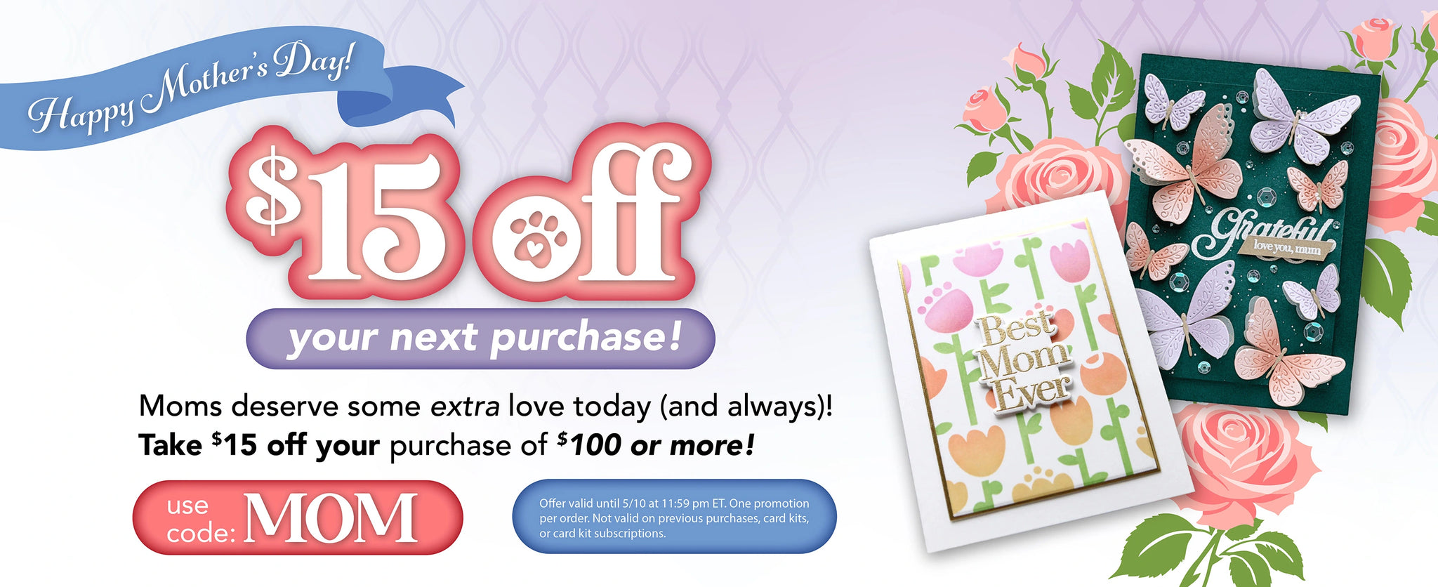
Now for some fun sale information! Simon Says Stamp is showering moms with love with $15 off your $100 purchase! Simply fill your cart and add code MOM at checkout to receive your discount!

Thanks so much for stopping by today, and have a marvelous day!
Filed Under: simon says stamp Tagged With: dahlia background, extra large thank you, ink blending, misti, ombré emboss/resist, thank you XL

Enhancing Embossing Folder Details with Lisa Horton Crafts Interference Inkpads!

August 15, 2024

This post was sponsored by Simon Says Stamp. Thanks, Simon!

Hi friends! I recently purchased some new-to-me inks that I’ve seen for a long time: Lisa Horton Crafts Interference Inks. These inks are a mixture of dye and pigment ink, creating an ink that has an incredibly unique metallic pearlescent shimmer and shifts colors in different lights and angles! An Instagram friend of mine (@ritzyhag) shared one of her projects with these inks that she’d purchased from the UK last year, and so I was super excited to see them available at Simon Says Stamp. (Click HERE to see them all!) I purchased… several… of these inks, and I am absolutely delighted with the initial experiementation results.

If you’ve been paying any attention to my blog over the last several months, you know that embossing folders are some of my most favorite products, simply because of the versatility of techniques with which you can use on them. When I purchased these inks, my first instinct was to pair them with some gorgeous detailed embossing folders, and boy they did not disappoint. I have created several cards to share with you over the next couple of weeks, but I thought we’d start off with some citrus-y cards to juxtapost the cool color palettes from my cards this week. Let’s get started with the details!

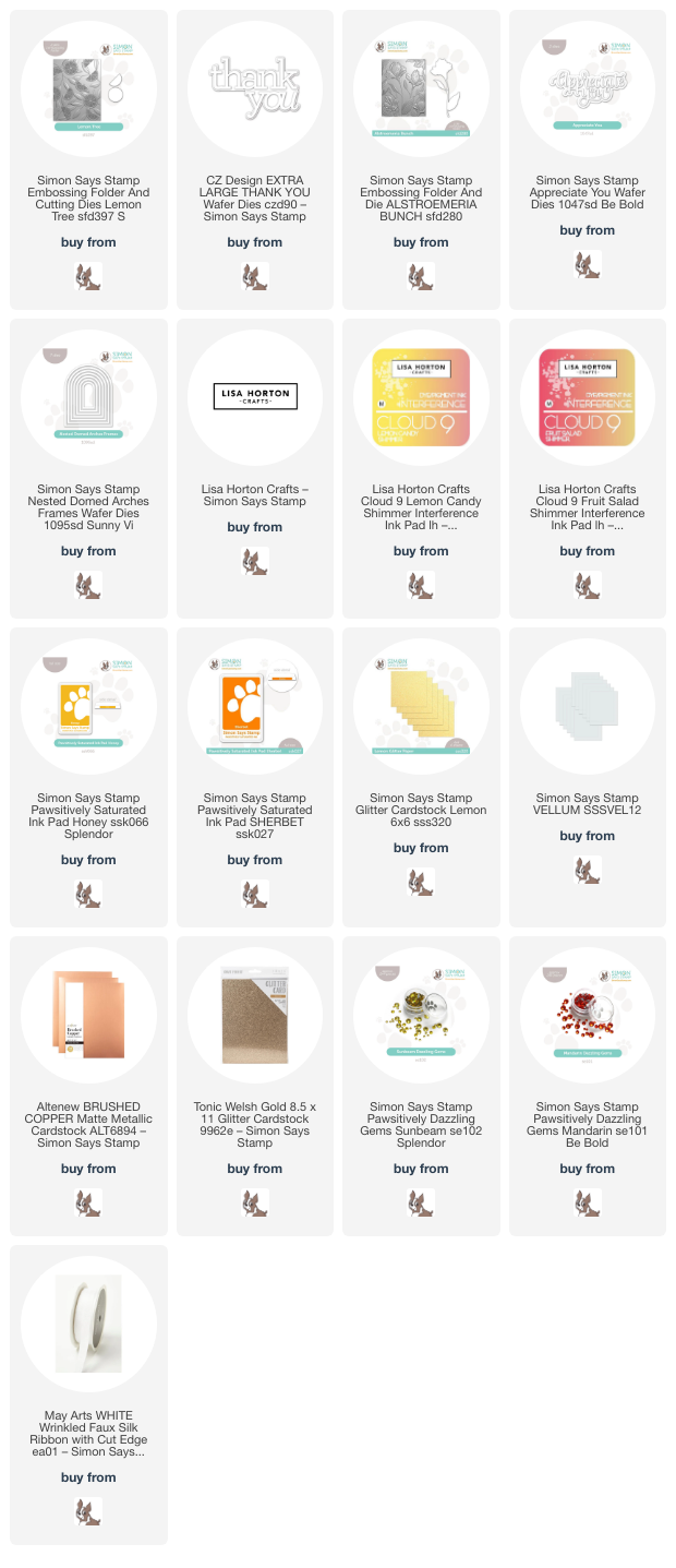
I realized that I hadn’t used the new Lemon Tree Embossing Folder, so I pulled that out and started ruminating on some citrusy colors and themes. The Interference Inks come in such an enormous array of colors; it was easy to find some colors that would beautifully accent this citrus color palette! They are a mixture of pigment and dye inks, so they stamp one color on white and another on black. I am having tons of fun experimenting with them on different colors of cardstock, too!!

I started by embossing a panel of sunny yellow cardstock with the new Lemon Tree Embossing Folder, then blended Honey Pawsitively Saturated Ink around the edges with a blending brush. Blending after embossing enhances the textured pattern on the cardstock and adds extra dimension to the panel. After I had finished blending, I swiped the raised areas of the panel with the gorgeous Lisa Horton Crafts Lemon Candy Shimmer ink, which adds some incredible shimmer to the pattern and adds some luxury to the entire panel. I also splattered the background with some shimmering gold glitter watercolors from my stash.

For the greeting, I kept things simple, cutting the Thank You XL die from some yellow glitter cardstock and vellum, then popped it up on the blended backdrop with some thin strips of foam adhesive. I used an alcohol marker to add some deep yellow to a length of white silk ribbon and tied it in a fluffy bow, tucking it beneath the sentiment die cut. Finally, I added a few sparkling Sunbeam Pawsitively Dazzling Gems. The shimmer and sparkle on this card is incredible in real life!!

For my second card, I continued with the citrusy color palette, this time using an under-utilized color in my craft room: tangerine. I paired it with the Alstroemeria Bunch Embossing Folder, creating a fiery tiger lily-inspired background. I embossed the orange A2 cardstock with the Alstroemeria Bunch Embossing Folder, then blended around the edges with Sherbet Pawsitively Saturated Ink. To enhance the details on the embossed area, I swiped Lisa Horton Craft Fruit Salad Shimmer ink over the raised areas. This reddish orange metallic ink worked beautifully with the blended background to add the prettiest shimmer to my project! I took it one step further and splattered some sparkling rose gold glitter watercolor on the background, as well.

For the greeting, I die cut the detail layer of the Appreciate You die from some copper brushed metallic foil cardstock and the shadow from some vellum, adhering the two layers together with liquid adhesive. I also die cut the Nested Domed Arches Frames from some Welsh gold glitter paper, popping one of the frames up on the embellished card front with some thin strips of foam adhesive. Before adhering the greeting over the arched frame, I die cut one of the standalone alstroemeria flowers, which is included in the Alstroemeria Bunch Embossing Folder, from some more of the same vivid orange cardstock, then placed the die cut in the coordinating spot of the embossing folder and ran it through my die cutting machine to emboss the details into the image. I used some residual ink on the blending brush from blending on the card front to add some dimension to the standalone die cut, then added some more rose gold glitter watercolor details. I popped up the alstroemeria flower die cut and greeting with foam adhesive over the glittery arched frame, finishing the card off with some sparkling Mandarin Pawsitively Dazzling Gems.

Soooo much sparkle and shimmer on these cards… the pictures simply do not do them justice!! These new Lisa Horton Crafts Interference Inks have so much potential for fun techniques. I can’t wait to continue playing with them! Thanks so much for stopping by today, and have a marvelous day!

Filed Under: simon says stamp Tagged With: 3D embossing folder, alstroemeria bunch, appreciate you, extra large thank you, ink blending, interference ink, lemon tree, lisa horton interference inks, nested domed arches frames

April Showers Bring May Flowers: Stencil Edition!

May 16, 2024

This post was sponsored by Simon Says Stamp. Thanks, Simon!

Hi friends! I was thrilled to be asked to help teach at a booth at Simon Says Stamp’s amazing in-person creative event last weekend, appropriately called CREATE, and on Saturday, we used a new-to-me product that was so lovely that I just had to go purchase on my break: Floral Whimsy Stencil! We used a beautiful ink combination of Cheeky, Tidepool, and Ocean to create a springy, cool color palette, but my dress for Saturday featured pretty yellow blooms on a white linen background, and all I could think about was trying out this stencil set with a similar color palette when I got home. I went to town blending and create two different projects with very different feel to them, so let’s get started with the details!

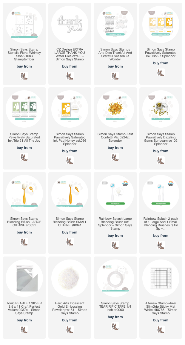
For both of my projects, I paired the Floral Whimsy Stencil with the luscious lemony tones of the Pawsitively Saturated Ink Trio 27 and used Cabbage and Artichoke Pawsitively Saturated Inks from Ink Trio 21 to create the foliage. If you’ve followed my blog for any length of time, you’ll know that I love monochromatic projects, adding in fun textures and accents to keep things interesting. I have been looking at home remodeling ideas on social media, and one of the popular trends right now is called “color drenching,” which perfectly coincides with my monochromatic style! Everything is painted the same color, from the doors to the trim to the walls, and it creates the most elegant and luxurious effect. I wanted to channel that a bit today, creating one project with a traditional crisp white background, but also creating a “color drenched” project with some sunny yellow cardstock.

For my first project, I placed a panel of sunshine yellow cardstock in the center of my sticky mat and blended the pattern with the inks listed above using the the Floral Whimsy Stencil, adding some extra interest with dark and light inks by using both the small and large blending brushes. One of my favorite things about this stencil is that each stencil has registration marks lasered around the edge of the pattern that line up perfectly with your A2 card front so that you can get exact placement of each stencil. Super user-friendly!

Once I had finished blending my color-drenched background, I die cut the detail layer of the Thank You XL die (another purchase last weekend!) twice from some deep green cardstock, adhering the layers together to get some extra height and dimension. I die cut the shadow layer from some silver pearl vellum and adhered all of the layers together, adding them to the card front with some thin strips of foam adhesive. Finally, I finished off this simple, color-drenched card with some coordinating, sparkly Sunbeam Pawsitively Dazzling Gems.

For my second project, I decided to create a flat shaker card, this time with a more lemon meringue color palette, blending the Floral Whimsy Stencil on white, rather than yellow, cardstock. I blended the images in the same fashion, using the two different sizes of blending brush to help add extra shading to the centers of the flowers and leaves, etc. I trimmed the panel down by 1/4″ on all sides, then blended some of the darkest yellow ink from the Pawsitively Saturated Ink Trio 27 around the edges to create a glow on my patterned background. To create the shaker, I adhered some leftover clear stamp packaging from a stamp set around the entirety of the patterned panel with some super sticky double sided tape, then filled it with Zest sequins. I love the effect of these flat shakers; they’re so fun and so sparkly!

For the greeting, I stamped some sentiments from the Thankful & Grateful set onto some white cardstock using Honey ink, then stamped directly over the top with some sticky embossing ink and added some Iridescent Gold embossing powder. This extra step of adding the iridescent sheer embossing powder adds a little extra shimmer and interest to the sentiment. I used the coordinating die for the large “grateful” sentiment, then used my trimmer to trim the sentiment strips. I added the sentiment strips to the center of my shaker with some foam squares and mounted the entire shaker panel with some more super strong double sided tape onto a full size panel of white cardstock. Such a fun way to make a simple stenciled panel a little extra special!

Well, that’s all for my projects today. I hope these sunny yellow cards bring some sunshine to your Thursday! Thanks so much for stopping by today, and have a marvelous day!

Filed Under: simon says stamp Tagged With: extra large thank you, flat shaker, floral whimsy, ink blending, layered stencil, pawsitively saturated, stencil, thankful and grateful

Primary Sidebar

  • Facebook
  • Instagram
  • Pinterest
  • YouTube

Favorite Shops

Secondary Sidebar

Subscribe

Enter your email address to subscribe to this blog and receive notifications of new posts by email.

Instagram
Something is wrong.
Instagram token error.
Follow
Load More

Archives

Tags

3D embossing folder alcohol markers better press birthday birthday card blog hop card kit christmas christmas card christmas tag colored pencil copic copic coloring Daniel Smith die cutting embossing folder embroidery felt giveaway holiday holiday card hot foil ink blending karin brushmarker pro layered stencil masculine my monthly hero new release no line coloring no line watercolor OLO marker olo markers original illustration pawsitively saturated rainbow shaker card slimline stamping stamptember stencil thank you thinking of you valentine's day video watercolor

Popular Posts

Simon Says Stamp October 2026 Card Kit of the Month: Homespun Gratitude!
Honey Bee Stamps Cheerful Love Blog Hop!
Altenew Craft A Flower: Poppy Blog Hop+Giveaway!
Autumn Legs with Colorado Craft Company and Catherine Pooler!
Simon Says Stamp Cozy & Bright Inspiration, Part Two!
February 2018 My Monthly Hero Blog Hop!
The Ton Anniversary Release- Day 2
Sunflower Home Decor with Simon Says Stamp!
Simon Says Stamp STAMPtember Surprise: Boo Bundle Halloween Card Kit!
Hero Arts Spring 2020 Catalog Release Blog Hop+Giveaway!

Disclosure

Some affiliate links are used in my posts. This means that, should you click on one of my links and purchase something from that company, I will receive a small portion of the sale at no extra cost to you. I use the money earned from these sales to help maintain my blog. I so appreciate you visiting and, if you do choose to use one of my affiliate links, thank you so much for your support!
Copyright © 2026 ·Brunch Pro Theme · Genesis Framework by StudioPress · WordPress · Log in
Loading Comments...