• Skip to main content
  • Skip to primary sidebar
  • Skip to secondary sidebar

Sixth Street Sundries

Emily Midgett

  • Home
  • About Me
  • Contact
  • OLO Marker Color Swatch Chart
  • Shop

holbein watercolor

Beachy Pastels with Scrappy Tails Crafts!

July 24, 2023

Hi friends! I have a couple of muted beachy projects to share with you today using some beautiful newer products from Scrappy Tails Crafts! Sabrina from Scrappy Tails Crafts generously sent me some of their gorgeous new June 2023 release to work with, and I was immediately drawn to the magnificent dies in the release: the A7 Seashell Cover Plate die and the beautiful sentiments in the A7 Rope Cover Plate die sets. I pulled out some watercolors and created a pair of soft, ethereal cards, perfect for sympathy or just general thinking of you. Let’s get started with the details!

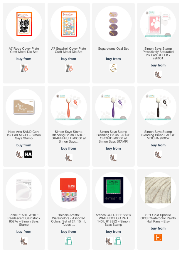
For both of these cards, I kept my color palette extremely subtle, reminiscent of a beautiful beach sunset. I die cut the large A7 Seashell Cover Plate die from some Arches Cold Press watercolor paper, as well as the individual seashells included with the die set, and watercolored them using Holbein watercolors. I added some shimmering handmade watercolor accents using my watercolors from IUILE watercolors. These are my favorite way to add a touch of shimmer and shine to my projects!

For this larger project, after watercoloring the cover plate, I chose to pull the colors from the background onto the card front. I pulled out Amethyst (from Altenew), Cheeky (from Simon Says Stamp), and Sand (from Hero Arts), then used blending brushes to very lightly blend these colors around the edges of my A7 card front. The super soft colors enhance the softly watercolored die cuts so nicely!!

Once I had finished blended the background, I turned my attention to the greeting. I die cut the beautiful sentiments from the A7 Rope Cover Plate using white pearlescent cardstock. I die cut the detailed sentiment die cut twice from white cardstock and once from the pearlescent cardstock, then adhered them together to create a dimensional die cut greeting. I backed the sentiment strip die cut with a small piece of cardstock that I blended with the Amethyst ink to create a bit of contrast. After I’d added the die cut frame with some foam adhesive, I adhered the greeting with both liquid and foam adhesive, finally adding a few sparkly jewels for some added texture.

My second card uses some of the leftovers from the first card, but this time allows the sentiment to be the star of the show! I die cut the beautiful “thoughts and prayers” die, keeping the outline die around the detailed sentiment portion. I saved the detailed layer for later and reserved the centers of some of the letters (like g, a, and o). I then die cut only the background of the sentiment from heavyweight vellum using the outline die cut. I adhered the vellum to the back of the outline, then added the centers of the letters that I had saved to the side. For the smaller sentiment strip, I kept the individual letters in their correct spot, adding a strip of washi tape to the back to keep them in place.

Using the same colors of ink that I used on the first project, I lightly blended a halo on the center of my creamy white cardstock front. I adhered my sentiment pieces over the top of this subtly blended area using foam adhesive, then added the individual watercolored seashell die cuts using both liquid and foam adhesive. Finally, I added a few sparkling gems to fill in the bare spots of the seashell arrangements.

Well, that’s all for my projects today! The June 2023 release is so beautiful and full of gorgeous summery imagery. You should definitely take a peek! Thanks so much for stopping by today, and have a marvelous day!
Filed Under: scrappy tails crafts Tagged With: beachy, holbein watercolor, rope cover plate, seashell cover plate, sympathy card, watercolor

More Simon Says Stamps Hugs Release!

December 17, 2022

Hi there! I’m still not 100%, but I wanted to share these projects that I made using new goodies from the Simon Says Stamp Hugs release while my brain was a little lucid. (Kids, man, they bring home some wicked germs!! I can’t remember the last time I felt this bad. Even hubby, my redheaded man of steel who never gets sick, has been knocked down for days.) I have a pair of cards using the fabulous new You’re My Gal and the Jumbled Hearts background stamp along with some old and new goodies, so let’s get started with the details!

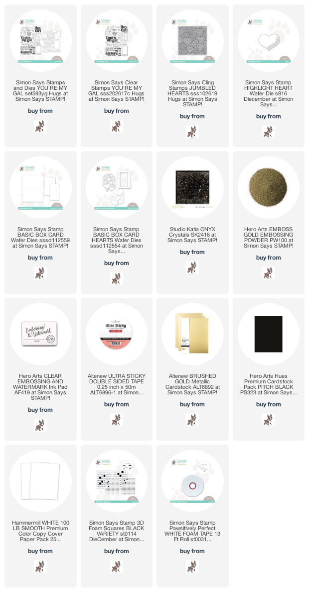
Both of my cards feature backgrounds created by watercoloring the new Jumbled Hearts background stamp and my Holbein watercolors. I began by heat embossing the entire 6×6 background stamp on a panel of watercolor paper using gold embossing powder. I used my Holbein watercolors to add lots of fun, Valentine-y colors to the heat embossed hearts.

For my first card, I trimmed down the watercolored Jumbled Hearts panel so that it covered most of my card front. I wanted to add black accents, so I used a black Karin marker to complete the “background” that behind all of the hearts. I added a strip of matte gold cardstock along the edge, then completed the rest of the A2 card front by tucking a strip of black cardstock beneath it.

After I’d finished my card base, I used the same brushed gold cardstock to die cut the Highlight Heart die from the DieCember release. The lines on the heart die cut match the graphic feel of the hearts on the embossed, watercolored background!

For the greeting, I heat embossed a few of the sentiments from the You’re My Gal stamp set onto some more black cardstock and trimmed them down to sentiment strips. I popped up the gold heart with some black foam tape, then added the sentiment strips using a double layer of the black foam tape. The final touch was to add some black gems for one more accent of shiny black!

My second card features the “leftover” strip of my watercolored Jumbled Hearts panel as the background on a Basic Box Card project. I die cut the main portion of the box card from some watermelon cardstock, coordinating with the watercolored hearts on my embossed panel.

Before assembling the Basic Box Card, I also die cut a few of the elements from the Basic Box Card Hearts add-on dies, cutting the scalloped panel from some white glitter cardstock, then cutting the super detailed heart outline layer once from gold glitter and once from plain white cardstock. I reserved the interior die cuts from the gold glitter die cut, then used Paws-itively Saturated Peony, Cheeky, and Taffy inks with the  Simon Says Stamp Blending Brushes to carefully blend a pretty ombre on the detailed die cut. I adhered the blended die cut and the white glitter die cut to the interior of the Basic Box Card according to the instructions, then turned my attention to the card front.

I gold heat embossed a couple of greetings from the You’re My Gal onto some white cardstock and die cut them. I adhered the sentiment pieces to the front of the box card using some of Altenew’s Ultra Sticky Tape, then added a trio of glittery gold hearts that we’d reserved earlier. Such a pretty card to give to your favorite gal pal, and I love how the card folds up so nicely to fit flat in an envelope! Such a unique look.

Well, that’s all for my projects today! I hope you’ll take a peek at the Hugs release, because it’s filled with all kinds of beautiful products perfect for your Valentine’s Day projects! Thanks so much for stopping by today, and have a marvelous day!

Filed Under: simon says stamp Tagged With: basic box card die, basic box card hearts die, highlight heart die, holbein watercolor, jumbled hearts, valentine's day, watercolor, you're my gal

Art Supply Favorites-A Long List!

November 23, 2022

Hi there! So I’ve recently had some questions about what watercolor supplies I would recommend, so I thought I would put a post together sharing some of my favorite items in case you wanted to ask Santa for them for your stocking… 😉

I want to preface this post by saying that I am a firm believer in the statement that you get what you pay for. Sometimes the inexpensive items are okay, like when you’re dealing with store-brand food vs name brand, but with art supplies, I’ve definitely found a difference in quality when using the student grade options. Of course, this is not an inexpensive hobby to begin with, so watching for sales and using coupons is a great way to expand your collection of art supplies while also not compromising quality. I have been stamping for 13 years, watercoloring seriously for 6+ years, and so have been building up my collection gradually. I have been lucky to have been provided some of these supplies through my work with different companies, but the vast majority of these supplies have been purchased by me over time, watching for sales and with birthday money or Christmas gift cards. I only recommend supplies that I really think will provide great results, regardless of whether they’ve been purchased by me or if companies have generously sent them to me to try. This list is not at all intended to encourage you to make purchases that you don’t need; I only want to recommend my favorite supplies if you are planning to do some artsy shopping or want to ask for some art supplies for Christmas! 🙂

***I will be providing affiliate links where applicable. When you use these links, no extra cost is added to your purchase, and it helps me to support my blog and my family. This is my job, so any support that you give me by using my affiliate links is immensely appreciated!***

First up, watercolors.

Watercolors hold true to the idea that you get what you pay for. Student grade watercolors contain less pigment and more fillers in order to make them less expensive; thus, the student grade watercolors will require more paint in order to achieve better vibrancy. The artist grade watercolors are more expensive, but contain much higher ratio of pigment to fillers, so I find that they last longer than the student grade and give better results from the start. Over the course of my watercolor journey, I have found that saving the “good” supplies and using the less expensive supplies for practice is a waste of time and money, because the good supplies behave vastly differently to the less expensive, so your results between the student grade vs artist grade will be very inconsistent. If I had known this at the start, I would not have bothered with the student grade and instead focused on building my artist-grade collection (slowly, ha) rather than wasting the time and money on the less expensive products.

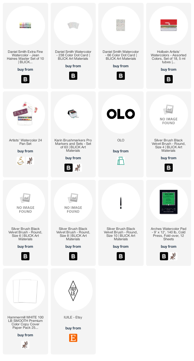
Pan Watercolors-Watercolors are one of those things that depend a lot on your personal preferences. If given the choice, I will choose to work with pan watercolors over watercolor markers, simply because I feel that I have better control over the amount of pigment and thus the intensity of the colors on my image. Artist watercolors also have better lightfast ratings, meaning that they will be less likely to fade over time. I have two artist-grade brands that I reach for over and over again: Daniel Smith Extra Fine Watercolors (Blick|SSS) and Holbein Artist Watercolors (Blick).

I have watercolors from a wide variety of brands, and I have found the stunning variety of colors in both of these brands to be unmatched. The Daniel Smith paints use many natural pigments, so the color palettes tend to be a bit more muted and earth-toned, while the Holbein palette seems to be a bit brighter and cooler. I used the Daniel Smith watercolors on the holiday paintings in the photo above; the Holbein palette is pictured below. You can see the difference in overall tone and brightness in the photos!

Both of these brands offer watercolor sets, in which they have selected a variety of shades that offer the majority of the rainbow. I have been collecting these watercolors over the last several years, and while I do enjoy having a huge variety of shades at my disposal, these watercolor sets would certainly be sufficient for quite a lot of projects. It’s amazing what custom colors you can create by mixing colors in different intensities. Holbein offers a very affordable set of 18 colors (Blick), which could easily be customized by adding a few extra pinks, purples, and greens (because we know how much I love pink!). Daniel Smith offers several different watercolor sets that are great for beginners. I personally love the color palette in the Jean Haines Master Set of 10 (Blick), which includes some of my favorite shades. One of my favorite things about the Daniel Smith line is that you can also purchase Dot Cards (Blick) that have a small sample of each color, so that you can try each color out, find your favorites, and build your own custom palette! You would be amazed at how long those little dots of watercolor will last-totally worth the money! Once you find your favorites, you can build your custom palette by purchasing the individual watercolor tubes.

I also wanted to mention the Altenew Artists’ 24 Pan Watercolors (ALT|SSS). I have found that these pan watercolors are of excellent quality and at an extremely affordable price point. If you are looking to dip your toe into watercoloring but don’t know if you want to invest in the artist grade watercolor tubes, this is a marvelous, super economical set of 24 pan watercolors that have a gorgeous color palette and move beautifully. I have been able to create tons of beautiful paintings with my 24 pan set, with a wide variety of color palettes, because mixing and matching the colors is super easy! These watercolors frequently go on sale, and they are 100% worth the money. I have a class on the Altenew website (only $8.95 for 6 videos!) that delves into these watercolors, great for beginners! You can check out the class HERE.

Watercolor Markers– While I adore pan watercolors, I can also appreciate the ease and vibrance of watercolor markers. There are several different brands of watercolor marker available, but I have found that the Karin Brushmarker Pro (Blick|SSS) markers offer wonderful quality and a huge variety of colors. I have found that I get better results by scribbling the color onto a ceramic palette, then picking the color up with my damp paintbrush, rather than putting the marker directly to the paper. This provides more control for my style of watercolor.

Next up: Alcohol Markers.

OLO Markers (OLO) are relatively new to the art world, as they were just debuted this past winter at NAMTA. I have been lucky enough to have the opportunity to work with these OLO markers over the last 8 months or so, and I have to say-I find them to be a wonderful addition to my work space. They have an incredible vibrance and blend super smoothly. I also really love the ease of selecting your blending colors; the color families are very clearly delineated and blend beautifully together, which takes the guesswork out of your color selection. They have 4 fluid ounces of ink in the barrel -nearly twice as much as other brands- and feature a unique ink delivery system that cuts down on the amount of ink wasted. Refilling them is extremely simple. I have a longer blog post with video detailing all of the unique qualities of these markers HERE. You can check them out HERE, and you will automatically receive a 10% discount when you shop using my personal link!

You can see the incredible vibrance of these markers in the photo above. I can’t wait for them to release even more colors!

Next up, paintbrushes and paper.

Watercolor Brushes-You cannot go wrong with Silver Black Velvet. I’ve tried tons of different brands of paintbrushes (don’t tell my hubby! Teehee.), and the Silver Black Velvet brushes win every time. The bristles release water very gradually, and they come to a nice crisp point giving you the ability to create really sharp edges for no-line watercoloring. I would recommend a Round Number 4 (Blick) or 6 (Blick), and a round number 8 (Blick) for large washes. If you only watercolor very small images, as many stamped images are fairly small and detailed, you might prefer the finely detailed point that a Round Number 4 brush provides. I know that these brushes are a little pricy to start, but again, you get what you pay for with watercolor supplies, and I do find that they last for quite a long time if you take care of them.

Watercolor paper– watercolor paper is a very personal choice. Your unique style of watercoloring may suit the features of one paper over another. Sometimes, it takes some experimentation to figure out which paper brand works best with your own personal style. That being said, I have always had good results with Arches cold press watercolor paper (Blick|SSS). Cold press paper has a textured side and a smooth(er) side, while hot press paper is very smooth, and I have found that texture to be an invaluable trait with my style of watercolor no matter the brand. The color moves beautifully, lifts and scrubs easily, and holds up to repeated layers of water and even embossing folders, without worrying about the fibers of the Arches cold press paper disintegrating.

You can see how well the Arches cold press holds up to a 3D embossing folder and some pretty intense watercoloring!

Alcohol Marker Cardstock– For alcohol marker coloring, no matter which brand, I have found that the Hammermill 100 lb cardstock (SSS) works wonderfully. The super smooth surface of the paper allows the colors to blend beautifully, and the weight is great for papercrafting.

Bonus: Metallic Watercolors.

If you like all things sparkly, as I do, you will love checking out the IUILE shop on Etsy. They feature handmade, unbelievably sparkly watercolor pans that add so much sparkle to your projects… it’s almost unreal. I use them for splattering backgrounds, for adding metallic sparkle to large brushed sentiments, and adding sparkly accents to alcohol marker pieces, as you can see in the Cinderella project above. They are such a fun little accent to add to your projects to help kick them up a notch!

I hope that you find this list helpful! I want to reiterate that these are my own personal preferences, and this is by no means an exhaustive list. I am by no means an expert, but I have done quite a lot of experimentation (and shopping, ha) so hopefully you can benefit from my artistic experimental trial-and-error over the last several years! If you have any questions, please feel free to reach out to me via email or DM on Instagram. I’m happy to help in any way that I can! Thanks so much for reading, if you’ve made it this far, and Happy Thanksgiving!

Filed Under: Uncategorized Tagged With: artists 24 pan watercolors, daniel smith watercolors, holbein watercolor, IUILE watercolors, karin brushmarker pro, olo markers, silver black velvet

VIDEO: Watercoloring with Stencils using New Pinkfresh Studio Holiday Products!

September 28, 2022

Hi there! I am up on the Pinkfresh Studio YouTube channel today, and I’m sharing a fun faux no-line watercolor using the new Festive Leaves stencils, two shades of ink, and a bit of watercoloring. Here’s the video:

Or you can watch the video HERE.

This technique is a super fun way to get more mileage out of your standalone stencils! The Festive Leaves stencils are a standalone stencil set, meaning that they do not have a coordinating stamp set. (There are dies though!) These layering stencils create beautiful, modern, graphic holiday foliage images, but I am a traditionalist, and I love figuring out new ways to tailor products to suit my own style. This standalone stencil set was perfect for this technique, because the simple layering stencils created full images without needing a stamp set to complete them, as some stencil sets do.

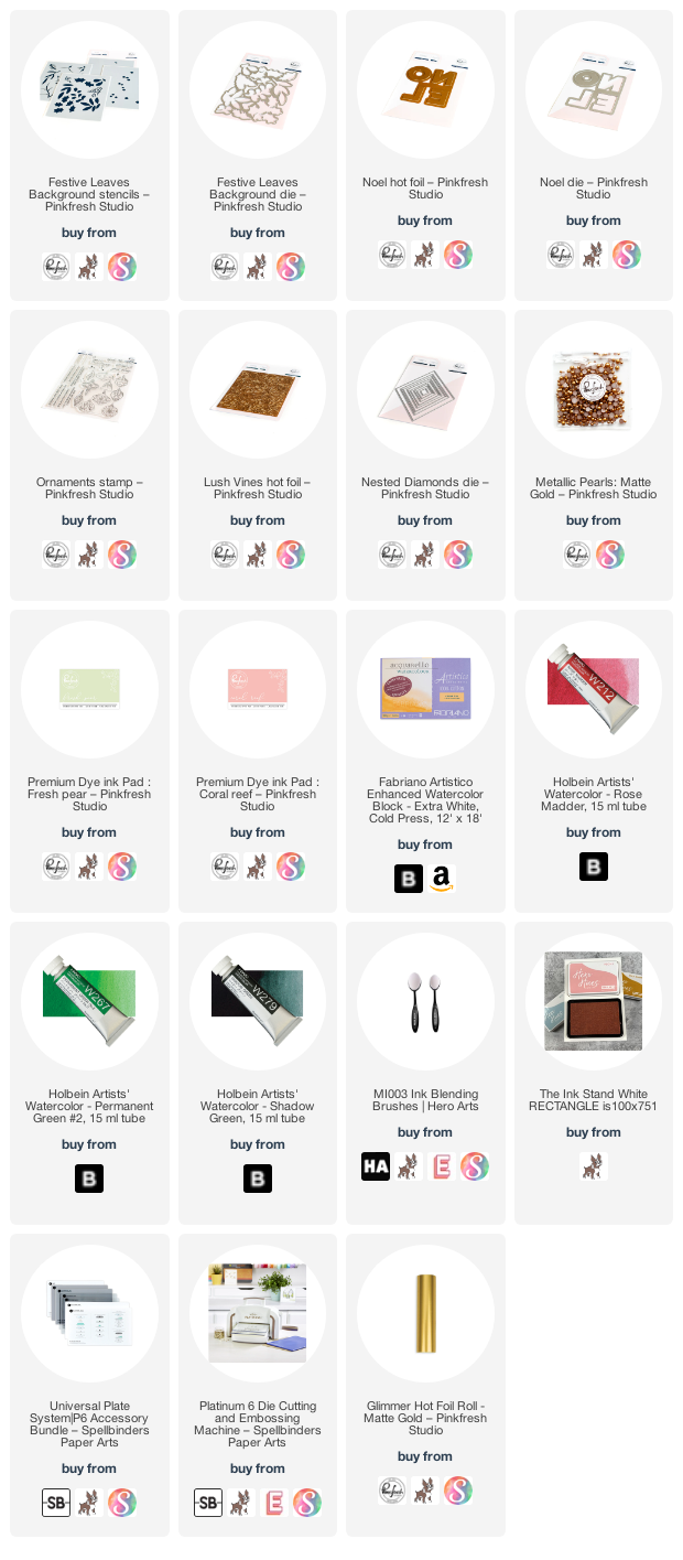
I began by blending Fresh Pear on the foliage stencils and Coral Reef Pinkfresh Studio inks on the berry stencils from the Festive Leaves stencil set onto some Fabriano Artistico watercolor paper. I blended very lightly on all of the layers, as the main purpose of this blending is to give us a basic outline for our watercoloring. You could also use no-line coloring ink, like Contour Ink from Hero Arts, but that might create a bit muddier watercoloring. The Pinkfresh Studio inks are water-based, so they work seamlessly with the Holbein watercolors that I used for this technique. I simply laid the watercolor over the top of the ink blended images. I used a bit looser watercoloring technique for these images; I wanted a bit more whimsical feel, rather than super controlled and detailed, to fit with the modern aesthetic of the images themselves. While the wet watercolor was still quite damp, I dropped in some darker green, allowing the color to “bloom” on the wet areas. Once the images were finished, I used the coordinating die to cut all of the images out in one fell swoop. That one-stop die cutting never ceases to amaze me with its cleverness!

For the background, I used the embossing mat from my Platinum 6 machine’s Universal Plate System with the Lush Vines Hot Foil Plate. This creates a lovely and subtle embossed background without having to go through all of the hot foiling process. I splattered some sparkly gold handmade watercolors on the background just to add a little extra interest. I also die cut a Nested Diamond frame from some white cardstock as a ground for my foliage and sentiment pieces.

Because I can’t keep my hot foil system out on my desk all the time, I like to foil bunches of stuff at once to have ready when I need it. I had foiled a Noel Hot Foil sentiment using Matte Gold foil, then die cut it with the coordinating die. I heat embossed a greeting from the Ornaments stamp set (this set has so many great sentiments, in addition to the beautiful ornament stamp!) using gold sparkle embossing powder. I also added a slightly wider strip of gold glitter cardstock behind to help the sentiment stand out a bit more. I adhered all of the components on the embossed background panel using double and single layers of foam tape. This card has lots of white space, so that extra foam tape helps to add lots of texture and interest to the card front. Finally, I added a few Matte Gold pearls for one last element of golden shine!

Well, that’s all for my project today. I encourage you to take a look at your standalone stencils to see which ones would work with this faux no-line watercoloring technique. Such a fun way to make your cards look even more unique and truly handmade! Thanks so much for stopping by today, and have a marvelous day!

Filed Under: pinkfresh studio Tagged With: christmas card, festive leaves stencils, holbein watercolor, holiday card, hot foil, layering stencil, noel, ornaments, stencil, watercolor

Simon Says Stamp Yay You Release Blog Hop+Givewaway!

May 13, 2022

Hi there! I’m so excited to be part of Simon Says Stamp’s Yay You blog hop today, celebrating their newest collection release. You should have arrived here from Bibi Cameron, and your next stop is Miriam Prantner. You can also start back at the beginning at the Simon Says Stamp Blog in case you get lost! I have a trio of wedding-themed projects to share with you today, all with a coordinated feel but each their own unique finished product. Let’s get started with the details!

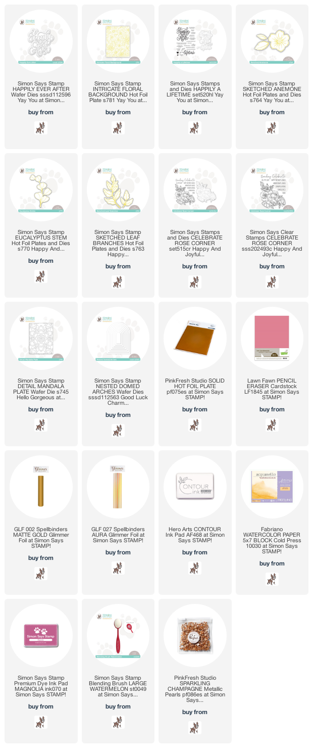
My first projects feature several of the stunning new hot foil goodies from the Yay You release. I came a little late to the hot foil game, only recently becoming slightly obsessed with the magic that is hot foiling, and these gorgeous new floral hot foil plates are just making me love it even more. I have found that the Pinkfresh Studio Solid Hot Foil Plate is an absolute game changer when it comes to hot foil. It allows you to get twice as much mileage from your hot foiling products, and it creates such an incredibly unique look with the solid foiled pieces.

For this first project, I wanted to create some bold matte gold floral images, so I combined the new Sketched Anemone hot foil plates with the Solid Hot Foil Plate to create some matte gold foil ephemera for my card front. I also created some foliage using the Eucalyptus Stem hot foil plate, as well as a few vellum Sketched Leaf Branches for some textural variety.

I die cut a Domed Arches die from some Lawn Fawn Pencil Eraser cardstock, which I find to be a most unique shade of pink-something that I truly have never seen before amongst my (somewhat copious) collection of colored cardstock! I placed the arch die cut on the Detail Mandala die and ran it through my die cut machine to add some subtle interest to the background. I popped the pierced dome die cut up on an A2 card base made from Pencil Eraser cardstock with some foam tape. I arranged the foiled floral swag on the dome die cut, then added a greeting from the new Happily A Lifetime. Such a gorgeous sentiment set! A few iridescent pearls finished the project off and added one final bit of textural contrast.

My second project features several of the same products used on the first project, as well as an identical color scheme, but this project features a completely different layout. I began this project by hot foiling the beautifully detailed new Intricate Floral hot foil plate onto some more Pencil Eraser cardstock using Aura foil from Spellbinders. This was my first occasion to use the Aura foil, and its iridescent gold shimmer does not disappoint in the slightest! The combination of the iridescent foil impressed into the unique melon pink background makes my heart flutter.

I trimmed the foiled background down slightly and added a strip of glittery gold along the edge, then mounted that on a full size A2 Pencil Eraser card base using foam adhesive. I heat embossed another greeting from Happily A Lifetime onto some more pink cardstock using white embossing powder for maximum contrast, then popped the greeting and some golden foiled eucalyptus die cuts up using a double layer of foam adhesive for tons of height and contrast. A few more iridescent pearls finished the project off.

My last project for today features the gorgeous, gigantic new Happily Ever After die. I thought the romantic font and sheer size of this die would work beautifully with my Celebrate Rose Corner stamps. Roses+weddings go together like peanut butter+jelly, right? I stamped the Celebrate Rose Corner using Contour Ink from Hero Arts, then did some no-line watercoloring on the roses using Holbein watercolors and Fabriano Artistico watercolor paper. Once I’d finished watercoloring, I die cut the large image using the coordinating die.

For the card base, I trimmed down an A7 card front from some more Pencil Eraser cardstock, which coordinated beautifully with the muted mauve-y pinks in the roses. To add a bit of interest to the background, I blended some Magnolia ink using a blending brush, then splattered some handmade shimmery gold watercolor on blended the background. I popped up the watercolored roses using foam adhesive, then added the glittery gold Happily Ever After die cut. I also tucked a couple of Eucalyptus Stem hot foiled vellum die cuts for added textural interest, as well as a few rose gold gems for even more sparkle. The sparkles and size make it super festive for a wedding card, but the soft colors and pretty flowers are so romantic, don’t you think?

Well, that’s all for my projects today! To celebrate their latest release, Simon Says Stamp is generously giving away a $25 coupon to every stop on the hop, selected from the blog comment section. Winners will be chosen and posted on the Simon Says Stamp blog on Wednesday, the 18th of May. The more comments you leave along the hop, the more chances you have to win!
Simon Says Stamp is also offering a fun gift with purchase freebie! Simply add code BEAUTY at checkout to receive the Beautiful die set for free!

Your next stop on the hop is Miriam Prantner. Thanks so much for stopping by today, and happy hopping!

Filed Under: simon says stamp Tagged With: celebrate rose corner, holbein watercolor, hot foil, original illustration, watercolor

  • Page 1
  • Page 2
  • Go to Next Page »

Primary Sidebar

  • Facebook
  • Instagram
  • Pinterest
  • YouTube

Favorite Shops

Secondary Sidebar

Subscribe

Enter your email address to subscribe to this blog and receive notifications of new posts by email.

Instagram
Something is wrong.
Instagram token error.
Follow
Load More

Archives

Tags

3D embossing folder alcohol markers better press birthday birthday card blog hop card kit christmas christmas card christmas tag colored pencil copic copic coloring Daniel Smith die cutting embossing folder embroidery felt giveaway holiday holiday card hot foil ink blending karin brushmarker pro layered stencil masculine my monthly hero new release no line coloring no line watercolor OLO marker olo markers original illustration pawsitively saturated rainbow shaker card slimline stamping stamptember stencil thank you thinking of you valentine's day video watercolor

Popular Posts

Simon Says Stamp Joy For You Blog Hop- Day 1!
Simon Says Stamp Joy For You Release-Now Available!
Frozen Fractals All Around with New Simon Says Stamp Joy For You Release!
Shaped Holiday Shaker Card with New Simon Says Stamp Jolly Season Card Kit of the Month!
Holiday Postage with New Simon Says Stamp!
Simon Says Stamp Glory to the Newborn King Holiday Kit-Part II!
Pinkfresh Studio 5th Birthday!
Altenew Build A Flower: Fuchsia Blog Hop+Giveway!
Holiday Joy in Pink and Green with New Simon Says Stamp DieCember!
Honey Bee Stamps September Release Blog Hop!

Disclosure

Some affiliate links are used in my posts. This means that, should you click on one of my links and purchase something from that company, I will receive a small portion of the sale at no extra cost to you. I use the money earned from these sales to help maintain my blog. I so appreciate you visiting and, if you do choose to use one of my affiliate links, thank you so much for your support!
Copyright © 2026 ·Brunch Pro Theme · Genesis Framework by StudioPress · WordPress · Log in
Loading Comments...