• Skip to main content
  • Skip to primary sidebar
  • Skip to secondary sidebar

Sixth Street Sundries

Emily Midgett

  • Home
  • About Me
  • Contact
  • OLO Marker Color Swatch Chart
  • Shop

nested arches

VIDEO: Pinkfresh Studio Window Card with Die Cuts and Hot Foil!

February 21, 2024

This video was sponsored by Pinkfresh Studio. Thanks, Pinkfresh!

Hi friends! I am up on the Pinkfresh Studio YouTube channel today with this fun monochromatic window card, complete with hot foiled and die cut accents. You can check out the video below or HERE on YouTube:

This shaped card features a fun window on the card front that I backed with some foiled acetate and adorned with some floral die cuts in monochromatic shades of aqua. Let’s get started with the details on my project!

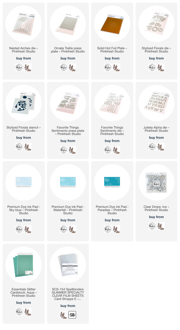
I began by die trimming down a panel of icy blue cardstock to 6″ x 4.25″, then using a score board to score a fold 1/2″ away from the top, creating a lip upon which I would later adhere the back of my card base. The plates on my die cutting machine are pretty beaten up, so I used two separate panels to create my top-folding A2 card base in order to keep the back panel as clean as possible. After I had scored the top fold, I used a die from the Nested Arches Die set to cut a window from the center of the front card panel. To fill in the open window, I used an acetate panel that I had created previously using the Ornate Trellis Better Press Plate and the Solid Hot Foil Plate. I love using heat-resistant acetate with the Solid Hot Foil Plate and leftover hot foil pieces; the super smooth surface of the acetate hot foils the solid foil pieces with immaculate results. I backed the open window with the hot foiled piece, adhering it with some super strong double sided tape.

Once I had created my card base, it was time to embellish my card! I used the Stylized Florals Stencils with Sky Blue, Waterfall, and Paradise inks, keeping my aqua blue monochromatic color palette true throughout the process. I die cut the individually-stenciled flowers in one fell swoop with the one-piece Stylized Florals Dies, then cut the foliage from another panel of icy blue cardstock as well as some Aqua Glitter Paper. I adhered the die cuts together on the die cut foliage swag, using the color-printed schematic in the product packaging as my guide for placement. To add a bit more interest to the layers of the flowers, I added a smattering of Ice Clear Drops to the centers of a few of the flowers, adding one more element of texture and shine.

For the greeting, I used a silver hot foiled sentiment from the Favorite Things Sentiments Better Press set. This sentiment set is one of my favorites from Pinkfresh Studio; it features so many lovely sentiments, making it truly all-purpose! I used some residual ink left over on my blending brushes from my stenciled flowers to blend over the silver-foiled sentiment die cut to continue my monochromatic aqua color palette throughout the card. I thought this sentiment worked perfectly for a birthday card, so I also used some deep teal cardstock to die cut HBD using the Julieta Alpha Dies. (In the video, I share a trick for adhering alphabet die cuts in a perfectly straight line!) I popped up the greeting die cuts with foam adhesive, completing the card!

Well, that’s all for my project today. I just love a good monochromatic card, don’t you? It’s such fun to find new ways to keep things texturally and visually interesting while still staying in the same color family! Thanks so much for stopping by today, and have a marvelous day!
Filed Under: pinkfresh studio Tagged With: better press, favorite things, glitter cardstock, hot foil, ink blending, julieta alpha die, layered stencil, nested arches, ornate trellis, solid hot foil, stencil, stylized florals, window card

VIDEO: Using White Pigment Ink with Artistic Dahlias Layering Stencils!

April 12, 2023

Hi there! I am up on the Pinkfresh Studio YouTube channel today with this fun video sharing tips on how you can get beautifully vibrant results blending colorful dye inks on colored cardstock. You can watch the video below:

Or watch the video HERE on YouTube.

Colored cardstock is basically one of my most favorite things about cardmaking (as my ridiculously expansive collection of colored cardstock would attest)… there’s just something so beautiful and luxurious about richly colored cardstock, and we all know my love of monochromatic layers. I adore layering up as many monochromatic components as I can, creating a seamless feel to my card. I’ve come up with lots of fun hacks for coloring on my colored cardstock or adding color around the edge of my die cut pieces. Sometimes, though, time only permits me to do simple and quick techniques, and layered stenciling is such a great way to create impressive, custom-colored looks without getting my art supplies out. To use colorful dye inks with colored cardstock, I have a secret weapon for keeping those colors rich and vibrant: white pigment ink!

Before blending the colorful inks on my minty cardstock, each solid layer of the stencils first gets an even layer of white pigment ink, blended using a blending brush (or foam blending tool) that I have dedicated solely to white pigment ink. When blending colorful inks on colorful cardstock, it’s important to remember your color theory from kindergarten: which primary colors, when mixed together, will create which secondary colors? I.e.-red+yellow=orange, red+blue=purple, etc. For example, when choosing my coral and pink inks for this card, I knew that the base colors for the minty cardstock were made up of blue+yellow+white, and that would mix with the red+yellow of the coral to make a muddy mess. The colors certainly would not remain true. That’s where the white pigment ink comes into play. The pigment ink is a heavier formulation and does not sink down into the cardstock the way dye ink does, and so it creates a barrier when you blend your colorful ink over the top, preventing the colors from the ink from mixing with the colors of the cardstock and allowing them to stay true.

I had previously hot foiled the Celebrate and Nested Arches onto the minty cardstock using matte platinum hot foil, so I heat embossed my new Artistic Dahlias stamp set onto a panel of that same minty cardstock using coordinating platinum embossing powder, then used the coordinating stencils. I added the white pigment ink on all of the solid stencils first, wiped away any excess white ink to keep my ink pads clean, then blended the colorful inks over the top. The results are so beautifully vibrant! I even used the white pigment ink on the minty green leaves before applying the minty green ink; without it, the mint cardstock would simply have been made into a darker shade of green, rather than maintaining the light and airy feel of the pale minty foliage. I die cut the finished pieces with the handy-dandy one piece die.

To add some interest to the background, I die cut a frame using the Rounded and Braided Rectangle frame dies from an A2 panel of the same minty green cardstock, which merely pierced a die cut design . I die cut the Nested Arches hot foiled piece using the coordinating die. I also die cut the hot foiled Celebrate using the coordinating die. I arranged the die cuts on the card front and adhered them with a variety of foam tape (single and double layer) and liquid adhesive to create lots of dimension and varying heights. I find various heights to help add interest to a monochromatic card like this, bringing out the details and textures of the different elements. Finally, I added a few Champagne Glitter Drops for some sparkle!

Well, that’s all for my card today! I hope you enjoyed this technique. It’s not my typical watercoloring video, but it was lots of fun to create! Thanks so much for reading, and have a marvelous day.

Filed Under: pinkfresh studio Tagged With: artistic dahlia, celebrate hot foil, hot foil, layered stencils, nested arches, white pigment ink

Primary Sidebar

  • Facebook
  • Instagram
  • Pinterest
  • YouTube

Favorite Shops

Secondary Sidebar

Subscribe

Enter your email address to subscribe to this blog and receive notifications of new posts by email.

Instagram
Something is wrong.
Instagram token error.
Follow
Load More

Archives

Tags

3D embossing folder alcohol markers better press birthday birthday card blog hop card kit christmas christmas card christmas tag colored pencil copic copic coloring Daniel Smith die cutting embossing folder embroidery felt giveaway holiday holiday card hot foil ink blending karin brushmarker pro layered stencil masculine my monthly hero new release no line coloring no line watercolor OLO marker olo markers original illustration pawsitively saturated rainbow shaker card slimline stamping stamptember stencil thank you thinking of you valentine's day video watercolor

Popular Posts

Simon Says Stamp Sending Cheer Blog Hop- Day 2 + Freebie + Giveaway!
Altenew October 2026 Release Blog Hop + Giveaway!
Rustic Monochromatic Stars for Christmas with Rainbow Splash!
December 2018 My Monthly Hero Blog Hop + Giveaway!
March 2020 Essentials By Ellen Blog Hop+Giveaway!
The Ton Stamps Summer Release: Day 1
Hero Arts Partners Blog Hop: Lawn Fawn!
Waffleflower July Release Blog Hop!
Simon Says Stamp STAMPtember Tim Holtz Collaboration: Festive Holidays!
The Ton Anniversary Release: Day 1!

Disclosure

Some affiliate links are used in my posts. This means that, should you click on one of my links and purchase something from that company, I will receive a small portion of the sale at no extra cost to you. I use the money earned from these sales to help maintain my blog. I so appreciate you visiting and, if you do choose to use one of my affiliate links, thank you so much for your support!
Copyright © 2026 ·Brunch Pro Theme · Genesis Framework by StudioPress · WordPress · Log in
Loading Comments...