• Skip to main content
  • Skip to primary sidebar
  • Skip to secondary sidebar

Sixth Street Sundries

Emily Midgett

  • Home
  • About Me
  • Contact
  • OLO Marker Color Swatch Chart
  • Shop

neon

A Tropical Sunset Celebration with Simon Says Stamp!

May 29, 2024

This post was sponsored by Simon Says Stamp. Thanks, Simon!

Hi friends! As I was perusing some of the newer goodies from Simon Says Stamp, I realized that I had not used the fabulous Organic Leaves background stamp. Whenever I am presented with solid silhouette stamps, my mind automatically supplies a tropical sunset background. Perhaps it harkens back to my obsession with the movie The Little Mermaid from when I was a child; I see Ariel silhouetted against an ocean sunset sky very clearly in my mind’s eye. I also think of yummy drinks next to a pool when I think of tropical sunsets, and yummy drinks frequently are imbibed to toast something exciting, so I thought that I would combine a few of these elements to create some fun celebratory cards! Let’s get started with the details.

For both of my projects today, I kept the color palette simple and vibrant: a tropical sunset ombré, created by blending Dandelion Rainbow Splash Ink, and Cheeky and Rose Pawsitively Saturated Ink, accented with lots of crisp, intense black. I love the juxtaposition of the vibrant, almost neon colors with the stark black accents. I think the black keeps the vivid colors from being too overwhelming!

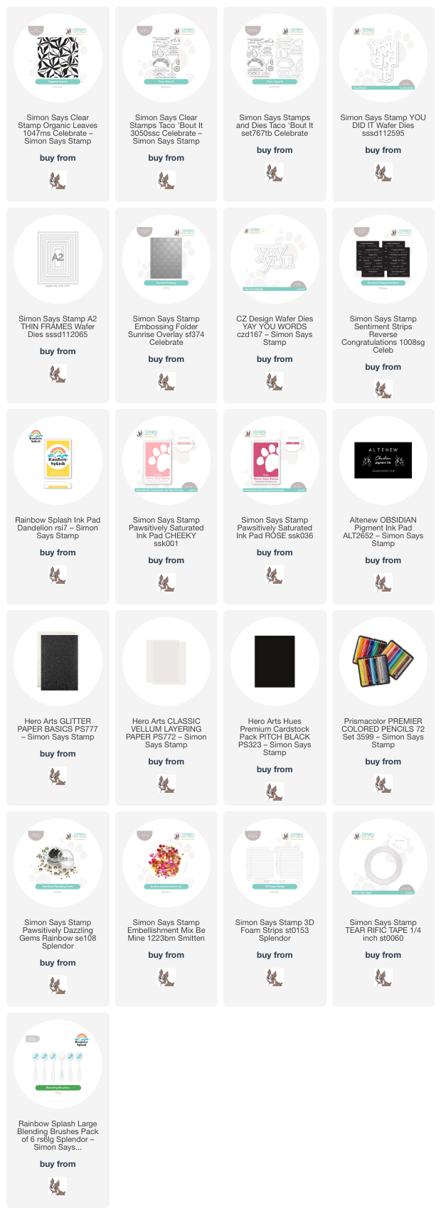
For my first project, I stamped the Organic Leaves background stamp on a panel of white cardstock using Obsidian Black pigment ink, then covered it with clear embossing powder. I think the clear embossing powder really enhances the black image and makes it even more crisp. After I had finished embossing, I took advantage of the embossing overlay to do some emboss/resist blending using Dandelion Rainbow Splash Ink, and Cheeky and Rose Pawsitively Saturated Ink. These three inks blend splendidly together and look magnificent with the crisp black leaf silhouettes!

For the greeting for my celebratory tropical sunset card (anybody else wishing that they were by the ocean in Mexico right now?) I paired a glittery, chunky die cut You Did It! cut with black glitter cardstock with the “fiesta like there’s no mañana” sentiment from Taco ‘Bout It. To accent the fun greeting, I couldn’t resist coloring up a sunset-inspired cocktail, heat embossing the glass and lemon onto some Pitch Black cardstock with white embossing powder, then using colored pencils to create my colorful cocktail. I added the shadow layer for the greeting using some vellum, then arranged all of the die cut components over an A2 Thin Frames die cut, rotated 90* and popped up with adhesive foam strips. Finally, I added a few Rainbow Pawsitively Dazzling Gems for added sparkle!

For my second card, I thought I would do the super popular embossing folder/ink swiping technique with the Sunrise Overlay embossing folder. I started by blending the same Dandelion Rainbow Splash Ink, and Cheeky and Rose Pawsitively Saturated Ink combination on a panel of white cardstock, then running the blended panel through my die cutting machine with the Sunrise Overlay embossing folder, making sure to run it through with the blended colors upside down so that I could do the fun ink swiping technique. After I had debossed the pattern on the blended side, I swiped the Obsidian Black pigment ink pad over the raised areas, creating a fun, almost distressed looking background. I allowed the black ink to dry completely, helping it along with my heat gun, then trimmed the panel down and used some leftover stamp packaging to create a flat shaker card. I filled my shaker card with Be Mine Sequins, which perfectly coordinates with my blended background!

After I had created my shaker panel, I mounted it on an A2 panel of Pitch Black cardstock, leaving a crisp black mat around the edges of my shaker panel. For the greeting, I trimmed down some sentiments from the Reverse Congratulations sentiment cards set, as well as die cutting the Yay You Words die set from black glitter cardstock and vellum. I adhered all of the pieces to the front of the shaker panel for a simple, fairly flat (and thus, easily mailed) congratulatory card!

Well, that’s all for my projects today! I have really been leaning in to bright, almost neon color palettes lately, and I think they’re so much fun for summertime. Thanks so much for stopping by today, and have a marvelous day!
Filed Under: simon says stamp Tagged With: A2 thin frames, embossing folder, flat shaker card, ink swiping, neon, organic leaves, reverse congratulations sentiment strips, shaker card, sunrise overlay, yay you words, you did it

Neon Rainbows for a Tropical Theme!

September 12, 2023

This post was sponsored by Simon Says Stamp. Thanks, Simon!

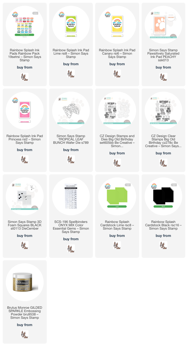
Hi friends! I am back with another card inspired by the new Rainbow Splash line from Simon Says Stamp. As I was swatching the colors in the Rainbow Splash Ink Collection, I noticed that the super bright Lime ink was nearly neon, and that inspired me to create a tropical project using a few inks from the Rainbow Splash line, softening the vivid neon aesthetic with the lovely Peachy ink from the Pawsitively Saturated ink line. Let’s get started on the details for this project!

I began by trimming down a panel of white cardstock to about 5.25″ x 4,” blending around the edges with Lime, Canary, Peachy, and Princess Inks. The Lime, Canary,and Princess Inks are from the Rainbow Splash family, but they work beautifully when paired with the Pawsitively Saturated inks. After I had created the beautiful neon glow on the edges of my white card front, I matted the panel with an ever-so-slightly larger piece of black cardstock to make it pop from the Lime Rainbow Splash cardstock base.

To keep the bright neon colors as vivid as possible, I die cut the Tropical Leaf Bunch die from some black cardstock. The crisp black cardstock contrasts beautifully with the neon background! I nestled one die cut into the corner and trimmed off the excess, then added the second over the top with some black foam adhesive squares for extra dimension and interest.

For the greeting, I heat embossed a couple of the greetings from the Big Old Birthday stamp set onto some more black cardstock using gold glitter embossing powder. I die cut the larger sentiment using the coordinating die and trimmed the smaller sentiment strip with my trimmer. I popped those up on the card front using some more black foam adhesive squares, finally adding a few Onyx adhesive gems for some more sparkle!

Well, that’s all for me today! It was such fun to step outside of my jewel- and pastel-toned aesthetic for this super vivid neon project. Sometimes, all you need is one color to jumpstart an idea for an entire card! Thanks so much for stopping by today, and have a marvelous day!

Filed Under: simon says stamp Tagged With: big old birthday, birthday, birthday card, neon, rainbow splash, tropical, tropical leaf bunch

Vivid Neon to Send Good Vibes!

August 18, 2023

This post was sponsored by Simon Says Stamp. Thanks, Simon!

Hi friends! In a complete style switch, I have this neon and black shaker card to share with you today! I have been playing around with ombré stamping and emboss resist techniques a lot lately, and decided I would highlight the ombré stamping with some black ink blending over the top to create this super vibrant shaker card. Let’s get started with the details!

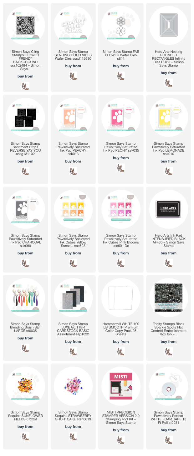
I began my project by using my MISTI to stamp the Flower Frenzy Background stamp using Peony, Peachy, and Lemonade inks. To create this ombré stamped background, my MISTI is invaluable. I begin by tapping the top of my stamp with the first color, then using my microfiber cloth to soften the line of ink so that it lightly fades away. stamped the color on my white cardstock twice, then repeated the process with the second shade, then the third. While the stamp and cardstock were still in place in my MISTI, I stamped a layer of clear embossing ink and covered it with clear embossing powder so that the ombré image would resist the ink blending on top of it! After I’d finished heat embossing, I covered the entire panel with Charcoal and Intens-ified Black using Blending Brushes.

Next, I die cut the detail layer of the Sending Good Vibes die from white cardstock and blended over the top using the same Peony, Peachy, and Lemonade inks used on the background. I cut the outline background from the black holographic cardstock in the Luxe Glitter Basic Cardstock Assortment and layered them together using liquid adhesive. I also die cut the Fab Flower die from white and black cardstock, then blended the same ink shades on the white die cuts and layered the background and outline pieces together. The background reminds me of the groovy patterns from the 1970’s, and these Fab Flowers worked perfectly!

To create my shaker, I die cut the center of a panel of black cardstock using the Hero Arts Rounded Rectangles dies, creating a frame. I backed it with some clear acetate, then filled my shaker with Trinity Black Sparkle Spots flat sequins and Simon Says Stamp’s Sunflower Sequins and Strawberry Shortcake sequins to create a color-coordinated shaker mix. I popped up the sentiment over the top of the shaker window using foam adhesive, then tucked the blended groovy flowers behind it. Finally, I added a greeting from the Reverse Yay You sentiment card set, popped up with some more foam tape.

Well, that’s all for my project today! This ombré emboss/resist technique is so much fun, and I think it creates such an impact. I hope you’ll give it a try! Thanks so much for stopping by today, and have a marvelous day!

Filed Under: simon says stamp Tagged With: emboss resist, encouragement card, fab flower, flower frenzy, ink blending, neon, ombré stamping, sending good vibes

Hero Arts My Monthly Hero March 2023 Blog Hop + Giveaway!

March 6, 2023

Hi there! Hero Arts is releasing their newest collection today, and we are hopping along to celebrate! You should have arrived here from Dana Joy, and your next stop is Ilina Crouse. You can also start at the beginning of the hop at the Hero Arts Blog for the full hop list. This month, we are focusing on all things fruity! Think fruit, veggies, farmer’s market, farms… there’s even a cute little farm puppy! The March My Monthly Hero kit features some beautiful fruit images, as well as some of the new neon liquid watercolors. Here’s a peek at the Classic Kit:

The Classic Kit includes: Clear Stamp Set, 6″ x 8″, 10 Coordinating Dies, Fruit Cling Stamp, 6″ x 6″, Intens-ified Black Ink Cube, Clay Fruit Embellishments, 2 Sheets each of Kiwi and Coral Cardstock, 5.5″ x 8.5″, 5 Sheets of Watercolor Paper, 4.25″ x 5.5″. This the main kit that you’ve come to know and love over the years, filled with amazing products for an amazing value at $36.99! (You can always subscribe to be guaranteed a kit each month, because they sell out frequently and are not restocked!)

Last month, Hero Arts debuted the new My Monthly Hero Premium Kit, which features all of the wonderful products previously mentioned in the Classic Kit along with the Fruit & Veggie Window Die, 3.7″ x 4.5″, 2 Liquid Watercolor Neon Brights in Orange & Green, and 5 Mini Brushes. The My Monthly Hero Premium Kit contents retail for $106, but the kit is yours for $49.99. Such an incredible value!! I have two projects to share with you today featuring the new kits, so let’s get started with the details!

The release of the new Neon Watercolors with the Spring 2023 catalog (you will receive Neon Orange and Neon Green with your Premium Kit) meant that I pulled out the Neon Ombré ink pads! I kept things bright and cheerful with the ombré colors, adding some dramatic flair with intense pops of black.

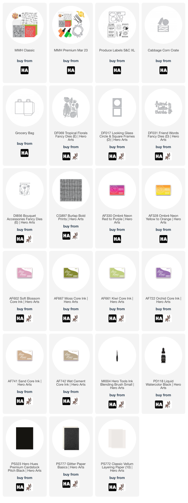
For this card featuring the Classic Kit, I did some watercoloring with the new Neon Watercolors. I black embossed several of the images from the Classic Kit onto some watercolor paper, then used the Neon Watercolors to add lots of bright color to the fruity images. I die cut the finished images with the coordinating frame cuts, also included in the kit. While I had my watercolors out, I also black embossed a greeting from the main kit’s stamp set and did a light neon watercolor wash over the top, fussy cutting it with my sharp scissors.

To coordinate with my super bright fruits, I used the Ombré Red to Purple and Ombré Yellow to Orange ink pads to blend a super bright background. I splattered some Black Liquid Watercolor on the blended panel to add a little mixed-media artistic feel to the background and break up some of the super bright color.

I die cut a frame using the Looking Glass Square Frame from some Pitch Black cardstock (which is in stock right now, so if you’ve been wanting to purchase… now is the time! It’s the best black cardstock everrrrr). I popped up the frame on my neon blended background using some foam adhesive, then added my fruit in a cluster around the frame using a double layer of foam tape for extra height. I die cut a few leaves from the Tropical Florals Fancy Die set with black glitter paper and tucked them in amongst the fruity cluster-cutting them from black reminds me of tropical jungle silhouetted against a saturated tropical sunset. The final touch was to add a few iridescent black gems for some sparkle!

My second card features the gorgeous, detailed frame from the Premium Kit, still juxtaposing the super bright neon colors with crisp black. I began my card by black embossing the background cling stamp included in the Premium Kit onto some watercolor paper, then taping it down to my watercolor board. I did a neon rainbow wash over the embossed background using the Neon Watercolors, then left my background to dry while still taped down to my watercolor board to reduce warping.

To create the front for my shaker card, I die cut the beautiful fruity frame die included in the Premium Kit twice: once from a full sized A2 Pitch Black card front, and once from a smaller square of black glitter paper. I trimmed the detailed die cut image from the black glitter paper to create a frame, which I adhered directly over the top of the Pitch Black frame. It subtly helps to emphasize the details on the fruity frame! This one would be gorgeous watercolored or colored with alcohol ink markers, but I wanted the fruity background to be the star of the show today.

I trimmed down some stamp packaging and adhered it to the back of the die cut black panel, then filled my flat shaker with the darling clay embellishments that are included in the kit. I pulled out an older word die set, Friend Words Fancy Dies, and die cut it from some white cardstock. I left the die cuts inside of the negative space and blended some more Ombré Red to Purple and Ombré Yellow to Orange over the die cut, then die cut another set from some plain white cardstock to layer beneath the blended die cuts, creating extra height. I adhered the dimensional die cut words to the front of my card. Because the shaker bits are thin and flat, we can have a flat shaker with no extra foam tape required!

Now, to completely switch gears, I have created this soft, vintage-y card using only die cuts, some soft ink blending, and white cardstock! The new March Release has a ton of gorgeous detailed fancy dies that are marvelous cut from colored cardstock, or, as I’ve done here, with a little subtle ink blending that makes a massive impact! I die cut the pieces from the new Cabbage Corn Crate Fancy Die and Grocery Bag Fancy Die from white cardstock, as well as the previously released Bouquet Accessories Fancy Dies, also from white cardstock.

After die cutting all of the components from white cardstock (the exception was the wrap for the bouquet, which I cut from Hero Arts’s heavyweight vellum cardstock), I pulled out Sand, Orchid, Soft Blossom, Kiwi, and Moss inks, as well as small blending brushes and went to town adding color to the plain white die cuts. All of the color on my card was created by using small blending brushes with several shades of ink to add subtle ink blending to the die cuts. It’s amazing what you can achieve with a few ink pads, a brush, and some white cardstock!

To add extra dimension to the ink blended die cuts, I employed a Post-It note as a mask. To get the mask exactly where I wanted it, I lightly bent the partially die cut areas and tucked the Post-It note beneath the partial die cut, as shown in the photo above, so that I could get the darker green ink precisely where I wanted it. I also used this technique with the husks of white corn to keep the Sand ink where I wanted it, as well as on the crate, to add extra shadows behind the cross piece.

After I had completed all of the ink blending, I partially inked up the Burlap Bold Print background stamp using Sand ink. I wanted a softer, more vintage feel to the card and didn’t want the background to be completely perfect, so I didn’t worry about using my Misti for perfect inking this time. I left my stamp on my work surface facing up, casually inked it up, and pressed my paper into the inked up background. I arranged the blended die cuts on the burlap background, placing the flowers and corn into the shopping bag and the cabbage into the crate. I love how it looks like you just came from the farmer’s market! I popped the die cuts up with foam adhesive for extra dimension. For the greeting, I used the new Produce Labels Stamp & Cut XL, die cutting the rectangle from white cardstock and adding the sentiment in Wet Cement with the accents in Sand ink.

Well, that’s all for my projects today! As you can see, these new products work well with a range of styles and color schemes. Super versatile and oh so fun! I don’t normally like “punny” sentiments that much, but I think the fruity puns are just so cute.

Now for some fun giveaway information:

Hero Arts is giving away a $50 gift card, drawn from the comments left across the hop. Enter by Sunday, March 12th at 11:59pm Pacific, and the winner will be announced on the Hero Arts blog the following week.

Your next stop on the hop is Ilina Crouse. Thanks so much for stopping by today, and happy hopping!

Filed Under: Hero Arts Tagged With: bouquet accessories, cabbage corn crate, farmer's market, friend words, grocery bag, ink blending, looking glass, my monthly hero, neon, produce labels, tropical florals

Primary Sidebar

  • Facebook
  • Instagram
  • Pinterest
  • YouTube

Favorite Shops

Secondary Sidebar

Subscribe

Enter your email address to subscribe to this blog and receive notifications of new posts by email.

Instagram
Something is wrong.
Instagram token error.
Follow
Load More

Archives

Tags

3D embossing folder alcohol markers better press birthday birthday card blog hop card kit christmas christmas card christmas tag colored pencil copic copic coloring Daniel Smith die cutting embossing folder embroidery felt giveaway holiday holiday card hot foil ink blending karin brushmarker pro layered stencil masculine my monthly hero new release no line coloring no line watercolor OLO marker olo markers original illustration pawsitively saturated rainbow shaker card slimline stamping stamptember stencil thank you thinking of you valentine's day video watercolor

Popular Posts

Simon Says Stamp Sending Cheer Blog Hop- Day 2 + Freebie + Giveaway!
Altenew October 2026 Release Blog Hop + Giveaway!
Rustic Monochromatic Stars for Christmas with Rainbow Splash!
March 2020 Essentials By Ellen Blog Hop+Giveaway!
December 2018 My Monthly Hero Blog Hop + Giveaway!
The Ton Stamps Summer Release: Day 1
Waffleflower July Release Blog Hop!
Hero Arts Partners Blog Hop: Lawn Fawn!
Simon Says Stamp STAMPtember Tim Holtz Collaboration: Festive Holidays!
Simon Says Stamp August 2026 Card Kit of the Month: Made to Flourish!

Disclosure

Some affiliate links are used in my posts. This means that, should you click on one of my links and purchase something from that company, I will receive a small portion of the sale at no extra cost to you. I use the money earned from these sales to help maintain my blog. I so appreciate you visiting and, if you do choose to use one of my affiliate links, thank you so much for your support!
Copyright © 2026 ·Brunch Pro Theme · Genesis Framework by StudioPress · WordPress · Log in
Loading Comments...