• Skip to main content
  • Skip to primary sidebar
  • Skip to secondary sidebar

Sixth Street Sundries

Emily Midgett

  • Home
  • About Me
  • Contact
  • OLO Marker Color Swatch Chart
  • Shop

masking

Honey Bee Stamps Bee Bold Release: Day 1

July 29, 2018

Good morning! Today marks the start of the new Honey Bee Stamps release for August, 2018! The Bee Bold Release has something for everyone…. fantastic dies, adorable critters, beautiful flowers… you’re going to love it! The entire new release will be available this Friday, August 3, but we have lots of sneak peeks to tease you with all week long! For today’s sneak peeks, I am showcasing some fun new shape dies and a lovely new sentiment set: Scalloped A2 Rectangles and Enjoy Stamp and Die set, both introduced today. Let’s get started with all of the details!

I wanted those beautiful new dies to be the star of my project today, so I kept things relatively simple. I love all of the little extra details that Melissa includes in her die designs, including the stippled edges on the word die sets and the stitching on the nested shape dies. These Scalloped A2 Rectangle dies have that darling stitching, which I think just adds that little extra sweetness of detail for which Honey Bee is known. I started by die cutting the largest of the A2 Scalloped Rectangle dies, then masking off the edges, just past that stitching detail, using some painter’s tape. I then used Distress Oxide inks in shades of Shaded Lilac, Worn Lipstick, and Tattered Rose to blend a beautiful, dusty desert sunset ombre down the card front. (What a mouthful of a description!) I love peeling away masking paper or painter’s tape; it’s like magic when you see those crisp edges appear.

I wanted the dies to be the star today, so I kept the rest of the project fairly simple. I used the new Enjoy die to create a dimensional die cut by cutting three “enjoys” from white card stock, then adhering them together using liquid adhesive. I stamped the “just for you” from the coordinating Enjoy stamp set onto a strip of white paper. I adhered everything in the bottom corner of the blended scalloped rectangle panel. That bright white pops so prettily on the colorful blended panel.

The final step was to add some beautiful Cupcake Rhinestones to the card front.

Be sure to check out the Honey Bee Stamps Blog to find out all of the details on these products (as well as the other products introduced today)! And definitely come back tomorrow, because we have even more inspiration for you. SO many cute items in this release!

Thanks for stopping by. Have a marvelous day!

Filed Under: Honey Bee Stamps Tagged With: dimensional die cut, ink blending, masking

Man Card Monday: June Edition!

June 25, 2018

Good morning! Happy Monday! It is impossible for me to believe that it’s the final week of June. Where in the world did this month go?? Summer is flying by! (Except I am totally fine if fall temps want to arrive early. I am over the heat and humidity and we’re only technically a few days into summer.) It’s the last Monday of the moth, so it’s time for Man Card Monday! Today’s card is really more of a “gender neutral Monday,” but I still say it counts for a man card haha! Let’s get started!

For my project today, I did a little masking and a little ink blending so that I could have a seamless, one-layer card that also had some Copic coloring on it. I started by stamping the super cute little Alpaca Stamp and Cut from Hero Arts using Intense Black Ink on Copic-friendly white card stock. I also stamped him once more on some masking paper, then fussy cut the image quite close to the black lines of the image.

After I’d colored my festive alpaca with a variety of colorful Copic markers and added some gray shadows here and there, I applied my masking paper over the top of the stamped and colored alpaca, then used my foam blending tool to blend Soft Sky ink from Hero Arts over the entire card front. I chose to do the extra step of cutting out the mask and blending the pale blue ink in the background (instead of just using the die cut) because I wanted a screen printed look, something that you might find in a stationery shop or something. 

The final step was to stamp a greeting from the Alpaca Stamp & Cut set onto a strip of white card stock and mount it on the card front using foam adhesive.

I love the simplicity of this card. I think that, and the lack of flowers (ha!) make it more man-friendly, or at least not overtly feminine… if you exchanged the pink for a dark blue, it would take any question of masculinity out of the equation, but I don’t think my hubby would be offended by this minuscule amount of pink. 😉

That’s all for me today! I hope you’re enjoying Man Card Monday… I like having an “excuse” to step outside my normal comfort zone each month. Thanks so much for stopping by, and have a marvelous week!


Filed Under: Hero Arts, Man Card Monday Tagged With: critter, ink blending, masculine, masking

Spellbinders Guest Designer, Part 2!

April 12, 2018

Hi there! I’m back again today with another Spellbinders guest post featuring the Lene Lok Folk Art Collection. (For my first post, click here.) Today, I’ve decided to showcase how perfectly these dies work for masculine or gender-neutral cards. Combining a simple stamping trick with some ink blending creates that perfectly simple, no frills card that’s great to give that guy in your life. Let’s get started!


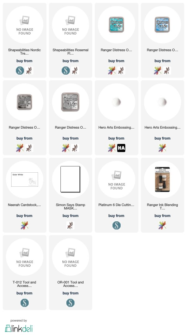
For my first project, I wanted to emphasize how beautifully the details of these intricate dies die cut from masking paper. I started by die cutting the Rosemal Flowers Etched Dies from the Folk Art collection using masking paper. I carefully peeled the backing off and adhered it to approximately the center of my white, A2 card front, burnishing it with my bone folder to ensure that my mask remained in place while I did some ink blending. I then blended Peacock Feathers and Mermaid Lagoon Distress Oxide inks on the card front. I peeled the mask away… and it was like magic. Masking is such a simple, but supremely effective, technique to utilize with these gorgeous intricate dies!

Next, I wanted to add a little extra “something” to the card front, so I decided to press my Versamark pad onto the entire card front and cover it with clear embossing powder. I heated it, then repeated the process again until I had a nice thick, glossy layer of embossing powder. You do run the risk of cracking when trying to maneuver your card front onto a card base, but you can always heat it up again to remove the crack! Such a neat glassy effect, and the lack of sparkles and flowers make this perfectly gender neutral.

For my second project, I wanted to make a decidedly masculine card. I think that the Nordic Tree die looks quite sturdy and masculine, with very few flourishes or hearts, so I wanted to make that the focal point of my masculine project. I essentially repeated the process from the previous card, die cutting the Nordic Tree die from masking paper and adhering it to the card front, then using Hickory Smoke and Black Soot Distress Oxide inks to blend a nice, gray-to-black ombre down the front. Lifting that masking paper off is so much fun. It makes me giddy to see that crisp white pattern revealed!

Next, I added a greeting. I thought this would be perfect for Father’s Day, so I added a crisp white embossed sentiment at the bottom of the blended panel. I trimmed some of the edges off and mounted it on a white card base to add some contrast to the edges of the project.

Well, I hope you’ve enjoyed this foray into the world of masculine cards today! I am all about flowers and pinks and purples, so it was definitely a fun challenge to create something a bit simpler and less frilly (and decidedly less sparkly haha!). Thanks for visiting! I will be back again soon with another guest post featuring the beautiful Lene Lok Folk Art Collection!


Filed Under: spellbinders Tagged With: father's day, ink blending, masculine, masking

2018 Autism Awareness Hop!

April 2, 2018

Good morning! Today, I have the pleasure of taking part in a fantastic blog hop: Autism Awareness Blog Hop. So very many families have a loved one who has been diagnosed as being on the spectrum; I myself have two family members on the spectrum. I am so honored that Veronica Zalis asked me to be a part of this blog hop today, and it’s in honor of those family members that I created this card! In honor of this worthy cause, Taylored Expressions has created a very special stamp set called Look With Your Heart, containing beautiful encouragement sentiments. Taylored Expressions also is committed to donating 25% of the proceeds from the sales of this set during the month of April to the Autism Society.

The hope for this blog hop is to bring awareness and a bit of compassion to those families affected by this diagnosis. My cousin (who is like a sister to me) has a son six months younger than my own children, and watching her joys and struggles with her son has been such an eye-opening experience for me. The parents of children with autism are truly superheroes. It’s one of those situations that you will never truly understand unless you have walked in their shoes, and they deserve every ounce of compassion and love that we can muster.

While the sentiments in this beautiful Look With Your Heart stamp set are all incredible and so poignant, one of the sentiments particularly spoke to me: “Every child is a different kind of flower, and all together make a beautiful garden.” Each child is their own person. Each child has their own value, their own contribution to society. They all are capable of making us better people, and together we can make the world a better place for them.

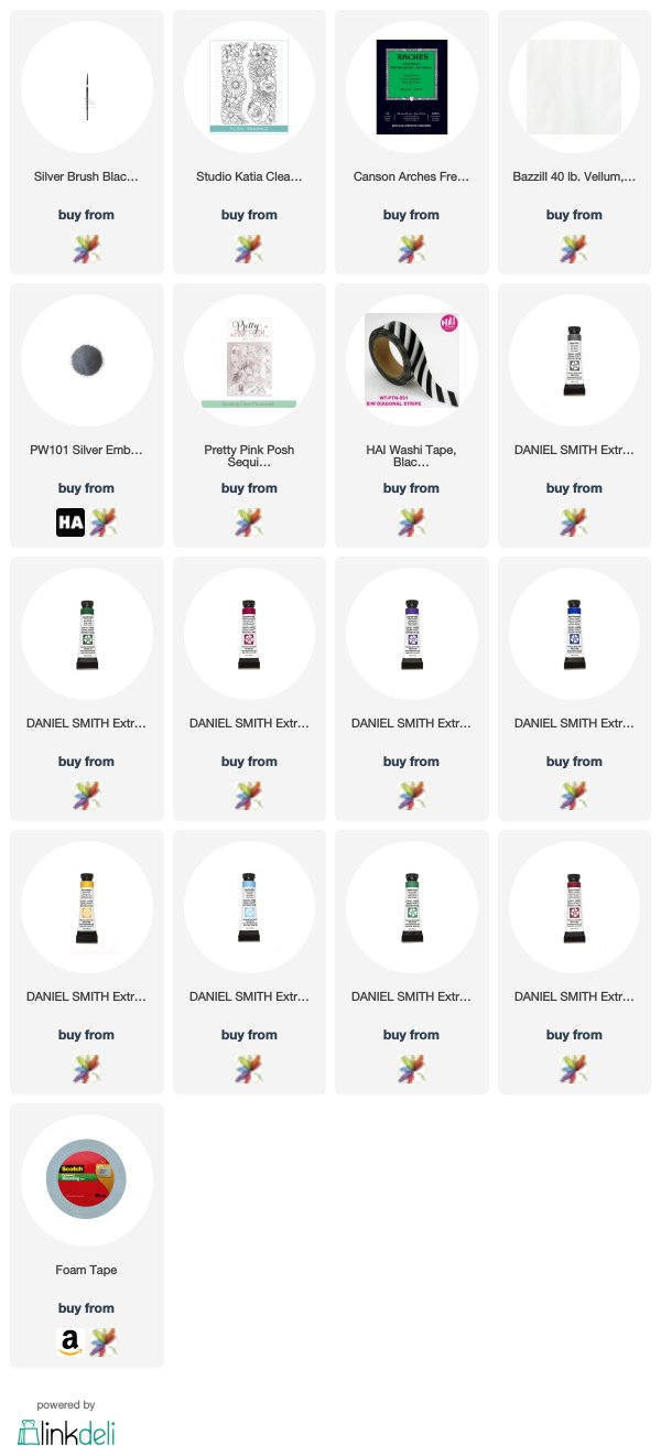
I started by stamping the beautiful Floral Trimmings stamp from Studio Katia and silver heat embossing it on some watercolor paper. I then placed strips of washi tape on the embossed panel and watercolored it using the same technique that I demonstrated in this video. Stripes and florals are super chic this spring, so I wanted to bring that trend in to this card. I wanted pretty pastel blue florals, so I used Daniel Smith’s French Ultramarine.

After peeling off my washi masking tape stripes, I worked on watercoloring the florals. I used a variety of colors of Daniel Smith watercolor tubes (helping to bring home my chosen sentiment with lots of different flowers ;)), including Quinacridone Pink, New Gamboge, Alizarin Crimson, and Hooker’s Green. (I’ll link them all below!) I stamped the same floral image from Floral Trimmings on a piece of scrap watercolor paper, then watercolored just a portion of it and fussy cut it to have an extra little floral element.

Once my watercoloring was complete, I turned to the greeting. I stamped the lovely sentiment from the Taylored Expressions Look With Your Heart stamp set onto some heavyweight vellum and heat embossed it using silver embossing powder. I then scored it and folded the edge over the edge of my floral panel and hid the adhesive on the back of the card. (You have to be sneaky with vellum or else that ugly adhesive shows right through!) I used the other fussy cut floral piece to hide some more adhesive in the corner of the vellum sentiment panel. Isn’t that sentiment just stunning?

I hid some more adhesive behind some Sparkling Clear sequins, then added a thin strip of silver glitter paper on the edge of the card front for a little sparkle.

Well, that’s all for my project today! I hope you’ll check out all of the different sponsors for this hop… there are some absolutely incredible prizes from some absolutely incredible and generous sponsors (including some of my absolute favorite companies… Ellen Hutson, Hero Arts, and Honeybee Stamps). There is a wealth of inspiration and encouragement to be found along this hop, and I hope you will check out each stop!

Veronica Zalis
Erica A-B
Sandy Allnock
Amanda Bodine
Kimberly Crawford 
Joscelyne Cutchens (Instagram)
Dana Joy
Wanda Guess
Jill Dewey Hawkins
Jennifer Ingle (Instagram)
Emily Midgett
Kay Miller
Carly Tee Minner
Miriam Prantner
Elena Roussakis
Heather Ruwe
Amy Tsuruta
Marcie Sharp
Alice Wertz
 Vera Yates
Melissa Phillips

There is also an opportunity for you to create your own Autism-themed project and link it up to the InLinkz for an additional chance to win one of these fabulous prizes!

An InLinkz Link-up
Thank you so much for stopping by and for your support! I hope this hop inspires everybody to be kind! The world sure could use it! Have a marvelous day. 🙂

Filed Under: studio katia, video, watercolor Tagged With: autism, blog hop, floral, masking, washi tape, watercolor

Get To Know the Ellen Hutson Design Team Blog Hop!

March 3, 2018


Good morning! Even as a seasoned cardmaker, I enjoy enjoy learning tips & tricks from other crafters. My favorite tip/trick is to use artwork and fashion found on Pinterest as inspiration for my cards. You can find some really beautiful and unique color combinations, layouts, and technique ideas from fashion and artwork photos on Pinterest. I get a lot of help on floral layouts from looking at wedding bouquets and floral patterned clothes on Pinterest.

Today, the new Ellen Hutson Design Team is having a special blog hop to help introduce all of the new team members! We were supposed to use our “favorite-” medium, stamp set, colors, etc. I combined several of those to create this pretty watercolored card!

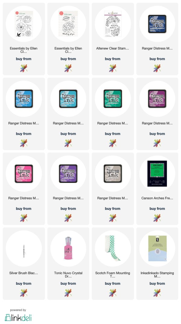
For my project today, I chose to create a no-line (almost) one layer card using some of my absolute favorite Essentials By Ellen products and Distress Inks for watercolors. I started by cutting a mask from the Mondo Hydrangea stamp set for the main flower, then stamping that same image again on some Arches watercolor paper using very pale gray ink. I placed the mask over the hydrangea, then stamped the leaves from Mondo Hydrangea and some of the smaller blooms and foliage from Mondo Peony using the same light gray ink. The nice thing about no-line coloring is that, even if your masking isn’t perfect and you get some overlapping lines (ahem, don’t look closely at my foliage in this next photo), you can still fudge it because those lines are mostly covered up by the coloring.

To watercolor the flowers, I chose to use a looser style of watercoloring, not quite so detailed as I normally would have done with my Daniel Smith or my Zigs… Distress Inks are a different animal when it comes to blending and shading, so you have to adjust accordingly. 🙂 I will list the different inks individually at the bottom of the post, but the main colors are Picked Raspberry, Wilted Violet, Salty Ocean, and Lucky Clover. I simply tapped them onto a piece of laminated card stock and picked the ink up with my paintbrush. For the shadows, I added in deeper shades of the same colors on the second layer for the shading, occasionally adding in some Pumice Stone to my color mixture to create shadows and depth.

The key with no-line watercolor is to work in sections that are not right next to each other. Watercolor a petal or two, then move to a completely different area. This helps to avoid the colors bleeding into each other, which also has the unpleasant effect of losing your crisp edges, and thus making your project a muddy mess. 🙂 After I had finished coloring all of the flowers, I allowed plenty of drying time before adding my halo of Wilted Violet around the edge of my bouquet. I added a few splatters with a flick of my paintbrush and added a few Nuvo Drops in Carnation Pink to help round out the bouquet and add some texture.

I trimmed down the edges to mount it on a royal purple mat and added a sentiment from Altenew’s Just Because stamp set heat embossed in white on navy blue card stock and popped up with dimensional adhesive. And that’s all for that project! Very loose watercoloring, but those bright Distress Ink colors really make those flowers pop off the page!

In the spirit of getting to know the new Ellen Hutson Design Team, here is a little info about me that you might not know:
~Coffee or tea? Depends on the time of day and the temperature outside. 😉 Coffee in the morning, tea in the afternoon. Sometimes iced, sometimes hot…. But I am an equal opportunity caffeinator.
~How did you come up with your blog name? Our first house was on Sixth Street. When I started blogging, I intended to blog about many different types of crafts, including scrapbooking, party decor, cardmaking, home decor, etc, so Sixth Street Sundries seemed perfect. Plus, I like alliteration haha.
~Tell us one silly/random/interesting tidbit about yourself! I have a master’s degree in vocal performance and have performed as the soprano soloist for Faure’s Requiem at The Kennedy Center in Washington, DC! I am also pretty tall, 5’10″… which makes my last name even funnier!

Well, that’s all for me today! If you’ve never been to my blog before, I hope you have enjoyed getting to know me a little bit. I’m so happy you’re here! And for old friends, welcome back! This year is going to be fantastic, I think! Here are links the rest of my esteemed Design Team compatriots:

Ardyth Percy-Robb
Carissa Wiley 
Carly Tee Minner
Carolyn Peeler
Elena Roussakis
Emily Midgett
Heather Campbell
Julia Stainton
Julie Ebersole
Justine Hovey
Kelly Griglione 
Kittie Caracciolo
Laurel Beard
Lisa Adametz
Lisa Spangler
Lydia Evans
Michele Ferguson
Sandy Allnock
Sharon Harnist
Therese Calvird

Filed Under: Ellen Hutson Tagged With: distress ink, distress watercolor, hydrangeas, masking, no line coloring, peonies, watercolor

  • « Go to Previous Page
  • Page 1
  • Page 2
  • Page 3
  • Go to Next Page »

Primary Sidebar

  • Facebook
  • Instagram
  • Pinterest
  • YouTube

Favorite Shops

Secondary Sidebar

Subscribe

Enter your email address to subscribe to this blog and receive notifications of new posts by email.

Instagram
Something is wrong.
Instagram token error.
Follow
Load More

Archives

Tags

3D embossing folder alcohol markers better press birthday birthday card blog hop card kit christmas christmas card christmas tag colored pencil copic copic coloring Daniel Smith die cutting embossing folder embroidery felt giveaway holiday holiday card hot foil ink blending karin brushmarker pro layered stencil masculine my monthly hero new release no line coloring no line watercolor OLO marker olo markers original illustration pawsitively saturated rainbow shaker card slimline stamping stamptember stencil thank you thinking of you valentine's day video watercolor

Popular Posts

Special Release: Simon Says Stamp Exclusive Tim Holtz Coordinating Dies!
Simon Says Stamp Card Kit November 2026: Jolly Season!
Shaped Holiday Shaker Card with New Simon Says Stamp Jolly Season Card Kit of the Month!
Simon Says Stamp Glory to the Newborn King Holiday Kit-Part II!
Simon Says Stamp Glory to the Newborn King Holiday Kit-Now Available!
Altnew Craft A Flower: Daffodil+ Glitter Cardstock Release Blog Hop + Giveaway!
Altenew October 2026 Release Blog Hop + Giveaway!
Grateful Acorns with Simon Says Stamp!
Coral Wild Rose for Mother's Day with Simon Says Stamp!
Fashion Shoppe and Flower Shoppe with Concord & 9th!

Disclosure

Some affiliate links are used in my posts. This means that, should you click on one of my links and purchase something from that company, I will receive a small portion of the sale at no extra cost to you. I use the money earned from these sales to help maintain my blog. I so appreciate you visiting and, if you do choose to use one of my affiliate links, thank you so much for your support!
Copyright © 2026 ·Brunch Pro Theme · Genesis Framework by StudioPress · WordPress · Log in
Loading Comments...